# Load required packages
pacman::p_load(
  malariaAtlas,  # Download PfPR2-10 rasters
  terra,         # For raster operations
  sf,            # For vector data
  exactextractr, # For precise extraction from rasters
  dplyr,         # For data manipulation
  lubridate,     # For date handling
  here,          # For file path management
  glue           # For dynamic string construction
)

# download latest sntutils if you haven't already (run once, manually)
# devtools::install_github("ahadi-analytics/sntutils")

# Define folder to store MAP surfaces
maps_data_path <- here::here("1.2_epidemiology/1.2b_pfpr_estimates/raw")

# Load admin boundary shapefile
shp_file <- base::readRDS(
  here::here(
    "1.1_foundational/1a_admin_boundaries",
    "1ai_adm3",
    "sle_spatial_adm3_2021.rds"
  )
) |>
  dplyr::select(adm0, adm1, adm2, adm3, geometry) |>
sf::st_as_sf()Working with geospatial model estimates
Intermediate
Overview
Reliable and spatially detailed data support the stratification of malaria transmission and its determinants across geographic areas, a central step of SNT. Such data can come from various sources including national surveillance, household surveys like DHS or MIS, or research institutions. For some data indicators, these sources may provide insufficient spatial granularity (for example, they are available only at adm1 whereas SNT is being done at adm2), or may have serious limitations in quality or completeness. In such cases, the SNT team may want to explore the use of geospatially modeled estimates of certain types of data.
Publicly available modeled surfaces from the Malaria Atlas Project (MAP) website are one option for providing spatially continuous estimates where gaps exist. The SNT team may also have access to pre-existing geospatial modeled surfaces from other groups or may be working with a group to generate geospatial estimates during SNT.
This section focuses on how to work with rasters and process existing modeled geospatial estimates for use in your SNT workflow. While Plasmodium falciparum parasite prevalence in children aged 2 to 10 years (PfPR2-10) is used here as a practical example, the same approach applies to other surfaces such as ITN access, ITN use, care-seeking behavior, treatment rates, and travel time to health services. We provide instructions for accessing publicly available MAP surfaces, but subsequent steps also apply for non-MAP surfaces. By following the steps below, you can apply these methods to any indicator relevant to your country context. To generate your own modeled estimates, see the code library page Generating Spatial Modeled Estimates.
While this page provides general information on working with rasters, the code library also provides additional pages that work with raster data:
The code library also includes pages for working with spatial vector (shapefile) data:
For working with point coordinate data and mapping point locations, see the page below:
NoteObjectives
- Access MAP-provided rasters such as PfPR2-10, ITN access, ITN use, treatment rates, care-seeking, and environmental surfaces
- Inspect, visualize, and validate raster surfaces over time and space
- Extract subnational summaries using unweighted or population-weighted zonal methods, depending on the indicator
- Compile and save clean, subnational summaries of modeled indicators for integration into SNT workflows
Data Needs and Considerations
What Are Geospatial Modeled Estimates?
Geospatial modeled estimates are statistical predictions of a health or environmental indicator at fine geographic resolution (e.g., 5 km × 5 km grid cells), produced using spatial models that integrate multiple data sources, such as survey data, remote sensing, and environmental covariates.
These estimates are useful when observed data (from surveys or routine systems) are incomplete, infrequent, or only available at coarser administrative levels than required for subnational tailoring (e.g., data available at adm1 while decisions are needed at adm2 or lower). To generate modeled estimates in such settings, two additional conditions are typically needed: (1) that the available data, such as PfPR survey points, are geolocated, and (2) that relevant covariates (e.g., rainfall, elevation, vegetation index) are available at finer spatial or temporal resolutions, with a plausible relationship to the indicator being modeled.
For example, PfPR2-10 from MAP estimates malaria prevalence among children aged 2 to 10 years across Africa using a Bayesian geostatistical model that combines household survey data, climate covariates, and covariates from satellite imagery. These continuous spatial estimates allow analysts to stratify PfPR2-10 at operational units smaller than the unit at which the household surveys were powered.
Glossary of Key Terms
- Geospatial model: A statistical model that predicts the value of a variable (e.g., malaria prevalence) at unsampled locations by incorporating the spatial location of observed data. These models often account for spatial dependence, i.e., the idea that nearby locations are likely to have similar values. Some models also incorporate spatially referenced covariates (e.g., rainfall, vegetation index) to improve predictions.
Example: The model used by MAP to generate PfPR2-10 estimates combines DHS/MIS data with satellite-derived environmental features.
- Model estimates: The predicted values output by a geospatial model. These are not directly observed but inferred based on patterns in the input data.
Example: A model estimate might indicate that malaria prevalence in an unsurveyed district is 14%, based on neighboring areas and environmental conditions.
- Surfaces: A general term referring to spatially continuous geospatial model outputs. These are typically in raster format and cover the entire area of interest.
Example: The surface of ITN use shows predicted use rates across all of Sierra Leone in a grid format.
- Rasters: A type of spatial data format where each grid cell (pixel) has a value corresponding to the modeled estimate at that location. Rasters can be used to represent continuous indicators like temperature, rainfall, or disease prevalence, or count indicators like population.
Example: A raster of PfPR2-10 where each pixel represents the estimated malaria prevalence among 2–10 year olds in that location.
- Model products: The complete outputs of a geospatial modeling effort, often including raster files, metadata, uncertainty intervals, and methodology documentation.
Example: A downloadable
.tifraster of ITN access from MAP, along with accompanying uncertainty intervals and metadata explaining how it was modeled.
- Risk maps: Maps that visualize modeled surfaces to indicate levels of risk or burden.
Example: A risk map of under-5 mortality rates from IHME that might be used to target child health interventions.
Important Considerations
While modeled surfaces can be useful for filling data gaps, it’s essential to understand their limitations and use them thoughtfully. The points below outline key considerations when applying these estimates in SNT workflows.
Coverage vs. Accuracy: Modeled estimates offer complete geographic coverage, but they are only as good as the data and assumptions that underpin them. Areas with few or poor-quality observations may have greater uncertainty.
Validation: Where possible, compare modeled estimates with available routine or survey data to assess consistency. For instance, if modeled ITN access is vastly higher than DHS estimates in a well-surveyed district, it may signal a problem with the model or inputs.
Interpretation: Remember that these are statistical predictions, not direct measurements. When communicating with stakeholders, it’s helpful to frame them as estimates with a degree of uncertainty, rather than precise truths.
WarningGlobal vs. Bespoke MAP Raster Products
While this page covers how to use raster products generally in SNT workflows, for MAP in particular it’s important to distinguish between globally available products and bespoke country-specific outputs. This clarity ensures users apply appropriate workflows, respect data-sharing agreements, and make informed choices based on the raster type they are working with.
MAP raster products fall into two categories:
Global products: Publicly available outputs from standard global models. They are accessible via the MAP website or the
malariaAtlasR package. The workflows in this guide assume you are using these global products.Bespoke products: Custom outputs developed for specific countries in collaboration with MAP. These may draw on national data and tailored models. They are not publicly accessible and must not be shared or published without explicit permission from national authorities.
Note: If your team has access to bespoke rasters for certain indicators such as parasite prevalence, you may still follow the steps in this workflow (e.g., aggregation, mapping), but do not share outside the SNT team or publish the products unless explicitly approved. Always check with the SNT team regarding appropriate use and permissions.
Key Features of Geospatial Rasters
Spatial Coverage and Continuity: geospatial rasters offer complete spatial coverage, including areas without direct observations. This is achieved through geostatistical modeling, which allows for the generation of smooth, continuous surfaces that reflect likely values in unsampled regions. However, note that predictions for areas without nearby direct observation will be more uncertain.
Covariate Integration: The values in the rasters reflect spatial variation in underlying drivers such as climate, population density, and intervention coverage. By incorporating these covariates into the modeling process, the resulting surfaces should, in theory, better reflect real-world spatial patterns compared to simple extrapolations. If your SNT team is working directly with a geospatial modeler to generate bespoke products, the SNT team may request the modeler to include or exclude various covariates in order to arrive at a final map that best reflects reality in the country.
Subnational Scale: MAP rasters are available at a resolution of approximately 5 km. Other groups’ rasters may be at a similar, smaller, or larger spatial resolution. Whatever the source, the spatial resolution of geospatially modeled rasters typically captures local variations in transmission or access patterns while aligning effectively with admin units such as districts or health facility catchment areas. It allows for meaningful aggregation to admin level 3 or comparable levels without excessive smoothing or loss of detail. However, for very small-scale analysis such as for microstratification, 5 km may be too large. It is best to examine the raster in detail at your spatial scale of analysis to decide whether the resolution is sufficient, including whether the heterogeneity at your level of analysis reflects reality.
Annual Surfaces: Provides yearly estimates for consistent temporal comparisons, although some years may rely heavily on model extrapolation. Since household surveys are usually an important input dataset into geospatial models, if there have been many years between surveys, the model predictions for the intervening years will be more uncertain.
These modeled estimates can fill data gaps but must be interpreted with caution, recognizing that accuracy depends heavily on input data quality and availability. Higher uncertainty is expected in areas with fewer surveys (primary data points) or limited covariate information. It is recommended that uncertainty be taken into consideration when using geospatial model outputs. For MAP, information on the uncertainty of their modeled surfaces is available on the Malaria Atlas Project website. Similarly, other geospatial modeling groups should be providing uncertainties as part of their outputs. If they are missing, we recommend you request uncertainty intervals directly from the modeling group.
ImportantConsult SNT Team
Use of modeled rasters is optional for SNT. However, if used, two rounds of validation by the SNT team are required:
- First, before any data extraction or processing begins, the SNT team must indicate that they are interested in considering geospatial modeled estimates for the relevant indicator.
- Second, after extraction, the SNT team must review outputs to determine whether they are realistic for the country context and suitable for further use.
These are modeled estimates, not primary or national data, and must be used cautiously and in consultation with the SNT team.
Step-by-Step
In this section, we will demonstrate how to aggregate rasters to the relevant operational unit level and prepare the results for future use. We will use PfPR2-10 from MAP as an example, so we also cover how to access and download the latest available estimates from MAP.
TipWorking with Non-MAP Rasters
If you already have a .tiff raster on hand, whether it is from MAP or another group, you may skip Step 1 and proceed directly to Step 2 to work with this raster. If the raster is from another group, you should be particularly alert about adapting the code to account for different layering structure and naming conventions in your raster.
To skip the step-by-step explanation, jump to the full code at the end of this page.
Step 1: Initial Setup, Check, and Load MAP Rasters
Step 1.1: Initial setup
In this step, we’ll load the required packages and the shapefile. We’ll use an administrative boundary shapefile for Sierra Leone as we will be focusing on Sierra Leone as an example.
To adapt the code:
- Line 176: Replace the placeholder with the actual directory path where you intend to save your relevant MAP surfaces.
- Lines 179–184: Replace with the path to your shapefile.
- Line 186: Ensure that your imported data includes
adm0,adm1,adm2,adm3columns. If not, rename withdplyr::rename().
Once updated, run the code to load your packages and shapefile.
Step 1.2: Check the available MAP rasters for download
With the workspace set up, the next step is to explore the modeled rasters available from MAP through the malariaAtlas R package. The listRaster() function lists all publicly accessible rasters provided by MAP, covering a range of malaria and health-related indicators.
To make this list more usable, the example below cleans the output to produce a summary showing the latest version available for each indicator. Specifically, it generates a simplified indicator name, filters out incomplete entries, and retains only the most recent dataset for each indicator based on the available years, ensuring you are working with the most up-to-date data. Remember to only run this code once, saving the output for later use.
# retrieve the available MAP rasters
available_data <- malariaAtlas::listRaster()

# clean up the dataset to have a unique ID and get the latest version/row for each indicator
available_data_cleaned <- available_data |>
  dplyr::mutate(
    indicator_name = dataset_id |>
      stringr::str_replace_all("\\d+", "") |>
      stringr::str_replace_all("_{2,}", "_")
  ) |>
  dplyr::select(
    indicator_name,
    dataset_id,
    title,
    min_raster_year,
    max_raster_year
  ) |>
  dplyr::filter(!is.na(max_raster_year)) |>
  dplyr::group_by(indicator_name) |>
  dplyr::slice_max(max_raster_year) |>
  dplyr::arrange(desc(max_raster_year)) |>
  dplyr::ungroup()

# check data
head(available_data_cleaned, 15)

# save processed file as CSV
rio::export(
  available_data_cleaned,
  here::here(
    save_path,
    "processed",
    "maps_available_rasters.rds"
  )
)To adapt the code:
- Lines 30–33: Replace the placeholder with the actual directory path where you intend to save your
available_data_cleanedfor later reuse.
Step 1.3: Retrieve the dataset ID for any MAP indicator of interest
To download a MAP raster, you need the dataset ID and the range of years it covers. If you’re working with a specific indicator, such as PfPR2-10, ITN access, or treatment rates, you can filter the cleaned list to retrieve its dataset ID along with the minimum and maximum available years. To find the correct indicator name, simply check the indicator_name column in the available_data_cleaned table.
# extract the dataset ID for the PfPR2-10 indicator from the cleaned list
pfpr2_10_id <- available_data_cleaned |>
  dplyr::filter(indicator_name == "Malaria_Global_Pf_Parasite_Rate")

# assign and print the dataset ID
dataset_id <- pfpr2_10_id$dataset_id
glue::glue(
  "Our dataset ID of interest is: {dataset_id}"
)

# assign and print the min year available
min_year <- pfpr2_10_id$min_raster_year
glue::glue(
  "The minimum year our dataset ID of interest is available: {min_year}"
)

# assign and print the max year available
max_year <- pfpr2_10_id$max_raster_year
glue::glue(
  "The maximum year our dataset ID of interest is available: {max_year}"
)To adapt the code:
- Line 302: The string in
indicator_name == "Malaria_Global_Pf_Parasite_Rate"can be replaced with the user’s indicator of interest to retrieve different MAP surfaces.
Once updated, run the code to get your dataset ID.
Step 1.4: Download the latest MAP PfPR2-10 rasters
Now that we have the dataset ID and the range of available years, we can use this to download the latest MAP PfPR2-10 rasters for the selected years. The malariaAtlas::getRaster() function provides access to these rasters using the dataset ID provided by MAP.
To adapt the code:
- Line 3: Do not change this line, as the input ID parameters is automated and sourced from the previous code section.
- Line 4: Keep this as is if you intend to download the maximum available data. Alternatively, modify it if you are not interested in downloading all available data.
- Line 5: Replace
maps_data_pathwith the folder path where you want to save the rasters. If you need rasters for more than one indicator, repeat this step for each one, updating thedataset_idaccordingly. - Line 7:
malariaAtlas::getRaster()creates an unwanted “getRaster” artifact folder in the working directory, this line safely deletes it after the download to keep your project clean.
Once updated, run the code to download the MAP surface raster data for your selected years and save them locally.
This full MAP raster retrieval workflow is automated, and in the future, if MAP uploads more recent data, the code will always get the latest version of that MAP raster surface, which is one of the strengths of doing this programmatically.
Step 2: Load and Inspect PfPR2-10 Rasters
Let’s examine the rasters across the years to ensure they loaded correctly, contain realistic values, and align with our understanding of malaria prevalence in Sierra Leone.
Step 2.1: Inspect raster contents before aggregation
Before we begin processing or visualizing modeled rasters, it’s important to understand what each layer represents. This helps ensure we use the correct surface (e.g., mean, lower bound) for aggregation or interpretation.
We’ll use the 2020 MAP PfPR2-10 raster as an example. These rasters typically contain multiple layers per year, including the mean estimate and uncertainty intervals.
class : SpatRaster
size : 74, 73, 4 (nrow, ncol, nlyr)
resolution : 0.04166667, 0.04166667 (x, y)
extent : -13.29167, -10.25, 6.916668, 10 (xmin, xmax, ymin, ymax)
coord. ref. : lon/lat WGS 84 (EPSG:4326)
source : maps_global_pfpr2_10_2020.tif
names : Malaria~05594_1, Malaria~05594_2, Malaria~05594_3, Malaria~05594_4
min values : 0.1809237, NaN, 0.0248465, 0.4505638
max values : 0.5903933, NaN, 0.2002271, 1.0000000 To adapt the code:
Do not change anything in this code as it uses maps_data_path that were established in previous chunks. Ensure that these are the correct raster paths in your data.
As you can see, rasters can contain multiple layers for each year. On MAP rasters, these layers represent different statistical summaries of the modeled PfPR2-10. The table below summarizes what each layer contains:
| Layer | Meaning |
|---|---|
Malaria~05594_1 |
Mean PfPR2–10 estimate |
Malaria~05594_2 |
Posterior standard deviation (uncertainty) |
Malaria~05594_3 |
Lower 95% credible interval bound |
Malaria~05594_4 |
Upper 95% credible interval bound |
Here, we are interested in the mean, lower, and upper estimates of PfPR2–10, corresponding to Layers 1, 3, and 4 in the raster stack. For example, to access the mean PfPR2–10 estimate, we use the index number of the corresponding layer:
Similarly, to access the lower bound and upper bound of the 95% credible interval:
Step 2.2: Aggregate rasters into one DataFrame
To prepare for visualization, we first convert the raster stack into a combined dataframe. In this example, we extract the mean, lower and upper PfPR2–10 estimates (layer 1, 3 and 4). We merge all available years for this indicator into a single long-format dataframe. This structure makes it easier to generate faceted plots and track changes in prevalence over time.
# list all valid raster files
raster_files <- list.files(
path = maps_data_path,
pattern = "\\.tif{1,2}$",
full.names = TRUE
) |>
purrr::keep(~ !file.info(.x)$isdir)
# prepare region shapefile as SpatVector
sle_vect <- terra::vect(shp_file)
# process rasters: reproject, crop, mask, and extract values for 3 layers
combined_df <- purrr::map(raster_files, function(path) {
raster_stack <- terra::rast(path)[[c(1, 3, 4)]] |>
terra::project(terra::crs(sle_vect)) |>
terra::crop(sle_vect) |>
terra::mask(sle_vect)
if (terra::ncell(raster_stack) == 0) {
return(NULL)
}
df <- terra::as.data.frame(raster_stack, xy = TRUE, na.rm = TRUE)
names(df)[3:5] <- c("mean", "lower", "upper")
df_long <- tidyr::pivot_longer(
df,
cols = c("mean", "lower", "upper"),
names_to = "stat",
values_to = "PfPR2_10"
)
df_long$year <- stringr::str_extract(basename(path), "(?<=_Rate\\.)\\d{4}")
df_long
}) |>
purrr::compact() |>
dplyr::bind_rows() |>
# transform to long format
tidyr::pivot_wider(names_from = stat, values_from = PfPR2_10)
# check what the head looks like
head(combined_df)To adapt the code:
Do not change anything in this code as it uses shp_file and maps_data_path that were established in previous chunks. Ensure that these are the correct shapefiles and raster paths in your data.
Step 2.3: Visualize the rasters
Now that we have created a list of raster files and combined them into a single dataframe, let’s visualize the mean PfPR2–10 estimate by plotting them as faceted rasters across the years.
Code
# plot rasters
adm3_map_modeled_pfpr <- ggplot2::ggplot(
combined_df,
ggplot2::aes(x = x, y = y, fill = mean * 100)
) +
ggplot2::geom_raster() +
ggplot2::coord_equal() +
ggplot2::facet_wrap(~year) +
ggplot2::scale_fill_viridis_c(
na.value = "transparent",
option = "B",
direction = -1,
labels = scales::label_number(suffix = "%")
) +
ggplot2::theme_void() +
ggplot2::labs(
title = expression(
"Mean MAP-Modeled " * italic(Pf) * "PR"[2 - 10] * " by adm2 (2000–2022)"
),
x = NULL,
y = NULL
) +
ggplot2::theme(
legend.position = "bottom",
legend.key.width = ggplot2::unit(2, "cm"),
legend.text = ggplot2::element_text(size = 8),
legend.title = ggplot2::element_text(size = 9, face = "bold")
) +
ggplot2::guides(
fill = ggplot2::guide_colorbar(
title = expression(italic(PfPR)[2 - 10]),
title.position = "top",
title.hjust = 0.5,
label.position = "bottom",
barwidth = ggplot2::unit(10, "lines"),
barheight = ggplot2::unit(0.5, "lines")
)
)
adm3_map_modeled_pfpr
# save map plot
ggplot2::ggsave(
plot = adm3_map_modeled_pfpr,
here::here("map/figures/adm2_map_pfpr_rosters_2000_2022.png"),
#width = 12,
#height = 7,
dpi = 300
)
NoteOutput
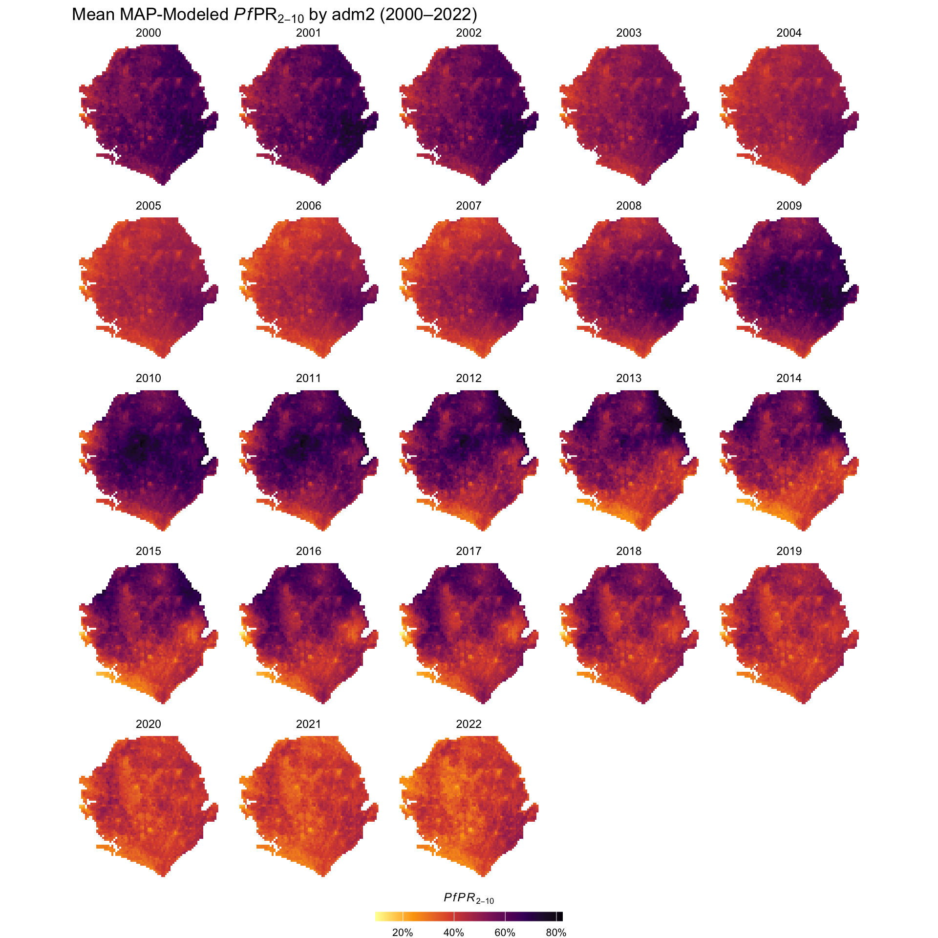
Figure: Mean Modeled estimates of Plasmodium falciparum parasite prevalence in children aged 2–10 (PfPR2-10), shown as percentage values. Estimates are derived from MAP geostatistical surfaces. Source: Malaria Atlas Project website.
To adapt the code:
- Line 3: Update
combined_dfvariable name if you used a different name in the previous step. - Lines 18–20: Modify the plot title to reflect your country or indicator of interest.
- Line 48: Update the output path to match your desired save location.
Once updated, run the code to generate the raster visualization.
Now that we have successfully visualized the mean PfPR2-10 rasters across the years, we can observe the distribution of Plasmodium falciparum prevalence in Sierra Leone. The values are displayed as percentages, with higher intensities indicating greater prevalence in a given year and location.
While these maps show modeled trends over time, such as changes in prevalence across years, they reflect model estimates, not direct observations. This highlights why validation from the SNT team is essential, to confirm that the spatial and temporal patterns align with the country’s operational context.
Step 3: Aggregate Rasters to Admin Level
Rasters provide estimates at pixel resolution (for MAP, 5 km), but these pixel-level values are usually not directly usable for decision-making in the SNT process. For SNT, we need indicator values aggregated to the level of the operational unit of decision making, typically adm2 or adm3, that was selected by the SNT team at the beginning of the process.
To aggregate raster values to the administrative unit level, there are several options:
Centroid approach: Extract the value of the pixel closest to the centroid of each admin unit.
Unweighted mean: Take the mean of all raster cells that fall within each unit, giving each pixel equal weight.
Population-weighted mean: Take the mean of raster cells, weighted by the human population in each pixel. This ensures that more densely populated areas contribute more to the final value.
For indicators that are inherently population-referenced, such as PfPR2-10, ITN access, treatment rates, or travel time, population-weighted extraction is usually preferred, as it reflects where people actually live. In contrast, for purely environmental indicators like rainfall or elevation, the unweighted mean (or in some cases the centroid method) can be acceptable. The choice between methods depends on the degree of spatial variation within the unit: when variation is low, simpler methods may suffice; when high, weighted methods are generally more appropriate.
Step 3.1: Centroid approach (Option A)
In this example, we demonstrate unweighted extraction using the combined_df created earlier, using the centroid approach. While PfPR2-10 is used here to illustrate the method, it is important to note that PfPR2-10 is a population-referenced indicator. In practice, you should apply population weighting when summarizing PfPR2-10 (see Step 4).
# convert combined_df to sf object
combined_sf <- sf::st_as_sf(
combined_df,
coords = c("x", "y"),
crs = sf::st_crs(shp_file)
)
# reproject both layers to a planar CRS for joining
combined_proj <- sf::st_transform(combined_sf, crs = 32632)
shp_proj <- sf::st_transform(shp_file, crs = 32632)
# spatial join to assign admin units to raster points
joined_sf <- sf::st_join(
combined_proj,
shp_proj,
join = sf::st_intersects
) |>
dplyr::select(
dplyr::everything(),
year,
mean,
lower,
upper
) |>
sf::st_drop_geometry()
# aggregate mean PfPR2-10 by admin unit and year
aggregated_df <- joined_sf |>
dplyr::group_by(adm0, adm1, adm2, adm3, year) |>
dplyr::summarise(
mean_pfpr = mean(mean, na.rm = TRUE),
lower_pfpr = mean(lower, na.rm = TRUE),
upper_pfpr = mean(upper, na.rm = TRUE),
.groups = "drop"
)
# inspect top of data
head(aggregated_df)To adapt the code:
Please ensure this code remains unchanged as it uses data from the previously defined parameters.
In this step, we matched the raster estimates to admin boundaries by first making sure their coordinate systems aligned. We then turned the raster points into a spatial object and joined them to the admin areas they fall in. Finally, we calculated the average prevalence for each admin area and year to prepare the estimates for further analysis.
Step 3.2: Unweighted aggregation using the sntutils package (Option B)
In this step, we demonstrate how to perform unweighted extraction using the sntutils::process_raster_collection() function. This automates the process of summarizing raster values to administrative units without applying population weights.
Again, while PfPR2-10 is used as an example, it is recommended to apply population weighting for this indicator (see Step 4). The unweighted approach shown here is primarily intended for area-based indicators or initial summaries when population data is not yet applied.
# extract mean PfPR2–10 estimates (Layer 1)
pfpr_mean_df <- sntutils::process_raster_collection(
directory = maps_data_path,
shapefile = shp_file,
id_cols = c("adm0", "adm1", "adm2", "adm3"),
aggregations = "mean",
pattern = ".tif",
layer_to_process = 1 # specifies the MAPS layer to process
) |>
dplyr::select(adm0, adm1, adm2, adm3, year, mean_pfpr = mean)
# extract lower bound of PfPR2–10 (Layer 3)
pfpr_lower_df <- sntutils::process_raster_collection(
directory = maps_data_path,
shapefile = shp_file,
id_cols = c("adm0", "adm1", "adm2", "adm3"),
aggregations = "mean",
pattern = ".tif",
layer_to_process = 3 # specifies the MAPS layer to process
) |>
dplyr::select(adm0, adm1, adm2, adm3, year, lower_pfpr = mean)
# extract upper bound of PfPR2–10 (Layer 4)
pfpr_upper_df <- sntutils::process_raster_collection(
directory = maps_data_path,
shapefile = shp_file,
id_cols = c("adm0", "adm1", "adm2", "adm3"),
aggregations = "mean",
pattern = ".tif",
layer_to_process = 4 # specifies the MAPS layer to process
) |>
dplyr::select(adm0, adm1, adm2, adm3, year, upper_pfpr = mean)
# join all three outputs into a single dataframe
pfpr_unweighted <- pfpr_mean_df |>
dplyr::left_join(
pfpr_lower_df,
by = c("adm0", "adm1", "adm2", "adm3", "year")
) |>
dplyr::left_join(
pfpr_upper_df,
by = c("adm0", "adm1", "adm2", "adm3", "year")
) |>
dplyr::arrange(adm0, adm1, adm2, adm3)
# inspect result
head(pfpr_unweighted)To adapt the code:
Please ensure this code remains unchanged as it uses data from the previously defined parameters.
We can see that both methods give similar but slightly different results. In Step 3.1 (Option A), we used a manual unweighted approach, while in Step 3.2 (Option B), we used the automated unweighted sntutils::process_raster_collection function. Both follow the same logic (summarizing values by admin areas) but the differences come from how they handle the extraction process.
TipQuick Tip: Why the Results Differ?
Option A (Manual with terra): Uses the center points (centroids) of raster grid cells to assign values to admin units. It is simpler but may slightly misrepresent boundary areas where only part of the cell overlaps.
Option B (Using the sntutils package): Built on the
exactextractrpackage, this method applies area-weighted calculations that account for partial overlaps between raster cells and admin boundaries (not weighted for population yet). This makes it more accurate, especially for small or irregularly shaped areas.
Both methods are unweighted and valid, but we recommend using sntutils::process_raster_collection() as the preferred option because it provides a more precise summary of admin coverage.
Step 3.3: Using population weighting (Option C)
When summarizing indicators like PfPR2-10 at the admin level, simple averages may misrepresent the burden if larger or more populated areas are treated the same as sparsely populated ones. To ensure the aggregated value reflects population distribution, it is important to weight estimates by population size. This gives a population-weighted average that better represents where people actually live.
For example, consider a district where most people live in a town with low PfPR2-10, but the surrounding rural areas have much higher prevalence. An unweighted mean would treat every pixel equally, potentially overstating the risk if most of the population actually lives in the lower-risk area. Population-weighted extraction adjusts for this by giving more influence to where people actually reside, providing a summary that better reflects the risk experienced by the population.
To apply population weighting, you need gridded population data for the country of interest and for the corresponding year(s) of your raster. This ensures that prevalence estimates are adjusted based on where people actually live, making them more programmatically relevant.
In this section, we illustrate the process using WorldPop data as an example. However, the choice of population data must follow country-specific guidance, as outlined below:
ImportantConsult SNT Team
Population weighting of rasters requires a modeled population surface, since official population data is not available at the 5 km pixel level. This means the final result reflects the combination of two modeled estimates: one for the malaria indicator, and one for the population distribution.
Most commonly, this surface will come from WorldPop, but the specific dataset used should be agreed upon with the SNT team.
The concern is not about national totals, but about how population is distributed within each admin unit.
If the population model is out of date, misrepresents urban–rural distribution, or fails to account for recent movements (e.g., displacement), it may bias the weighted results.
Analysts should be aware of these limitations and engage the SNT team if there are known issues with local population patterns that could affect interpretation.
Step 3.3.1: Download WorldPop Population Rasters
In our case, we have PfPR2-10 rasters for Sierra Leone from 2000 to 2022. Given that our goal is to estimate the average PfPR2-10 risk across the population in each admin unit, we use total population rasters to apply population weighting.
We use the sntutils::download_pop_rasters() function to download multi-year WorldPop total population count rasters for Sierra Leone. See the WorldPop Raster Data page for more detail on data types, resolution, and preprocessing steps for population rasters.
To adapt the code:
- Line 11: Set this to the ISO3 country code(s) of interest (e.g., “SLE” for Sierra Leone).
- Line 12: Set this to the years of interest. WorldPop currently provides rasters from 2000 to 2020.
- Line 13: Replace
dest_dirwhere you want the population count rasters to be saved.
Once updated, run the code to download the population count rasters for your selected years and save them locally.
Step 3.3.2: Extrapolate Population Raster Data to Fill Temporal Gaps
Before performing any population-weighted calculations, we ensure that population data is temporally aligned with the full range of PfPR2-10 surfaces. Since WorldPop data is only available up to 2020, while PfPR2-10 extends to 2022, we reuse the 2020 population raster for the missing years.
Because population weighting relies on the relative distribution of people across space, not absolute counts, this approach is sufficient, as long as we assume the spatial pattern of population has remained stable. This avoids introducing unnecessary assumptions through artificial growth rates. If there is reason to believe that population distribution has shifted significantly (e.g., due to displacement or urban expansion), consult the SNT team before proceeding.
# load 2020 WorldPop raster
pop_2020 <- terra::rast(
here::here(
worldpop_rast_path,
"sle_ppp_2020_1km_Aggregated_UNadj.tif"
)
)
# save results
terra::writeRaster(pop_2020,
here::here(
worldpop_rast_path,
"sle_ppp_2021_1km_Aggregated_UNadj.tif"
),
overwrite = TRUE)
terra::writeRaster(pop_2020,
here::here(
worldpop_rast_path,
"sle_ppp_2022_1km_Aggregated_UNadj.tif"
),
overwrite = TRUE)To adapt the code:
- Line 5: Update the file path to point to the last available population raster (e.g., 2020).
- Output Paths: Change the file names or directories as needed to match your output structure.
- Rasters Years: Replace the year labels with the years you need to cover in your analysis.
Once updated, run the code to save copies of the 2020 raster for use in future-year analyses.
To fill the gap for 2021 and 2022, we simply reuse the 2020 WorldPop raster. Since we’re applying population weighting, and only the spatial distribution matters, this is sufficient as long as the distribution hasn’t changed significantly.
Step 3.3.3: Aggregate Weighted Rasters to Admin Level
With the interpolated or sourced population rasters prepared, we now calculate population-weighted estimates for PfPR2-10 or any other indicator. This ensures that the resulting values reflect risk where people actually live, not just across land area.
WarningPopulation Weighting Uses Modeled Surfaces
Pixel-level population weighting requires a modeled population surface such as WorldPop, since official census data is not available at this resolution.
As a result, both the malaria indicator and the population distribution are modeled estimates. Analysts should interpret the aggregated results accordingly, keeping in mind the limitations of each surface, especially in areas with sparse data, recent displacement, or outdated inputs.
Always consult the SNT team if there are known issues with local population patterns that may affect interpretation.
The weighting happens directly within the sntutils::process_weighted_raster_collection() workflow, which takes both the indicator rasters (e.g., PfPR2-10) and the corresponding population rasters (e.g., WorldPop) as inputs. It uses spatially-aware extraction to account for partial cell coverage along boundaries, applying population as a weight to calculate population-weighted means.
For each year, it:
Matches the indicator raster with the corresponding population raster based on year..
Aligns the rasters spatially if needed through extrapolation.
Applies population weighting while adjusting for partial cell overlaps.
Falls back to unweighted means if no valid population weights are available.
TipQuick Tip: Aggregate by admin unit mean or median?
When working with very small districts or more granular shapefiles (e.g., adm3 or below), pixel-based means may be overly sensitive to extreme values in high-variance rasters. In such cases, using the median can result in more robust and interpretable estimates. If you’re unsure, run both and inspect the skewness across units.
This automated approach produces admin-level summaries that account for both population distribution and spatial boundary alignment, all in a single step.
Note:
sntutils::process_weighted_raster_collection()is particularly useful when the rasters are single rasters in folders. However, if the rasters are all stacked in an individual raster, then use thesntutils::process_weighted_raster_stacks()function for this. We demonstrate how best to do this on the Modeled Estimates of Malaria Mortality and Proxies page.
Show the code
# get pop weighted mean pfpr
pfpr_mean_df_weighted <- sntutils::process_weighted_raster_collection(
value_raster_dir = maps_data_path,
pop_raster_dir = worldpop_rast_path,
shapefile = shp_file,
id_cols = c("adm0", "adm1", "adm2", "adm3"),
value_pattern = "\\.tiff$",
pop_pattern = "\\.tif$",
value_layer_to_process = 1, # specifies the MAPS layer to process
stat_type = "mean"
) |>
dplyr::select(
adm0, adm1, adm2, adm3, year, weighted_mean, unweighted_mean
)
# get pop weighted lower pfpr
pfpr_lower_df_weighted <- sntutils::process_weighted_raster_collection(
value_raster_dir = maps_data_path,
pop_raster_dir = worldpop_rast_path,
shapefile = shp_file,
id_cols = c("adm0", "adm1", "adm2", "adm3"),
value_pattern = "\\.tiff$",
pop_pattern = "\\.tif$",
value_layer_to_process = 1, # specifies the MAPS layer to process
stat_type = "mean"
) |>
dplyr::select(
adm0, adm1, adm2, adm3, year, weighted_mean, unweighted_mean
)
# get pop weighted upper pfpr
pfpr_upper_df_weighted <- sntutils::process_weighted_raster_collection(
value_raster_dir = maps_data_path,
pop_raster_dir = worldpop_rast_path,
shapefile = shp_file,
id_cols = c("adm0", "adm1", "adm2", "adm3"),
value_pattern = "\\.tiff$",
pop_pattern = "\\.tif$",
value_layer_to_process = 1, # specifies the MAPS layer to process
stat_type = "mean"
) |>
dplyr::select(
adm0, adm1, adm2, adm3, year, weighted_mean, unweighted_mean
)
# join all three outputs into a single dataframe
pfpr_weighted <- pfpr_mean_df_weighted |>
dplyr::left_join(
pfpr_lower_df_weighted,
by = c("adm0", "adm1", "adm2", "adm3", "year")
) |>
dplyr::left_join(
pfpr_upper_df_weighted,
by = c("adm0", "adm1", "adm2", "adm3", "year")
) |>
dplyr::select(
adm0, adm1, adm2, adm3, year, weighted_mean, weighted_lower,
weighted_upper, unweighted_mean, unweighted_lower, unweighted_upper,
) |>
dplyr::arrange(adm0, adm1, adm2, adm3)
# inspect result
pfpr_weighted |>
dplyr::select(-adm0) |>
head()To adapt the code:
- Line 3: Replace
maps_data_pathwith the folder containing the modeled surfaces (e.g., PfPR2-10 mean, lower, or upper). - Line 4: Replace
worldpop_rast_pathwith the folder containing the corresponding population rasters (e.g., WorldPop). - Line 5: Provide the shapefile object
shp_filedefining the administrative boundaries for aggregation. - Line 6: Adjust the
id_colsif your shapefile uses different column names or administrative levels. - Lines 7–8: Update the
value_patternandpop_patternif your raster files use different extensions (e.g.,.tiff,.tif). - Line 9: Set
value_layer_to_processto the appropriate layer index if your rasters contain multiple bands. - Line 10: Change
stat_type = "mean"to"median"or"both"if you require different summary statistics. - Lines 31–40: Adjust the
dplyr::select()statement to rename or include additional fields (e.g., rename lower/upper columns before merge if needed). - Line 43: Add or adjust sorting order depending on your desired output structure.
Once configured for all other steps, run the code to generate population-weighted estimates for the provided surfaces across your defined administrative zones.
After running the batch process, you obtain population-weighted estimates for your indicator, such as PfPR2-10. These reflect the average risk experienced by people, not just the geographic area. This is done by applying the population raster as a weight during extraction, ensuring that populated areas contribute more to the result than uninhabited areas. The sntutils::process_weighted_raster_collection() function uses exactextractr::exact_extract() internally to handle this, applying both population weighting and partial coverage adjustments to ensure the calculation is spatially accurate.
TipUnderstanding Population-Weighted Aggregation Logic
The sntutils::process_weighted_raster_collection() function uses exactextractr::exact_extract() to perform the extraction. This function applies population weighting while also accounting for partial cell coverage along admin boundaries.
The calculation follows this formula:
\[ \text{Population-weighted PfPR2-10} = \frac{\sum (\text{PfPR2-10}_i \times \text{Population}_i \times \text{Coverage}_i)} {\sum (\text{Population}_i \times \text{Coverage}_i)} \]
Where:
• \(\text{PfPR2-10}_i\) is the value in raster cell \(i\),
• \(\text{Population}_i\) is the population in cell \(i\),
• \(\text{Coverage}_i\) is the fraction of cell \(i\) within the boundary, and
The \(\sum\) symbol means sum over all cells inside the boundary, and the The subscript \(i\) just refers to each cell.
If all cells are fully contained in the boundary, this simplifies to:
\[ \text{Population-weighted PfPR2-10} = \frac{\sum (\text{PfPR2-10} \times \text{Population})} {\sum \text{Population}} \]
This produces estimates that reflect population risk, not just land area.
In this step, we have applied population-weighting to PfPR2-10 using total population. Similarly, other population-referenced indicators such as ITN access, ITN use, care-seeking behaviour, and treatment coverage should also be population-weighted using the same process described here. In contrast, environmental surfaces like temperature, rainfall, or travel time are not population-referenced and should not be population-weighted. These should be extracted and aggregated using unweighted methods, specifically with sntutils::process_raster_collection().
In the next step, we’ll visualise the weighted and unweighted results across adm2 units to show how each method captures the underlying distribution of PfPR2-10.
Step 4: Visualize PfPR2-10 Spatial Distribution and Temporal Trends
Step 4.1: Check and validate unweighted vs. weighted estimates
If you are considering unweighted vs weighted aggregations, before proceeding with the final outputs it’s valuable to compare the two estimates to understand where and why they differ. This comparison helps validate the population-weighting approach and informs the choice of which method to use for programmatic decisions.
Population weighting should theoretically produce different results from unweighted aggregation when:
- Population distribution is spatially heterogeneous within admin units
- PfPR2-10 (or other indicator being aggregated) is spatially heterogeneous within admin units
- Areas with higher population density have different PfPR2-10 (or other indicator being aggregated) levels than areas with lower density
This means that an indicator like PfPR2-10, which we expect may be lower in urban areas with higher population density than in rural areas with lower population density, is more likely to get a different result under a weighted aggregation than an indicator like rainfall, which we don’t expect to differ in areas of different population density.
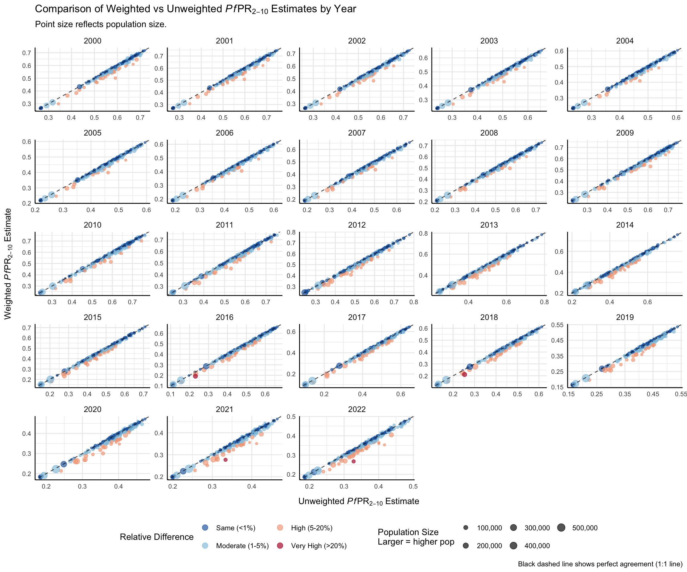
A simple scatter plot helps reveal where the choice of method matters most for decision-making. Here, unweighted PfPR2–10 estimates are on the x-axis, population-weighted estimates on the y-axis, point size reflects population, and color highlights relative differences. This makes it easy to spot meaningful differences, especially in high-population areas where decisions carry greater weight. We can easily see from the visualization that when there is a relative difference between the two estimates of admin unit PfPR2-10, the weighted estimate is lower than the unweighted estimate-consistent with pixels of higher population having lower PfPR2-10.
Show the code
# get population data for context
worldpop_df <- sntutils::process_raster_collection(
directory = worldpop_rast_path,
shapefile = shp_file,
id_cols = c("adm0", "adm1", "adm2", "adm3"),
aggregations = c("sum"),
pattern = "\\.tif$"
) |>
dplyr::select(adm0, adm1, adm2, adm3, year, pop_size = sum)
# create a comparison plot of weighted and unweighted est
comparison_data <- pfpr_weighted |>
dplyr::select(
adm0, adm1, adm2, adm3, year,
weighted_mean, unweighted_mean
) |>
dplyr::left_join(
worldpop_df,
by = c("adm0", "adm1", "adm2", "adm3", "year")
) |>
dplyr::mutate(
# calculate relative percentage difference
relat_diff_pct = 100 *
(abs(weighted_mean - unweighted_mean) / weighted_mean),
# Create four-tier color variable
point_color = dplyr::case_when(
relat_diff_pct >= 20 ~ "Very High",
relat_diff_pct >= 5 ~ "High",
relat_diff_pct >= 1 ~ "Moderate",
TRUE ~ "Same"
),
# convert to factor to control order
point_color = factor(
point_color,
levels = c("Same", "Moderate", "High", "Very High")
)
) |>
dplyr::filter(!is.na(relat_diff_pct))
# create plot with four-tiered relative percentage difference
comparison_plot <- comparison_data |>
ggplot2::ggplot(
ggplot2::aes(
x = unweighted_mean,
y = weighted_mean
)
) +
# add points
ggplot2::geom_point(
ggplot2::aes(color = point_color, size = pop_size),
alpha = 0.67,
na.rm = TRUE
) +
ggplot2::scale_color_manual(
values = c(
"Same" = "#2166ac",
"Moderate" = "#92c5de",
"High" = "#f4a582",
"Very High" = "#b2182b"
),
name = "Relative Difference",
labels = c(
"Same" = "Same (<1%)",
"Moderate" = "Moderate (1-5%)",
"High" = "High (5-20%)",
"Very High" = "Very High (>20%)"
)
) +
ggplot2::scale_size_continuous(
name = "Population Size\nLarger = higher pop",
range = c(0.5, 4.2),
labels = scales::comma_format()
) +
ggplot2::geom_abline(
slope = 1,
intercept = 0,
color = "black",
linetype = "dashed",
alpha = 0.7
) +
ggplot2::guides(
color = ggplot2::guide_legend(
order = 1,
nrow = 2,
override.aes = list(size = 3)
),
size = ggplot2::guide_legend(order = 2, nrow = 2)
) +
ggplot2::facet_wrap(
~year,
scales = "free"
) +
ggplot2::labs(
title = expression(
"Comparison of Weighted vs Unweighted " *
italic(Pf) *
"PR"[2 - 10] *
" Estimates by Year"
),
subtitle = "Point size reflects population size.",
x = expression("Unweighted " * italic(Pf) * "PR"[2 - 10] * " Estimate"),
y = expression("Weighted " * italic(Pf) * "PR"[2 - 10] * " Estimate"),
caption = "Black dashed line shows perfect agreement (1:1 line)"
) +
ggplot2::theme_minimal() +
ggplot2::theme(
strip.text = ggplot2::element_text(size = 10),
axis.text = ggplot2::element_text(size = 8),
axis.line = ggplot2::element_line(color = "black", linewidth = 0.5),
legend.position = "bottom",
legend.spacing.x = ggplot2::unit(1, "cm"),
axis.title.x = ggplot2::element_text(margin = ggplot2::margin(t = 10)),
axis.title.y = ggplot2::element_text(margin = ggplot2::margin(r = 10))
)
print(comparison_plot)
NoteOutput
To adapt the code:
- Line 3: Replace
worldpop_rast_pathwith the path to your WorldPop raster directory. - Line 5: Confirm
shp_filecontains the correct administrative boundaries used in your analysis. - Line 6: Adjust the
id_colsto reflect your shapefile’s structure (e.g.adm0,adm1,adm2,adm3). - Line 7: Make sure the
pattern(e.g."\\.tif$") matches your raster file format. - Lines 34–38: Modify the thresholds in
case_when()if you want different classification bands for relative difference. - Lines 99–109: Edit axis titles or plot labels in
labs()if you’re using a different indicator or want localized text. - Line 111+: Update the
theme()settings to match your styling preferences or figure formatting standards.
Users can compare weighted and unweighted estimates to assess the impact of methodological choices.
Looking at the plot, we can see that most points fall below the 1:1 line, indicating that weighted PfPR2-10 estimates are consistently lower than unweighted estimates. This pattern is particularly evident for more populous areas (larger points), suggesting that unweighted estimates may overstate malaria prevalence by not accounting for population distribution.
When looking at comparison_data, we can see that several chiefdoms, particularly Kakua (Bo district) and York Rural (Western Rural district), the relative differences in PfPR2-10 exceed 20%.
Kakua (2021–2022): Weighted estimates are 20–23% lower than unweighted.
York Rural (2016, 2018): Differences of ~20–21%, with weighted estimates also lower.
These discrepancies likely reflect uneven population distribution, where weighted estimates better capture actual risk than simple geographic averages. This provides strong justification for prioritizing population-weighted estimates in contexts where population density varies substantially within spatial units.
Step 4.2: Prepare data for plotting
After comparing weighted and unweighted PfPR2-10 estimates, the weighted estimates are deemed more reliable.
We now prepare the data to visualize trends over time and space. This helps determine that the population weighted extraction and aggregation from sntutils::process_weighted_raster_collection() worked as well as identify areas where prevalence is persistently high or shows changes over the years, supporting stratification decisions.
In this step, we classify each administrative unit into one of the following PfPR2–10 risk categories: “<5%”, “5–10%”, “10–20%”, “20–30%”, “30–40%”, “40–50%”, and “≥50%”.
Show the code
# prepare data for trend plotting
pfpr_plot_data <- pfpr_weighted |>
dplyr::group_by(adm0, adm1, adm2, year) |>
dplyr::summarise(
weighted_mean = mean(weighted_mean, na.rm = TRUE),
unweighted_mean = mean(unweighted_mean, na.rm = TRUE),
weighted_lower = mean(weighted_lower, na.rm = TRUE),
unweighted_lower = mean(unweighted_lower, na.rm = TRUE),
weighted_upper = mean(weighted_upper, na.rm = TRUE),
unweighted_upper = mean(unweighted_upper, na.rm = TRUE),
.groups = 'drop'
)
# generate adm2-level shapefile for plotting
shp_adm2 <- shp_file |>
dplyr::group_by(adm0, adm1, adm2) |>
dplyr::summarise(.groups = "drop") |>
sf::st_union(by_feature = TRUE)
# join weighted pfpr data to shapefile for mapping
pfpr_weighted_shp <- pfpr_weighted |>
dplyr::left_join(
shp_adm2,
by = c("adm0", "adm1", "adm2")
) |>
sf::st_as_sf() |>
dplyr::mutate(
pfpr_bin_unweighted = dplyr::case_when(
is.na(unweighted_mean) ~ NA_character_,
unweighted_mean < 0.05 ~ "<5",
unweighted_mean < 0.10 ~ "5-10",
unweighted_mean < 0.20 ~ "10-20",
unweighted_mean < 0.30 ~ "20-30",
unweighted_mean < 0.40 ~ "30-40",
unweighted_mean < 0.50 ~ "40-50",
TRUE ~ "≥50"
),
pfpr_bin_unweighted = factor(
pfpr_bin_unweighted,
levels = c(
"<5",
"5-10",
"10-20",
"20-30",
"30-40",
"40-50",
"≥50"
)
),
pfpr_bin_weighted = dplyr::case_when(
is.na(weighted_mean) ~ NA_character_,
weighted_mean < 0.05 ~ "<5",
weighted_mean < 0.10 ~ "5-10",
weighted_mean < 0.20 ~ "10-20",
weighted_mean < 0.30 ~ "20-30",
weighted_mean < 0.40 ~ "30-40",
weighted_mean < 0.50 ~ "40-50",
TRUE ~ "≥50"
),
pfpr_bin_weighted = factor(
pfpr_bin_weighted,
levels = c(
"<5",
"5-10",
"10-20",
"20-30",
"30-40",
"40-50",
"≥50"
)
)
)To adapt the code:
- Line 4: Ensure the year column exists and is numeric for correct plotting.
- Line 9: If you have a pre-existing adm2 shapefile, you may skip this block and use it directly.
- Line 23 onwards: Adjust these thresholds if your program uses different stratification criteria
Once updated, run the code to prepare your pfpr estimates for visualization.
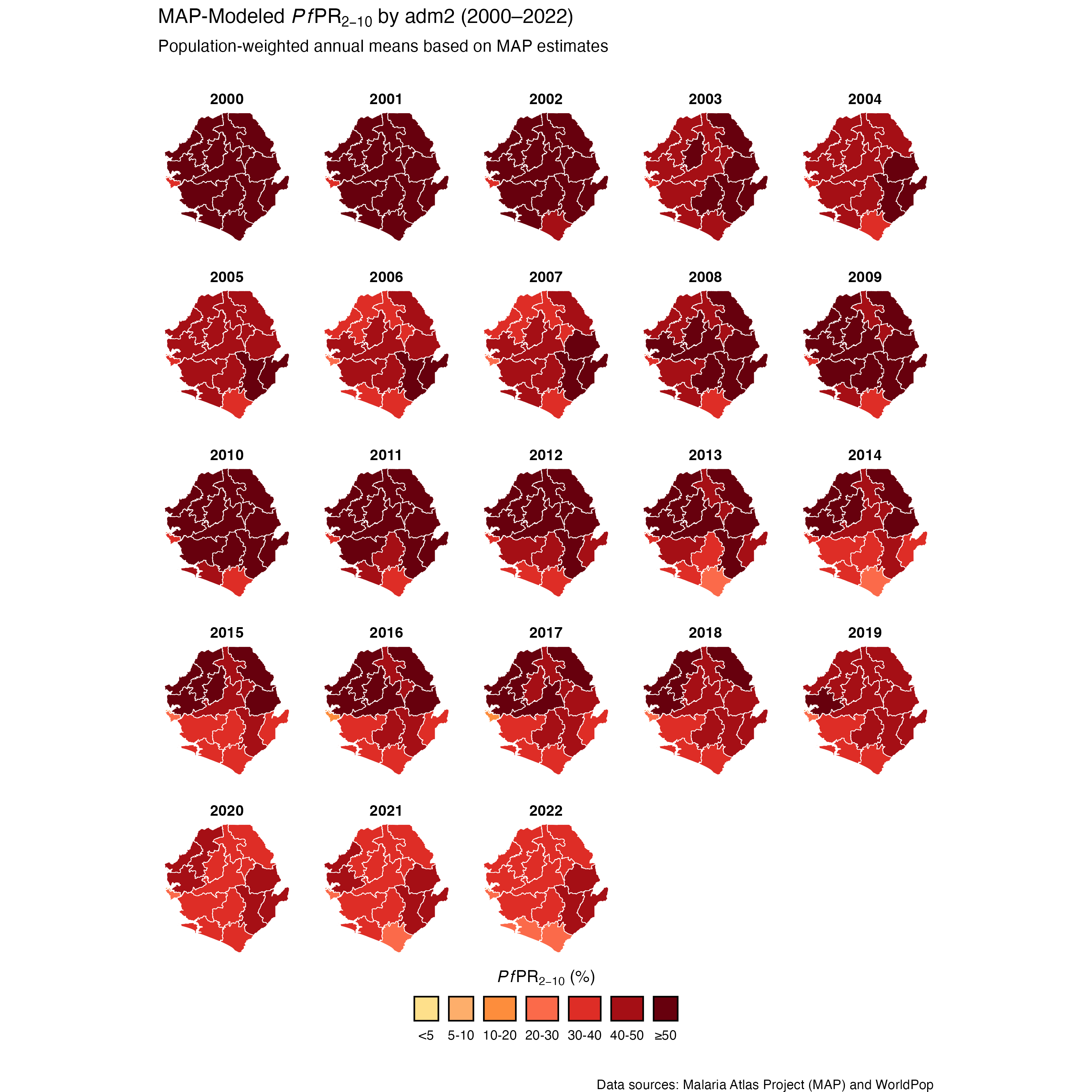
Step 4.3: Visualize PfPR2-10 spatial distribution
We start with the unweighted estimate, and then we plot the population-weighted version to see how adjusting for where people live affects the spatial pattern of PfPR2-10.
Show full code
# map PfPR2-10 trends over space and time
unweighted_pfpr_map <- pfpr_weighted_shp |>
ggplot2::ggplot() +
ggplot2::geom_sf(
ggplot2::aes(fill = pfpr_bin_unweighted),
color = "white",
size = 0.2,
show.legend = TRUE,
na.rm = TRUE
) +
ggplot2::scale_fill_manual(
values = c(
"<5" = "#fee08b",
"5-10" = "#fdae6b",
"10-20" = "#fd8d3c",
"20-30" = "#fb6a4a",
"30-40" = "#de2d26",
"40-50" = "#a50f15",
"≥50" = "#67000d"
),
drop = FALSE,
na.translate = FALSE,
guide = ggplot2::guide_legend(
label.position = "bottom",
title.position = "top",
title.hjust = 0.5,
override.aes = list(
colour = "black",
size = 0.15,
alpha = 1
),
nrow = 1,
byrow = TRUE
)
) +
ggplot2::facet_wrap(~year, ncol = 5) +
ggplot2::labs(
title = expression(
"MAP-Modeled " * italic(Pf) * "PR"[2 - 10] * " by adm2 (2000–2022)"
),
subtitle = "Population-unweighted annual means based on MAP estimates\n\n",
caption = "\n\nData sources: Malaria Atlas Project (MAP) and WorldPop",
fill = expression(italic(Pf) * "PR"[2 - 10] * " (%)")
) +
ggplot2::theme_void() +
ggplot2::theme(
legend.position = "bottom",
strip.text = ggplot2::element_text(face = "bold", size = 10),
panel.spacing = ggplot2::unit(1, "lines")
)
NoteOutput

To adapt the code:
- Line 5: Ensure
pfpr_bin_unweightedis the correct column name from your aggregation step. - Line 36: Adjust
facet_wrap(~ year)to another level (e.g., adm1) if preferred. - From Line 37: Update titles or captions as needed.
Once updated, run the code to generate the plot.
Show full code
# map PfPR2-10 trends over space and time
weighted_pfpr_map <- pfpr_weighted_shp |>
ggplot2::ggplot() +
ggplot2::geom_sf(
ggplot2::aes(fill = pfpr_bin_weighted),
color = "white",
size = 0.2,
show.legend = TRUE,
na.rm = TRUE
) +
ggplot2::scale_fill_manual(
values = c(
"<5" = "#fee08b",
"5-10" = "#fdae6b",
"10-20" = "#fd8d3c",
"20-30" = "#fb6a4a",
"30-40" = "#de2d26",
"40-50" = "#a50f15",
"≥50" = "#67000d"
),
drop = FALSE,
na.translate = FALSE,
guide = ggplot2::guide_legend(
label.position = "bottom",
title.position = "top",
title.hjust = 0.5,
override.aes = list(
colour = "black",
size = 0.15,
alpha = 1
),
nrow = 1,
byrow = TRUE
)
) +
ggplot2::facet_wrap(~year, ncol = 5) +
ggplot2::labs(
title = expression(
"MAP-Modeled " * italic(Pf) * "PR"[2 - 10] * " by adm2 (2000–2022)"
),
subtitle = "Population-weighted annual means based on MAP estimates\n\n",
caption = "\n\nData sources: Malaria Atlas Project (MAP) and WorldPop",
fill = expression(italic(Pf) * "PR"[2 - 10] * " (%)"),
) +
ggplot2::theme_void() +
ggplot2::theme(
legend.position = "bottom",
strip.text = ggplot2::element_text(face = "bold", size = 10),
panel.spacing = ggplot2::unit(1, "lines")
)
NoteOutput
To adapt the code:
- Line 5: Ensure
pfpr_binis the correct column name from your aggregation step. - Line 36: Adjust
facet_wrap(~ year)to another level (e.g., adm1) if preferred. - From 37: Update titles or captions as needed.
Once updated, run the code to generate the plot.
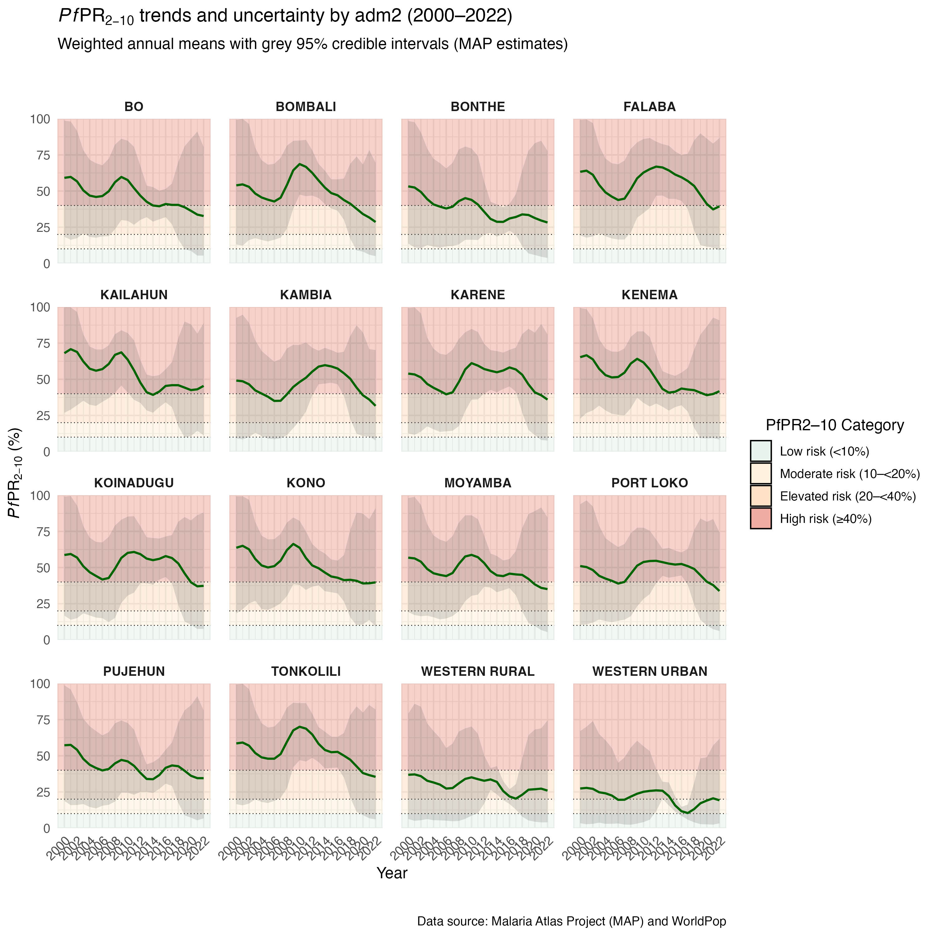
Step 4.4: Visualize PfPR2-10 trends
In this step, we plot the annual mean PfPR2–10 for all districts to check how transmission patterns have changed over time, from 2000 to 2022. For interpretability, we apply simple risk bands that classify values into four categories: low risk (<10%), moderate risk (10–<20%), elevated risk (20–<40%), and high risk (≥40%). To reflect uncertainty in modeled estimates, we also include 95% credible intervals as grey bands around each trend line.
Show full code
# create PfPR category band definitions (in percent)
pfpr_bands <- tibble::tibble(
ymin = c(0, 10, 20, 40),
ymax = c(10, 20, 40, 100),
category = factor(
c("<10%", "10–<20%", "20–<40%", "≥40%"),
levels = c("<10%", "10–<20%", "20–<40%", "≥40%")
),
risk_label = factor(
c(
"Low risk (<10%)",
"Moderate risk (10–<20%)",
"Elevated risk (20–<40%)",
"High risk (≥40%)"
),
levels = c(
"Low risk (<10%)",
"Moderate risk (10–<20%)",
"Elevated risk (20–<40%)",
"High risk (≥40%)"
)
)
)
# plot pfpr trends
weighted_pfpr_trend <-
pfpr_plot_data |>
ggplot2::ggplot(ggplot2::aes(x = year, y = weighted_mean * 100)) +
# Background color bands
ggplot2::geom_rect(
data = pfpr_bands,
inherit.aes = FALSE,
ggplot2::aes(
xmin = -Inf,
xmax = Inf,
ymin = ymin,
ymax = ymax,
fill = risk_label
),
alpha = 0.25
) +
# add horizontal dashed lines for category thresholds
ggplot2::geom_hline(
yintercept = c(10, 20, 40),
linetype = "dotted",
color = "black",
linewidth = 0.3
) +
# add uncertainty ribbon using lower and upper bounds
ggplot2::geom_ribbon(
ggplot2::aes(
ymin = weighted_lower * 100,
ymax = weighted_upper * 100
),
fill = "grey35",
alpha = 0.2
) +
# PfPR lines
ggplot2::geom_line(linewidth = 0.8, color = "darkgreen") +
# facet by adm2
ggplot2::facet_wrap(~adm2, ncol = 4) +
# axes
ggplot2::scale_x_continuous(
breaks = seq(
from = min(pfpr_plot_data$year, na.rm = TRUE),
to = max(pfpr_plot_data$year, na.rm = TRUE),
by = 2
)
) +
ggplot2::scale_y_continuous(limits = c(0, 100), expand = c(0, 0)) +
# color legend
ggplot2::scale_fill_manual(
name = "PfPR2–10 Category",
values = c(
"Low risk (<10%)" = "#D0E6D5",
"Moderate risk (10–<20%)" = "#FFE3B3",
"Elevated risk (20–<40%)" = "#FDBE85",
"High risk (≥40%)" = "#E34A33"
),
guide = ggplot2::guide_legend(
title.position = "top",
title.hjust = 0.5,
override.aes = list(
alpha = 0.45,
colour = "black",
size = 0.15
),
label.position = "right",
nrow = 4,
byrow = TRUE
)
) +
# labels and theme
ggplot2::labs(
title = expression(
italic(Pf) * "PR"[2 - 10] * " trends and uncertainty by adm2 (2000–2022)"
),
subtitle = "Weighted annual means with grey 95% credible intervals (MAP estimates)\n\n",
x = "Year",
y = expression(italic(Pf) * "PR"[2 - 10] * " (%)"),
caption = "\n\nData source: Malaria Atlas Project (MAP) and WorldPop"
) +
ggplot2::theme_minimal(base_size = 12) +
ggplot2::theme(
strip.text = ggplot2::element_text(face = "bold", size = 10),
axis.text.x = ggplot2::element_text(angle = 45, hjust = 1),
panel.spacing = ggplot2::unit(1, "lines"),
legend.position = "right"
)
NoteOutput
To adapt the code:
- Line 27: Ensure
weighted_meanis the correct column name from your aggregation step. - Line 60: Adjust
facet_wrap(~ adm2)to another level (e.g., adm1) if preferred. - From Line 93: Update titles or captions as needed.
Once updated, run the code to generate the plot.
You’ll notice the uncertainty intervals are much narrower in 2016; this is because a MIS/DHS survey was conducted that year, providing both high-quality and more abundant data, which improved the model’s precision. Just a reminder that model accuracy often depends on the availability and volume of good input data, as mentioned earlier under in the Overview section.
ImportantValidate Results with SNT Team
As noted in the Overview section, the use of geospatial-modeled rasters, including MAP rasters, requires two rounds of validation by the SNT team. Having now completed data extraction, aggregation, and visualization, this is the point where the second validation step should take place.
The SNT team must review the spatial and temporal patterns in the PfPR2-10 outputs to determine whether they are reasonable, appropriate for the country context, and suitable for further use. If discrepancies or unexpected results are found, these should be discussed before proceeding.
This step ensures that model-based estimates are used responsibly and align with programmatic realities.
Now let us save these plots for future reference.
# save the comparison plot
ggplot2::ggsave(
plot = comparison_plot,
here::here("03_output/3a_figures/pfpr2_10_compare_weighted_unweighted_trends_2000_2022.png"),
width = 12,
height = 7,
dpi = 300
)
# save trend plot
ggplot2::ggsave(
plot = weighted_pfpr_trend,
here::here("03_output/3a_figures/pfpr2_10_trends_adm2_2000_2022.png"),
width = 12,
height = 7,
dpi = 300
)
# save map plot
ggplot2::ggsave(
plot = unweighted_pfpr_map,
here::here("03_output/3a_figures/pfpr2_10_map_unweighted_adm2_2000_2022.png"),
width = 12,
height = 7,
dpi = 300
)
# save map plot
ggplot2::ggsave(
plot = weighted_pfpr_map,
here::here("03_output/3a_figures/pfpr2_10_map_weighted_adm2_2000_2022.png"),
width = 12,
height = 7,
dpi = 300
)To adapt the code:
- Line 4: Update the file path and name as needed to match your output structure.
- Lines 5–7: Adjust the width, height, and dpi if you need a different image size or quality.
Once updated, run the code to save the plot as a PNG file.
Step 5: Save Processed PfPR2-10 Modeled Estimates
We save the cleaned and aggregated PfPR2-10 estimates for later use in the SNT seasonality analysis.
# define save path
save_path <- here::here("1.2_epidemiology/1.2b_pfpr_estimates")
# save processed file as CSV
rio::export(
pfpr_weighted,
here::here(save_path, "processed", "pfpr2_10_processed_adm3_2000_2022.csv")
)
# save processed file as RDS
rio::export(
pfpr_weighted,
here::here(save_path, "processed", "pfpr2_10_processed_adm3_2000_2022.rds")
)To adapt the code:
- Line 3: Update save_path to your output directory.
- File Names: Change file names (e.g.,
pfpr2_10_processed_adm3_2000_2022) to reflect your estimates, time range, or admin level.
Once updated, run the code to save your outputs in both raw and processed formats.
Summary
This section provided a complete walkthrough for preparing district-level, population-weighted summaries from geospatial modeled estimates. While the example focused on PfPR2-10 estimates from MAP, the same process applies to other population-referenced indicators like ITN access, ITN use, care-seeking, and treatment rates. It also demonstrated how to apply unweighted extraction methods, which are suitable for non-population-referenced indicators such as land use, travel time, or environmental surfaces. We retrieved annual .tif files, applied population weighting where appropriate, and summarized values by district for 2000 to 2022. We examined temporal trends across districts, producing outputs ready for future use or adaptation to other indicators, boundaries, or years.
Full code
Find the full code script for working with geospatial model estimates below.
Show full code
################################################################################
############ ~ Working with geospatial model estimates full code ~ #############
################################################################################
### Step 1: Initial Setup, Check, and Load MAP Rasters -------------------------
#### Step 1.1: Initial setup ---------------------------------------------------
# Load required packages
pacman::p_load(
malariaAtlas, # Download PfPR2-10 rasters
terra, # For raster operations
sf, # For vector data
exactextractr, # For precise extraction from rasters
dplyr, # For data manipulation
lubridate, # For date handling
here, # For file path management
glue # For dynamic string construction
)
# download latest sntutils if you haven't already (run once, manually)
# devtools::install_github("ahadi-analytics/sntutils")
# Define folder to store MAP surfaces
maps_data_path <- here::here("1.2_epidemiology/1.2b_pfpr_estimates/raw")
# Load admin boundary shapefile
shp_file <- base::readRDS(
here::here(
"1.1_foundational/1a_admin_boundaries",
"1ai_adm3",
"sle_spatial_adm3_2021.rds"
)
) |>
dplyr::select(adm0, adm1, adm2, adm3, geometry) |>
sf::st_as_sf()
#### Step 1.2: Check the available MAP rasters for download --------------------
# retrieve the available MAP rasters
available_data <- malariaAtlas::listRaster()
# clean up the dataset to have a unique ID and get the latest version/row for each indicator
available_data_cleaned <- available_data |>
dplyr::mutate(
indicator_name = dataset_id |>
stringr::str_replace_all("\\d+", "") |>
stringr::str_replace_all("_{2,}", "_")
) |>
dplyr::select(
indicator_name,
dataset_id,
title,
min_raster_year,
max_raster_year
) |>
dplyr::filter(!is.na(max_raster_year)) |>
dplyr::group_by(indicator_name) |>
dplyr::slice_max(max_raster_year) |>
dplyr::arrange(desc(max_raster_year)) |>
dplyr::ungroup()
# check data
head(available_data_cleaned, 15)
# save processed file as CSV
rio::export(
available_data_cleaned,
here::here(
save_path,
"processed",
"maps_available_rasters.rds"
)
)
#### Step 1.3: Retrieve the dataset ID for any MAP indicator of interest -------
# extract the dataset ID for the PfPR2-10 indicator from the cleaned list
pfpr2_10_id <- available_data_cleaned |>
dplyr::filter(indicator_name == "Malaria_Global_Pf_Parasite_Rate")
# assign and print the dataset ID
dataset_id <- pfpr2_10_id$dataset_id
glue::glue(
"Our dataset ID of interest is: {dataset_id}"
)
# assign and print the min year available
min_year <- pfpr2_10_id$min_raster_year
glue::glue(
"The minimum year our dataset ID of interest is available: {min_year}"
)
# assign and print the max year available
max_year <- pfpr2_10_id$max_raster_year
glue::glue(
"The maximum year our dataset ID of interest is available: {max_year}"
)
#### Step 1.4: Download the latest MAP *Pf*PR2-10 rasters ----------------------
# download rasters for 2000 to 2022
malariaAtlas::getRaster(
  dataset_id = dataset_id,
  year = min_year:max_year,
  file_path = maps_data_path,
  shp = shp_file
)

# remove unwanted artifact folder (created by malariaAtlas::getRaster)
unlink(here::here(file_path, "getRaster"), recursive = TRUE)
### Step 2: Load and Inspect *Pf*PR2-10 Rasters --------------------------------
#### Step 2.1: Inspect raster contents before aggregation ----------------------
# 2020 raster
pfpr_2020 <- terra::rast(
  here::here(
    maps_data_path,
    "Malaria__202406_Global_Pf_Parasite_Rate.2020.13.3_6.923_.10.2_10.00_2025_06_20.tiff"
  )
)

# check basic structure
pfpr_2020
# mean estimate (Layer 1)
pfpr_2020[[1]]
# lower 95% credible interval (Layer 3)
pfpr_2020[[3]]

# upper 95% credible interval (Layer 4)
pfpr_2020[[4]]
#### Step 2.2: Aggregate rasters into one DataFrame ----------------------------
# list all valid raster files
raster_files <- list.files(
  path = maps_data_path,
  pattern = "\\.tif{1,2}$",
  full.names = TRUE
) |>
  purrr::keep(~ !file.info(.x)$isdir)

# prepare region shapefile as SpatVector
sle_vect <- terra::vect(shp_file)

# process rasters: reproject, crop, mask, and extract values for 3 layers
combined_df <- purrr::map(raster_files, function(path) {
  raster_stack <- terra::rast(path)[[c(1, 3, 4)]] |>
    terra::project(terra::crs(sle_vect)) |>
    terra::crop(sle_vect) |>
    terra::mask(sle_vect)

  if (terra::ncell(raster_stack) == 0) {
    return(NULL)
  }

  df <- terra::as.data.frame(raster_stack, xy = TRUE, na.rm = TRUE)
  names(df)[3:5] <- c("mean", "lower", "upper")

  df_long <- tidyr::pivot_longer(
    df,
    cols = c("mean", "lower", "upper"),
    names_to = "stat",
    values_to = "PfPR2_10"
  )

  df_long$year <- stringr::str_extract(basename(path), "(?<=_Rate\\.)\\d{4}")
  df_long
}) |>
  purrr::compact() |>
  dplyr::bind_rows() |>
  # transform to long format
  tidyr::pivot_wider(names_from = stat, values_from = PfPR2_10)

# check what the head looks like
head(combined_df)
#### Step 2.3: Visualize the rasters -------------------------------------------
# plot rasters
adm3_map_modeled_pfpr <- ggplot2::ggplot(
  combined_df,
  ggplot2::aes(x = x, y = y, fill = mean * 100)
) +
  ggplot2::geom_raster() +
  ggplot2::coord_equal() +
  ggplot2::facet_wrap(~year) +
  ggplot2::scale_fill_viridis_c(
    na.value = "transparent",
    option = "B",
    direction = -1,
    labels = scales::label_number(suffix = "%")
  ) +
  ggplot2::theme_void() +
  ggplot2::labs(
    title = expression(
      "Mean MAP-Modeled " * italic(Pf) * "PR"[2 - 10] * " by adm2 (2000–2022)"
    ),
    x = NULL,
    y = NULL
  ) +
  ggplot2::theme(
    legend.position = "bottom",
    legend.key.width = ggplot2::unit(2, "cm"),
    legend.text = ggplot2::element_text(size = 8),
    legend.title = ggplot2::element_text(size = 9, face = "bold")
  ) +
  ggplot2::guides(
    fill = ggplot2::guide_colorbar(
      title = expression(italic(PfPR)[2 - 10]),
      title.position = "top",
      title.hjust = 0.5,
      label.position = "bottom",
      barwidth = ggplot2::unit(10, "lines"),
      barheight = ggplot2::unit(0.5, "lines")
    )
  )

adm3_map_modeled_pfpr

# save map plot
ggplot2::ggsave(
  plot = adm3_map_modeled_pfpr,
  here::here("map/figures/adm2_map_pfpr_rosters_2000_2022.png"),
  #width = 12,
  #height = 7,
  dpi = 300
)
### Step 3: Aggregate Rasters to Admin Level -----------------------------------
#### Step 3.1: Centroid approach (Option A) {#step-3-1} ------------------------
# convert combined_df to sf object
combined_sf <- sf::st_as_sf(
  combined_df,
  coords = c("x", "y"),
  crs = sf::st_crs(shp_file)
)

# reproject both layers to a planar CRS for joining
combined_proj <- sf::st_transform(combined_sf, crs = 32632)
shp_proj <- sf::st_transform(shp_file, crs = 32632)

# spatial join to assign admin units to raster points
joined_sf <- sf::st_join(
  combined_proj,
  shp_proj,
  join = sf::st_intersects
) |>
  dplyr::select(
    dplyr::everything(),
    year,
    mean,
    lower,
    upper
  ) |>
  sf::st_drop_geometry()

# aggregate mean PfPR2-10 by admin unit and year
aggregated_df <- joined_sf |>
  dplyr::group_by(adm0, adm1, adm2, adm3, year) |>
  dplyr::summarise(
    mean_pfpr = mean(mean, na.rm = TRUE),
    lower_pfpr = mean(lower, na.rm = TRUE),
    upper_pfpr = mean(upper, na.rm = TRUE),
    .groups = "drop"
  )

# inspect top of data
head(aggregated_df)
#### Step 3.2: Unweighted aggregation using the sntutils package (Option B) {#step-3-2}
# extract mean PfPR2–10 estimates (Layer 1)
pfpr_mean_df <- sntutils::process_raster_collection(
  directory = maps_data_path,
  shapefile = shp_file,
  id_cols = c("adm0", "adm1", "adm2", "adm3"),
  aggregations = "mean",
  pattern = ".tif",
  layer_to_process = 1 # specifies the MAPS layer to process
) |>
  dplyr::select(adm0, adm1, adm2, adm3, year, mean_pfpr = mean)

# extract lower bound of PfPR2–10 (Layer 3)
pfpr_lower_df <- sntutils::process_raster_collection(
  directory = maps_data_path,
  shapefile = shp_file,
  id_cols = c("adm0", "adm1", "adm2", "adm3"),
  aggregations = "mean",
  pattern = ".tif",
  layer_to_process = 3 # specifies the MAPS layer to process
) |>
  dplyr::select(adm0, adm1, adm2, adm3, year, lower_pfpr = mean)

# extract upper bound of PfPR2–10 (Layer 4)
pfpr_upper_df <- sntutils::process_raster_collection(
  directory = maps_data_path,
  shapefile = shp_file,
  id_cols = c("adm0", "adm1", "adm2", "adm3"),
  aggregations = "mean",
  pattern = ".tif",
  layer_to_process = 4 # specifies the MAPS layer to process
) |>
  dplyr::select(adm0, adm1, adm2, adm3, year, upper_pfpr = mean)

# join all three outputs into a single dataframe
pfpr_unweighted <- pfpr_mean_df |>
  dplyr::left_join(
    pfpr_lower_df,
    by = c("adm0", "adm1", "adm2", "adm3", "year")
  ) |>
  dplyr::left_join(
    pfpr_upper_df,
    by = c("adm0", "adm1", "adm2", "adm3", "year")
  ) |>
  dplyr::arrange(adm0, adm1, adm2, adm3)

# inspect result
head(pfpr_unweighted)
#### Step 3.3: Using population weighting (Option C) {#step-3-3} ---------------
# set up output path
worldpop_rast_path <- here::here(
  "01_data",
  "1.1_foundational",
  "1.1c_population",
  "1.1ci_worldpop_rasters"
)

# download pop data
sntutils::download_worldpop(
  country_codes = "SLE",
  years = 2000:2020,
  dest_dir = here::here(worldpop_rast_path, "raw"),
)
# load 2020 WorldPop raster
pop_2020 <- terra::rast(
  here::here(
    worldpop_rast_path,
    "sle_ppp_2020_1km_Aggregated_UNadj.tif"
  )
)

# save results
terra::writeRaster(pop_2020,
                   here::here(
                     worldpop_rast_path,
                     "sle_ppp_2021_1km_Aggregated_UNadj.tif"
                   ),
                   overwrite = TRUE)

terra::writeRaster(pop_2020,
                   here::here(
                     worldpop_rast_path,
                     "sle_ppp_2022_1km_Aggregated_UNadj.tif"
                   ),
                   overwrite = TRUE)
# get pop weighted mean pfpr
pfpr_mean_df_weighted <- sntutils::process_weighted_raster_collection(
  value_raster_dir = maps_data_path,
  pop_raster_dir = worldpop_rast_path,
  shapefile = shp_file,
  id_cols = c("adm0", "adm1", "adm2", "adm3"),
  value_pattern = "\\.tiff$",
  pop_pattern = "\\.tif$",
  value_layer_to_process = 1, # specifies the MAPS layer to process
  stat_type = "mean"
) |>
  dplyr::select(
    adm0, adm1,  adm2, adm3, year, weighted_mean, unweighted_mean
  )

# get pop weighted lower pfpr
pfpr_lower_df_weighted <- sntutils::process_weighted_raster_collection(
  value_raster_dir = maps_data_path,
  pop_raster_dir = worldpop_rast_path,
  shapefile = shp_file,
  id_cols = c("adm0", "adm1", "adm2", "adm3"),
  value_pattern = "\\.tiff$",
  pop_pattern = "\\.tif$",
  value_layer_to_process = 1, # specifies the MAPS layer to process
  stat_type = "mean"
) |>
  dplyr::select(
    adm0, adm1,  adm2, adm3, year, weighted_mean, unweighted_mean
  )


# get pop weighted upper pfpr
pfpr_upper_df_weighted <- sntutils::process_weighted_raster_collection(
  value_raster_dir = maps_data_path,
  pop_raster_dir = worldpop_rast_path,
  shapefile = shp_file,
  id_cols = c("adm0", "adm1", "adm2", "adm3"),
  value_pattern = "\\.tiff$",
  pop_pattern = "\\.tif$",
  value_layer_to_process = 1, # specifies the MAPS layer to process
  stat_type = "mean"
) |>
  dplyr::select(
    adm0, adm1,  adm2, adm3, year, weighted_mean, unweighted_mean
  )

# join all three outputs into a single dataframe
pfpr_weighted <- pfpr_mean_df_weighted |>
  dplyr::left_join(
    pfpr_lower_df_weighted,
    by = c("adm0", "adm1", "adm2", "adm3", "year")
  ) |>
  dplyr::left_join(
    pfpr_upper_df_weighted,
    by = c("adm0", "adm1", "adm2", "adm3", "year")
  ) |>
      dplyr::select(
    adm0, adm1,  adm2, adm3, year, weighted_mean, weighted_lower,
    weighted_upper, unweighted_mean, unweighted_lower, unweighted_upper,
  ) |>
  dplyr::arrange(adm0, adm1, adm2, adm3)

# inspect result
pfpr_weighted |>
  dplyr::select(-adm0) |>
  head()
### Step 4: Visualize *Pf*PR2-10 Spatial Distribution and Temporal Trends ------
#### Step 4.1: Check and validate unweighted vs. weighted estimates ------------
# get population data for context
worldpop_df <- sntutils::process_raster_collection(
  directory = worldpop_rast_path,
  shapefile = shp_file,
  id_cols = c("adm0", "adm1", "adm2", "adm3"),
  aggregations = c("sum"),
  pattern = "\\.tif$"
) |>
  dplyr::select(adm0, adm1, adm2, adm3, year, pop_size = sum)

# create a comparison plot of weighted and unweighted est
comparison_data <- pfpr_weighted |>
  dplyr::select(
    adm0, adm1, adm2, adm3, year,
    weighted_mean, unweighted_mean
  ) |>
  dplyr::left_join(
    worldpop_df,
    by = c("adm0", "adm1", "adm2", "adm3", "year")
  ) |>
  dplyr::mutate(
    # calculate relative percentage difference
    relat_diff_pct = 100 *
      (abs(weighted_mean - unweighted_mean) / weighted_mean),
    # Create four-tier color variable
    point_color = dplyr::case_when(
      relat_diff_pct >= 20 ~ "Very High",
      relat_diff_pct >= 5 ~ "High",
      relat_diff_pct >= 1 ~ "Moderate",
      TRUE ~ "Same"
    ),
    # convert to factor to control order
    point_color = factor(
      point_color,
      levels = c("Same", "Moderate", "High", "Very High")
    )
  ) |>
  dplyr::filter(!is.na(relat_diff_pct))

# create plot with four-tiered relative percentage difference
comparison_plot <- comparison_data |>
  ggplot2::ggplot(
  ggplot2::aes(
     x = unweighted_mean,
     y = weighted_mean
    )
  ) +
  # add points
  ggplot2::geom_point(
    ggplot2::aes(color = point_color, size = pop_size),
    alpha = 0.67,
    na.rm = TRUE
  ) +
  ggplot2::scale_color_manual(
    values = c(
      "Same" = "#2166ac",
      "Moderate" = "#92c5de",
      "High" = "#f4a582",
      "Very High" = "#b2182b"
    ),
    name = "Relative Difference",
    labels = c(
      "Same" = "Same (<1%)",
      "Moderate" = "Moderate (1-5%)",
      "High" = "High (5-20%)",
      "Very High" = "Very High (>20%)"
    )
  ) +
  ggplot2::scale_size_continuous(
    name = "Population Size\nLarger = higher pop",
    range = c(0.5, 4.2),
    labels = scales::comma_format()
  ) +
  ggplot2::geom_abline(
    slope = 1,
    intercept = 0,
    color = "black",
    linetype = "dashed",
    alpha = 0.7
  ) +
  ggplot2::guides(
    color = ggplot2::guide_legend(
      order = 1,
      nrow = 2,
      override.aes = list(size = 3)
    ),
    size = ggplot2::guide_legend(order = 2, nrow = 2)
  ) +
  ggplot2::facet_wrap(
    ~year,
    scales = "free"
  ) +
  ggplot2::labs(
    title = expression(
      "Comparison of Weighted vs Unweighted " *
        italic(Pf) *
        "PR"[2 - 10] *
        " Estimates by Year"
    ),
    subtitle = "Point size reflects population size.",
    x = expression("Unweighted " * italic(Pf) * "PR"[2 - 10] * " Estimate"),
    y = expression("Weighted " * italic(Pf) * "PR"[2 - 10] * " Estimate"),
    caption = "Black dashed line shows perfect agreement (1:1 line)"
  ) +
  ggplot2::theme_minimal() +
  ggplot2::theme(
    strip.text = ggplot2::element_text(size = 10),
    axis.text = ggplot2::element_text(size = 8),
    axis.line = ggplot2::element_line(color = "black", linewidth = 0.5),
    legend.position = "bottom",
    legend.spacing.x = ggplot2::unit(1, "cm"),
    axis.title.x = ggplot2::element_text(margin = ggplot2::margin(t = 10)),
    axis.title.y = ggplot2::element_text(margin = ggplot2::margin(r = 10))
  )

print(comparison_plot)
#### Step 4.2: Prepare data for plotting ---------------------------------------
# prepare data for trend plotting
pfpr_plot_data <- pfpr_weighted |>
  dplyr::group_by(adm0, adm1, adm2, year) |>
  dplyr::summarise(
    weighted_mean = mean(weighted_mean, na.rm = TRUE),
    unweighted_mean = mean(unweighted_mean, na.rm = TRUE),
    weighted_lower = mean(weighted_lower, na.rm = TRUE),
    unweighted_lower = mean(unweighted_lower, na.rm = TRUE),
    weighted_upper = mean(weighted_upper, na.rm = TRUE),
    unweighted_upper = mean(unweighted_upper, na.rm = TRUE),
    .groups = 'drop'
  )

# generate adm2-level shapefile for plotting
shp_adm2 <- shp_file |>
  dplyr::group_by(adm0, adm1, adm2) |>
  dplyr::summarise(.groups = "drop") |>
  sf::st_union(by_feature = TRUE)

# join weighted pfpr data to shapefile for mapping
pfpr_weighted_shp <- pfpr_weighted |>
  dplyr::left_join(
    shp_adm2,
    by = c("adm0", "adm1", "adm2")
  ) |>
  sf::st_as_sf() |>
  dplyr::mutate(
    pfpr_bin_unweighted = dplyr::case_when(
      is.na(unweighted_mean) ~ NA_character_,
      unweighted_mean < 0.05 ~ "<5",
      unweighted_mean < 0.10 ~ "5-10",
      unweighted_mean < 0.20 ~ "10-20",
      unweighted_mean < 0.30 ~ "20-30",
      unweighted_mean < 0.40 ~ "30-40",
      unweighted_mean < 0.50 ~ "40-50",
      TRUE ~ "≥50"
    ),
    pfpr_bin_unweighted = factor(
      pfpr_bin_unweighted,
      levels = c(
        "<5",
        "5-10",
        "10-20",
        "20-30",
        "30-40",
        "40-50",
        "≥50"
      )
    ),
    pfpr_bin_weighted = dplyr::case_when(
      is.na(weighted_mean) ~ NA_character_,
      weighted_mean < 0.05 ~ "<5",
      weighted_mean < 0.10 ~ "5-10",
      weighted_mean < 0.20 ~ "10-20",
      weighted_mean < 0.30 ~ "20-30",
      weighted_mean < 0.40 ~ "30-40",
      weighted_mean < 0.50 ~ "40-50",
      TRUE ~ "≥50"
    ),
    pfpr_bin_weighted = factor(
      pfpr_bin_weighted,
      levels = c(
        "<5",
        "5-10",
        "10-20",
        "20-30",
        "30-40",
        "40-50",
        "≥50"
      )
    )
  )
#### Step 4.3: Visualize *Pf*PR2-10 spatial distribution -----------------------
# map PfPR2-10 trends over space and time
unweighted_pfpr_map <- pfpr_weighted_shp |>
  ggplot2::ggplot() +
  ggplot2::geom_sf(
    ggplot2::aes(fill = pfpr_bin_unweighted),
    color = "white",
    size = 0.2,
    show.legend = TRUE,
    na.rm = TRUE
  ) +
  ggplot2::scale_fill_manual(
    values = c(
      "<5" = "#fee08b",
      "5-10" = "#fdae6b",
      "10-20" = "#fd8d3c",
      "20-30" = "#fb6a4a",
      "30-40" = "#de2d26",
      "40-50" = "#a50f15",
      "≥50" = "#67000d"
    ),
    drop = FALSE,
    na.translate = FALSE,
    guide = ggplot2::guide_legend(
      label.position = "bottom",
      title.position = "top",
      title.hjust = 0.5,
      override.aes = list(
        colour = "black",
        size = 0.15,
        alpha = 1
      ),
      nrow = 1,
      byrow = TRUE
    )
  ) +
  ggplot2::facet_wrap(~year, ncol = 5) +
  ggplot2::labs(
    title = expression(
      "MAP-Modeled " * italic(Pf) * "PR"[2 - 10] * " by adm2 (2000–2022)"
    ),
    subtitle = "Population-unweighted annual means based on MAP estimates\n\n",
    caption = "\n\nData sources: Malaria Atlas Project (MAP) and WorldPop",
    fill = expression(italic(Pf) * "PR"[2 - 10] * " (%)")
  ) +
  ggplot2::theme_void() +
  ggplot2::theme(
    legend.position = "bottom",
    strip.text = ggplot2::element_text(face = "bold", size = 10),
    panel.spacing = ggplot2::unit(1, "lines")
  )
# map PfPR2-10 trends over space and time
weighted_pfpr_map <- pfpr_weighted_shp |>
  ggplot2::ggplot() +
  ggplot2::geom_sf(
    ggplot2::aes(fill = pfpr_bin_weighted),
    color = "white",
    size = 0.2,
    show.legend = TRUE,
    na.rm = TRUE
  ) +
  ggplot2::scale_fill_manual(
    values = c(
      "<5" = "#fee08b",
      "5-10" = "#fdae6b",
      "10-20" = "#fd8d3c",
      "20-30" = "#fb6a4a",
      "30-40" = "#de2d26",
      "40-50" = "#a50f15",
      "≥50" = "#67000d"
    ),
    drop = FALSE,
    na.translate = FALSE,
    guide = ggplot2::guide_legend(
      label.position = "bottom",
      title.position = "top",
      title.hjust = 0.5,
      override.aes = list(
        colour = "black",
        size = 0.15,
        alpha = 1
      ),
      nrow = 1,
      byrow = TRUE
    )
  ) +
  ggplot2::facet_wrap(~year, ncol = 5) +
  ggplot2::labs(
    title = expression(
      "MAP-Modeled " * italic(Pf) * "PR"[2 - 10] * " by adm2 (2000–2022)"
    ),
    subtitle = "Population-weighted annual means based on MAP estimates\n\n",
    caption = "\n\nData sources: Malaria Atlas Project (MAP) and WorldPop",
    fill = expression(italic(Pf) * "PR"[2 - 10] * " (%)"),
  ) +
  ggplot2::theme_void() +
  ggplot2::theme(
    legend.position = "bottom",
    strip.text = ggplot2::element_text(face = "bold", size = 10),
    panel.spacing = ggplot2::unit(1, "lines")
  )
#### Step 4.4: Visualize *Pf*PR2-10 trends -------------------------------------
# create PfPR category band definitions (in percent)
pfpr_bands <- tibble::tibble(
  ymin = c(0, 10, 20, 40),
  ymax = c(10, 20, 40, 100),
  category = factor(
    c("<10%", "10–<20%", "20–<40%", "≥40%"),
    levels = c("<10%", "10–<20%", "20–<40%", "≥40%")
  ),
  risk_label = factor(
    c(
      "Low risk (<10%)",
      "Moderate risk (10–<20%)",
      "Elevated risk (20–<40%)",
      "High risk (≥40%)"
    ),
    levels = c(
      "Low risk (<10%)",
      "Moderate risk (10–<20%)",
      "Elevated risk (20–<40%)",
      "High risk (≥40%)"
    )
  )
)

# plot pfpr trends
weighted_pfpr_trend <-
  pfpr_plot_data |>
  ggplot2::ggplot(ggplot2::aes(x = year, y = weighted_mean * 100)) +
  # Background color bands
  ggplot2::geom_rect(
    data = pfpr_bands,
    inherit.aes = FALSE,
    ggplot2::aes(
      xmin = -Inf,
      xmax = Inf,
      ymin = ymin,
      ymax = ymax,
      fill = risk_label
    ),
    alpha = 0.25
  ) +
  # add horizontal dashed lines for category thresholds
  ggplot2::geom_hline(
    yintercept = c(10, 20, 40),
    linetype = "dotted",
    color = "black",
    linewidth = 0.3
  ) +
  # add uncertainty ribbon using lower and upper bounds
  ggplot2::geom_ribbon(
    ggplot2::aes(
      ymin = weighted_lower * 100,
      ymax = weighted_upper * 100
    ),
    fill = "grey35",
    alpha = 0.2
  ) +
  # PfPR lines
  ggplot2::geom_line(linewidth = 0.8, color = "darkgreen") +
  # facet by adm2
  ggplot2::facet_wrap(~adm2, ncol = 4) +
  # axes
  ggplot2::scale_x_continuous(
    breaks = seq(
      from = min(pfpr_plot_data$year, na.rm = TRUE),
      to = max(pfpr_plot_data$year, na.rm = TRUE),
      by = 2
    )
  ) +
  ggplot2::scale_y_continuous(limits = c(0, 100), expand = c(0, 0)) +
  # color legend
  ggplot2::scale_fill_manual(
    name = "PfPR2–10 Category",
    values = c(
      "Low risk (<10%)" = "#D0E6D5",
      "Moderate risk (10–<20%)" = "#FFE3B3",
      "Elevated risk (20–<40%)" = "#FDBE85",
      "High risk (≥40%)" = "#E34A33"
    ),
    guide = ggplot2::guide_legend(
      title.position = "top",
      title.hjust = 0.5,
      override.aes = list(
        alpha = 0.45,
        colour = "black",
        size = 0.15
      ),
      label.position = "right",
      nrow = 4,
      byrow = TRUE
    )
  ) +
  # labels and theme
  ggplot2::labs(
    title = expression(
      italic(Pf) * "PR"[2 - 10] * " trends and uncertainty by adm2 (2000–2022)"
    ),
    subtitle = "Weighted annual means with grey 95% credible intervals (MAP estimates)\n\n",
    x = "Year",
    y = expression(italic(Pf) * "PR"[2 - 10] * " (%)"),
    caption = "\n\nData source: Malaria Atlas Project (MAP) and WorldPop"
  ) +
  ggplot2::theme_minimal(base_size = 12) +
  ggplot2::theme(
    strip.text = ggplot2::element_text(face = "bold", size = 10),
    axis.text.x = ggplot2::element_text(angle = 45, hjust = 1),
    panel.spacing = ggplot2::unit(1, "lines"),
    legend.position = "right"
  )
# save the comparison plot
ggplot2::ggsave(
  plot = comparison_plot,
  here::here("03_output/3a_figures/pfpr2_10_compare_weighted_unweighted_trends_2000_2022.png"),
  width = 12,
  height = 7,
  dpi = 300
)

# save trend plot
ggplot2::ggsave(
  plot = weighted_pfpr_trend,
  here::here("03_output/3a_figures/pfpr2_10_trends_adm2_2000_2022.png"),
  width = 12,
  height = 7,
  dpi = 300
)

# save map plot
ggplot2::ggsave(
  plot = unweighted_pfpr_map,
  here::here("03_output/3a_figures/pfpr2_10_map_unweighted_adm2_2000_2022.png"),
  width = 12,
  height = 7,
  dpi = 300
)

# save map plot
ggplot2::ggsave(
  plot = weighted_pfpr_map,
  here::here("03_output/3a_figures/pfpr2_10_map_weighted_adm2_2000_2022.png"),
  width = 12,
  height = 7,
  dpi = 300
)
### Step 5: Save Processed *Pf*PR2-10 Modeled Estimates ------------------------
# define save path
save_path <- here::here("1.2_epidemiology/1.2b_pfpr_estimates")

# save processed file as CSV
rio::export(
  pfpr_weighted,
  here::here(save_path, "processed", "pfpr2_10_processed_adm3_2000_2022.csv")
)

# save processed file as RDS
rio::export(
  pfpr_weighted,
  here::here(save_path, "processed", "pfpr2_10_processed_adm3_2000_2022.rds")
)