pacman::p_load(
  dplyr,         # data manipulation
  tidyr,         # data tidying
  lubridate,     # date handling
  ggplot2,       # data visualization
  scales,        # axis formatting
  data.table,    # rleid() for run-length grouping
  forcats,       # factor ordering for the heatmap y-axis
  patchwork,     # arranging diagnostic plots side-by-side
  knitr,         # html table rendering
  tibble,        # tribble() for tidy literal tables
  glue,          # string interpolation
  cli,           # informative messages
  here           # reproducible file paths
)Determining active and inactive status
Overview
In the SNT workflow, reporting rate calculations, necessary for the estimation of incidence, treatment seeking, and other downstream indicators, depend on the activity status of each health facility. Knowing whether a facility was operational in a given month determines whether its absence from the data should be treated as a denominator issue (the facility was not expected to report) or a data quality issue (the facility was expected to report but did not).
In most countries, a Master Facility List (MFL) maintained by the NMP provides the authoritative active/inactive status for every facility. When that list is missing, stale, or not granular enough at the monthly level, we fall back to inferring activity status from the reporting data itself: a facility is considered active in months when it submitted any of a small set of key malaria indicators.
This page covers three complementary methods for that inference: Permanent activation, First-to-last with grace, and Dynamic run-length. Each method makes different assumptions about how facilities open, close, and reopen, and the choice has direct downstream consequences for every reporting-rate-based output. We end with a diagnostic comparison so we can see at a glance where the three methods agree and where they diverge on the same DHIS2 panel.
NoteObjectives
- Classify each facility-month into Active Reporting / Active – Not Reporting / Inactive
- Visualize monthly reporting activity across the country and within administrative units
- Compare classification methods side-by-side and pick the right one for the analysis at hand
- Export the active-facility denominator (
df_expected) used by downstream reporting-rate and incidence calculations
Key Concepts
To proceed with reporting rate calculations, we first need to determine whether each health facility was active in a given month, that is, whether it was expected to report.
The method used to define facility activity status should be discussed with the SNT team, who will guide whether the country has an established or preferred method. In some cases, the NMP may already rely on a Health Facility Master List (MFL) to identify active facilities. While this can be a useful starting point, it may not always reflect real-time service delivery or facility functionality, and its reliability should be carefully assessed.
If no trusted method exists, or if additional validation is needed, an alternative data-driven approach can be used. This approach infers activity status directly from routine surveillance data, based on whether a facility reported any valid values for key malaria indicators.
NoteMonthly activity classification
For each health facility (HF) on a given month:
- If the HF submitted valid (non-NA) data for any key indicator → it is classified as Active Reporting
- If the HF did not report on any key indicator:
- If it has reported in any prior month → Active – Not Reporting
- If it has never reported (or has been silent long enough to be considered closed) → Inactive
These key indicators (such as allout, test, susp, pres, conf, and treat) reflect core functions of malaria service delivery, including suspected case reporting, diagnostic testing, and treatment. If a facility reports on any of these indicators in a given month, it can reasonably be considered operational and engaged in the malaria surveillance system.
TipBest practice: use the MFL when available
Where possible, obtain a copy of the Master Facility List (MFL) that includes columns for active/inactive status of health facilities. This is typically the most accurate and up-to-date classification of facility active/inactive status. Use this information to generate active status visualizations and reporting rate analysis. Review the Merging shapefiles with tabular data page to merge the MFL with DHIS2 data and proceed with the visualization steps on this page.
ImportantConsult with SNT team
In the absence of health facility active status information in the MFL, active/inactive status may be determined through one of the three methods below based on what is designated as a key indicator.
The selection of key indicators (and the method used to define facility activity) should be discussed and validated with the SNT team. In some countries, a Health Facility Master List may be appropriate; in others, indicator-based definitions may be more reliable. The final approach should reflect how malaria services are delivered and reported within the national system.
WarningIndicator-specific activity status
In most countries, a separate monthly activity status may be needed when calculating reporting rates for IPD or OPD-specific indicators. For example, inpatient indicators should only include facilities with inpatient capacity. The criteria for inclusion should be discussed with the program. While facility type (e.g., hospital or health center with wards) can help, it may not always be definitive.
Activity Classification Methods
A health facility is considered “active” for a given month based on three different methods, each with distinct criteria. Below are the three methods.
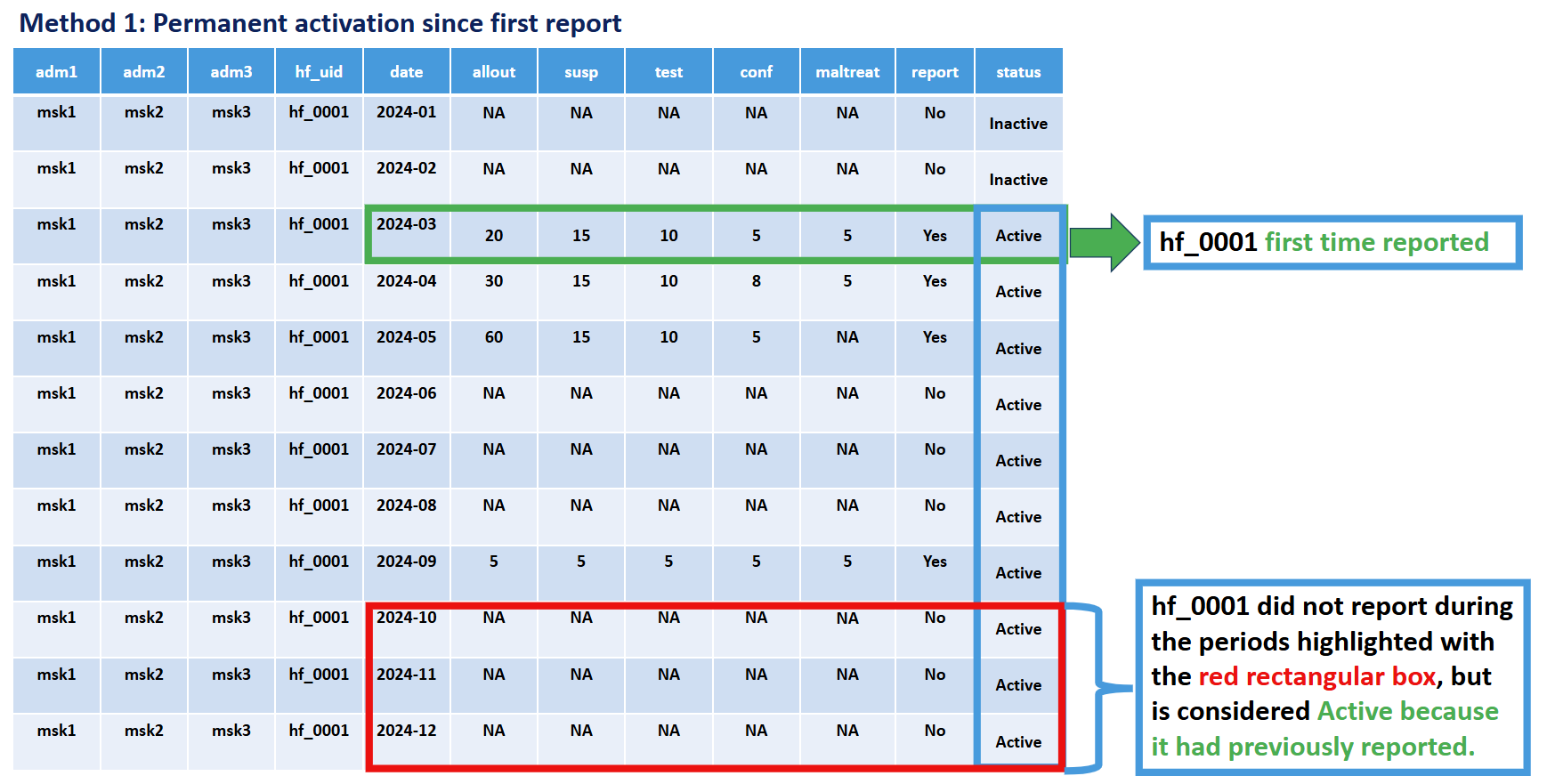
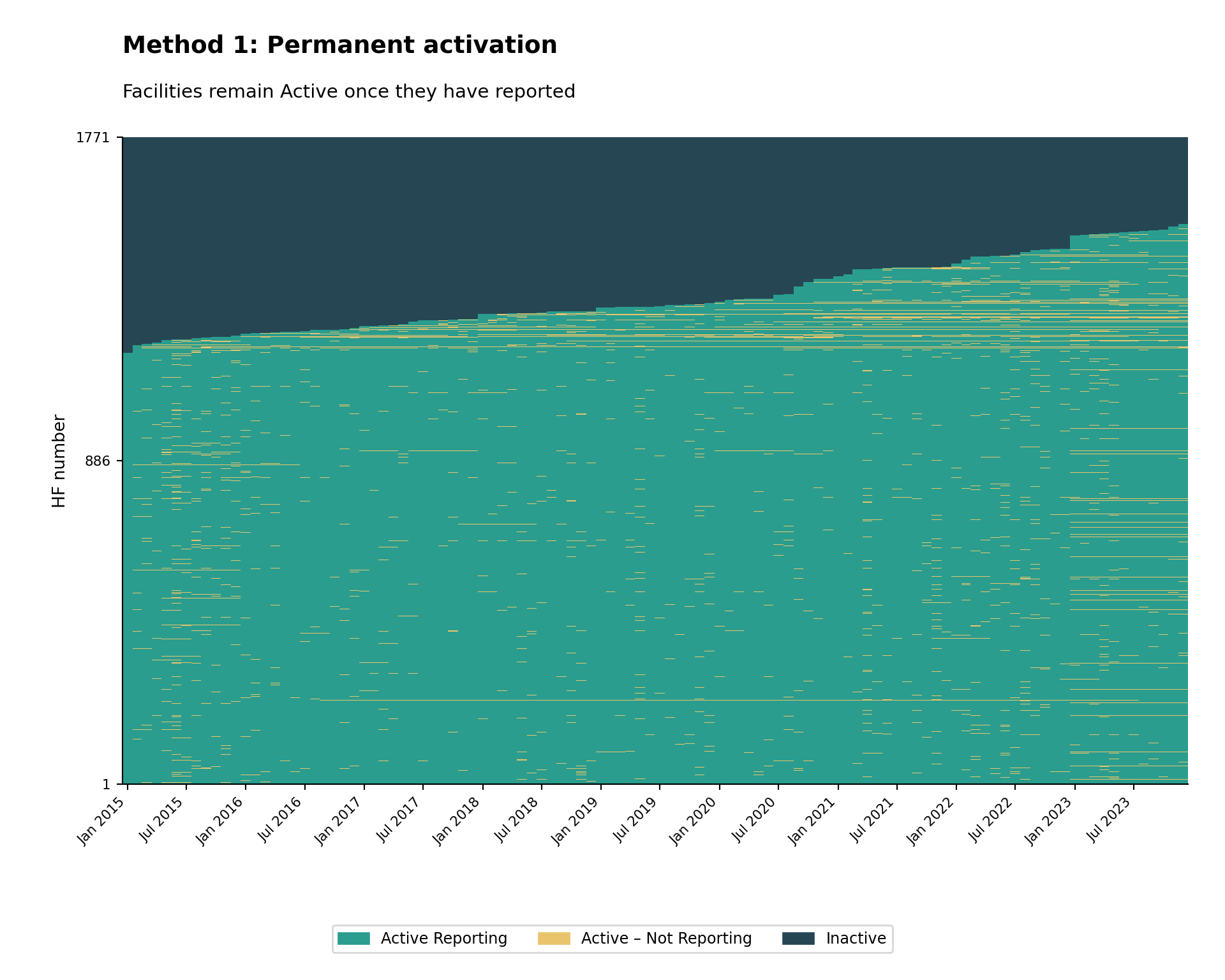
Method 1: Permanent Activation
Criteria: A facility is classified as active from its first reporting month onwards, and inactive before its first report.
Key principle: A facility is only included in the denominator (expected to report) starting from the month it first actually reported any malaria data. Before that first reporting month, the facility is considered “inactive” and not expected to report.
Rationale: This method recognizes that facilities may not exist, be operational, have DHIS2 access, or be participating in malaria surveillance from the beginning of the analysis period. It avoids underestimating reporting performance by only evaluating facilities during periods after which they have demonstrated the capacity to report.
Illustration:
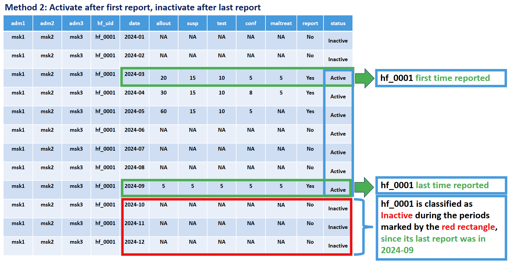
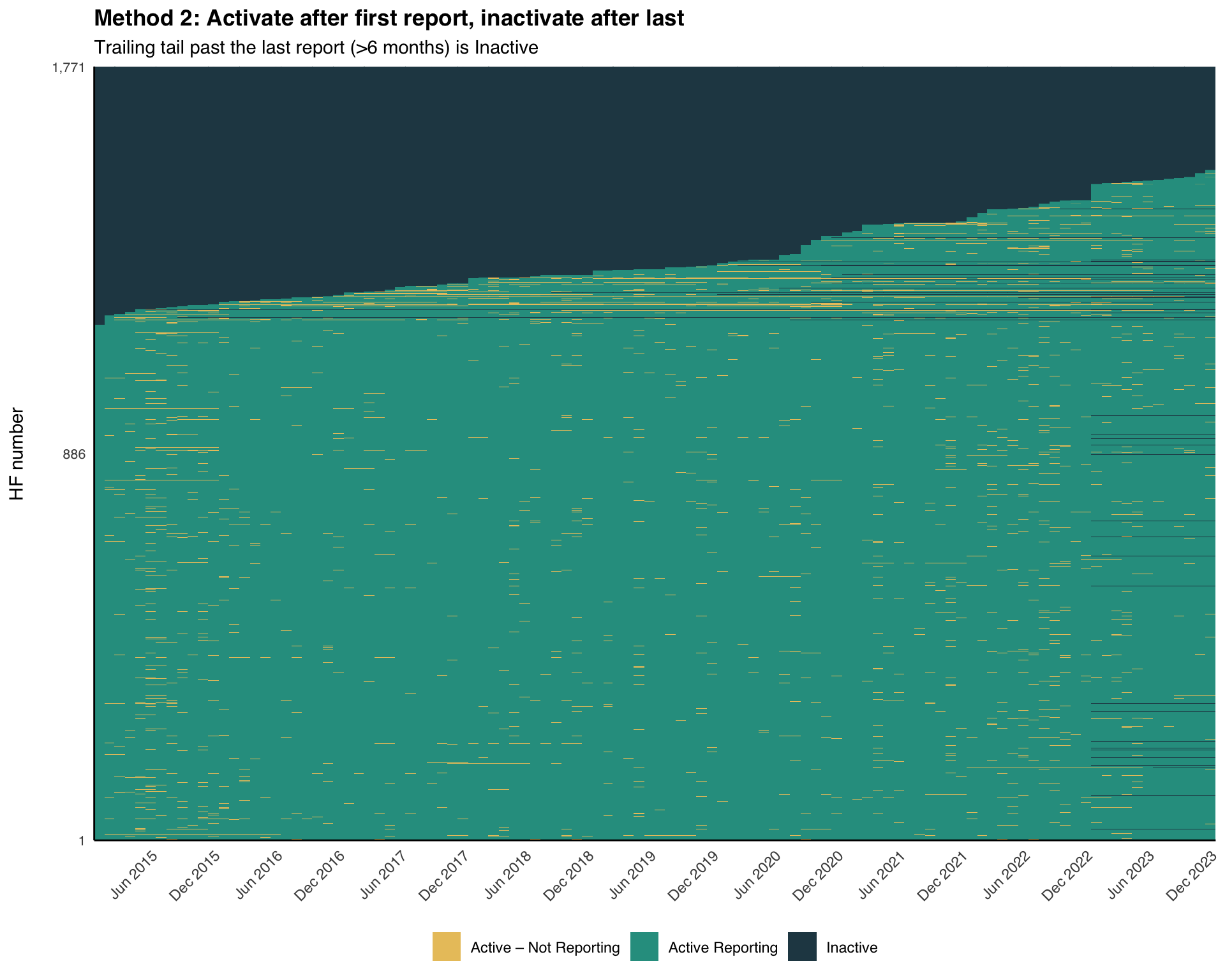
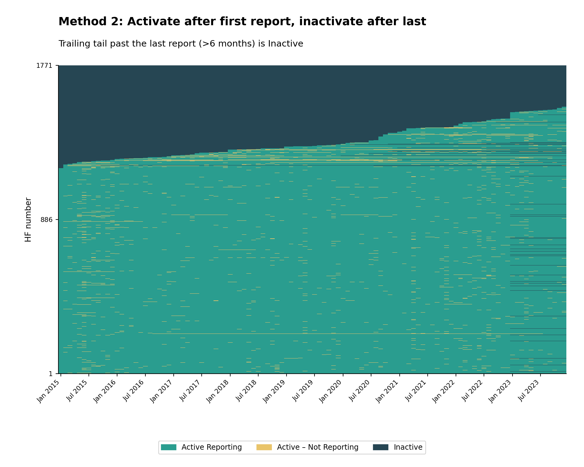
Method 2: First-to-Last Activation
Criteria: A facility is classified as active once it starts reporting, and inactive after its last report. To avoid mis-attributing non-reporting as inactivity in the most recent months of the dataset, we also require a minimum number of non-reports (default: 6 months) past the facility’s last report before it is treated as Inactive.
Key principle: A facility is included in the denominator (expected to report) for a given month if it has ever reported, and excluded only after it has stopped reporting and the panel has extended past it by the grace period.
Rationale: This method recognizes that facilities may shut down permanently, for example due to insecurity, decreased local population, or diminished service-delivery resources. It avoids underestimating reporting performance by only evaluating facilities during periods when they have demonstrated the capacity to report.
Illustration:
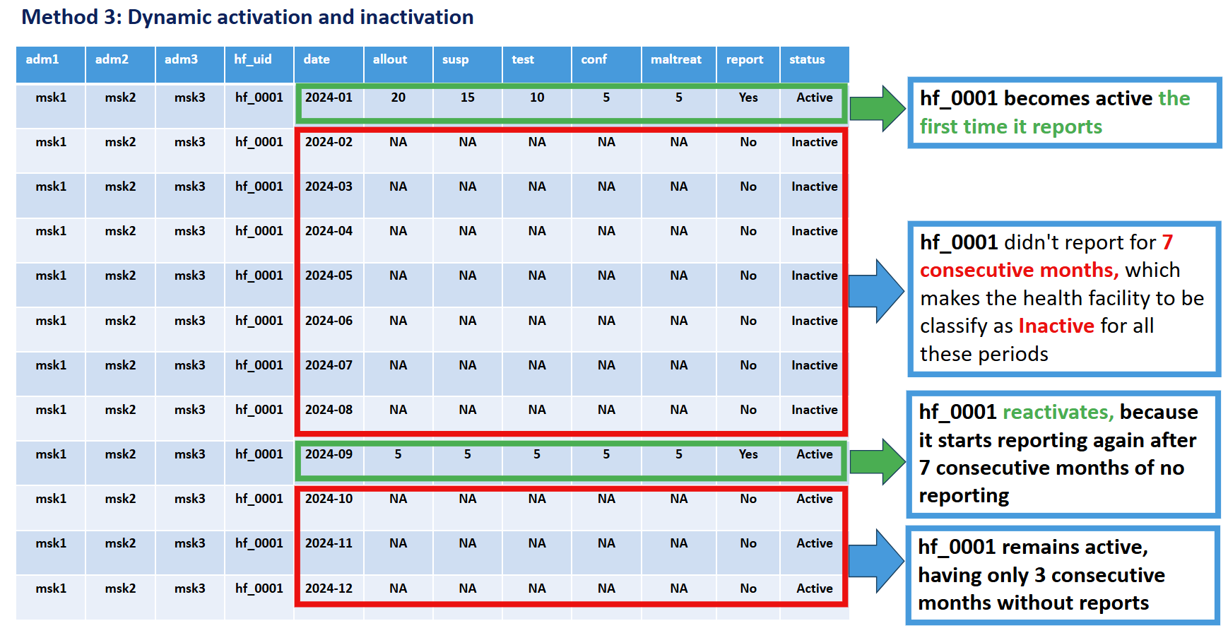
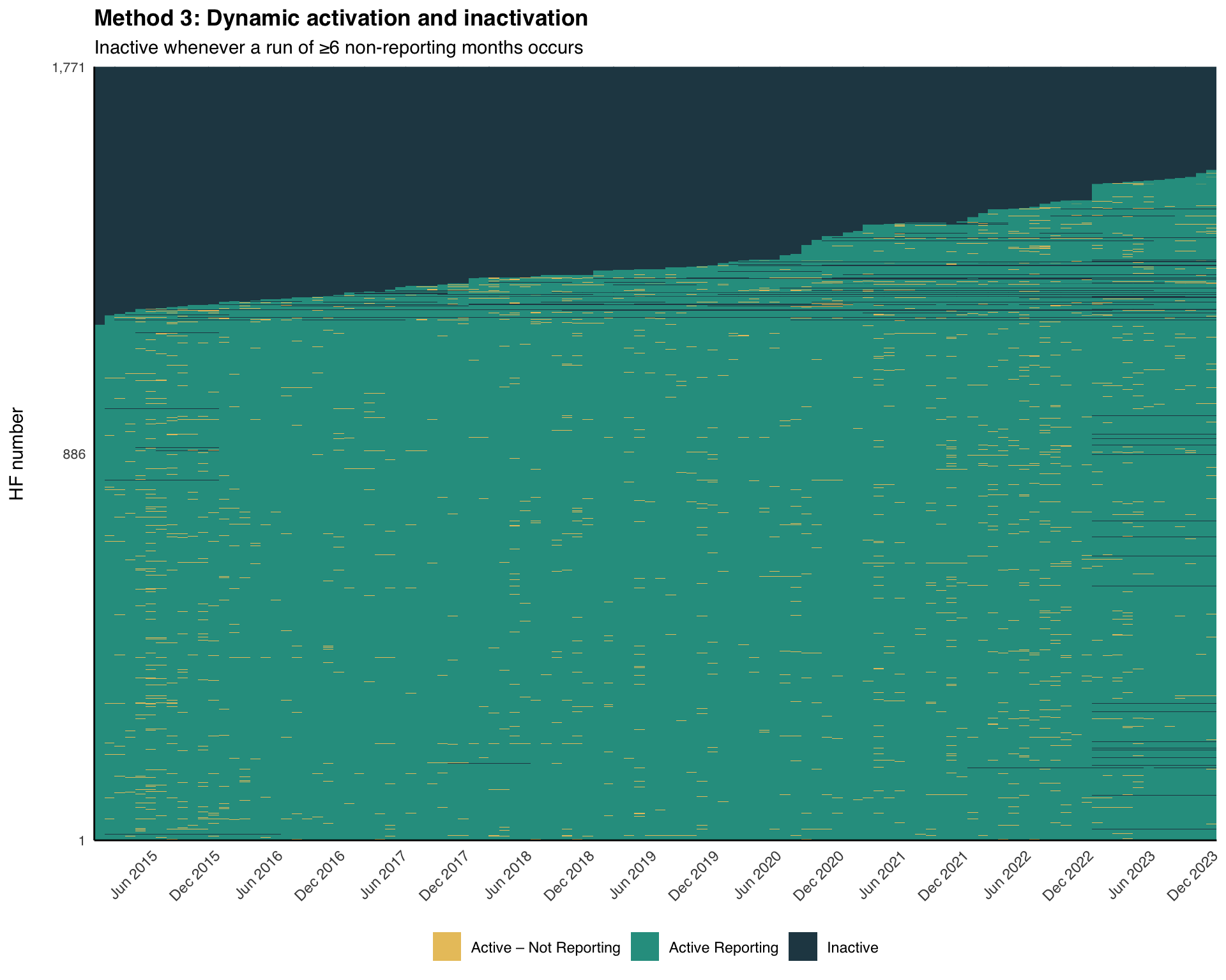
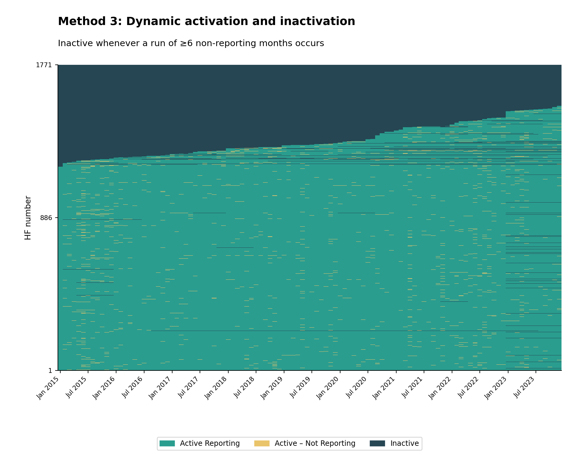
Method 3: Dynamic Run-Length
Criteria: A facility is classified as active once it starts reporting, and inactive whenever a continuous run of non-reporting reaches a configured minimum length (default: 6 months). The whole run is marked Inactive, and the facility reactivates the next time it reports.
Key principle: A facility is excluded from the denominator (expected to report) for every month inside a non-reporting run of at least N months. The window size (N) can be configured based on program requirements.
Rationale: This method recognizes that facilities may have temporary interruptions in functionality due to operational factors such as staff shortages, equipment issues, inaccessibility from natural disasters, or insecurity. The facility may regain activity in the future as those factors change, then become inactive again. It provides a dynamic assessment that balances operational reality with accountability. It is not normal for a facility to be frequently changing between active and inactive status; if this pattern appears when using Method 3, consider lengthening the window size or switching to Method 2.
Illustration:
| Comparison Aspect | Method 1 | Method 2 | Method 3 |
|---|---|---|---|
| Activation Criteria | First report received | First report received | First report received |
| Inactivation Criteria | Never (once active, always active) | After last report + grace period (e.g. 6 months) | Whenever a non-reporting run reaches N months |
| Facility Status | Binary: inactive → permanent active | Binary: inactive → active → permanent inactive | Dynamic: can toggle between active/inactive multiple times |
| Handles Temporary Closures | No | No | Yes |
| Handles Permanent Closures | No | Yes | Yes |
| Data Requirements | Minimal historical data | Complete historical data preferred | Complete time series data |
| Best Use When | Analyzing new facilities or early program phases | Studying facility attrition / permanent closures | Monitoring ongoing operations with temporary disruptions |
| Advantages | Simple to implement; stable denominators | Accounts for permanent exits; avoids penalizing for closed facilities | Realistic for operational contexts; accommodates temporary issues |
| Limitations | Overestimates active facilities over time | May misclassify temporarily closed facilities as permanently closed | More complex; status can fluctuate; requires parameter tuning |
Step-by-Step
In the remainder of this page we build each method step-by-step using simplified inline code, then visualize the result with a small reusable heatmap function. We use the cleaned Sierra Leone DHIS2 data from the DHIS2 preprocessing page. We end with faceted views by admin unit and a diagnostic comparison of the three methods.
Step 1: Load Packages and Data
Step 1.1: Load required R packages
To adapt the code:
- Do not modify anything in the code above
import pandas as pd           # data manipulation
import numpy as np            # numeric operations
import matplotlib.pyplot as plt  # plotting
import matplotlib.dates as mdates
import matplotlib.patches as mpatches
from pathlib import Path
from pyprojroot import here   # reproducible file paths

# cli helpers — defined once, reused on every step
def cli_header(message):
    print(f"\n{message}")

def cli_info(message):
    print(f"INFO: {message}")

def cli_success(message):
    print(f"SUCCESS: {message}")

def cli_warning(message):
    print(f"WARNING: {message}")

def cli_danger(message):
    print(f"ERROR: {message}")
To adapt the code:
- Do not modify anything in the code above
Step 1.2: Import data
Load the preprocessed malaria routine data exported by the import step (clean_malaria_routine_data_final.parquet) and make sure the date column is a proper Date object.
To adapt the code:
- Lines 2-6: Adjust the path components if your data is stored elsewhere
import pandas as pd
from pathlib import Path
from pyprojroot import here
# load preprocessed malaria routine data
df = pd.read_parquet(
Path(here(
"01_data/1.2_epidemiology/1.2a_routine_surveillance/processed/"
"clean_malaria_routine_data_final.parquet"
))
)
# ensure the date column is a proper datetime object
df["date"] = pd.to_datetime(df["date"])To adapt the code:
- Line 6: Adjust the path if your data is stored elsewhere
Step 2: Build the Balanced Panel
Real-world DHIS2 extracts are often missing rows for facilities that did not exist (or were not in DHIS2 yet) in some months. To classify activity status consistently we first expand the data into a balanced panel (every facility paired with every month between the first and last date of the dataset) and treat any missing facility-month as a non-reporting month. Then we flag whether each facility-month reported on any key indicator and record each facility’s first and last reporting date plus the panel’s overall last date. All three methods reuse these columns.
# key indicators that signal malaria service delivery
key_indicators <- c("allout", "test", "pres", "conf", "maltreat", "maladm")
# default grace / dynamic-inactivation window (months)
nonreport_window <- 6L
# (1) build a balanced (facility × month) panel and fill missing metadata
month_seq <- seq(min(df$date), max(df$date), by = "month")
panel <- tidyr::expand_grid(
hf_uid = unique(df$hf_uid),
date = month_seq
)
df <- df |>
dplyr::right_join(panel, by = c("hf_uid", "date")) |>
dplyr::arrange(hf_uid, date) |>
dplyr::group_by(hf_uid) |>
tidyr::fill(adm0, adm1, adm2, adm3, .direction = "downup") |>
dplyr::ungroup()
# (2) row-level reporting flag: did this facility-month report any indicator?
df <- df |>
dplyr::mutate(
reported_any = dplyr::if_any(
dplyr::all_of(key_indicators),
~ !is.na(.x)
)
)
# (3) per-facility first / last reporting dates and panel last date
# (use if/else, not dplyr::if_else, so min/max are not evaluated on facilities
# that never reported — avoids "no non-missing arguments to min" warnings)
df <- df |>
dplyr::arrange(hf_uid, date) |>
dplyr::group_by(hf_uid) |>
dplyr::mutate(
first_rep = if (any(reported_any)) min(date[reported_any]) else as.Date(NA),
last_rep = if (any(reported_any)) max(date[reported_any]) else as.Date(NA),
last_date = max(date)
) |>
dplyr::ungroup()To adapt the code:
- Line 2: Replace
key_indicatorswith the columns your program treats as reporting indicators - Line 5: Tune
nonreport_windowto match your country’s preferred grace period (months) - Line 18: Adjust the metadata columns filled within facility groups if your data uses different admin column names
import pandas as pd
import numpy as np
# key indicators that signal malaria service delivery
key_indicators = ["allout", "test", "pres", "conf", "maltreat", "maladm"]
# default grace / dynamic-inactivation window (months)
nonreport_window = 6
# (1) build a balanced (facility × month) panel and fill missing metadata
month_seq = pd.date_range(df["date"].min(), df["date"].max(), freq="MS")
panel = pd.MultiIndex.from_product(
[df["hf_uid"].unique(), month_seq],
names=["hf_uid", "date"]
).to_frame(index=False)
df = (
panel.merge(df, on=["hf_uid", "date"], how="left")
.sort_values(["hf_uid", "date"])
)
# forward-fill then back-fill admin metadata within each facility group
meta_cols = ["adm0", "adm1", "adm2", "adm3"]
df[meta_cols] = (
df.groupby("hf_uid")[meta_cols]
.transform(lambda s: s.ffill().bfill())
)
# (2) row-level reporting flag: did this facility-month report any indicator?
# add any missing key indicator columns as NaN so the predicate uses the same
# six columns as R's dplyr::if_any(dplyr::all_of(key_indicators), ~!is.na(.x))
for _col in key_indicators:
if _col not in df.columns:
df[_col] = np.nan
df = df.assign(
reported_any=lambda d: d[key_indicators].notna().any(axis=1)
)
# (3) per-facility first / last reporting dates and panel last date
def facility_dates(g):
mask = g["reported_any"]
g = g.copy()
if mask.any():
g["first_rep"] = g.loc[mask, "date"].min()
g["last_rep"] = g.loc[mask, "date"].max()
else:
g["first_rep"] = pd.NaT
g["last_rep"] = pd.NaT
g["last_date"] = g["date"].max()
return g
df = (
df.sort_values(["hf_uid", "date"])
.groupby("hf_uid", group_keys=False)
.apply(facility_dates)
.reset_index(drop=True)
)To adapt the code:
- Line 4: Replace
key_indicatorswith the columns your program treats as reporting indicators - Line 7: Tune
nonreport_windowto match your country’s preferred grace period (months) - Line 21: Adjust the metadata columns filled within facility groups if your data uses different admin column names
Step 3: Heatmap Helper
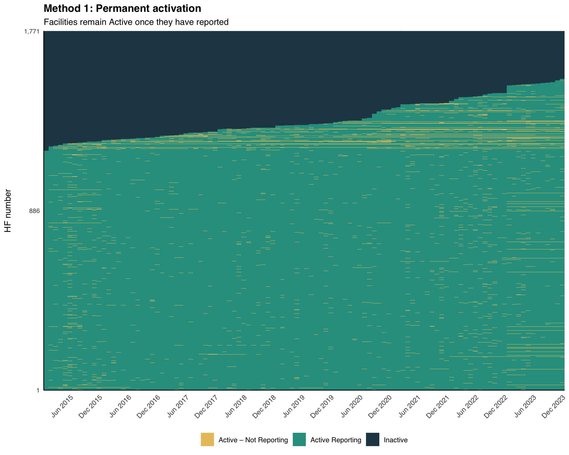
Define one small ggplot helper we will reuse for all three method visualizations. It takes a classified data frame and a status column, orders facilities by first reporting date, and renders a tile heatmap with the 3-state forest palette (teal-green = Active Reporting, amber = Active – Not Reporting, dark navy = Inactive).
Show the code
plot_activity_heatmap <- function(
data,
status_col,
hf_col = "hf_uid",
date_col = "date",
title = NULL,
subtitle = NULL,
facet_col = NULL,
facet_ncol = 4
) {
# forest 3-state palette: teal-green / amber / dark navy
status_colours <- c(
"Active Reporting" = "#2A9D8F", # teal-green: operational
"Active – Not Reporting" = "#E9C46A", # amber: operational but silent
"Inactive" = "#264653" # dark navy: not operational
)
# order facilities by first reporting date for a clean visual sweep
facility_order <- data |>
dplyr::distinct(.data[[hf_col]], first_rep) |>
dplyr::arrange(first_rep) |>
dplyr::pull(.data[[hf_col]])
data <- data |>
dplyr::mutate(
.hf_ordered = forcats::fct_relevel(
as.character(.data[[hf_col]]),
!!!as.character(facility_order)
)
)
# only show first / middle / last facility number on the y-axis
n_hf <- length(facility_order)
if (n_hf >= 3) {
y_breaks <- facility_order[c(1, ceiling(n_hf / 2), n_hf)]
y_labels <- scales::comma(c(1, ceiling(n_hf / 2), n_hf))
} else {
y_breaks <- facility_order
y_labels <- scales::comma(seq_len(n_hf))
}
p <- ggplot2::ggplot(
data,
ggplot2::aes(
x = .data[[date_col]],
y = .hf_ordered,
fill = .data[[status_col]]
)
) +
ggplot2::geom_tile(width = 31, height = 1) +
ggplot2::scale_fill_manual(
values = status_colours,
na.value = "white",
name = NULL
) +
ggplot2::scale_x_date(
expand = c(0, 0),
date_breaks = "6 months",
date_labels = "%b %Y"
) +
ggplot2::scale_y_discrete(
breaks = y_breaks,
labels = y_labels
) +
ggplot2::labs(
x = NULL,
y = "HF number\n",
title = title,
subtitle = subtitle
) +
ggplot2::theme_minimal(base_family = "sans") +
ggplot2::theme(
axis.text.x = ggplot2::element_text(angle = 45, hjust = 1),
axis.text.y = ggplot2::element_text(size = 8),
axis.line = ggplot2::element_line(color = "black", linewidth = 0.5),
legend.position = "bottom",
legend.direction = "horizontal",
plot.title = ggplot2::element_text(face = "bold")
)
if (!is.null(facet_col)) {
p <- p +
ggplot2::facet_wrap(
ggplot2::vars(.data[[facet_col]]),
scales = "free_y",
ncol = facet_ncol
)
}
p
}To adapt the code:
- Lines 13–17: Change
status_coloursto match your project palette - Last argument when calling: Pass
facet_col = "adm1"to split the heatmap by administrative unit
Show the code
import matplotlib.pyplot as plt
import matplotlib.dates as mdates
import matplotlib.patches as mpatches
from matplotlib.collections import PatchCollection
import numpy as np
def plot_activity_heatmap(
data,
status_col,
hf_col="hf_uid",
date_col="date",
title=None,
subtitle=None,
facet_col=None,
facet_ncol=4
):
# forest 3-state palette: teal-green / amber / dark navy
status_colours = {
"Active Reporting": "#2A9D8F", # teal-green: operational
"Active – Not Reporting": "#E9C46A", # amber: operational but silent
"Inactive": "#264653", # dark navy: not operational
}
colour_map = dict(status_colours)
def _draw_panel(ax, subset, title_text=None):
subset = subset.copy()
# order this panel's facilities by first reporting date, mirroring
# facet_wrap(scales = "free_y") so every panel fills its own y-axis
order = (
subset[[hf_col, "first_rep"]]
.drop_duplicates()
.sort_values("first_rep")
[hf_col]
.tolist()
)
rank = {hf: i for i, hf in enumerate(order)}
n = len(order)
subset["_y"] = subset[hf_col].map(rank)
subset["_c"] = subset[status_col].map(colour_map).fillna("white")
# draw each facility-month as a filled tile, matching geom_tile:
# 31-day wide, 1-row tall, centred on the date and facility rank
x = mdates.date2num(subset[date_col])
tiles = [
mpatches.Rectangle((xi - 15.5, yi - 0.5), 31, 1)
for xi, yi in zip(x, subset["_y"])
]
ax.add_collection(
PatchCollection(
tiles,
facecolors=subset["_c"].tolist(),
edgecolors="none",
)
)
ax.set_xlim(x.min() - 15.5, x.max() + 15.5)
ax.set_ylim(-0.5, n - 0.5)
# y-axis ticks: first / middle / last facility in this panel
if n >= 3:
tick_positions = [0, (n - 1) // 2, n - 1]
tick_labels = [str(1), str((n - 1) // 2 + 1), str(n)]
else:
tick_positions = list(range(n))
tick_labels = [str(i + 1) for i in range(n)]
# x-axis: six-monthly ticks
ax.xaxis.set_major_locator(mdates.MonthLocator(bymonth=[1, 7]))
ax.xaxis.set_major_formatter(mdates.DateFormatter("%b %Y"))
plt.setp(ax.get_xticklabels(), rotation=45, ha="right", fontsize=8)
# y-axis: facility rank labels
ax.set_yticks(tick_positions)
ax.set_yticklabels(tick_labels, fontsize=8)
ax.set_ylabel("HF number")
ax.spines["top"].set_visible(False)
ax.spines["right"].set_visible(False)
ax.set_xlabel("")
if title_text:
ax.set_title(title_text, fontsize=9, pad=4)
# shared legend handles (one swatch per status)
legend_handles = [
mpatches.Patch(color=v, label=k)
for k, v in status_colours.items()
]
if facet_col is None:
fig, ax = plt.subplots(figsize=(10, 8))
_draw_panel(ax, data)
# reserve margins so the title block and legend are never clipped
fig.subplots_adjust(top=0.86, bottom=0.20, left=0.10, right=0.97)
x0 = ax.get_position().x0
# bold title with a lighter subtitle beneath, left-aligned (ggplot-like)
if title:
fig.text(x0, 0.965, title, ha="left", va="top",
fontsize=14, fontweight="bold")
if subtitle:
fig.text(x0, 0.915, subtitle, ha="left", va="top", fontsize=11)
# legend sits clear of the x-axis tick labels
fig.legend(handles=legend_handles, loc="lower center", ncol=3,
fontsize=9, bbox_to_anchor=(0.5, 0.02))
else:
groups = sorted(data[facet_col].dropna().unique())
n_groups = len(groups)
n_cols = facet_ncol
n_rows = int(np.ceil(n_groups / n_cols))
fig, axes = plt.subplots(
n_rows, n_cols,
figsize=(4 * n_cols, 3.2 * n_rows)
)
axes_flat = np.array(axes).reshape(-1)
for idx, grp in enumerate(groups):
_draw_panel(axes_flat[idx], data[data[facet_col] == grp], str(grp))
for ax in axes_flat[n_groups:]:
ax.set_visible(False)
fig.subplots_adjust(top=0.93, bottom=0.14, left=0.08, right=0.97,
hspace=0.75, wspace=0.28)
x0 = axes_flat[0].get_position().x0
if title:
fig.text(x0, 0.985, title, ha="left", va="top",
fontsize=15, fontweight="bold")
if subtitle:
fig.text(x0, 0.965, subtitle, ha="left", va="top", fontsize=12)
# legend sits well clear of the bottom row's x-axis tick labels
fig.legend(handles=legend_handles, loc="lower center", ncol=3,
fontsize=10, bbox_to_anchor=(0.5, 0.02))
return figTo adapt the code:
- Lines 14–18: Change
status_coloursto match your project palette - Last argument when calling: Pass
facet_col="adm1"to split the heatmap by administrative unit
Step 4: Method 1 — Permanent Activation
Step 4.1: Apply Method 1 classification
A facility becomes Active from the month of its first report onward, and stays Active for the rest of the panel.
df <- df |>
dplyr::arrange(hf_uid, date) |>
dplyr::group_by(hf_uid) |>
dplyr::mutate(
ever_reported = dplyr::cumany(reported_any),
activity_method1 = dplyr::case_when(
!any(reported_any) ~ "Inactive",
!ever_reported ~ "Inactive",
reported_any ~ "Active Reporting",
TRUE ~ "Active – Not Reporting"
)
) |>
dplyr::ungroup()To adapt the code:
- Do not modify anything in the code above
df = df.sort_values(["hf_uid", "date"])
# cumulative "has ever reported" flag within each facility
df["ever_reported"] = (
df.groupby("hf_uid")["reported_any"]
.transform("cummax")
)
# method 1: permanent activation from first report month onward
df["activity_method1"] = np.select(
[
~df.groupby("hf_uid")["reported_any"].transform("any"),
~df["ever_reported"],
df["reported_any"],
],
[
"Inactive",
"Inactive",
"Active Reporting",
],
default="Active – Not Reporting",
)To adapt the code:
- Do not modify anything in the code above
Step 4.2: Visualize Method 1 heatmap
NoteOutput
To adapt the code:
- Add
facet_col = "adm1"to split the heatmap by region
Step 5: Method 2 — First-to-Last
Step 5.1: Apply Method 2 classification
A facility becomes Active from its first report and stays Active through its last report. After the last report, it remains Active – Not Reporting until the panel has extended nonreport_window months past it, at which point it becomes Inactive.
df <- df |>
dplyr::arrange(hf_uid, date) |>
dplyr::group_by(hf_uid) |>
dplyr::mutate(
months_since_last = dplyr::if_else(
is.na(last_rep),
Inf,
as.numeric(
lubridate::interval(last_rep, last_date) / lubridate::dmonths(1)
)
),
activity_method2 = dplyr::case_when(
is.na(first_rep) ~ "Inactive",
date < first_rep ~ "Inactive",
reported_any ~ "Active Reporting",
date <= last_rep ~ "Active – Not Reporting",
date > last_rep & months_since_last >= nonreport_window ~ "Inactive",
TRUE ~ "Active – Not Reporting"
)
) |>
dplyr::ungroup()To adapt the code:
- Line 17: Change the grace logic if your program prefers immediate inactivation after the last report
df = df.sort_values(["hf_uid", "date"])
# months between a facility's last report and the panel's last date
def months_since_last(g):
g = g.copy()
if g["last_rep"].isna().all():
g["months_since_last"] = np.inf
else:
last_rep = g["last_rep"].iloc[0]
last_date = g["last_date"].iloc[0]
# dmonths(1) = 30.4375 days in lubridate; this matches R exactly
delta_days = (last_date - last_rep).days
g["months_since_last"] = delta_days / 30.4375
return g
df = (
df.groupby("hf_uid", group_keys=False)
.apply(months_since_last)
.reset_index(drop=True)
)
# method 2: first-to-last with grace period
df["activity_method2"] = np.select(
[
df["first_rep"].isna(),
df["date"] < df["first_rep"],
df["reported_any"],
df["date"] <= df["last_rep"],
(df["date"] > df["last_rep"])
& (df["months_since_last"] >= nonreport_window),
],
[
"Inactive",
"Inactive",
"Active Reporting",
"Active – Not Reporting",
"Inactive",
],
default="Active – Not Reporting",
)To adapt the code:
- Line 27: Change the grace logic if your program prefers immediate inactivation after the last report
Step 5.2: Visualize Method 2 heatmap
NoteOutput
To adapt the code:
- Do not modify anything in the code above
Step 6: Method 3 — Dynamic
Step 6.1: Apply Method 3 classification
Inactivation is triggered whenever a continuous run of non-reporting reaches nonreport_window months; the whole run is marked Inactive, and the facility reactivates the next time it reports.
df <- df |>
dplyr::arrange(hf_uid, date) |>
dplyr::group_by(hf_uid) |>
dplyr::mutate(
# 1 if this month did not report, 0 if it did
gap = dplyr::if_else(!reported_any, 1L, 0L),
# one id per consecutive run of identical gap values
gap_run = data.table::rleid(gap),
# length of the run this row belongs to (same value for every row in run)
run_len = stats::ave(gap, gap_run, FUN = length),
activity_method3 = dplyr::case_when(
!any(reported_any) ~ "Inactive",
is.na(first_rep) ~ "Inactive",
date < first_rep ~ "Inactive",
reported_any ~ "Active Reporting",
gap == 1 & run_len < nonreport_window ~ "Active – Not Reporting",
gap == 1 & run_len >= nonreport_window ~ "Inactive",
TRUE ~ "Inactive"
)
) |>
dplyr::ungroup()To adapt the code:
- Do not modify anything in the code above
df = df.sort_values(["hf_uid", "date"])
def add_run_length(g):
"""Label each row with the length of its consecutive gap run."""
g = g.copy()
# 1 if the facility did not report this month, 0 if it did
g["gap"] = (~g["reported_any"]).astype(int)
# consecutive run id (increments each time gap changes)
g["gap_run"] = (g["gap"] != g["gap"].shift()).cumsum()
# length of every run (same value for all rows in the same run)
g["run_len"] = g.groupby("gap_run")["gap"].transform("count")
return g
df = (
df.groupby("hf_uid", group_keys=False)
.apply(add_run_length)
.reset_index(drop=True)
)
# method 3: dynamic activation — inactivate any run of ≥ nonreport_window months
never_reported = ~df.groupby("hf_uid")["reported_any"].transform("any")
df["activity_method3"] = np.select(
[
never_reported,
df["first_rep"].isna(),
df["date"] < df["first_rep"],
df["reported_any"],
(df["gap"] == 1) & (df["run_len"] < nonreport_window),
(df["gap"] == 1) & (df["run_len"] >= nonreport_window),
],
[
"Inactive",
"Inactive",
"Inactive",
"Active Reporting",
"Active – Not Reporting",
"Inactive",
],
default="Inactive",
)To adapt the code:
- Do not modify anything in the code above
Step 6.2: Visualize Method 3 heatmap
NoteOutput
To adapt the code:
- Do not modify anything in the code above
Step 7: Faceted Heatmaps by Admin Unit
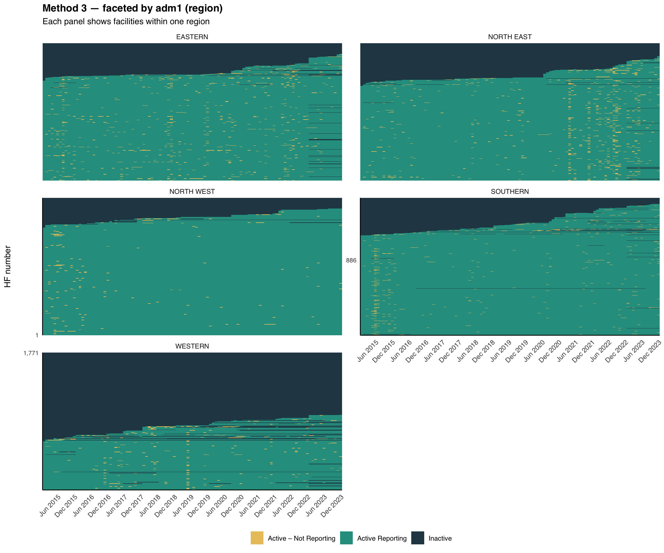
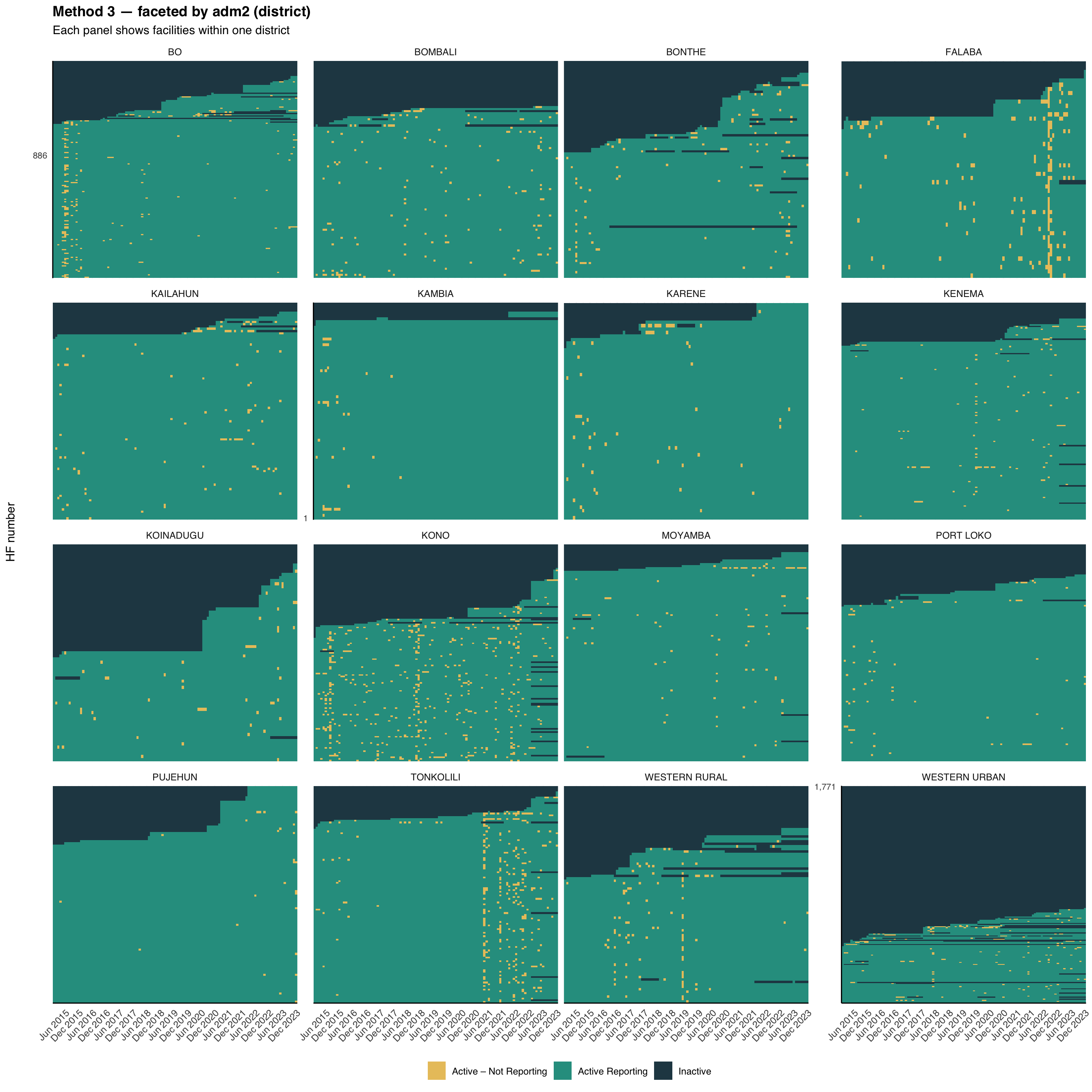
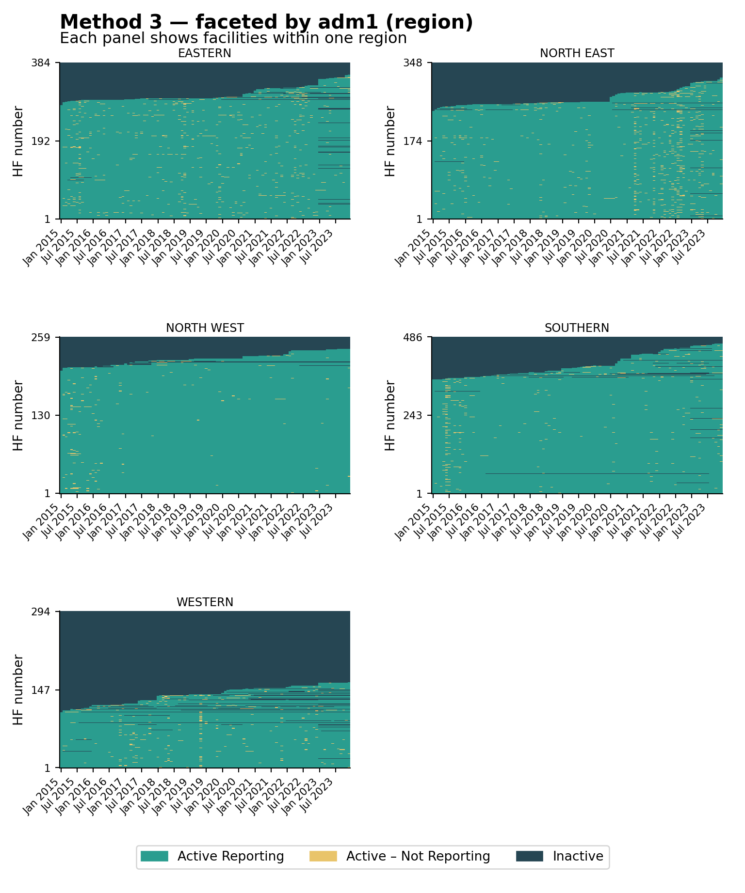
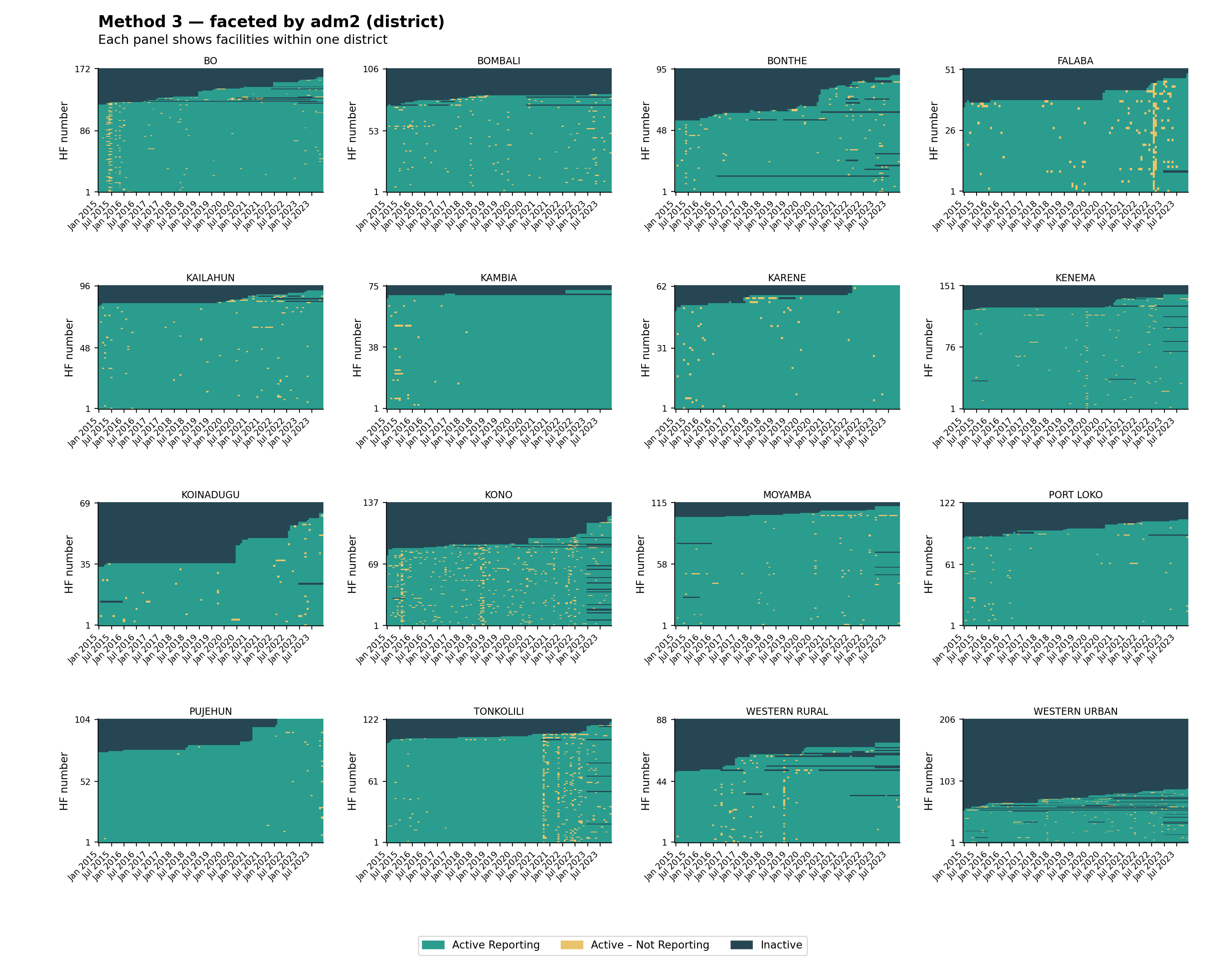
The same helper supports faceting. Splitting the heatmap by adm1 (region) and then by adm2 (district) is useful for spotting whether reporting gaps are concentrated in particular geographies, a common pattern when access or security shocks affect a single area. The visualizations below use the Method 3 classification (the strictest of the three), faceted at two admin levels.
# faceted by adm1 (region)
plot_activity_heatmap(
data = df,
status_col = "activity_method3",
facet_col = "adm1",
facet_ncol = 2,
title = "Method 3 — faceted by adm1 (region)",
subtitle = "Each panel shows facilities within one region"
)
# faceted by adm2 (district)
plot_activity_heatmap(
data = df,
status_col = "activity_method3",
facet_col = "adm2",
facet_ncol = 4,
title = "Method 3 — faceted by adm2 (district)",
subtitle = "Each panel shows facilities within one district"
)
NoteOutput — by adm1
NoteOutput — by adm2
To adapt the code:
status_col: Swap to"activity_method1"or"activity_method2"to facet a different classificationfacet_col: Any column indfcan be used (e.g.,"adm3","hf_type")facet_ncol: Tune the panel grid layout
# faceted by adm1 (region)
plot_activity_heatmap(
data=df,
status_col="activity_method3",
facet_col="adm1",
facet_ncol=2,
title="Method 3 — faceted by adm1 (region)",
subtitle="Each panel shows facilities within one region",
)
# faceted by adm2 (district)
plot_activity_heatmap(
data=df,
status_col="activity_method3",
facet_col="adm2",
facet_ncol=4,
title="Method 3 — faceted by adm2 (district)",
subtitle="Each panel shows facilities within one district",
)
NoteOutput — by adm1
NoteOutput — by adm2
To adapt the code:
status_col: Swap to"activity_method1"or"activity_method2"to facet a different classificationfacet_col: Any column indfcan be used (e.g.,"adm3","hf_type")facet_ncol: Tune the panel grid layout
The national heatmap shows how much non-reporting there is; the faceted views show where it is concentrated. Reporting problems usually cluster around shocks (insecurity, stockouts, DHIS2 access) that hit specific regions or districts rather than the whole country at once. Look for vertical amber stripes (a system-wide disruption in one month), whole districts dominated by dark navy (a structural issue in that area), and districts that look healthy at adm1 but reveal weak patches once faceted at adm2; always inspect at the level at which decisions will be made.
Step 8: Compare Methods
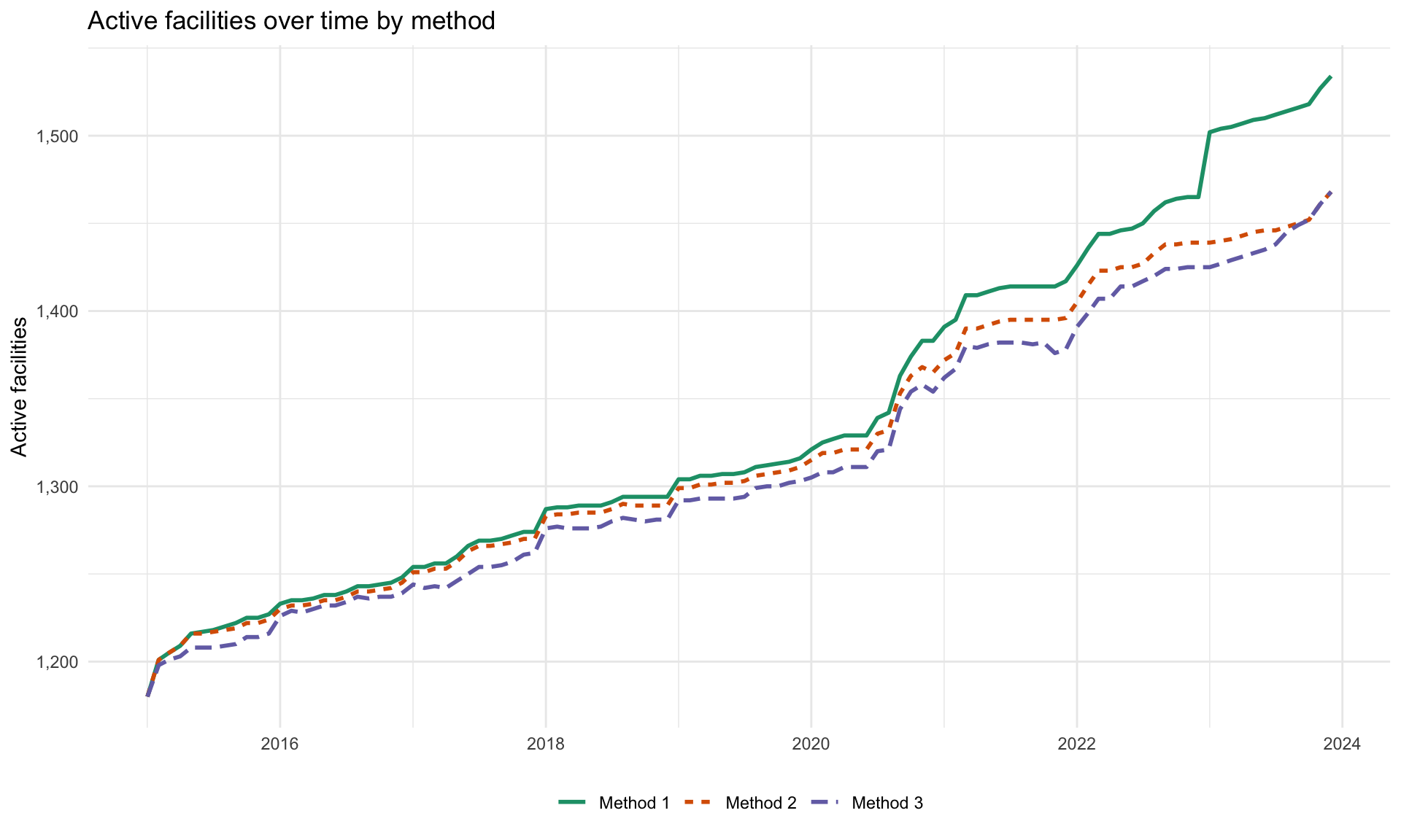
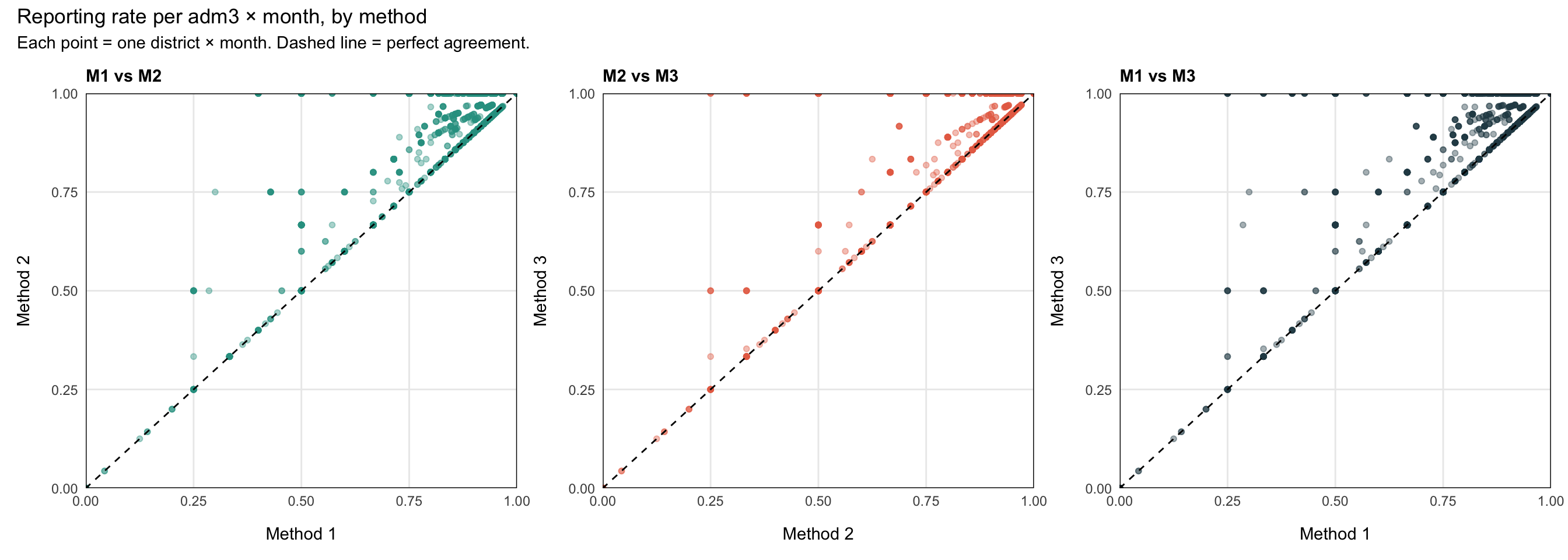
To understand how the three methods differ in practice we look at two complementary views on the same data: a time series of how many facilities each method counts as Active each month, and a set of pairwise scatterplots of the resulting reporting rate per adm3 and month.
Step 8.1: Active facilities over time
df_methods_long <- df |>
dplyr::select(
hf_uid, date,
activity_method1, activity_method2, activity_method3
) |>
tidyr::pivot_longer(
cols = dplyr::starts_with("activity_method"),
names_to = "method",
values_to = "status"
) |>
dplyr::mutate(
method = dplyr::recode(
method,
"activity_method1" = "Method 1",
"activity_method2" = "Method 2",
"activity_method3" = "Method 3"
),
is_active = status %in% c("Active Reporting", "Active – Not Reporting")
)
df_active_per_month <- df_methods_long |>
dplyr::group_by(date, method) |>
dplyr::summarise(
n_active = sum(is_active, na.rm = TRUE),
.groups = "drop"
)
ggplot2::ggplot(
df_active_per_month,
ggplot2::aes(x = date, y = n_active, colour = method, linetype = method)
) +
ggplot2::geom_line(linewidth = 1) +
ggplot2::scale_y_continuous(labels = scales::comma) +
ggplot2::scale_colour_brewer(palette = "Dark2") +
ggplot2::labs(
x = NULL,
y = "Active facilities",
title = "Active facilities over time by method",
colour = NULL,
linetype = NULL
) +
ggplot2::theme_minimal() +
ggplot2::theme(legend.position = "bottom")
NoteOutput
To adapt the code:
- Do not modify anything in the code above
import matplotlib.pyplot as plt
import matplotlib.dates as mdates
# reshape to long format: one row per facility × month × method
df_methods_long = (
df[["hf_uid", "date", "activity_method1", "activity_method2", "activity_method3"]]
.melt(
id_vars=["hf_uid", "date"],
value_vars=["activity_method1", "activity_method2", "activity_method3"],
var_name="method",
value_name="status",
)
.assign(
method=lambda d: d["method"].map({
"activity_method1": "Method 1",
"activity_method2": "Method 2",
"activity_method3": "Method 3",
}),
is_active=lambda d: d["status"].isin(
["Active Reporting", "Active – Not Reporting"]
),
)
)
df_active_per_month = (
df_methods_long.groupby(["date", "method"], as_index=False)
.agg(n_active=("is_active", "sum"))
)
# Dark2 palette (first three colours)
method_colours = {
"Method 1": "#1B9E77",
"Method 2": "#D95F02",
"Method 3": "#7570B3",
}
method_linestyles = {
"Method 1": "-",
"Method 2": "--",
"Method 3": ":",
}
fig, ax = plt.subplots(figsize=(10, 6))
for method, grp in df_active_per_month.groupby("method"):
ax.plot(
grp["date"],
grp["n_active"],
label=method,
color=method_colours[method],
linestyle=method_linestyles[method],
linewidth=1.5,
)
ax.xaxis.set_major_locator(mdates.MonthLocator(interval=6))
ax.xaxis.set_major_formatter(mdates.DateFormatter("%b %Y"))
plt.setp(ax.get_xticklabels(), rotation=45, ha="right")
ax.yaxis.set_major_formatter(
plt.FuncFormatter(lambda x, _: f"{int(x):,}")
)
ax.set_xlabel("")
ax.set_ylabel("Active facilities")
ax.set_title("Active facilities over time by method", fontweight="bold",
loc="left")
ax.legend(loc="lower center", ncol=3, bbox_to_anchor=(0.5, -0.25))
ax.grid(axis="y", linewidth=0.4, alpha=0.5)
fig.tight_layout()
NoteOutput
To adapt the code:
- Do not modify anything in the code above
Step 8.2: Pairwise reporting-rate diagnostic
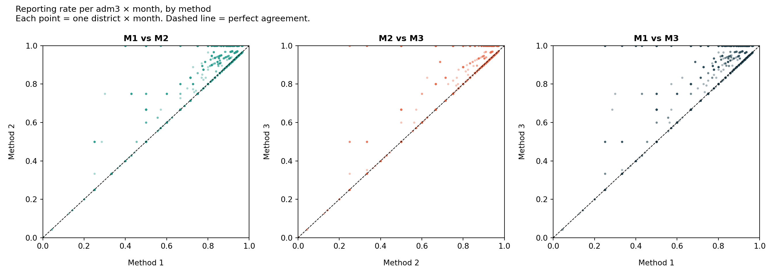
Each point is one adm3 × month combination. The x and y are the reporting rate (n_reported / n_active) under two different methods. Points on the dashed 45° line agree perfectly; points above the line mean the y-axis method gives a higher rate (i.e., it is stricter: it removed more facilities from the denominator).
Show the code
# reporting rate per adm3 × month under each method
df_rate <- df |>
dplyr::mutate(
m1_active = activity_method1 %in%
c("Active Reporting", "Active – Not Reporting"),
m2_active = activity_method2 %in%
c("Active Reporting", "Active – Not Reporting"),
m3_active = activity_method3 %in%
c("Active Reporting", "Active – Not Reporting")
) |>
dplyr::group_by(date, adm3) |>
dplyr::summarise(
n_reported = sum(reported_any, na.rm = TRUE),
n_m1_active = sum(m1_active, na.rm = TRUE),
n_m2_active = sum(m2_active, na.rm = TRUE),
n_m3_active = sum(m3_active, na.rm = TRUE),
.groups = "drop"
) |>
dplyr::mutate(
rate_m1 = n_reported / n_m1_active,
rate_m2 = n_reported / n_m2_active,
rate_m3 = n_reported / n_m3_active
) |>
dplyr::filter(
is.finite(rate_m1), is.finite(rate_m2), is.finite(rate_m3)
)
# helper for one pairwise scatter
make_scatter <- function(d, xcol, ycol, xlab, ylab, title, colour) {
ggplot2::ggplot(d, ggplot2::aes(x = .data[[xcol]], y = .data[[ycol]])) +
ggplot2::geom_point(alpha = 0.4, size = 1.4, colour = colour) +
ggplot2::geom_abline(slope = 1, intercept = 0, linetype = "dashed") +
ggplot2::scale_x_continuous(limits = c(0, 1), expand = c(0, 0)) +
ggplot2::scale_y_continuous(limits = c(0, 1), expand = c(0, 0)) +
ggplot2::labs(x = xlab, y = ylab, title = title) +
ggplot2::theme_minimal() +
ggplot2::theme(
plot.title = ggplot2::element_text(face = "bold", size = 11),
panel.border = ggplot2::element_rect(colour = "black", fill = NA),
panel.grid.minor = ggplot2::element_blank(),
axis.title.x = ggplot2::element_text(margin = ggplot2::margin(t = 12)),
axis.title.y = ggplot2::element_text(margin = ggplot2::margin(r = 12))
)
}
p1 <- make_scatter(
df_rate, "rate_m1", "rate_m2",
"Method 1", "Method 2", "M1 vs M2", "#2A9D8F"
)
p2 <- make_scatter(
df_rate, "rate_m2", "rate_m3",
"Method 2", "Method 3", "M2 vs M3", "#E76F51"
)
p3 <- make_scatter(
df_rate, "rate_m1", "rate_m3",
"Method 1", "Method 3", "M1 vs M3", "#264653"
)
patchwork::wrap_plots(p1, p2, p3, nrow = 1) +
patchwork::plot_annotation(
title = "Reporting rate per adm3 × month, by method",
subtitle = "Each point = one district × month. Dashed line = perfect agreement."
)
NoteOutput
To adapt the code:
- Do not modify anything in the code above
Show the code
import matplotlib.pyplot as plt
import numpy as np
# reporting rate per adm3 × month under each method
active_labels = ["Active Reporting", "Active – Not Reporting"]
df_rate = (
df.assign(
m1_active=lambda d: d["activity_method1"].isin(active_labels),
m2_active=lambda d: d["activity_method2"].isin(active_labels),
m3_active=lambda d: d["activity_method3"].isin(active_labels),
)
.groupby(["date", "adm3"], as_index=False)
.agg(
n_reported=("reported_any", "sum"),
n_m1_active=("m1_active", "sum"),
n_m2_active=("m2_active", "sum"),
n_m3_active=("m3_active", "sum"),
)
.assign(
rate_m1=lambda d: d["n_reported"] / d["n_m1_active"],
rate_m2=lambda d: d["n_reported"] / d["n_m2_active"],
rate_m3=lambda d: d["n_reported"] / d["n_m3_active"],
)
.replace([np.inf, -np.inf], np.nan)
.dropna(subset=["rate_m1", "rate_m2", "rate_m3"])
)
# helper for one pairwise scatter panel
def make_scatter(ax, xcol, ycol, xlab, ylab, title, colour):
ax.scatter(
df_rate[xcol], df_rate[ycol],
alpha=0.4, s=8, color=colour, linewidths=0,
)
ax.plot([0, 1], [0, 1], linestyle="dashed", color="black", linewidth=0.8)
ax.set_xlim(0, 1)
ax.set_ylim(0, 1)
ax.set_xlabel(xlab, labelpad=12)
ax.set_ylabel(ylab, labelpad=12)
ax.set_title(title, fontweight="bold", fontsize=11)
for spine in ax.spines.values():
spine.set_visible(True)
spine.set_color("black")
ax.grid(False)
ax.minorticks_off()
fig, axes = plt.subplots(1, 3, figsize=(14, 5))
make_scatter(axes[0], "rate_m1", "rate_m2", "Method 1", "Method 2", "M1 vs M2", "#2A9D8F")
make_scatter(axes[1], "rate_m2", "rate_m3", "Method 2", "Method 3", "M2 vs M3", "#E76F51")
make_scatter(axes[2], "rate_m1", "rate_m3", "Method 1", "Method 3", "M1 vs M3", "#264653")
fig.suptitle(
"Reporting rate per adm3 × month, by method\n"
"Each point = one district × month. Dashed line = perfect agreement.",
fontsize=11,
x=0.02,
ha="left",
)
fig.tight_layout()
NoteOutput
To adapt the code:
- Do not modify anything in the code above
TipHow to read the diagnostic
The three methods sit on a leniency spectrum: they all agree on when a facility is reporting, but they disagree on what to do with the silent months.
- Method 1 (most lenient). Once a facility reports, it counts as Active forever. The denominator is the largest, so reporting rates are the lowest. Long quiet tails after a facility actually closes still drag the rate down.
- Method 2 (middle). Trailing silence past the grace window (
nonreport_window) is removed from the denominator, so closed facilities stop hurting the rate. Within-period gaps are still counted as Active – Not Reporting. - Method 3 (strictest). Any run of ≥
nonreport_windowconsecutive non-reports, whether in the middle of a facility’s timeline or at the end, pulls those months out of the denominator. Reporting rates are the highest but the method can hide real underperformance during long quiet spells.
In the M1 vs M3 scatter the points sit above the 45° line: M3’s rates are systematically higher than M1’s, because M3 keeps removing inactive facilities from the denominator that M1 still counts. M2 sits between them. Use this diagnostic to pick the method that best matches how the NMP thinks about facility activity.
Step 9: Export the Denominator
Build the monthly active-facility denominator per adm3 using the chosen method (Method 1 below): this becomes the denominator for downstream reporting-rate and incidence calculations.
df_expected <- df |>
dplyr::mutate(
is_active = activity_method1 %in% c(
"Active Reporting", "Active – Not Reporting"
),
YM = format(date, "%Y-%m")
) |>
dplyr::group_by(YM, adm0, adm1, adm2, adm3) |>
dplyr::summarise(
denominator = sum(is_active, na.rm = TRUE),
.groups = "drop"
) |>
dplyr::arrange(YM, adm0, adm1, adm2, adm3)
# save the denominator for downstream reporting-rate workflows
save_path <- here::here(
"01_data",
"1.2_epidemiology",
"1.2a_routine_surveillance",
"processed"
)
saveRDS(
df_expected,
here::here(save_path, "sle_active_facility_denominator.rds")
)To adapt the code:
- Line 3: Swap
activity_method1foractivity_method2oractivity_method3to use a different method’s denominator
active_labels = ["Active Reporting", "Active – Not Reporting"]
df_expected = (
df.assign(
is_active=lambda d: d["activity_method1"].isin(active_labels),
YM=lambda d: d["date"].dt.strftime("%Y-%m"),
)
.groupby(["YM", "adm0", "adm1", "adm2", "adm3"], as_index=False)
.agg(denominator=("is_active", "sum"))
.sort_values(["YM", "adm0", "adm1", "adm2", "adm3"])
.reset_index(drop=True)
)
# save the denominator for downstream reporting-rate workflows
save_path = Path(
here("01_data/1.2_epidemiology/1.2a_routine_surveillance/processed")
)
df_expected.to_parquet(
save_path / "sle_active_facility_denominator.parquet",
index=False,
)To adapt the code:
- Line 5: Swap
activity_method1foractivity_method2oractivity_method3to use a different method’s denominator
Summary
We classified each facility-month into one of three activity states under three different methods (Permanent activation, First-to-last with grace, and Dynamic) using a simplified inline implementation for each. A reusable heatmap function visualizes the result both nationally and faceted by admin unit. The pairwise diagnostic in Step 8 makes the leniency trade-off explicit so we can pick the method that best matches how the NMP thinks about facility activity. Method 1’s active counts feed into downstream reporting-rate and incidence calculations as the denominator (df_expected).
Full code
Find the full code script for determining active and inactive status below.
Show full code
################################################################################
############# ~ Determining active and inactive status full code ~ #############
################################################################################
### Step 1: Load Packages and Data ---------------------------------------------
#### Step 1.1: Load required R packages ----------------------------------------
pacman::p_load(
dplyr, # data manipulation
tidyr, # data tidying
lubridate, # date handling
ggplot2, # data visualization
scales, # axis formatting
data.table, # rleid() for run-length grouping
forcats, # factor ordering for the heatmap y-axis
patchwork, # arranging diagnostic plots side-by-side
knitr, # html table rendering
tibble, # tribble() for tidy literal tables
glue, # string interpolation
cli, # informative messages
here # reproducible file paths
)
#### Step 1.2: Import data -----------------------------------------------------
df <- arrow::read_parquet(here::here(
  "01_data",
  "1.2_epidemiology",
  "1.2a_routine_surveillance",
  "processed",
  "clean_malaria_routine_data_final.parquet"
))

df <- df |>
  dplyr::mutate(date = as.Date(date))
### Step 2: Build the Balanced Panel -------------------------------------------
# key indicators that signal malaria service delivery
key_indicators <- c("allout", "test", "pres", "conf", "maltreat", "maladm")
# default grace / dynamic-inactivation window (months)
nonreport_window <- 6L
# (1) build a balanced (facility × month) panel and fill missing metadata
month_seq <- seq(min(df$date), max(df$date), by = "month")
panel <- tidyr::expand_grid(
hf_uid = unique(df$hf_uid),
date = month_seq
)
df <- df |>
dplyr::right_join(panel, by = c("hf_uid", "date")) |>
dplyr::arrange(hf_uid, date) |>
dplyr::group_by(hf_uid) |>
tidyr::fill(adm0, adm1, adm2, adm3, .direction = "downup") |>
dplyr::ungroup()
# (2) row-level reporting flag: did this facility-month report any indicator?
df <- df |>
dplyr::mutate(
reported_any = dplyr::if_any(
dplyr::all_of(key_indicators),
~ !is.na(.x)
)
)
# (3) per-facility first / last reporting dates and panel last date
# (use if/else, not dplyr::if_else, so min/max are not evaluated on facilities
# that never reported — avoids "no non-missing arguments to min" warnings)
df <- df |>
dplyr::arrange(hf_uid, date) |>
dplyr::group_by(hf_uid) |>
dplyr::mutate(
first_rep = if (any(reported_any)) min(date[reported_any]) else as.Date(NA),
last_rep = if (any(reported_any)) max(date[reported_any]) else as.Date(NA),
last_date = max(date)
) |>
dplyr::ungroup()
### Step 3: Heatmap Helper -----------------------------------------------------
plot_activity_heatmap <- function(
data,
status_col,
hf_col = "hf_uid",
date_col = "date",
title = NULL,
subtitle = NULL,
facet_col = NULL,
facet_ncol = 4
) {
# forest 3-state palette: teal-green / amber / dark navy
status_colours <- c(
"Active Reporting" = "#2A9D8F", # teal-green: operational
"Active – Not Reporting" = "#E9C46A", # amber: operational but silent
"Inactive" = "#264653" # dark navy: not operational
)
# order facilities by first reporting date for a clean visual sweep
facility_order <- data |>
dplyr::distinct(.data[[hf_col]], first_rep) |>
dplyr::arrange(first_rep) |>
dplyr::pull(.data[[hf_col]])
data <- data |>
dplyr::mutate(
.hf_ordered = forcats::fct_relevel(
as.character(.data[[hf_col]]),
!!!as.character(facility_order)
)
)
# only show first / middle / last facility number on the y-axis
n_hf <- length(facility_order)
if (n_hf >= 3) {
y_breaks <- facility_order[c(1, ceiling(n_hf / 2), n_hf)]
y_labels <- scales::comma(c(1, ceiling(n_hf / 2), n_hf))
} else {
y_breaks <- facility_order
y_labels <- scales::comma(seq_len(n_hf))
}
p <- ggplot2::ggplot(
data,
ggplot2::aes(
x = .data[[date_col]],
y = .hf_ordered,
fill = .data[[status_col]]
)
) +
ggplot2::geom_tile(width = 31, height = 1) +
ggplot2::scale_fill_manual(
values = status_colours,
na.value = "white",
name = NULL
) +
ggplot2::scale_x_date(
expand = c(0, 0),
date_breaks = "6 months",
date_labels = "%b %Y"
) +
ggplot2::scale_y_discrete(
breaks = y_breaks,
labels = y_labels
) +
ggplot2::labs(
x = NULL,
y = "HF number\n",
title = title,
subtitle = subtitle
) +
ggplot2::theme_minimal(base_family = "sans") +
ggplot2::theme(
axis.text.x = ggplot2::element_text(angle = 45, hjust = 1),
axis.text.y = ggplot2::element_text(size = 8),
axis.line = ggplot2::element_line(color = "black", linewidth = 0.5),
legend.position = "bottom",
legend.direction = "horizontal",
plot.title = ggplot2::element_text(face = "bold")
)
if (!is.null(facet_col)) {
p <- p +
ggplot2::facet_wrap(
ggplot2::vars(.data[[facet_col]]),
scales = "free_y",
ncol = facet_ncol
)
}
p
}
### Step 4: Method 1 — Permanent Activation ------------------------------------
#### Step 4.1: Apply Method 1 classification -----------------------------------
df <- df |>
dplyr::arrange(hf_uid, date) |>
dplyr::group_by(hf_uid) |>
dplyr::mutate(
ever_reported = dplyr::cumany(reported_any),
activity_method1 = dplyr::case_when(
!any(reported_any) ~ "Inactive",
!ever_reported ~ "Inactive",
reported_any ~ "Active Reporting",
TRUE ~ "Active – Not Reporting"
)
) |>
dplyr::ungroup()
#### Step 4.2: Visualize Method 1 heatmap --------------------------------------
plot_activity_heatmap(
data = df,
status_col = "activity_method1",
title = "Method 1: Permanent activation",
subtitle = "Facilities remain Active once they have reported"
)
### Step 5: Method 2 — First-to-Last -------------------------------------------
#### Step 5.1: Apply Method 2 classification -----------------------------------
df <- df |>
dplyr::arrange(hf_uid, date) |>
dplyr::group_by(hf_uid) |>
dplyr::mutate(
months_since_last = dplyr::if_else(
is.na(last_rep),
Inf,
as.numeric(
lubridate::interval(last_rep, last_date) / lubridate::dmonths(1)
)
),
activity_method2 = dplyr::case_when(
is.na(first_rep) ~ "Inactive",
date < first_rep ~ "Inactive",
reported_any ~ "Active Reporting",
date <= last_rep ~ "Active – Not Reporting",
date > last_rep & months_since_last >= nonreport_window ~ "Inactive",
TRUE ~ "Active – Not Reporting"
)
) |>
dplyr::ungroup()
#### Step 5.2: Visualize Method 2 heatmap --------------------------------------
plot_activity_heatmap(
data = df,
status_col = "activity_method2",
title = "Method 2: Activate after first report, inactivate after last",
subtitle = glue::glue(
"Trailing tail past the last report (>{nonreport_window} months) is Inactive"
)
)
### Step 6: Method 3 — Dynamic -------------------------------------------------
#### Step 6.1: Apply Method 3 classification -----------------------------------
df <- df |>
dplyr::arrange(hf_uid, date) |>
dplyr::group_by(hf_uid) |>
dplyr::mutate(
# 1 if this month did not report, 0 if it did
gap = dplyr::if_else(!reported_any, 1L, 0L),
# one id per consecutive run of identical gap values
gap_run = data.table::rleid(gap),
# length of the run this row belongs to (same value for every row in run)
run_len = stats::ave(gap, gap_run, FUN = length),
activity_method3 = dplyr::case_when(
!any(reported_any) ~ "Inactive",
is.na(first_rep) ~ "Inactive",
date < first_rep ~ "Inactive",
reported_any ~ "Active Reporting",
gap == 1 & run_len < nonreport_window ~ "Active – Not Reporting",
gap == 1 & run_len >= nonreport_window ~ "Inactive",
TRUE ~ "Inactive"
)
) |>
dplyr::ungroup()
#### Step 6.2: Visualize Method 3 heatmap --------------------------------------
plot_activity_heatmap(
data = df,
status_col = "activity_method3",
title = "Method 3: Dynamic activation and inactivation",
subtitle = glue::glue(
"Inactive whenever a run of ≥{nonreport_window} non-reporting months occurs"
)
)
### Step 7: Faceted Heatmaps by Admin Unit -------------------------------------
# faceted by adm1 (region)
plot_activity_heatmap(
data = df,
status_col = "activity_method3",
facet_col = "adm1",
facet_ncol = 2,
title = "Method 3 — faceted by adm1 (region)",
subtitle = "Each panel shows facilities within one region"
)
# faceted by adm2 (district)
plot_activity_heatmap(
data = df,
status_col = "activity_method3",
facet_col = "adm2",
facet_ncol = 4,
title = "Method 3 — faceted by adm2 (district)",
subtitle = "Each panel shows facilities within one district"
)
### Step 8: Compare Methods ----------------------------------------------------
#### Step 8.1: Active facilities over time -------------------------------------
df_methods_long <- df |>
dplyr::select(
hf_uid, date,
activity_method1, activity_method2, activity_method3
) |>
tidyr::pivot_longer(
cols = dplyr::starts_with("activity_method"),
names_to = "method",
values_to = "status"
) |>
dplyr::mutate(
method = dplyr::recode(
method,
"activity_method1" = "Method 1",
"activity_method2" = "Method 2",
"activity_method3" = "Method 3"
),
is_active = status %in% c("Active Reporting", "Active – Not Reporting")
)
df_active_per_month <- df_methods_long |>
dplyr::group_by(date, method) |>
dplyr::summarise(
n_active = sum(is_active, na.rm = TRUE),
.groups = "drop"
)
ggplot2::ggplot(
df_active_per_month,
ggplot2::aes(x = date, y = n_active, colour = method, linetype = method)
) +
ggplot2::geom_line(linewidth = 1) +
ggplot2::scale_y_continuous(labels = scales::comma) +
ggplot2::scale_colour_brewer(palette = "Dark2") +
ggplot2::labs(
x = NULL,
y = "Active facilities",
title = "Active facilities over time by method",
colour = NULL,
linetype = NULL
) +
ggplot2::theme_minimal() +
ggplot2::theme(legend.position = "bottom")
#### Step 8.2: Pairwise reporting-rate diagnostic ------------------------------
# reporting rate per adm3 × month under each method
df_rate <- df |>
dplyr::mutate(
m1_active = activity_method1 %in%
c("Active Reporting", "Active – Not Reporting"),
m2_active = activity_method2 %in%
c("Active Reporting", "Active – Not Reporting"),
m3_active = activity_method3 %in%
c("Active Reporting", "Active – Not Reporting")
) |>
dplyr::group_by(date, adm3) |>
dplyr::summarise(
n_reported = sum(reported_any, na.rm = TRUE),
n_m1_active = sum(m1_active, na.rm = TRUE),
n_m2_active = sum(m2_active, na.rm = TRUE),
n_m3_active = sum(m3_active, na.rm = TRUE),
.groups = "drop"
) |>
dplyr::mutate(
rate_m1 = n_reported / n_m1_active,
rate_m2 = n_reported / n_m2_active,
rate_m3 = n_reported / n_m3_active
) |>
dplyr::filter(
is.finite(rate_m1), is.finite(rate_m2), is.finite(rate_m3)
)
# helper for one pairwise scatter
make_scatter <- function(d, xcol, ycol, xlab, ylab, title, colour) {
ggplot2::ggplot(d, ggplot2::aes(x = .data[[xcol]], y = .data[[ycol]])) +
ggplot2::geom_point(alpha = 0.4, size = 1.4, colour = colour) +
ggplot2::geom_abline(slope = 1, intercept = 0, linetype = "dashed") +
ggplot2::scale_x_continuous(limits = c(0, 1), expand = c(0, 0)) +
ggplot2::scale_y_continuous(limits = c(0, 1), expand = c(0, 0)) +
ggplot2::labs(x = xlab, y = ylab, title = title) +
ggplot2::theme_minimal() +
ggplot2::theme(
plot.title = ggplot2::element_text(face = "bold", size = 11),
panel.border = ggplot2::element_rect(colour = "black", fill = NA),
panel.grid.minor = ggplot2::element_blank(),
axis.title.x = ggplot2::element_text(margin = ggplot2::margin(t = 12)),
axis.title.y = ggplot2::element_text(margin = ggplot2::margin(r = 12))
)
}
p1 <- make_scatter(
df_rate, "rate_m1", "rate_m2",
"Method 1", "Method 2", "M1 vs M2", "#2A9D8F"
)
p2 <- make_scatter(
df_rate, "rate_m2", "rate_m3",
"Method 2", "Method 3", "M2 vs M3", "#E76F51"
)
p3 <- make_scatter(
df_rate, "rate_m1", "rate_m3",
"Method 1", "Method 3", "M1 vs M3", "#264653"
)
patchwork::wrap_plots(p1, p2, p3, nrow = 1) +
patchwork::plot_annotation(
title = "Reporting rate per adm3 × month, by method",
subtitle = "Each point = one district × month. Dashed line = perfect agreement."
)
### Step 9: Export the Denominator ---------------------------------------------
df_expected <- df |>
dplyr::mutate(
is_active = activity_method1 %in% c(
"Active Reporting", "Active – Not Reporting"
),
YM = format(date, "%Y-%m")
) |>
dplyr::group_by(YM, adm0, adm1, adm2, adm3) |>
dplyr::summarise(
denominator = sum(is_active, na.rm = TRUE),
.groups = "drop"
) |>
dplyr::arrange(YM, adm0, adm1, adm2, adm3)
# save the denominator for downstream reporting-rate workflows
save_path <- here::here(
"01_data",
"1.2_epidemiology",
"1.2a_routine_surveillance",
"processed"
)
saveRDS(
df_expected,
here::here(save_path, "sle_active_facility_denominator.rds")
)Show full code
################################################################################
############# ~ Determining active and inactive status full code ~ #############
################################################################################
### Step 1: Load Packages and Data ---------------------------------------------
#### Step 1.1: Load required R packages ----------------------------------------
import pandas as pd # data manipulation
import numpy as np # numeric operations
import matplotlib.pyplot as plt # plotting
import matplotlib.dates as mdates
import matplotlib.patches as mpatches
from pathlib import Path
from pyprojroot import here # reproducible file paths
# cli helpers — defined once, reused on every step
def cli_header(message):
print(f"\n{message}")
def cli_info(message):
print(f"INFO: {message}")
def cli_success(message):
print(f"SUCCESS: {message}")
def cli_warning(message):
print(f"WARNING: {message}")
def cli_danger(message):
print(f"ERROR: {message}")
#### Step 1.2: Import data -----------------------------------------------------
import pandas as pd
from pathlib import Path
from pyprojroot import here

# load preprocessed malaria routine data
df = pd.read_parquet(
    Path(here(
        "01_data/1.2_epidemiology/1.2a_routine_surveillance/processed/"
        "clean_malaria_routine_data_final.parquet"
    ))
)

# ensure the date column is a proper datetime object
df["date"] = pd.to_datetime(df["date"])
### Step 2: Build the Balanced Panel -------------------------------------------
import pandas as pd
import numpy as np

# key indicators that signal malaria service delivery
key_indicators = ["allout", "test", "pres", "conf", "maltreat", "maladm"]

# default grace / dynamic-inactivation window (months)
nonreport_window = 6

# (1) build a balanced (facility × month) panel and fill missing metadata
month_seq = pd.date_range(df["date"].min(), df["date"].max(), freq="MS")
panel = pd.MultiIndex.from_product(
    [df["hf_uid"].unique(), month_seq],
    names=["hf_uid", "date"]
).to_frame(index=False)

df = (
    panel.merge(df, on=["hf_uid", "date"], how="left")
    .sort_values(["hf_uid", "date"])
)

# forward-fill then back-fill admin metadata within each facility group
meta_cols = ["adm0", "adm1", "adm2", "adm3"]
df[meta_cols] = (
    df.groupby("hf_uid")[meta_cols]
    .transform(lambda s: s.ffill().bfill())
)

# (2) row-level reporting flag: did this facility-month report any indicator?
# add any missing key indicator columns as NaN so the predicate uses the same
# six columns as R's dplyr::if_any(dplyr::all_of(key_indicators), ~!is.na(.x))
for _col in key_indicators:
    if _col not in df.columns:
        df[_col] = np.nan
df = df.assign(
    reported_any=lambda d: d[key_indicators].notna().any(axis=1)
)

# (3) per-facility first / last reporting dates and panel last date
def facility_dates(g):
    mask = g["reported_any"]
    g = g.copy()
    if mask.any():
        g["first_rep"] = g.loc[mask, "date"].min()
        g["last_rep"]  = g.loc[mask, "date"].max()
    else:
        g["first_rep"] = pd.NaT
        g["last_rep"]  = pd.NaT
    g["last_date"] = g["date"].max()
    return g

df = (
    df.sort_values(["hf_uid", "date"])
    .groupby("hf_uid", group_keys=False)
    .apply(facility_dates)
    .reset_index(drop=True)
)
### Step 3: Heatmap Helper -----------------------------------------------------
import matplotlib.pyplot as plt
import matplotlib.dates as mdates
import matplotlib.patches as mpatches
from matplotlib.collections import PatchCollection
import numpy as np

def plot_activity_heatmap(
    data,
    status_col,
    hf_col="hf_uid",
    date_col="date",
    title=None,
    subtitle=None,
    facet_col=None,
    facet_ncol=4
):
    # forest 3-state palette: teal-green / amber / dark navy
    status_colours = {
        "Active Reporting":       "#2A9D8F",  # teal-green: operational
        "Active – Not Reporting": "#E9C46A",  # amber: operational but silent
        "Inactive":               "#264653",  # dark navy: not operational
    }
    colour_map = dict(status_colours)

    def _draw_panel(ax, subset, title_text=None):
        subset = subset.copy()

        # order this panel's facilities by first reporting date, mirroring
        # facet_wrap(scales = "free_y") so every panel fills its own y-axis
        order = (
            subset[[hf_col, "first_rep"]]
            .drop_duplicates()
            .sort_values("first_rep")
            [hf_col]
            .tolist()
        )
        rank = {hf: i for i, hf in enumerate(order)}
        n = len(order)
        subset["_y"] = subset[hf_col].map(rank)
        subset["_c"] = subset[status_col].map(colour_map).fillna("white")

        # draw each facility-month as a filled tile, matching geom_tile:
        # 31-day wide, 1-row tall, centred on the date and facility rank
        x = mdates.date2num(subset[date_col])
        tiles = [
            mpatches.Rectangle((xi - 15.5, yi - 0.5), 31, 1)
            for xi, yi in zip(x, subset["_y"])
        ]
        ax.add_collection(
            PatchCollection(
                tiles,
                facecolors=subset["_c"].tolist(),
                edgecolors="none",
            )
        )
        ax.set_xlim(x.min() - 15.5, x.max() + 15.5)
        ax.set_ylim(-0.5, n - 0.5)

        # y-axis ticks: first / middle / last facility in this panel
        if n >= 3:
            tick_positions = [0, (n - 1) // 2, n - 1]
            tick_labels    = [str(1), str((n - 1) // 2 + 1), str(n)]
        else:
            tick_positions = list(range(n))
            tick_labels    = [str(i + 1) for i in range(n)]

        # x-axis: six-monthly ticks
        ax.xaxis.set_major_locator(mdates.MonthLocator(bymonth=[1, 7]))
        ax.xaxis.set_major_formatter(mdates.DateFormatter("%b %Y"))
        plt.setp(ax.get_xticklabels(), rotation=45, ha="right", fontsize=8)

        # y-axis: facility rank labels
        ax.set_yticks(tick_positions)
        ax.set_yticklabels(tick_labels, fontsize=8)
        ax.set_ylabel("HF number")

        ax.spines["top"].set_visible(False)
        ax.spines["right"].set_visible(False)
        ax.set_xlabel("")

        if title_text:
            ax.set_title(title_text, fontsize=9, pad=4)

    # shared legend handles (one swatch per status)
    legend_handles = [
        mpatches.Patch(color=v, label=k)
        for k, v in status_colours.items()
    ]

    if facet_col is None:
        fig, ax = plt.subplots(figsize=(10, 8))
        _draw_panel(ax, data)
        # reserve margins so the title block and legend are never clipped
        fig.subplots_adjust(top=0.86, bottom=0.20, left=0.10, right=0.97)
        x0 = ax.get_position().x0
        # bold title with a lighter subtitle beneath, left-aligned (ggplot-like)
        if title:
            fig.text(x0, 0.965, title, ha="left", va="top",
                     fontsize=14, fontweight="bold")
        if subtitle:
            fig.text(x0, 0.915, subtitle, ha="left", va="top", fontsize=11)
        # legend sits clear of the x-axis tick labels
        fig.legend(handles=legend_handles, loc="lower center", ncol=3,
                   fontsize=9, bbox_to_anchor=(0.5, 0.02))
    else:
        groups = sorted(data[facet_col].dropna().unique())
        n_groups = len(groups)
        n_cols = facet_ncol
        n_rows = int(np.ceil(n_groups / n_cols))
        fig, axes = plt.subplots(
            n_rows, n_cols,
            figsize=(4 * n_cols, 3.2 * n_rows)
        )
        axes_flat = np.array(axes).reshape(-1)
        for idx, grp in enumerate(groups):
            _draw_panel(axes_flat[idx], data[data[facet_col] == grp], str(grp))
        for ax in axes_flat[n_groups:]:
            ax.set_visible(False)
        fig.subplots_adjust(top=0.93, bottom=0.14, left=0.08, right=0.97,
                            hspace=0.75, wspace=0.28)
        x0 = axes_flat[0].get_position().x0
        if title:
            fig.text(x0, 0.985, title, ha="left", va="top",
                     fontsize=15, fontweight="bold")
        if subtitle:
            fig.text(x0, 0.965, subtitle, ha="left", va="top", fontsize=12)
        # legend sits well clear of the bottom row's x-axis tick labels
        fig.legend(handles=legend_handles, loc="lower center", ncol=3,
                   fontsize=10, bbox_to_anchor=(0.5, 0.02))
    return fig
### Step 4: Method 1 — Permanent Activation ------------------------------------
#### Step 4.1: Apply Method 1 classification -----------------------------------
df = df.sort_values(["hf_uid", "date"])

# cumulative "has ever reported" flag within each facility
df["ever_reported"] = (
    df.groupby("hf_uid")["reported_any"]
    .transform("cummax")
)

# method 1: permanent activation from first report month onward
df["activity_method1"] = np.select(
    [
        ~df.groupby("hf_uid")["reported_any"].transform("any"),
        ~df["ever_reported"],
        df["reported_any"],
    ],
    [
        "Inactive",
        "Inactive",
        "Active Reporting",
    ],
    default="Active – Not Reporting",
)
#### Step 4.2: Visualize Method 1 heatmap --------------------------------------
plot_activity_heatmap(
    data=df,
    status_col="activity_method1",
    title="Method 1: Permanent activation",
    subtitle="Facilities remain Active once they have reported",
)
### Step 5: Method 2 — First-to-Last -------------------------------------------
#### Step 5.1: Apply Method 2 classification -----------------------------------
df = df.sort_values(["hf_uid", "date"])

# months between a facility's last report and the panel's last date
def months_since_last(g):
    g = g.copy()
    if g["last_rep"].isna().all():
        g["months_since_last"] = np.inf
    else:
        last_rep  = g["last_rep"].iloc[0]
        last_date = g["last_date"].iloc[0]
        # dmonths(1) = 30.4375 days in lubridate; this matches R exactly
        delta_days = (last_date - last_rep).days
        g["months_since_last"] = delta_days / 30.4375
    return g

df = (
    df.groupby("hf_uid", group_keys=False)
    .apply(months_since_last)
    .reset_index(drop=True)
)

# method 2: first-to-last with grace period
df["activity_method2"] = np.select(
    [
        df["first_rep"].isna(),
        df["date"] < df["first_rep"],
        df["reported_any"],
        df["date"] <= df["last_rep"],
        (df["date"] > df["last_rep"])
        & (df["months_since_last"] >= nonreport_window),
    ],
    [
        "Inactive",
        "Inactive",
        "Active Reporting",
        "Active – Not Reporting",
        "Inactive",
    ],
    default="Active – Not Reporting",
)
#### Step 5.2: Visualize Method 2 heatmap --------------------------------------
plot_activity_heatmap(
    data=df,
    status_col="activity_method2",
    title="Method 2: Activate after first report, inactivate after last",
    subtitle=(
        f"Trailing tail past the last report (>{nonreport_window} months) is Inactive"
    ),
)
### Step 6: Method 3 — Dynamic -------------------------------------------------
#### Step 6.1: Apply Method 3 classification -----------------------------------
df = df.sort_values(["hf_uid", "date"])

def add_run_length(g):
    """Label each row with the length of its consecutive gap run."""
    g = g.copy()
    # 1 if the facility did not report this month, 0 if it did
    g["gap"] = (~g["reported_any"]).astype(int)
    # consecutive run id (increments each time gap changes)
    g["gap_run"] = (g["gap"] != g["gap"].shift()).cumsum()
    # length of every run (same value for all rows in the same run)
    g["run_len"] = g.groupby("gap_run")["gap"].transform("count")
    return g

df = (
    df.groupby("hf_uid", group_keys=False)
    .apply(add_run_length)
    .reset_index(drop=True)
)

# method 3: dynamic activation — inactivate any run of ≥ nonreport_window months
never_reported = ~df.groupby("hf_uid")["reported_any"].transform("any")

df["activity_method3"] = np.select(
    [
        never_reported,
        df["first_rep"].isna(),
        df["date"] < df["first_rep"],
        df["reported_any"],
        (df["gap"] == 1) & (df["run_len"] < nonreport_window),
        (df["gap"] == 1) & (df["run_len"] >= nonreport_window),
    ],
    [
        "Inactive",
        "Inactive",
        "Inactive",
        "Active Reporting",
        "Active – Not Reporting",
        "Inactive",
    ],
    default="Inactive",
)
#### Step 6.2: Visualize Method 3 heatmap --------------------------------------
plot_activity_heatmap(
    data=df,
    status_col="activity_method3",
    title="Method 3: Dynamic activation and inactivation",
    subtitle=(
        f"Inactive whenever a run of ≥{nonreport_window} non-reporting months occurs"
    ),
)
### Step 7: Faceted Heatmaps by Admin Unit -------------------------------------
# faceted by adm1 (region)
plot_activity_heatmap(
    data=df,
    status_col="activity_method3",
    facet_col="adm1",
    facet_ncol=2,
    title="Method 3 — faceted by adm1 (region)",
    subtitle="Each panel shows facilities within one region",
)

# faceted by adm2 (district)
plot_activity_heatmap(
    data=df,
    status_col="activity_method3",
    facet_col="adm2",
    facet_ncol=4,
    title="Method 3 — faceted by adm2 (district)",
    subtitle="Each panel shows facilities within one district",
)
### Step 8: Compare Methods ----------------------------------------------------
#### Step 8.1: Active facilities over time -------------------------------------
import matplotlib.pyplot as plt
import matplotlib.dates as mdates

# reshape to long format: one row per facility × month × method
df_methods_long = (
    df[["hf_uid", "date", "activity_method1", "activity_method2", "activity_method3"]]
    .melt(
        id_vars=["hf_uid", "date"],
        value_vars=["activity_method1", "activity_method2", "activity_method3"],
        var_name="method",
        value_name="status",
    )
    .assign(
        method=lambda d: d["method"].map({
            "activity_method1": "Method 1",
            "activity_method2": "Method 2",
            "activity_method3": "Method 3",
        }),
        is_active=lambda d: d["status"].isin(
            ["Active Reporting", "Active – Not Reporting"]
        ),
    )
)

df_active_per_month = (
    df_methods_long.groupby(["date", "method"], as_index=False)
    .agg(n_active=("is_active", "sum"))
)

# Dark2 palette (first three colours)
method_colours = {
    "Method 1": "#1B9E77",
    "Method 2": "#D95F02",
    "Method 3": "#7570B3",
}
method_linestyles = {
    "Method 1": "-",
    "Method 2": "--",
    "Method 3": ":",
}

fig, ax = plt.subplots(figsize=(10, 6))
for method, grp in df_active_per_month.groupby("method"):
    ax.plot(
        grp["date"],
        grp["n_active"],
        label=method,
        color=method_colours[method],
        linestyle=method_linestyles[method],
        linewidth=1.5,
    )

ax.xaxis.set_major_locator(mdates.MonthLocator(interval=6))
ax.xaxis.set_major_formatter(mdates.DateFormatter("%b %Y"))
plt.setp(ax.get_xticklabels(), rotation=45, ha="right")
ax.yaxis.set_major_formatter(
    plt.FuncFormatter(lambda x, _: f"{int(x):,}")
)
ax.set_xlabel("")
ax.set_ylabel("Active facilities")
ax.set_title("Active facilities over time by method", fontweight="bold",
             loc="left")
ax.legend(loc="lower center", ncol=3, bbox_to_anchor=(0.5, -0.25))
ax.grid(axis="y", linewidth=0.4, alpha=0.5)
fig.tight_layout()
#### Step 8.2: Pairwise reporting-rate diagnostic ------------------------------
import matplotlib.pyplot as plt
import numpy as np

# reporting rate per adm3 × month under each method
active_labels = ["Active Reporting", "Active – Not Reporting"]

df_rate = (
    df.assign(
        m1_active=lambda d: d["activity_method1"].isin(active_labels),
        m2_active=lambda d: d["activity_method2"].isin(active_labels),
        m3_active=lambda d: d["activity_method3"].isin(active_labels),
    )
    .groupby(["date", "adm3"], as_index=False)
    .agg(
        n_reported=("reported_any", "sum"),
        n_m1_active=("m1_active", "sum"),
        n_m2_active=("m2_active", "sum"),
        n_m3_active=("m3_active", "sum"),
    )
    .assign(
        rate_m1=lambda d: d["n_reported"] / d["n_m1_active"],
        rate_m2=lambda d: d["n_reported"] / d["n_m2_active"],
        rate_m3=lambda d: d["n_reported"] / d["n_m3_active"],
    )
    .replace([np.inf, -np.inf], np.nan)
    .dropna(subset=["rate_m1", "rate_m2", "rate_m3"])
)

# helper for one pairwise scatter panel
def make_scatter(ax, xcol, ycol, xlab, ylab, title, colour):
    ax.scatter(
        df_rate[xcol], df_rate[ycol],
        alpha=0.4, s=8, color=colour, linewidths=0,
    )
    ax.plot([0, 1], [0, 1], linestyle="dashed", color="black", linewidth=0.8)
    ax.set_xlim(0, 1)
    ax.set_ylim(0, 1)
    ax.set_xlabel(xlab, labelpad=12)
    ax.set_ylabel(ylab, labelpad=12)
    ax.set_title(title, fontweight="bold", fontsize=11)
    for spine in ax.spines.values():
        spine.set_visible(True)
        spine.set_color("black")
    ax.grid(False)
    ax.minorticks_off()

fig, axes = plt.subplots(1, 3, figsize=(14, 5))

make_scatter(axes[0], "rate_m1", "rate_m2", "Method 1", "Method 2", "M1 vs M2", "#2A9D8F")
make_scatter(axes[1], "rate_m2", "rate_m3", "Method 2", "Method 3", "M2 vs M3", "#E76F51")
make_scatter(axes[2], "rate_m1", "rate_m3", "Method 1", "Method 3", "M1 vs M3", "#264653")

fig.suptitle(
    "Reporting rate per adm3 × month, by method\n"
    "Each point = one district × month. Dashed line = perfect agreement.",
    fontsize=11,
    x=0.02,
    ha="left",
)
fig.tight_layout()
### Step 9: Export the Denominator ---------------------------------------------
active_labels = ["Active Reporting", "Active – Not Reporting"]

df_expected = (
    df.assign(
        is_active=lambda d: d["activity_method1"].isin(active_labels),
        YM=lambda d: d["date"].dt.strftime("%Y-%m"),
    )
    .groupby(["YM", "adm0", "adm1", "adm2", "adm3"], as_index=False)
    .agg(denominator=("is_active", "sum"))
    .sort_values(["YM", "adm0", "adm1", "adm2", "adm3"])
    .reset_index(drop=True)
)

# save the denominator for downstream reporting-rate workflows
save_path = Path(
    here("01_data/1.2_epidemiology/1.2a_routine_surveillance/processed")
)

df_expected.to_parquet(
    save_path / "sle_active_facility_denominator.parquet",
    index=False,
)