# install or load required packages
pacman::p_load(
  here,       # for handling relative file paths
  haven,      # for reading DHS .dta files and labelled data
  dplyr,      # for data wrangling
  stringr,    # for string operations
  ggplot2,    # for visualization
  sf,         # for working with shapefiles
  rio,        # for saving outputs
  survey,     # for complex survey analysis
  ineq,       # for inequality measures (Gini)
  ggforce,    # for scattered pie plots
  ggtext      # enhanced plot text
)

# import the HR (household) data
sle_dhs_hr <- readRDS(
  here::here("1.6_health_systems/1.6a_dhs/raw/SLHR7AFL.rds")
) |>
  dplyr::mutate(
    # clean admin names
    adm1 = haven::as_factor(hv024) |>
      toupper() |>
      stringr::str_remove(" PROVINCE"),
    adm2 = haven::as_factor(shdist) |>
      toupper(),
    # extract wealth variables
    wealth_quintile = hv270,
    wealth_score = hv271,
    sample_weight = hv005 / 1000000,
    de_jure_members = hv012
)Wealth quintiles analysis
Beginner
Overview
Wealth quintiles provide a relative measure of household economic status and are essential for analyzing equity in malaria intervention planning. In SNT, wealth analysis helps identify socioeconomic disparities, prioritize resources for disadvantaged populations, and tailor strategies to reach the poorest households effectively.
The DHS Program calculates wealth quintiles using a wealth index derived from principal component analysis of household assets and characteristics. This approach provides a consistent measure of relative economic status across countries where income data is often unreliable or unavailable.
This page focuses on extracting and analyzing wealth quintile distributions and Gini coefficients from DHS surveys for subnational malaria intervention tailoring.
NoteObjectives
- Access and process DHS wealth quintile data at subnational levels
- Calculate Gini coefficients for wealth inequality analysis following DHS methodology
- Generate wealth distribution visualizations for SNT decision-making
- Compile and save clean, subnational summaries of wealth indicators
Background
Core Indicators for Wealth Analysis
Wealth analysis in DHS relies on two key variables that are pre-calculated in the survey data:
- Wealth quintiles (
hv270): Categorical variable dividing households into five equal groups (poorest, poorer, middle, richer, richest) based on the wealth index - Wealth index factor score (
hv271): Continuous variable representing the underlying wealth score used to create the quintiles
Gini Coefficient for Wealth Inequality
The Gini coefficient measures wealth inequality within populations, ranging from 0 (perfect equality) to 1 (maximum inequality). DHS calculates Gini coefficients using the Brown formula with 100 wealth groups, providing a standardized measure for comparing inequality across regions or over time.
Wealth index limitations
The DHS wealth index measures relative wealth within a country, not absolute poverty, and therefore may not capture all dimensions of socioeconomic status. Wealth quintiles are also calculated separately for each survey, limiting direct comparability of wealth distribution over time or across survey cycles.
Step-by-step
This page covers wealth quintile analysis using raw DHS survey data, to maintain flexibility for subnational analyses and Gini coefficient calculation.
To skip the step-by-step explanation, jump to the full code at the end of this page.
Step 1: Load and prepare DHS Data
To adapt the code:
- Line 23: Replace HR file path with your country’s DHS dataset
- Lines 26-31: Update administrative variable mappings if needed
- Lines 33-36: Ensure wealth variables match your DHS dataset structure
Step 2: Calculate wealth quintile distributions
Step 2.1: Set survey design
Step 2.2: Calculate wealth quintiles
Calculate the distribution of households and population across wealth quintiles at the adm2 level.
Show the code
# Calculate wealth quintile distribution by admin2 - FIXED VERSION
wealth_quintile_adm2 <- survey::svyby(
  ~factor(wealth_quintile),
  ~adm2,
  des_wealth,
  FUN = svymean,
  vartype = c("se", "ci"),
  keep.var = TRUE,
  na.rm = TRUE  # Handles missing values
)

# Robust pivoting - handle cases where some factor levels are missing
wealth_quintile_adm2 <- sle_dhs_hr |>
  dplyr::group_by(adm2) |>
  dplyr::summarise(
    total_hh = sum(sample_weight, na.rm = TRUE),
    poorest = sum(sample_weight * (wealth_quintile == 1), na.rm = TRUE) / total_hh,
    poorer = sum(sample_weight * (wealth_quintile == 2), na.rm = TRUE) / total_hh,
    middle = sum(sample_weight * (wealth_quintile == 3), na.rm = TRUE) / total_hh,
    richer = sum(sample_weight * (wealth_quintile == 4), na.rm = TRUE) / total_hh,
    richest = sum(sample_weight * (wealth_quintile == 5), na.rm = TRUE) / total_hh,
    .groups = "drop"
  ) |>
  tidyr::pivot_longer(
    cols = c(poorest, poorer, middle, richer, richest),
    names_to = "quintile_label",
    values_to = "proportion"
  ) |>
  dplyr::mutate(
    proportion_pct = round(proportion * 100, 1)
  )
Step 3: Calculate Gini coefficients
Step 3.1: Gini coefficient calculation function
Implement the DHS methodology for calculating Gini coefficients using the Brown Formula.
Show the code
#' Calculate Gini coefficient following DHS methodology
calculate_dhs_gini <- function(wealth_scores, weights, population, n_groups = 100) {
  # Remove missing values
  complete_cases <- !is.na(wealth_scores) & !is.na(weights) & !is.na(population)
  wealth_scores <- wealth_scores[complete_cases]
  weights <- weights[complete_cases]
  population <- population[complete_cases]

  if (length(wealth_scores) == 0) return(NA_real_)

  # DHS methodology steps
  min_wealth <- min(wealth_scores)
  max_wealth <- max(wealth_scores)

  # Create wealth groups
  wealth_group <- cut(
    wealth_scores,
    breaks = seq(min_wealth, max_wealth, length.out = n_groups + 1),
    include.lowest = TRUE,
    labels = FALSE
  )

  # Tally population and wealth for each group
  group_data <- data.frame(
    group = wealth_group,
    weight = weights,
    population = population,
    wealth_score = wealth_scores
  )

  group_summary <- group_data |>
    dplyr::group_by(group) |>
    dplyr::summarise(
      group_pop = sum(weight * population, na.rm = TRUE),
      group_wealth = sum(weight * (wealth_score - min_wealth) * population, na.rm = TRUE),
      .groups = "drop"
    ) |>
    dplyr::arrange(group)

  # Calculate cumulative proportions
  group_summary <- group_summary |>
    dplyr::mutate(
      cum_pop = cumsum(group_pop),
      cum_wealth = cumsum(group_wealth)
    )

  total_pop <- sum(group_summary$group_pop)
  total_wealth <- sum(group_summary$group_wealth)

  group_summary <- group_summary |>
    dplyr::mutate(
      prop_pop = cum_pop / total_pop,
      prop_wealth = cum_wealth / total_wealth
    )

  # Apply Brown Formula for Gini coefficient
  prop_pop <- c(0, group_summary$prop_pop)
  prop_wealth <- c(0, group_summary$prop_wealth)

  n <- length(prop_pop)
  G <- 0
  for (k in 2:n) {
    G <- G + (prop_pop[k] - prop_pop[k-1]) * (prop_wealth[k] + prop_wealth[k-1])
  }

  return(1 - G)
}
Step 3.2: Apply Gini coefficient calculation function
gini_by_adm2 <- sle_dhs_hr |>
  dplyr::group_by(adm2) |>
  dplyr::summarise(
    gini = calculate_dhs_gini(
      wealth_scores = wealth_score,
      weights = sample_weight,
      population = de_jure_members
    ),
    sample_size = dplyr::n(),
    .groups = "drop"
  ) |>
  dplyr::mutate(
    gini = round(gini, 3),
    reliable_estimate = sample_size >= 25  # Reliability flag (?)
  )
Step 4: Visualize wealth distribution
Step 4.1: Join wealth analysis with shapefile
Show the code
# Get the DHS adm2 shapefile
sle_dhs_shp2 <- sf::read_sf(
  here::here(
    "01_foundational/1a_administrative_boundaries",
    "1ai_adm2",
    "sdr_subnational_boundaries_adm2.shp"
  )
) |>
  dplyr::select(
    adm1 = OTHREGNA,    # ADM1 for reference
    adm2 = DHSREGEN,    # ADM2 column
    adm2_code = REG_ID  # ADM2 code
  ) |>
  dplyr::mutate(
    adm1 = toupper(adm1),
    adm2 = toupper(adm2)  # ← Proper adm2 cleaning
  )

# Prepare wealth distribution data for mapping
wealth_distribution_final <- wealth_quintile_adm2 |>
  dplyr::left_join(sle_dhs_shp2, by = "adm2") |>
  sf::st_as_sf()

# Prepare Gini data for mapping
gini_final <- gini_by_region |>
  dplyr::left_join(sle_dhs_shp2, by = "adm2") |>
  sf::st_as_sf()
Step 4.2: Visualize dominant wealth quintiles
Show the code
dominant_quintile_adm2 <- wealth_quintile_adm2 |>
dplyr::group_by(adm2) |>
dplyr::slice_max(proportion, n = 1) |>
dplyr::select(adm2, dominant_quintile = quintile_label, dominant_prop = proportion) |>
dplyr::ungroup() |>
dplyr::mutate(
dominant_quintile = factor(
dominant_quintile,
levels = c("poorest", "poorer", "middle", "richer", "richest"),
labels = c("Poorest", "Poorer", "Middle", "Richer", "Richest")
)
)
# Join with ADM2 shapefile
dominant_quintile_adm2_map <- dominant_quintile_adm2 |>
dplyr::left_join(sle_dhs_shp2, by = "adm2") |>
sf::st_as_sf()
# Define consistent color scheme
wealth_quintile_colors <- c(
"Poorest" = "#E41A1C", # Red
"Poorer" = "#FF7F00", # Orange
"Middle" = "#FFD700", # Yellow
"Richer" = "#4DAF4A", # Green
"Richest" = "#984EA3" # Purple
)
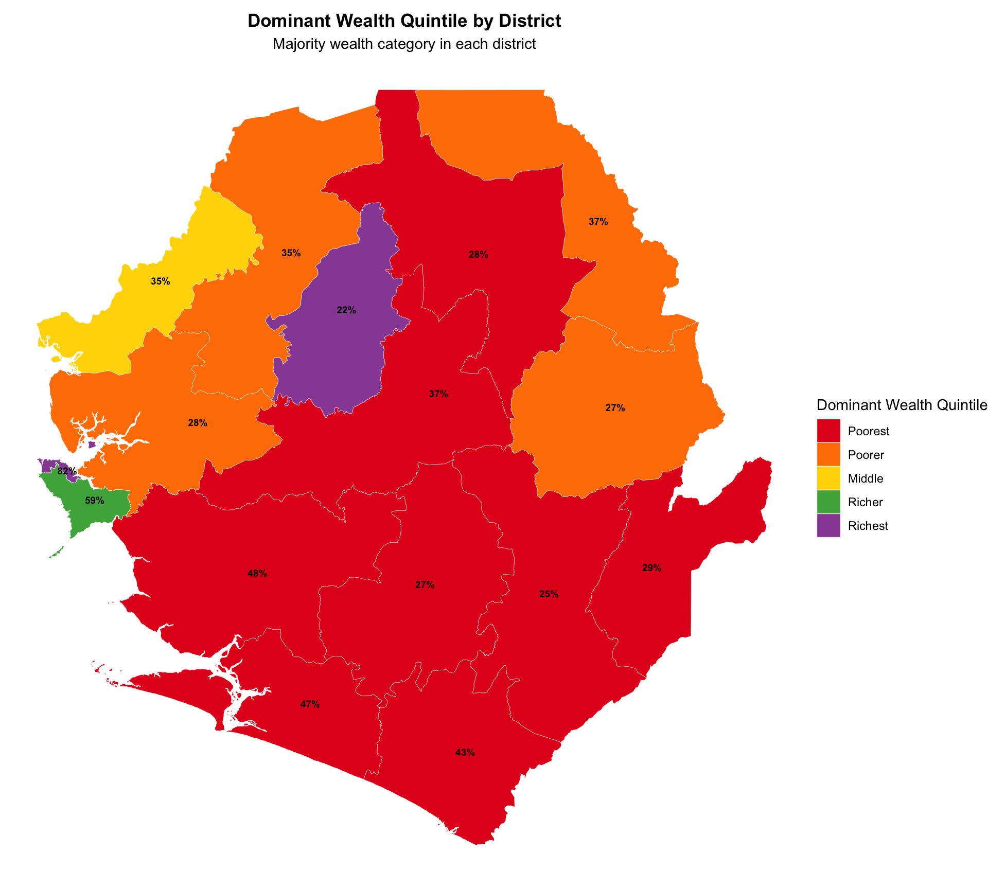
# Dominant wealth quintile by district with custom colors
plot_dominant_quintile_adm2 <- dominant_quintile_adm2_map |>
ggplot2::ggplot() +
ggplot2::geom_sf(ggplot2::aes(fill = dominant_quintile), color = "white", size = 0.1) +
# Use custom colors instead of brewer palette
ggplot2::scale_fill_manual(
values = wealth_quintile_colors,
name = "Dominant Wealth Quintile"
) +
ggplot2::labs(
title = "Dominant Wealth Quintile by District",
subtitle = "Majority wealth category in each district"
) +
ggplot2::theme_void() +
ggplot2::theme(
legend.position = "right",
plot.title = ggplot2::element_text(face = "bold", hjust = 0.5),
plot.subtitle = ggplot2::element_text(hjust = 0.5)
)
# Add proportion labels to the map
plot_dominant_quintile_adm2 <- plot_dominant_quintile_adm2 +
ggplot2::geom_sf_text(
ggplot2::aes(label = scales::percent(dominant_prop, accuracy = 1)),
size = 2.5,
color = "black",
fontface = "bold"
)
NoteOutput
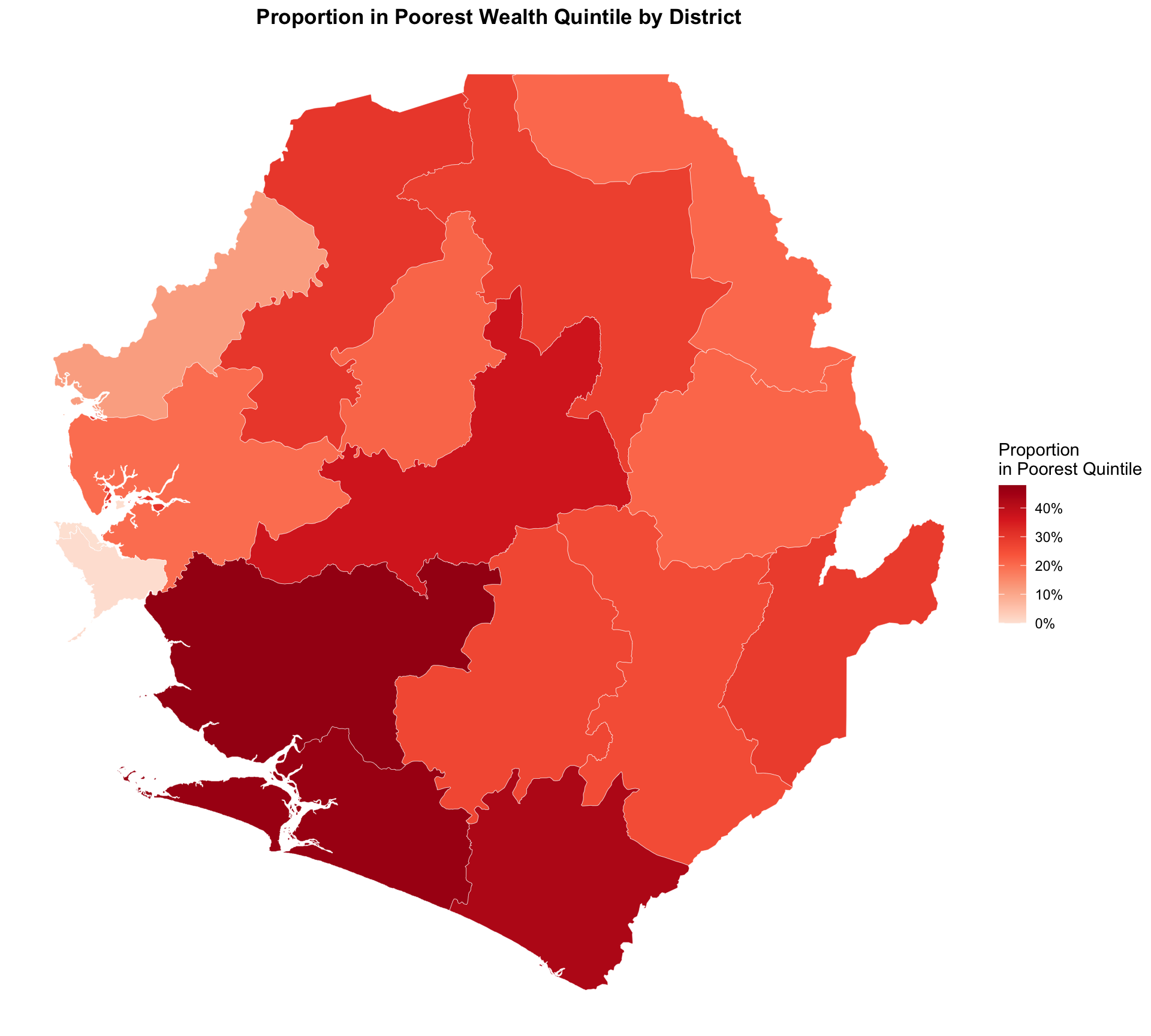
Step 4.3: Visualize proportion of districts in poorest wealth quintile
Show the code
# Proportion in poorest quintile by district
plot_poorest_adm2 <- wealth_distribution_final |>
  dplyr::filter(quintile_label == "poorest") |>
  ggplot2::ggplot() +
  ggplot2::geom_sf(ggplot2::aes(fill = proportion), color = "white", size = 0.1) +
ggplot2::scale_fill_gradientn(
    colors = c("#fee5d9", "#fcae91", "#fb6a4a", "#de2d26", "#a50f15"),
    name = "Proportion\nin Poorest Quintile",
    labels = scales::percent
    ) +
  ggplot2::labs(
    title = "Proportion in Poorest Wealth Quintile by District"
  ) +
  ggplot2::theme_void() +
  ggplot2::theme(
    legend.position = "right",
    plot.title = ggplot2::element_text(face = "bold", hjust = 0.5),
    plot.subtitle = ggplot2::element_text(hjust = 0.5)
  )
NoteOutput
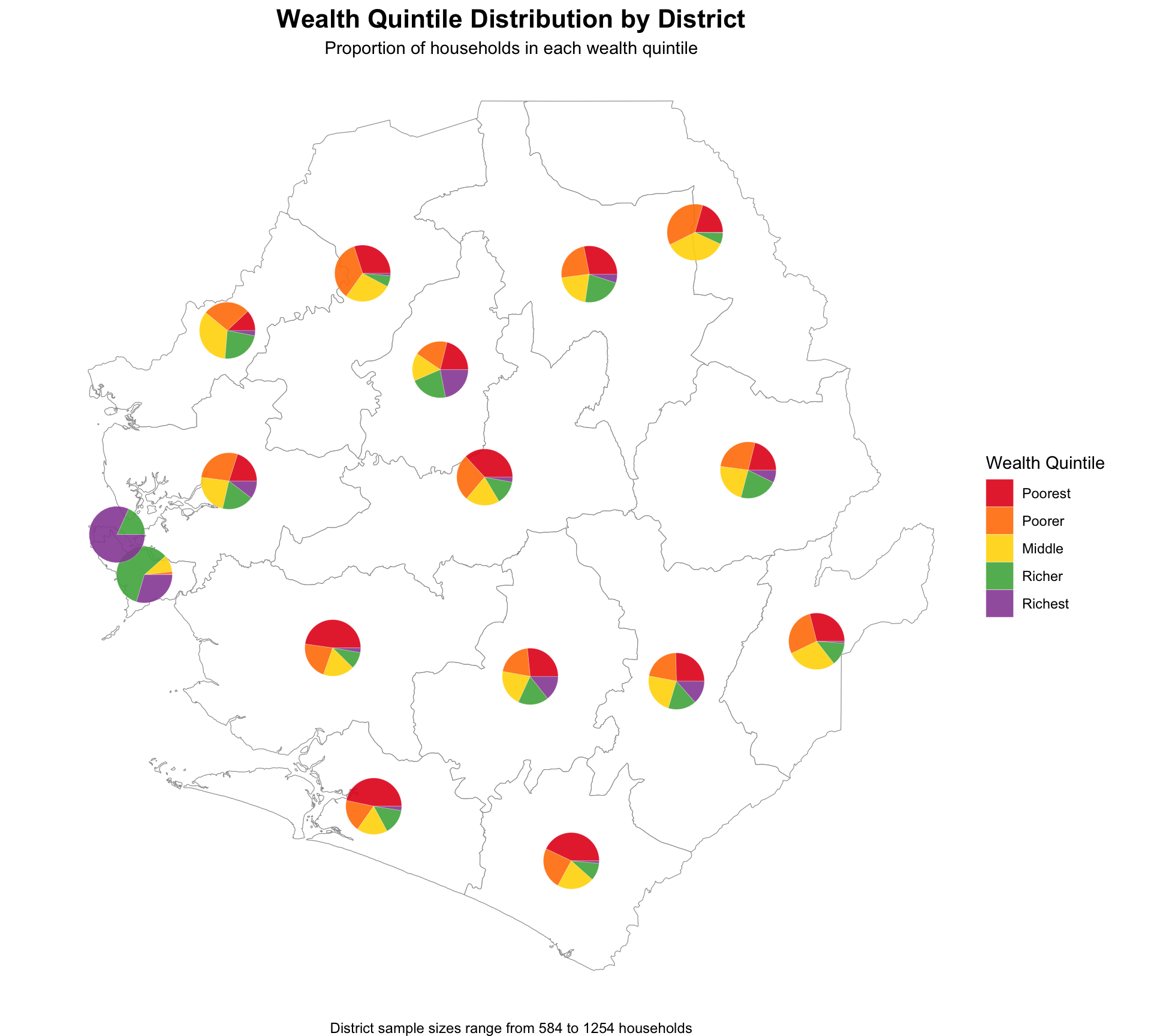
Step 4.4: Visualize quintile proportions by district
Show the code
# Calculate district centroids for pie chart placement
district_centroids <- sle_dhs_shp2 |>
  sf::st_centroid() |>
  sf::st_coordinates() |>
  as.data.frame() |>
  dplyr::bind_cols(adm2 = sle_dhs_shp2$adm2) |>
  dplyr::rename(longitude = X, latitude = Y)

# Prepare wealth data for pie charts - reaggregate at district level
wealth_pie_data <- sle_dhs_hr |>
  dplyr::group_by(adm2) |>
  dplyr::summarise(
    total_weight = sum(sample_weight, na.rm = TRUE),
    Q1 = sum(sample_weight * (wealth_quintile == 1), na.rm = TRUE) / total_weight,
    Q2 = sum(sample_weight * (wealth_quintile == 2), na.rm = TRUE) / total_weight,
    Q3 = sum(sample_weight * (wealth_quintile == 3), na.rm = TRUE) / total_weight,
    Q4 = sum(sample_weight * (wealth_quintile == 4), na.rm = TRUE) / total_weight,
    Q5 = sum(sample_weight * (wealth_quintile == 5), na.rm = TRUE) / total_weight,
    sample_size = dplyr::n(),
    .groups = "drop"
  ) |>
  # Join with centroids for positioning
  dplyr::left_join(district_centroids, by = "adm2")

# Prepare data for pie charts
wealth_pie_ggforce <- wealth_pie_data |>
  tidyr::pivot_longer(
    cols = c(Q1, Q2, Q3, Q4, Q5),
    names_to = "quintile",
    values_to = "proportion"
  ) |>
  dplyr::group_by(adm2) |>
  dplyr::mutate(
    # Calculate start and end angles for each segment
    end_angle = cumsum(proportion) * 2 * pi,
    start_angle = lag(end_angle, default = 0),
    # Convert quintile to factor with proper order
    quintile = factor(quintile,
                     levels = c("Q1", "Q2", "Q3", "Q4", "Q5"),
                     labels = c("Poorest", "Poorer", "Middle", "Richer", "Richest"))
  ) |>
  dplyr::ungroup()

# Create pie chart map
wealth_pie_map <- ggplot2::ggplot() +
  # Base map
  ggplot2::geom_sf(data = sle_dhs_shp2, fill = "white", color = "gray60", linewidth = 0.2) +
  # Pie charts
  ggforce::geom_arc_bar(
    data = wealth_pie_ggforce,
    ggplot2::aes(
      x0 = longitude,
      y0 = latitude,
      r0 = 0,
      r = 0.08,  # Radius of pies
      start = start_angle,
      end = end_angle,
      fill = quintile
    ),
    color = "white",
    linewidth = 0.1
  ) +
  ggplot2::scale_fill_manual(
    values = wealth_quintile_colors,
    name = "Wealth Quintile"
  ) +
  ggplot2::labs(
    title = "Wealth Quintile Distribution by District",
    subtitle = "Proportion of households in each wealth quintile",
    caption = paste("District sample sizes range from",
                   min(wealth_pie_data$sample_size), "to",
                   max(wealth_pie_data$sample_size), "households")
  ) +
  ggplot2::theme_void() +
  ggplot2::theme(
    plot.title = ggplot2::element_text(face = "bold", hjust = 0.5, size = 16),
    plot.subtitle = ggplot2::element_text(hjust = 0.5, size = 11),
    legend.position = "right"
  )
NoteOutput
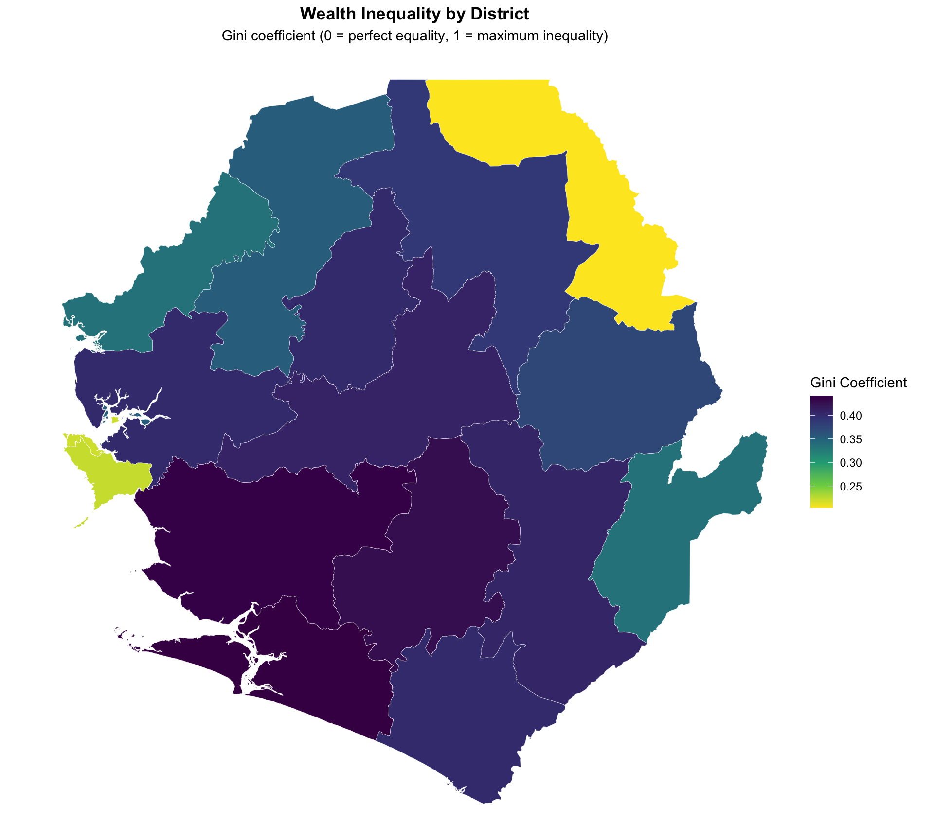
Step 4.5: Visualize wealth inequality using Gini coefficient
Show the code
# Gini coefficient by district
plot_gini_adm2 <- gini_final |>
  ggplot2::ggplot() +
  ggplot2::geom_sf(ggplot2::aes(fill = gini), color = "white", size = 0.1) +
  ggplot2::scale_fill_viridis_c(
    option = "viridis",
    direction = -1,
    name = "Gini Coefficient"
  ) +
  ggplot2::labs(
    title = "Wealth Inequality by District",
    subtitle = "Gini coefficient (0 = perfect equality, 1 = maximum inequality)"
  ) +
  ggplot2::theme_void() +
  ggplot2::theme(
    legend.position = "right",
    plot.title = ggplot2::element_text(face = "bold", hjust = 0.5),
    plot.subtitle = ggplot2::element_text(hjust = 0.5)
  )

# Add sample size reliability indicators for Gini map
plot_gini_adm2 <- plot_gini_adm2 +
  ggplot2::geom_sf(
    data = gini_final |> dplyr::filter(!reliable_estimate),
    fill = NA,
    color = "red",
    size = 0.3,
    linetype = "dashed"
  )
NoteOutput
Step 5: Save processed wealth analysis data
Save the wealth analysis outputs for integration into SNT workflows.
# define save directory
save_path <- here::here("1.6_health_systems/1.6a_dhs")

# Save wealth quintile distributions
rio::export(
  wealth_quintile_adm1,
  here::here(save_path, "processed", "wealth_quintile_distributions.csv")
)

# Save Gini coefficients
rio::export(
  gini_by_region,
  here::here(save_path, "processed", "wealth_gini_coefficients.csv")
)

# Save combined wealth analysis dataset
wealth_analysis_final <- list(
  quintile_distributions = wealth_quintile_adm2,
  gini_coefficients = gini_by_region
)

saveRDS(
  wealth_analysis_final,
  here::here(save_path, "processed", "complete_wealth_analysis.rds")
)
Summary
Wealth quintile analysis provides critical insights for equity-focused malaria programming in SNT. By understanding the socioeconomic distribution of populations and how intervention coverage varies by wealth status, SNT teams can make evidence-based decisions to ensure malaria interventions reach the most vulnerable populations effectively.
The methodology presented here follows DHS guidelines and provides reproducible approaches for calculating wealth distributions and Gini coefficients at subnational levels.