# install `pacman` if not already installed
if (!requireNamespace("pacman", quietly = TRUE)) {
  install.packages("pacman")
}

# load required packages using pacman
pacman::p_load(
  dplyr,        # data manipulation
  ggplot2,      # plotting
  ggtext,       # markdown text in ggplot2
  here,         # file path management
  lubridate,    # date handling
  naniar,       # missing data visualization and analysis
  tidyr,        # data reshaping
  cli,          # clean logging and CLI-style messages
  scales,       # number formatting
  UpSetR,       # upset plots for co-missingness
  wesanderson   # color palettes
)Missing data detection methods
Overview
Missing data is a persistent challenge in public health datasets and is particularly relevant to the SNT process, where multiple data sources must be integrated across time, administrative levels, and reporting platforms. The completeness and consistency of these data underpin risk stratification, resource allocation, and the evaluation of intervention impact.
This challenge is most acute in sub-Saharan Africa, where 95% of global malaria deaths occur and health information systems face the greatest structural pressures. In routine systems such as DHIS2, which serve as the backbone for malaria reporting across the region, missing data may follow recognizable patterns linked to health system functioning, though some degree of randomness can also be present. Not all missingness is due to error, and not all of it should or can be imputed.
Gaps in DHIS2 data are shaped by underlying structural constraints. These include internet outages, delayed uploads, limited supervision, register stockouts, staff shortages, and unclear handling of zeros versus missing values. These issues contribute to uneven reporting patterns across facility types and seasons. Hospitals tend to report less consistently than health posts, as seen in Senegal, where health posts maintained higher reporting completeness than hospitals over multiple years. Reporting is also more complete during the rainy season, with some months showing a 7.5% increase in submissions (Senegal). In Ghana, outpatient totals were frequently submitted while key malaria treatment indicators were left blank, creating selective gaps. Similarly, in Nigeria’s Gombe State, nearly 40% of expected monthly records were incomplete, and intervention-related indicators like IPTp showed disproportionately high rates of missingness. During campaigns or periods of high workload, parallel reporting systems and competing priorities further increase the risk of missing or conflicting data, as shown in Ethiopia and Tanzania, where fragmented systems and unclear use of blanks weakened data reliability.
These systematic gaps create analytical blind spots that compromise SNT outputs. Areas with weak surveillance may appear to have lower burden due to underreporting, while high-burden areas with poor connectivity can be underrepresented in resource allocation. If not addressed, missing data bias estimates, distort risk stratification, misrepresent coverage, and weaken the link between inputs and outcomes. They also reduce the stability of risk maps and the reliability of impact projections.
At the same time, not all missing data should be imputed. Some gaps are due to non-active HF status, such as a facility not yet operational. Others reflect values missing for reasons that cannot be inferred from the available data. In these cases, imputation is not appropriate. We must first understand why data are missing. This involves assessing whether the missingness is completely at random, related to other observed variables, or related to the missing values themselves.
Given the complexity of these decisions, dropping incomplete records is rarely justified. Understanding the cause and patterns of missingness is necessary for determining appropriate analytical approaches, whether that involves excluding certain records, applying logical inference, or implementing statistical methods that preserve the spatial and temporal structure of the data.
NoteObjectives
- Learn systematic approaches to detect and visualize missing data patterns in surveillance systems
- Examine missingness across temporal, spatial, and demographic dimensions
- Identify structural zeros, legitimate zeros, and logical inconsistencies in related indicators
- Distinguish between MCAR, MAR, and MNAR missing data mechanisms
- Apply diagnostic visualizations to assess data quality and reporting completeness
- Generate comprehensive missing data assessments to inform analytical decisions
Understanding Missing Data
Before proceeding with any analytical approach, it is important to understand the types of missingness present in the dataset, and to identify the most appropriate methods for addressing each type, whether through exclusion, clinical logic, or statistical techniques.
Understanding Types of Missing Data
When working with incomplete data, it’s important to understand why values are missing. This determines whether imputation is appropriate.
TipKey patterns to examine to help determine the type of missingness
- Temporal gaps: Are some months or seasons consistently underreported?
- Spatial gaps: Are there consistent patterns across districts or regions? When facility data are sparse, higher-level patterns can inform analytical approaches using neighbouring facilities of the same type.
- Facility-level gaps: Do reporting rates vary by facility type (e.g., hospitals vs health posts), ownership, or service volume?
- Demographic gaps: Are data more frequently missing for specific age groups (e.g., under-fives, adolescents, pregnant women)?
- Variable-level gaps: Are certain indicators (e.g.,
IPTp3,ACTavailability) more frequently left blank?
These patterns help identify where missingness occurs and why it occurs. Understanding these patterns is the first step in diagnosing whether missingness is Missing Completely At Random (MCAR), Missing At Random (MAR), or Missing Not At Random (MNAR).
Once patterns are identified, use them to assess the mechanism behind the missing values. There are three main types of missingness, and understanding which type we are dealing with helps us make informed analytical decisions about how to handle the missing data.
Not all gaps in the data reflect missingness. Some values are absent because they were never expected to be present in the first place. These reflect non-active HF status, not missing data. For example, a facility may not have been operational during a particular period, or may never have reported on a specific indicator. In such cases, the absence of data should be marked as not applicable and excluded from any imputation procedure.
- Missing Completely At Random (MCAR)
What it means: The data are missing for no particular reason. The missingness is unrelated to anything in the dataset.
Example: Suppose some monthly reports are missing because a stack of paper forms was lost in a flood. The flood didn’t target specific facilities or months, it was random. In this case, the missing data is MCAR.
Implication: Imputation is generally acceptable for MCAR data using simple methods. However, we can safely analyze the non-missing data. It is still representative of the whole.
- Missing At Random (MAR)
What it means: The missingness is related to something else in the dataset, but not to the missing value itself.
Example: Imagine that reports of confirmed malaria cases are more likely to be missing from hospitals than health posts. But we know which facilities are hospitals and which are health posts. So the missingness is not random, but it is explainable based on another variable facility type.
Implication: We can use the information we have (like facility type, month, or region) to predict and impute the missing values. Most imputation methods assume MAR.
- Missing Not At Random (MNAR)
What it means: The missingness is related to the value that is missing, and it cannot be explained using other information in the data.
Example: Suppose some facilities do not report malaria deaths because they fear it reflects badly on their performance. The missingness is not random and not explained by any variable in the dataset. We do not know which deaths are missing, and we cannot reliably estimate them.
Implication: Imputation is risky. The data are biased in a way that cannot be corrected without more information.
| Type | What Causes It | Can Be Imputed? | Example |
|---|---|---|---|
| MCAR | Random external factors unrelated to any variable in the dataset | Yes | Monthly reports lost in a flood, no systematic pattern by location, time, or indicator |
| MAR | Missingness depends on observed variables | Yes | Hospitals report less consistently than health posts, but facility type is known and recorded |
| MNAR | Missingness depends on the unobserved value itself | Not recommended | Facilities underreport malaria deaths to avoid scrutiny; missingness cannot be explained using other variables |
ImportantConsult with SNT team
If the missingness mechanism is unclear (MCAR, MAR, or MNAR), consult the SNT team. Patterns that seem technical may reflect known operational issues (e.g., stockouts, parallel reporting during campaigns). Getting their input early can prevent incorrect imputation choices later.
Step-by-Step
This step-by-step section shows how to systematically detect missingness patterns using our Sierra Leone DHIS2 data (previously assembled in the DHIS2 data preprocessing page). It builds on the principles outlined above, emphasizing the importance of detecting and understanding missing data patterns.
The examples focus on identifying temporal, spatial, and systematic patterns in missingness that inform our classification decisions. Understanding these patterns is necessary before proceeding to the Imputation Methods page, where we implement structural and statistical imputation techniques.
Step 1: Install and Load Libraries
First, install and/or load the necessary packages for data manipulation, visualization, and missing data detection.
To adapt the code:
- Do not modify anything in the code above
Show the code
from pathlib import Path

import matplotlib.pyplot as plt
import matplotlib.colors as mcolors
import matplotlib.ticker as mticker
import numpy as np
import pandas as pd
from pyprojroot import here

# ── cli helpers ──────────────────────────────────────────────────────────────
def cli_header(message):
    print(f"\n{message}")

def cli_info(message):
    print(f"INFO: {message}")

def cli_success(message):
    print(f"SUCCESS: {message}")

def cli_warning(message):
    print(f"WARNING: {message}")

def cli_danger(message):
    print(f"ERROR: {message}")

def anti_join(left, right, on):
    """Return rows in left with no matching key in right."""
    right_keys = right[on].drop_duplicates()
    return (
        left.merge(right_keys, on=on, how="left", indicator=True)
        .loc[lambda x: x["_merge"] == "left_only"]
        .drop(columns="_merge")
    )
To adapt the code:
- Do not modify anything in the code above
Step 2: Load Data
Load the DHIS2 surveillance data and prepare it for missing data detection.
In this example, we focus on the past five years (the data stops in December 2023), so filter out anything before 2019.
Show the code
# read the processed surveillance data produced by the import workflow
df_routine <- readRDS(
  here::here(
    "01_data",
    "1.2_epidemiology",
    "1.2a_routine_surveillance",
    "processed",
    "clean_malaria_routine_data_final.rds"
  )
) |>
  # drop the import-source label carried over from import.qmd
  dplyr::select(-dplyr::any_of("sheet_admin")) |>
  # filter to the past five years
  dplyr::filter(year >= 2019) |>
  dplyr::rename(maladm_hf_u5 = maladm_u5) |>
  dplyr::mutate(
    # ym: human-readable year-month label used as a discrete x-axis
    ym = format(date, "%Y-%m"),
    # date stays as Date (already Date in the .rds produced by import.qmd)
    date = as.Date(date)
)To adapt the code:
- Lines 2-8: Update the path to point at the processed routine surveillance file produced by the import workflow (see the DHIS2 data preprocessing page).
- Line 14: Filter the data to the period of interest.
- Line 15: Drop the
dplyr::rename()line if the dataset already uses the target column name.
Show the code
from pathlib import Path

import pandas as pd
from pyprojroot import here

# read the processed surveillance data produced by the import workflow.
# the .rds (loaded by R) and .parquet (loaded here) are written from the
# same dhis2_df in import.qmd, so both languages see identical data.
data_path = Path(here(
    "01_data/1.2_epidemiology/1.2a_routine_surveillance/processed/"
    "clean_malaria_routine_data_final.parquet"
))

df_routine = (
    pd.read_parquet(data_path)
    # drop the import-source label carried over from import.qmd
    .drop(columns="sheet_admin", errors="ignore")
    # filter to the past five years
    .loc[lambda d: d["year"] >= 2019]
    .rename(columns={"maladm_u5": "maladm_hf_u5"})
    .assign(date=lambda d: pd.to_datetime(d["date"], errors="coerce"))
    .assign(ym=lambda d: d["date"].dt.strftime("%Y-%m"))
    .reset_index(drop=True)
)To adapt the code:
- Lines 6-12: Update the path to point at the processed routine surveillance file produced by the import workflow (see the DHIS2 data preprocessing page).
- Line 19: Filter the data to the period of interest.
- Line 20: Drop the
.rename()line if the dataset already uses the target column name.
Step 3: Distinguish Reporting Gaps from Indicator-Level Missingness
Before drilling into temporal, spatial, and facility-type patterns, it helps to separate three concepts that often get lumped together as “missing data”:
- Reporting completeness: was a report submitted at all for a given facility-month?
- Conditional missingness: given that a report was submitted, which indicators were left blank?
- Non-applicable periods: months before a facility was operational or after it stopped reporting are not missing. They are simply not expected.
A vertical band of “missing” months in a heatmap usually means no report was submitted (the entire row is NA). A single missing cell within an otherwise complete report has a very different meaning and a different mechanism. Untangling these is the first step before any of the visualisations below can be interpreted correctly.
WarningFilter to active facility-months first
Non-applicable periods (months before a facility was operational, after it stopped reporting, or during gaps in reporting) are defined on the Determining active and inactive status page. Run that workflow first; the analyses below assume df_routine has been filtered to active facility-months. Mixing in not-yet-active or already-inactive months will inflate the missing rates we see in every subsequent step.
Step 3.1: Conditional missingness within submitted reports
A facility-month is treated as a submitted report when at least one core indicator is non-missing. Among submitted reports, the percentage of each indicator left blank tells us whether the missingness is form-completion practice (specific indicators selectively skipped) or reporting failure (whole rows missing). Within an active facility-month, a missing indicator should reflect the former.
Show the code
# define the core indicators that signal a report was submitted
core_inds <- c("test", "conf", "maltreat")

# flag each facility-month as reporting or non-reporting
df_routine <- df_routine |>
  dplyr::mutate(
    report_submitted = dplyr::if_any(
      dplyr::all_of(core_inds),
      ~ !is.na(.x)
    )
  )

# conditional missingness: within submitted reports only,
# what % of each indicator was left blank?
conditional_missing <- df_routine |>
  dplyr::filter(report_submitted) |>
  dplyr::summarise(
    dplyr::across(
      dplyr::all_of(core_inds),
      ~ round(mean(is.na(.x)) * 100, 1)
    )
  ) |>
  tidyr::pivot_longer(
    dplyr::everything(),
    names_to = "indicator",
    values_to = "pct_missing_given_reported"
  )

conditional_missing |>
  dplyr::rename(
    Indicator = indicator,
    `% missing given reported` = pct_missing_given_reported
  ) |>
knitr::kable(align = "lr", digits = 1)To adapt the code:
- Line 2: Update
core_indsto the indicators that signal a report was submitted in the dataset.
Show the code
import pandas as pd

# define the core indicators that signal a report was submitted
core_inds = ["test", "conf", "maltreat"]

# flag each facility-month as reporting or non-reporting
df_routine = df_routine.assign(
    report_submitted=lambda d: d[core_inds].notna().any(axis=1)
)

# conditional missingness: within submitted reports only,
# what % of each indicator was left blank?
conditional_missing = (
    df_routine.loc[df_routine["report_submitted"]]
    [core_inds]
    .isna()
    .mean()
    .mul(100)
    .round(1)
    .rename_axis("indicator")
    .reset_index(name="pct_missing_given_reported")
)

conditional_missingTo adapt the code:
- Line 4: Update
core_indsto the indicators that signal a report was submitted in the dataset.
Step 3.2: Quantitative summary across variables
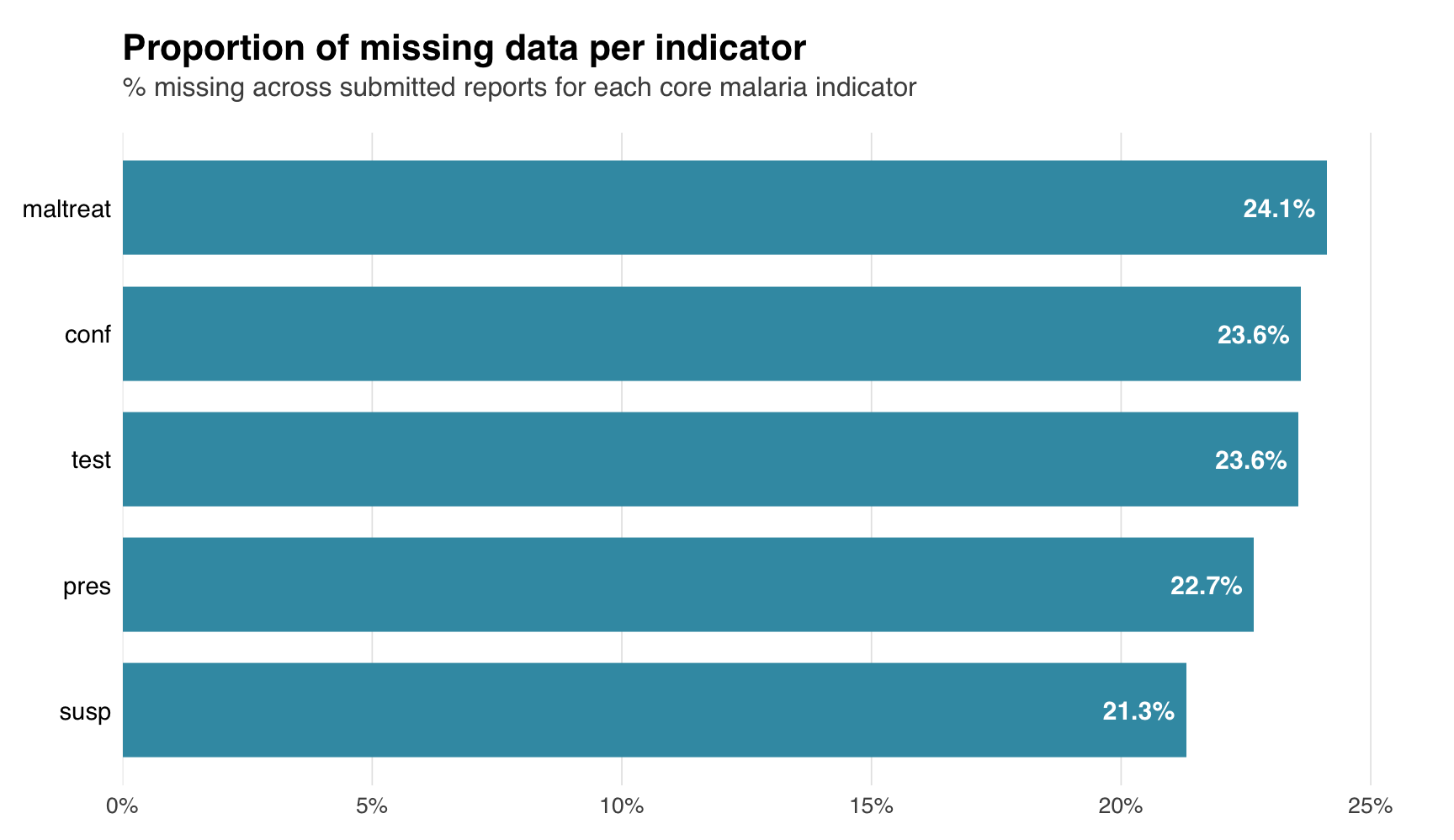
A tabular summary and bar chart give a per-variable view of overall missingness. The bar chart sorts indicators by missing rate, making it easy to spot indicators that warrant closer inspection.
Show the code
# variables to summarise
summary_vars <- c("test", "susp", "pres", "conf", "maltreat")

# compute % missing for the core aggregated indicators
miss_summary <- naniar::miss_var_summary(
  df_routine |>
    dplyr::select(dplyr::all_of(summary_vars))
) |>
  dplyr::mutate(pct_miss = as.numeric(pct_miss))

# bar chart of % missing per variable
miss_summary |>
  dplyr::mutate(
    variable = factor(variable, levels = rev(variable)),
    label_text = paste0(round(pct_miss, 1), "%"),
    inside = pct_miss > max(pct_miss) * 0.15
  ) |>
  ggplot2::ggplot(ggplot2::aes(x = pct_miss, y = variable)) +
  ggplot2::geom_col(fill = "#3B9AB2", width = 0.75) +
  ggplot2::geom_text(
    ggplot2::aes(
      label = label_text,
      hjust = ifelse(inside, 1.15, -0.15),
      colour = ifelse(inside, "white", "grey20")
    ),
    size = 4,
    fontface = "bold",
    family = "sans"
  ) +
  ggplot2::scale_colour_identity() +
  ggplot2::scale_x_continuous(
    expand = ggplot2::expansion(mult = c(0, 0.05)),
    labels = function(x) paste0(x, "%")
  ) +
  ggplot2::labs(
    title = "Proportion of missing data per indicator",
    subtitle = paste(
      "% missing across submitted reports for each",
      "core malaria indicator"
    ),
    x = NULL,
    y = NULL
  ) +
  ggplot2::theme_minimal(base_family = "sans") +
  ggplot2::theme(
    plot.title = ggplot2::element_text(
      size = 16,
      face = "bold",
      margin = ggplot2::margin(b = 4)
    ),
    plot.subtitle = ggplot2::element_text(
      size = 12,
      colour = "grey30",
      margin = ggplot2::margin(b = 14)
    ),
    axis.text.y = ggplot2::element_text(size = 11, colour = "black"),
    axis.text.x = ggplot2::element_text(size = 10, colour = "grey30"),
    panel.grid.major.y = ggplot2::element_blank(),
    panel.grid.minor = ggplot2::element_blank(),
    panel.grid.major.x = ggplot2::element_line(
      colour = "grey90",
      size = 0.3
    ),
    axis.ticks = ggplot2::element_blank(),
    plot.margin = ggplot2::margin(15, 30, 10, 10)
  )
NoteOutput
To adapt the code:
- Line 2: Update
summary_varsto match the dataset’s indicators of interest.
TipCo-missingness and Little’s MCAR test as additional diagnostics
Two extensions to the diagnostics above are useful when the basic summary leaves the mechanism ambiguous:
- Co-missingness:
naniar::gg_miss_upset(df_routine |> dplyr::select(test, susp, pres, conf, maltreat), nsets = 5)shows which indicators are missing together. Requires theUpSetRpackage. A single large intersection points to report-level reporting failure; many small intersections point to form completion practice. - Little’s MCAR test:
naniar::mcar_test(df_routine |> dplyr::select(test, conf, maltreat))returns a p-value for the null hypothesis that data are MCAR. A small p-value supports MAR or MNAR. The test can be slow on large datasets.
Show the code
import matplotlib.pyplot as plt
import matplotlib.ticker as mticker
import pandas as pd

# tabular summary of % missing for the core aggregated indicators
summary_vars = ["test", "susp", "pres", "conf", "maltreat"]

miss_summary = (
    pd.DataFrame({
        "variable": summary_vars,
        "n_miss": [df_routine[v].isna().sum() for v in summary_vars],
        "pct_miss": [
            round(df_routine[v].isna().mean() * 100, 1)
            for v in summary_vars
        ],
    })
    .sort_values("pct_miss", ascending=False)
    .reset_index(drop=True)
)

# bar chart of % missing per variable (horizontal, sorted descending)
vmax = float(miss_summary["pct_miss"].max())
threshold = vmax * 0.15

fig, ax = plt.subplots(figsize=(9, 5.2))
bars = ax.barh(
    miss_summary["variable"],
    miss_summary["pct_miss"],
    color="#3B9AB2",
    height=0.75
)
ax.invert_yaxis()

# value labels: inside the bar (white) when there is room,
# outside (grey) for short bars
for bar, val in zip(bars, miss_summary["pct_miss"]):
    label = f"{round(val, 1)}%"
    if val > threshold:
        ax.text(
            val - vmax * 0.012,
            bar.get_y() + bar.get_height() / 2,
            label,
            va="center",
            ha="right",
            color="white",
            fontsize=11,
            fontweight="bold"
        )
    else:
        ax.text(
            val + vmax * 0.012,
            bar.get_y() + bar.get_height() / 2,
            label,
            va="center",
            ha="left",
            color="#333333",
            fontsize=11,
            fontweight="bold"
        )

# title (large, bold) + subtitle (smaller, grey)
fig.suptitle(
    "Proportion of missing data per indicator",
    fontsize=16,
    fontweight="bold",
    x=0.05,
    ha="left",
    y=0.98
)
ax.set_title(
    "% missing across submitted reports for each core malaria indicator",
    fontsize=12,
    color="#555555",
    loc="left",
    pad=8
)

ax.set_xlabel("")
ax.set_ylabel("")
ax.xaxis.set_major_formatter(
    mticker.FuncFormatter(lambda x, _: f"{int(x)}%")
)
ax.tick_params(left=False, labelsize=11, colors="#333333")
ax.tick_params(axis="x", colors="#555555", labelsize=10)

# clean look: no border, only faint x gridlines
for spine in ax.spines.values():
    spine.set_visible(False)
ax.grid(axis="x", color="#E5E5E5", linewidth=0.6)
ax.grid(axis="y", visible=False)
ax.set_axisbelow(True)
ax.set_xlim(0, max(vmax * 1.05, 10))

plt.tight_layout(rect=[0, 0, 1, 0.94])
NoteOutput
(0.0, 25.305000000000003)
To adapt the code:
- Line 6: Update the indicator list in
summary_varsto match the dataset.
ImportantConsult with SNT team
Indicators that show very high or 100% missingness are often a signal that the value lives elsewhere, not that it is genuinely absent. SNT data management is iterative: an indicator that appears empty at the facility level may sit in a different mother dataset (an aggregated reporting form, a separate platform module, a parallel reporting system, or a renamed field). Before treating these indicators as analytical gaps, consult the SNT team to confirm whether the indicator is collected elsewhere or whether the dataset under analysis is the right starting point. What looks like a data problem is often a sourcing problem the team has already resolved.
The conditional missingness table and the overall summary together tell us whether the gaps we see downstream are predominantly reporting failures (whole rows missing, all indicators co-missing) or form completion practice (specific indicators missing despite a report being filed). The two require different responses on the Imputation Methods page.
Step 4: Check Missingness over Time
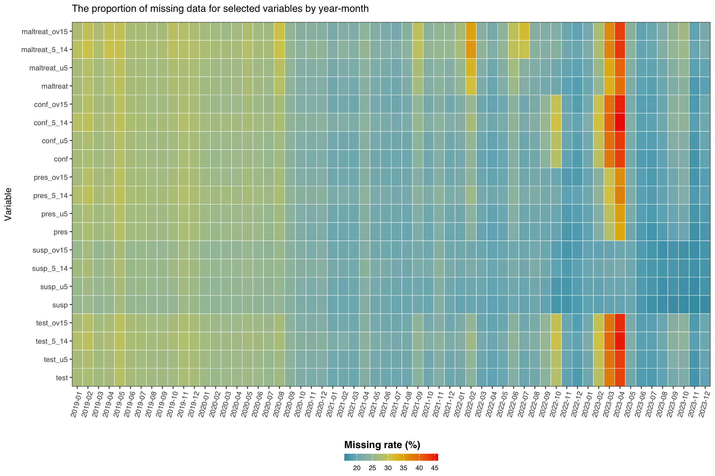
In this step, we check the missingness rate of our variables of interest across time. This analysis helps us understand temporal patterns in data availability and identify periods or variables with systematic missing data issues. The heatmap visualization provides an overview of data completeness across all malaria indicators for different age groups throughout the study period. The color intensity represents the percentage of missing values, allowing us to quickly identify problematic time periods or variables that may require special handling in subsequent analyses.
Initially, we want to check the following set of variables: malaria tests, suspected, presumed and confirmed cases and malaria treatments aggregated across all age groups, as well as the age-specific breakdowns.
Show the code
# get the variables of interest (aggregated and age-specific)
vars <- c(
  "test",        # aggregated malaria tests
  "test_u5",
  "test_5_14",
  "test_ov15",
  "susp",        # aggregated suspected cases
  "susp_u5",
  "susp_5_14",
  "susp_ov15",
  "pres",        # aggregated presumed cases
  "pres_u5",
  "pres_5_14",
  "pres_ov15",
  "conf",        # aggregated confirmed cases
  "conf_u5",
  "conf_5_14",
  "conf_ov15",
  "maltreat",    # aggregated treatments
  "maltreat_u5",
  "maltreat_5_14",
  "maltreat_ov15"
)

# calculate missing rates by date for each variable
missing_rate_date <- df_routine |>
  dplyr::group_by(date) |>
  dplyr::summarise(
    dplyr::across(
      dplyr::all_of(vars),
      ~ mean(is.na(.x)) * 100
    ),
    .groups = "drop"
  ) |>
  dplyr::arrange(date) |>
  tidyr::pivot_longer(
    cols = -ym,
    names_to = "variables",
    values_to = "missing_rate"
  ) |>
  # enforce the explicit `vars` order on the y-axis so R and Python match
  dplyr::mutate(variables = factor(variables, levels = vars))

# option to control the color scale range for the heatmap
# if TRUE: color scale goes from 0-100% (full range of possible missing rates,
# even if actual data doesnt cover this range)
# if FALSE: color scale is limited to actual range of missingness in the data
# (e.g., if missing rates range from 20-70%, color scale only
# covers that range)
full_range <- FALSE

# set fill scale limits based on full_range option
fill_limits <- if (full_range) {
  c(0, 100) # use full 0-100% range for color scale
} else {
  # use actual range of missing rates in the data for color scale
  fill_var_values <- missing_rate_date$missing_rate
  c(
    floor(min(fill_var_values, na.rm = TRUE)),
    ceiling(max(fill_var_values, na.rm = TRUE))
  )
}

# plot the missing range across variables
missing_plot_date <- ggplot2::ggplot(
  missing_rate_date,
  ggplot2::aes(
    y = variables,
    x = ym,
    fill = missing_rate
  )
) +
  ggplot2::geom_tile(colour = "white", linewidth = .2) +
  ggplot2::scale_fill_gradientn(
    colours = wesanderson::wes_palette(
      "Zissou1",
      100,
      type = "continuous"
    ),
    limits = fill_limits
  ) +
  ggplot2::guides(
    fill = ggplot2::guide_colorbar(
      title.position = "top",
      nrow = 1,
      label.position = "bottom",
      direction = "horizontal",
      barheight = ggplot2::unit(0.3, "cm"),
      barwidth = ggplot2::unit(4, "cm"),
      ticks = TRUE,
      draw.ulim = TRUE,
      draw.llim = TRUE
    )
  ) +

  ggplot2::scale_x_discrete(expand = c(0, 0)) +
  ggplot2::scale_y_discrete(expand = c(0, 0)) +
  ggplot2::theme_bw() +
  ggplot2::theme(
    legend.title = ggplot2::element_text(
      size = 12,
      face = "bold",
      family = "sans"
    ),
    legend.position = "bottom",
    legend.direction = "horizontal",
    legend.box = "horizontal",
    legend.box.just = "center",
    legend.margin = ggplot2::margin(t = 0, unit = "cm"),
    legend.text = ggplot2::element_text(
      size = 8,
      family = "sans"
    ),
    axis.title.x = ggplot2::element_text(
      margin = ggplot2::margin(t = 5, unit = "pt")
    ),
    axis.title.y = ggplot2::element_text(
      margin = ggplot2::margin(r = 10, unit = "pt")
    ),
    axis.text.x = ggplot2::element_text(
      angle = 75,
      hjust = 1,
      family = "sans"
    ),
    axis.text = ggplot2::element_text(family = "sans"),
    axis.title = ggplot2::element_text(family = "sans"),
    plot.title = ggtext::element_markdown(
      size = 12,
      family = "sans",
      margin = ggplot2::margin(b = 10)
    ),
    strip.text = ggplot2::element_text(
      family = "sans",
      face = "bold"
    ),
    panel.grid.minor = ggplot2::element_blank(),
    panel.grid.major = ggplot2::element_blank(),
    panel.background = ggplot2::element_blank(),
    strip.background = ggplot2::element_rect(fill = "grey90")
  ) +
  ggplot2::labs(
    fill = "Missing rate (%)",
    y = "Variable",
    x = "",
    title = "The proportion of missing data for selected variables by year-month"
  )

# display the plot
missing_plot_date
NoteOutput
To adapt the code:
- Lines 1-23: Update the
varsvector to match the dataset’s variable names. For a different country or dataset, modify variable names to reflect the relevant indicators (e.g., for Ghana this might becases_u5,tests_5_14, etc.). - Line 26: Replace
df_routinewith the dataset name if different. - Line 50: Set
full_range <- TRUEto span the color scale across 0-100% for consistent comparison across datasets or time periods. Setfull_range <- FALSEto limit the color scale to the actual data range for better visual contrast within the observed missingness patterns.
Show the code
import matplotlib.pyplot as plt
import matplotlib.colors as mcolors
import numpy as np
import pandas as pd

# variables of interest (aggregated and age-specific)
vars_of_interest = [
    "test",           # aggregated malaria tests
    "test_u5",
    "test_5_14",
    "test_ov15",
    "susp",           # aggregated suspected cases
    "susp_u5",
    "susp_5_14",
    "susp_ov15",
    "pres",           # aggregated presumed cases
    "pres_u5",
    "pres_5_14",
    "pres_ov15",
    "conf",           # aggregated confirmed cases
    "conf_u5",
    "conf_5_14",
    "conf_ov15",
    "maltreat",       # aggregated treatments
    "maltreat_u5",
    "maltreat_5_14",
    "maltreat_ov15",
]

# calculate missing rates by year-month for each variable
missing_rate_date = (
    df_routine.groupby("ym", as_index=False)[vars_of_interest]
    .apply(lambda g: g[vars_of_interest].isna().mean() * 100)
    .reset_index()
    .rename(columns={"level_0": "ym"})
)
# rebuild from groupby to preserve ym correctly
_grouped = df_routine.groupby("ym")
missing_rate_date = pd.DataFrame(
    {v: _grouped[v].apply(lambda s: s.isna().mean() * 100)
     for v in vars_of_interest}
).reset_index()

# pivot to long format
missing_rate_long = missing_rate_date.melt(
    id_vars="ym",
    value_vars=vars_of_interest,
    var_name="variables",
    value_name="missing_rate"
).sort_values("ym")

# option to control the color scale range for the heatmap
full_range = False

if full_range:
    vmin, vmax = 0.0, 100.0
else:
    vals = missing_rate_long["missing_rate"].dropna()
    vmin = float(np.floor(vals.min()))
    vmax = float(np.ceil(vals.max()))

# Zissou1 colormap (mirrors wesanderson::wes_palette("Zissou1", 100))
zissou1_colors = ["#3B9AB2", "#78B7C5", "#EBCC2A", "#E1AF00", "#F21A00"]
zissou1_cmap = mcolors.LinearSegmentedColormap.from_list(
    "Zissou1", zissou1_colors, N=100
)

# pivot back to matrix for pcolormesh
ym_order = sorted(missing_rate_long["ym"].unique())
var_order = vars_of_interest  # top-to-bottom order on y-axis

pivot = (
    missing_rate_long
    .pivot(index="variables", columns="ym", values="missing_rate")
    .reindex(index=var_order, columns=ym_order)
)

fig, ax = plt.subplots(figsize=(12, 8))
mesh = ax.pcolormesh(
    np.arange(len(ym_order) + 1),
    np.arange(len(var_order) + 1),
    pivot.values,
    cmap=zissou1_cmap,
    vmin=vmin,
    vmax=vmax,
    linewidth=0.2,
    edgecolors="white"
)
ax.set_aspect("auto")

# x-axis ticks and labels
ax.set_xticks(np.arange(len(ym_order)) + 0.5)
ax.set_xticklabels(ym_order, rotation=75, ha="right", fontsize=8)

# y-axis ticks and labels
ax.set_yticks(np.arange(len(var_order)) + 0.5)
ax.set_yticklabels(var_order, fontsize=8)

ax.set_xlabel("")
ax.set_ylabel("Variable")
ax.set_title(
    "The proportion of missing data for selected variables by year-month",
    fontsize=12, pad=10
)

# horizontal colorbar at the bottom
cbar = fig.colorbar(
    mesh, ax=ax, orientation="horizontal",
    fraction=0.03, pad=0.18, aspect=40
)
cbar.set_label("Missing rate (%)", fontsize=12, fontweight="bold")
cbar.ax.tick_params(labelsize=8)

# remove grid lines
ax.grid(False)
plt.tight_layout()
NoteOutput
To adapt the code:
- Lines 7-27: Update
vars_of_interestto match the dataset’s variable names. For a different country or dataset, modify variable names to reflect the relevant indicators. - Line 31: Replace
df_routinewith the dataset name if different. - Line 53: Set
full_range = Trueto span the color scale across 0-100% for consistent comparison across datasets or time periods. Setfull_range = Falseto limit the color scale to the actual data range for better visual contrast within the observed missingness patterns.
Several indicators show consistent missingness across time. Between mid-2022 and early 2023, missingness sharply increased for several indicators, with test, maltreat, and conf reaching rates above 45%.
What to look for in heatmaps like this on any dataset:
- Vertical bands (all indicators missing in the same months) indicate system-wide outages or platform migrations and usually point to MCAR at the time-period level.
- Horizontal bands (one indicator consistently missing across all months) indicate indicator-specific reporting practice or form changes and usually point to MAR conditional on indicator.
- An expanding right edge indicates delayed reporting in the most recent months; consider whether those months should be excluded.
- Co-located bands across age-disaggregated rows (e.g.,
test_u5,test_5_14,test_ov15all missing together) usually mean the aggregate was reported but the disaggregation was skipped.
Patterns that look like MAR conditional on time are addressable through time-stratified imputation on the Imputation Methods page.
Step 5: Check Missingness over Time and Administrative Level
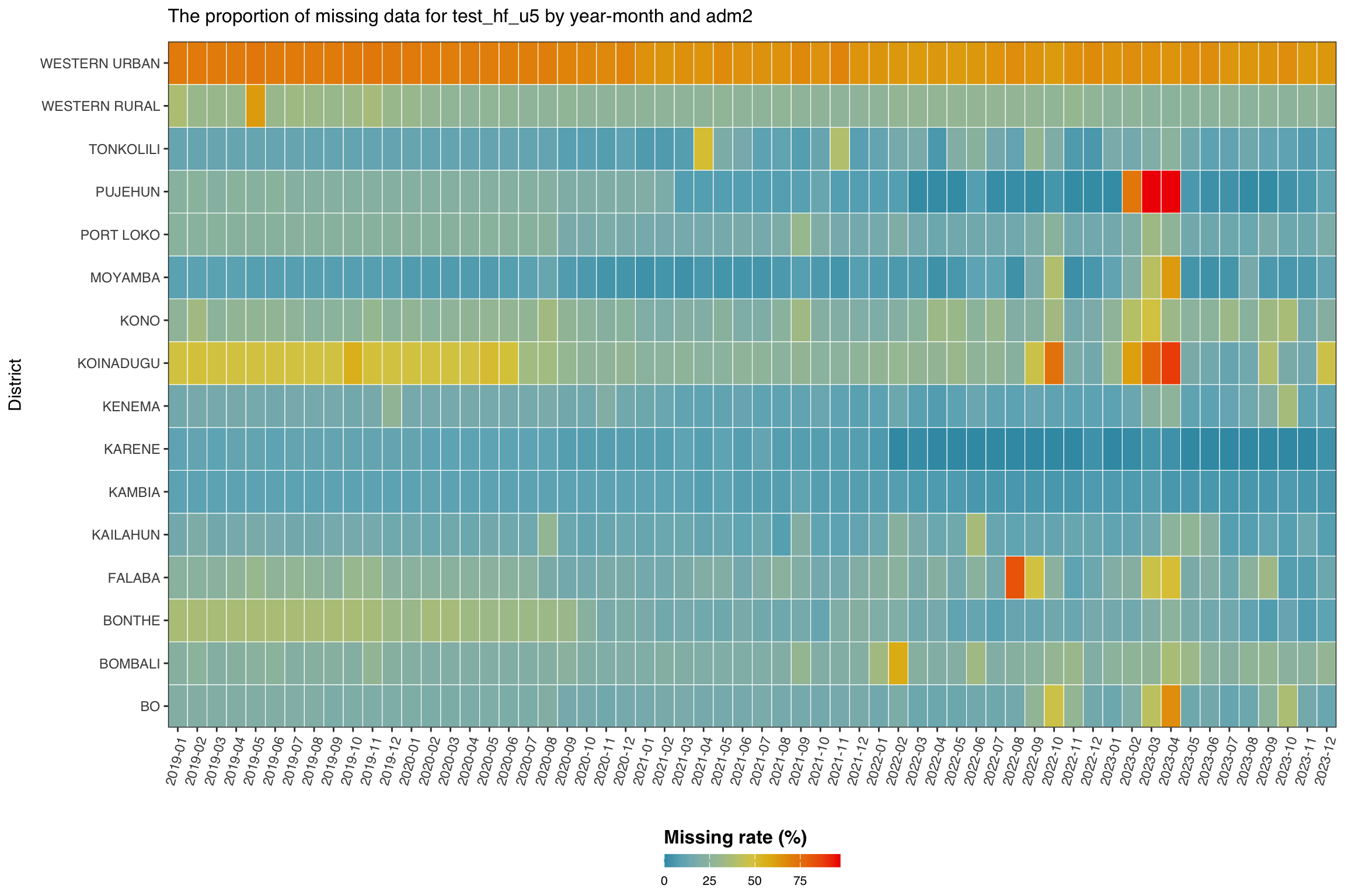
In this step, we focus on a single indicator, malaria testing for under 5’s at the health facility level (test_hf_u5), to examine how missingness varies over time across districts (adm2 level). This allows us to identify subnational areas with consistently poor reporting and spot time periods where data availability dropped sharply.
Although the data is available at the health facility level, the most granular reporting unit, it is still important to assess missingness at higher administrative levels. This broader view becomes especially useful when facility-level data are sparse. In such cases, we may use fallback analysis approaches that draw on patterns from neighbouring facilities within the same district.
Show the code
# calculate missing rates by year-month and adm2 for each variable
missing_rate_adm2 <- df_routine |>
  dplyr::group_by(ym, adm2) |>
  dplyr::summarise(
    missing_rate = mean(is.na(test_hf_u5)) * 100,
    .groups = "drop"
  )

# option to control the color scale range for the heatmap
# if TRUE: color scale goes from 0-100% (full range of possible missing rates,
# even if actual data doesnt cover this range)
# if FALSE: color scale is limited to actual range of missingness in the data
# (e.g., if missing rates range from 20-70%, color scale only
# covers that range)
full_range <- FALSE

# set fill scale limits based on full_range option
fill_limits <- if (full_range) {
  c(0, 100) # use full 0-100% range for color scale
} else {
  # use actual range of missing rates in the data for color scale
  fill_var_values <- missing_rate_adm2$missing_rate
  c(
    floor(min(fill_var_values, na.rm = TRUE)),
    ceiling(max(fill_var_values, na.rm = TRUE))
  )
}

# plot the missing range across location
missing_plot_adm2 <- ggplot2::ggplot(
  missing_rate_adm2,
  ggplot2::aes(
    y = adm2,
    x = ym,
    fill = missing_rate
  )
) +
  ggplot2::geom_tile(colour = "white", linewidth = .2) +
  ggplot2::scale_fill_gradientn(
    colours = wesanderson::wes_palette(
      "Zissou1",
      100,
      type = "continuous"
    ),
    limits = fill_limits
  ) +
  ggplot2::guides(
    fill = ggplot2::guide_colorbar(
      title.position = "top",
      nrow = 1,
      label.position = "bottom",
      direction = "horizontal",
      barheight = ggplot2::unit(0.3, "cm"),
      barwidth = ggplot2::unit(4, "cm"),
      ticks = TRUE,
      draw.ulim = TRUE,
      draw.llim = TRUE
    )
  ) +

  ggplot2::scale_x_discrete(expand = c(0, 0)) +
  ggplot2::scale_y_discrete(expand = c(0, 0)) +
  ggplot2::theme_bw() +
  ggplot2::theme(
    legend.title = ggplot2::element_text(
      size = 12,
      face = "bold",
      family = "sans"
    ),
    legend.position = "bottom",
    legend.direction = "horizontal",
    legend.box = "horizontal",
    legend.box.just = "center",
    legend.margin = ggplot2::margin(t = 0, unit = "cm"),
    legend.text = ggplot2::element_text(
      size = 8,
      family = "sans"
    ),
    axis.title.x = ggplot2::element_text(
      margin = ggplot2::margin(t = 5, unit = "pt")
    ),
    axis.title.y = ggplot2::element_text(
      margin = ggplot2::margin(r = 10, unit = "pt")
    ),
    axis.text.x = ggplot2::element_text(
      angle = 75,
      hjust = 1,
      family = "sans"
    ),
    axis.text = ggplot2::element_text(family = "sans"),
    axis.title = ggplot2::element_text(family = "sans"),
    plot.title = ggtext::element_markdown(
      size = 12,
      family = "sans",
      margin = ggplot2::margin(b = 10)
    ),
    strip.text = ggplot2::element_text(
      family = "sans",
      face = "bold"
    ),
    panel.grid.minor = ggplot2::element_blank(),
    panel.grid.major = ggplot2::element_blank(),
    panel.background = ggplot2::element_blank(),
    strip.background = ggplot2::element_rect(fill = "grey90")
  ) +
  ggplot2::labs(
    fill = "Missing rate (%)",
    y = "District",
    x = "",
    title = "The proportion of missing data for test_hf_u5 by year-month and adm2"
  )

# display the plot
missing_plot_adm2
NoteOutput
To adapt the code:
- Line 2: Replace
df_routinewith the dataset name if different. - Line 5: Update the variable name (
test_hf_u5) to match the dataset’s variable name of interest. - Line 15: Set
full_range <- TRUEto span the color scale across 0-100% for consistent comparison across datasets or time periods. Setfull_range <- FALSEto limit the color scale to the actual data range for better visual contrast within the observed missingness patterns.
Show the code
import matplotlib.pyplot as plt
import matplotlib.colors as mcolors
import numpy as np
import pandas as pd

# calculate missing rates by year-month and adm2 for test_hf_u5
missing_rate_adm2 = (
    df_routine.groupby(["ym", "adm2"], as_index=False)
    .agg(missing_rate=("test_hf_u5", lambda s: s.isna().mean() * 100))
)

# option to control the color scale range for the heatmap
full_range = False

if full_range:
    vmin, vmax = 0.0, 100.0
else:
    vals = missing_rate_adm2["missing_rate"].dropna()
    vmin = float(np.floor(vals.min()))
    vmax = float(np.ceil(vals.max()))

# Zissou1 colormap
zissou1_colors = ["#3B9AB2", "#78B7C5", "#EBCC2A", "#E1AF00", "#F21A00"]
zissou1_cmap = mcolors.LinearSegmentedColormap.from_list(
    "Zissou1", zissou1_colors, N=100
)

ym_order = sorted(missing_rate_adm2["ym"].unique())
adm2_order = sorted(missing_rate_adm2["adm2"].unique())

pivot = (
    missing_rate_adm2
    .pivot(index="adm2", columns="ym", values="missing_rate")
    .reindex(index=adm2_order, columns=ym_order)
)

fig, ax = plt.subplots(figsize=(12, 8))
mesh = ax.pcolormesh(
    np.arange(len(ym_order) + 1),
    np.arange(len(adm2_order) + 1),
    pivot.values,
    cmap=zissou1_cmap,
    vmin=vmin,
    vmax=vmax,
    linewidth=0.2,
    edgecolors="white"
)
ax.set_aspect("auto")

ax.set_xticks(np.arange(len(ym_order)) + 0.5)
ax.set_xticklabels(ym_order, rotation=75, ha="right", fontsize=8)

ax.set_yticks(np.arange(len(adm2_order)) + 0.5)
ax.set_yticklabels(adm2_order, fontsize=8)

ax.set_xlabel("")
ax.set_ylabel("District")
ax.set_title(
    "The proportion of missing data for test_hf_u5 by year-month and adm2",
    fontsize=12, pad=10
)

cbar = fig.colorbar(
    mesh, ax=ax, orientation="horizontal",
    fraction=0.03, pad=0.18, aspect=40
)
cbar.set_label("Missing rate (%)", fontsize=12, fontweight="bold")
cbar.ax.tick_params(labelsize=8)

ax.grid(False)
plt.tight_layout()
NoteOutput
To adapt the code:
- Line 8: Replace
df_routinewith the dataset name if different. - Line 9: Update the variable name (
test_hf_u5) to match the dataset’s variable name of interest. - Line 13: Set
full_range = Trueto span the color scale across 0-100% for consistent comparison across datasets or time periods. Setfull_range = Falseto limit the color scale to the actual data range for better visual contrast within the observed missingness patterns.
Missing data for test_hf_u5 varies by district and over time. WESTERN URBAN shows the highest missingness rate (about 67% on average), with KOINADUGU, WESTERN RURAL, and KONO also above 25%. Many districts also show increased missingness around mid to late 2022, suggesting a broader reporting issue. In contrast, districts like KARENE, KAMBIA, and MOYAMBA have lower and more stable missing rates. These patterns confirm that test_hf_u5 varies by both time and location.
This suggests that missingness in test_hf_u5 is likely Missing At Random (MAR), as it depends on observable factors such as district and reporting period. In such cases, stratified analysis approaches are appropriate. The district (adm2) level can also serve as a fallback unit for analysis, particularly when individual facility data are sparse, by drawing insights from patterns in neighbouring facilities within the same district.
ImportantConsult with SNT team
District-level patterns of missingness often reflect operational decisions the SNT team already knows about: which districts switched DHIS2 instances or migrated platforms, when health information system reforms rolled out, where parallel reporting systems run alongside DHIS2, and which districts ran campaigns that disrupted routine reporting. Before classifying a district’s pattern as MAR or MNAR, consult the SNT team to rule out a known structural cause. The team may also point to an alternative source that is more complete for the affected period.
What to look for when running this on a different country:
- Persistent horizontal stripes in specific districts often reflect urban or peri-urban hospitals reporting less consistently than rural health posts. Check the facility-type composition of those districts.
- Vertical bands shared across districts indicate a national-level reporting disruption such as a DHIS2 migration, a campaign month, or a holiday season.
- A dark lower-left region means missingness is concentrated early in the time series; the indicator may have been added later, in which case pre-activation months should be masked as not-applicable per the active status page.
- A smooth gradient with no strong pattern may indicate MCAR; confirm with
naniar::mcar_test()on that indicator.
When MAR patterns like those above are present, plan to use a stratified or hierarchical imputation approach on the Imputation Methods page.
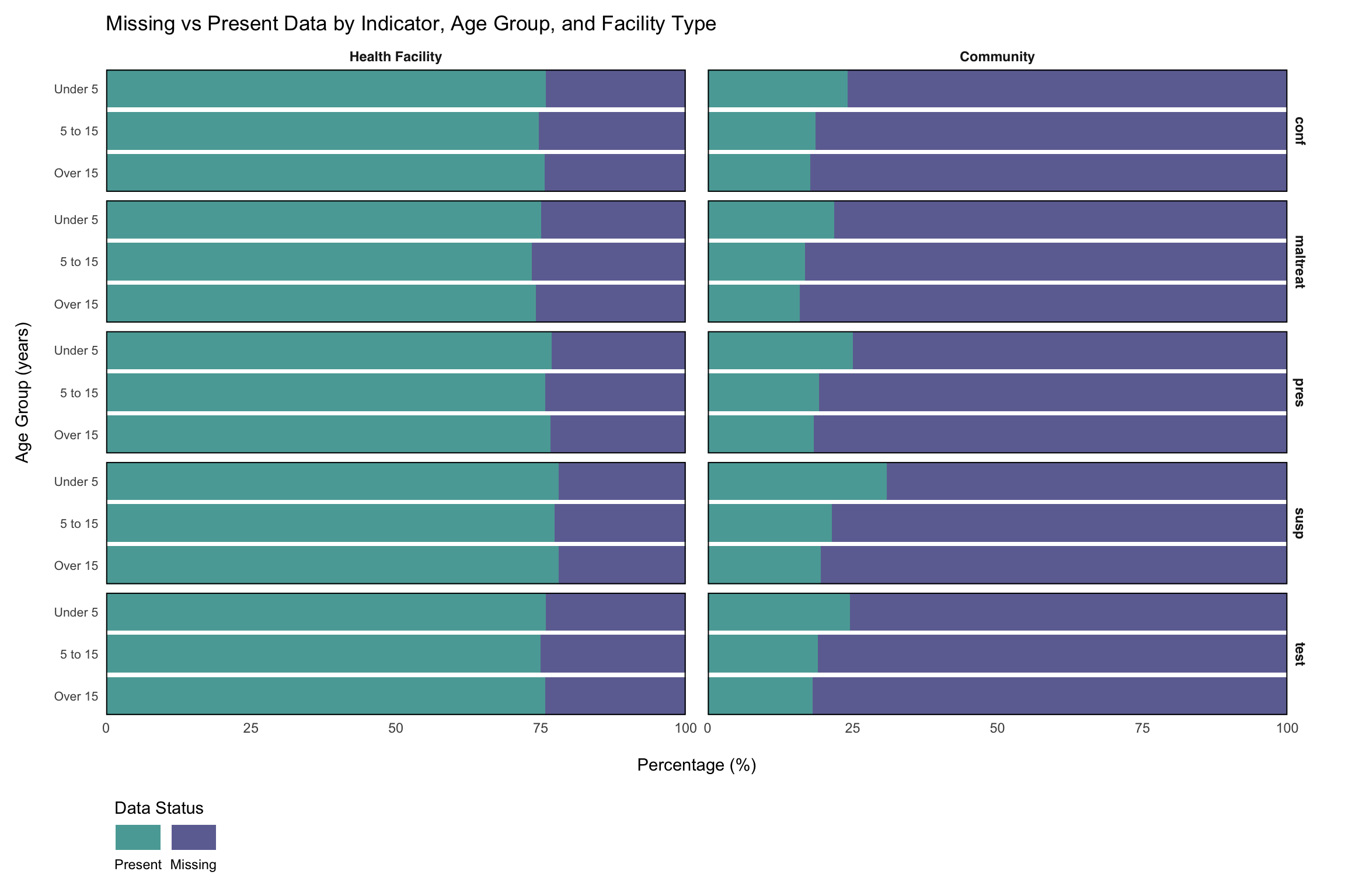
Step 6: Check Missingness by Health Facility Type and Age Groups
Beyond temporal and geographic patterns, missingness may also vary systematically by additional factors, such as health facility type and age groups. Many routine surveillance systems collect data that is already disaggregated by these factors (e.g., test_hf_u5 representing malaria tests conducted at health facilities for children under 5).
The first step in determining these patterns is to disaggregate such pre-aggregated data into a long format, creating separate columns for indicators, facility types, and age groups. This long format allows us to examine how missingness varies across these important stratification variables and identify systematic reporting gaps that may be related to facility capacity, service delivery models, or demographic-specific data collection challenges.
Show the code
# define core indicators to retain during disaggregation
core_indicators <- c(
  "adm0",
  "adm1",
  "adm2",
  "adm3",
  "hf",
  "hf_uid",
  "year",
  "month",
  "ym",
  "date"
)

# select core indicators and disaggregated variables
df_routine_disagg <- df_routine |>
  dplyr::select(
    dplyr::any_of(core_indicators),
    dplyr::matches("_(com|hf)_(u5|5_14|ov15)$")
  )

# transform to long format with separate facility type and age group columns
df_routine_disagg_long <- df_routine_disagg |>
  # drop maladm_hf_u5: lacks community-level and other age-group
  # counterparts, so it cannot be pivoted into the long format below
  dplyr::select(-maladm_hf_u5) |>
  tidyr::pivot_longer(
    cols = dplyr::matches("_(com|hf)_(u5|5_14|ov15)$"),
    names_to = c("indicator", "facility_type", "age_group"),
    names_pattern = "(.+)_(com|hf)_(u5|5_14|ov15)$",
    values_to = "value"
  ) |>
  # relabel factors
  dplyr::mutate(
    age_group = factor(
      age_group,
      levels = c("u5", "5_14", "ov15"),
      labels = c("Under 5", "5 to 15", "Over 15")
    ),
    facility_type = factor(
      facility_type,
      levels = c("hf", "com"),
      labels = c("Health Facility", "Community")
    )
  )

# preview the disaggregated data structure
df_routine_disagg_long |>
  utils::head() |>
knitr::kable()To adapt the code:
- Lines 2-13: Update the
core_indicatorsvector to match the dataset’s administrative and temporal variable names. - Line 16: Replace
df_routinewith the dataset name if different. - Lines 19, 28: Modify the regex pattern
"_(com|hf)_(u5|5_14|ov15)$"to match the facility type and age group naming conventions (e.g., if the data uses different facility codes or age categories).
Show the code
import re

import pandas as pd

# define core columns to retain during disaggregation
core_indicators = [
    "adm0", "adm1", "adm2", "adm3",
    "hf", "hf_uid",
    "year", "month", "ym", "date"
]

# select core indicators and disaggregated columns
disagg_pattern = re.compile(r".+_(com|hf)_(u5|5_14|ov15)$")
disagg_cols = [c for c in df_routine.columns if disagg_pattern.match(c)]
keep_core = [c for c in core_indicators if c in df_routine.columns]

df_routine_disagg = df_routine[keep_core + disagg_cols].copy()

# drop maladm_hf_u5: lacks community-level and other age-group counterparts
if "maladm_hf_u5" in df_routine_disagg.columns:
    df_routine_disagg = df_routine_disagg.drop(columns=["maladm_hf_u5"])

# re-identify disaggregated columns after the drop
disagg_cols_final = [
    c for c in df_routine_disagg.columns
    if c not in keep_core
]

# transform to long format with separate facility_type and age_group columns
def _parse_col(col):
    """Extract (indicator, facility_type, age_group) from column name."""
    m = re.match(r"^(.+)_(com|hf)_(u5|5_14|ov15)$", col)
    if m:
        return m.group(1), m.group(2), m.group(3)
    return None, None, None

long_rows = []
for col in disagg_cols_final:
    ind, ftype, age = _parse_col(col)
    if ind is None:
        continue
    tmp = df_routine_disagg[keep_core + [col]].copy()
    tmp = tmp.rename(columns={col: "value"})
    tmp["indicator"] = ind
    tmp["facility_type"] = ftype
    tmp["age_group"] = age
    long_rows.append(tmp)

df_routine_disagg_long = pd.concat(long_rows, ignore_index=True)

# relabel factors to match R output
age_order = ["u5", "5_14", "ov15"]
age_labels = ["Under 5", "5 to 15", "Over 15"]
ftype_order = ["hf", "com"]
ftype_labels = ["Health Facility", "Community"]

df_routine_disagg_long["age_group"] = pd.Categorical(
    df_routine_disagg_long["age_group"].map(
        dict(zip(age_order, age_labels))
    ),
    categories=age_labels,
    ordered=True
)
df_routine_disagg_long["facility_type"] = pd.Categorical(
    df_routine_disagg_long["facility_type"].map(
        dict(zip(ftype_order, ftype_labels))
    ),
    categories=ftype_labels,
    ordered=True
)

# preview the disaggregated data structure as an HTML table
df_routine_disagg_long.head().style.hide(axis="index")To adapt the code:
- Lines 6-13: Update
core_indicatorsto match the dataset’s administrative and temporal variable names. - Line 15: Replace
df_routinewith the dataset name if different. - Lines 13, 32: Modify the regex pattern
r".+_(com|hf)_(u5|5_14|ov15)$"to match the facility type and age group naming conventions in the dataset.
Now that we have disaggregated the data, we can examine how missingness varies across all indicators by facility type and age group. This check helps identify systematic patterns in data availability that may be related to service delivery models, facility capacity, or demographic-specific reporting challenges.
Show the code
# prepare data for stacked bar chart with both age group and facility type
missing_present_data_facility <- df_routine_disagg_long |>
  dplyr::group_by(indicator, age_group, facility_type) |>
  dplyr::summarise(
    total_records = dplyr::n(),
    missing_count = sum(is.na(value)),
    present_count = sum(!is.na(value)),
    missing_pct = round(missing_count / total_records * 100, 2),
    present_pct = round(present_count / total_records * 100, 2),
    .groups = "drop"
  ) |>
  tidyr::pivot_longer(
    cols = c(missing_pct, present_pct),
    names_to = "status",
    values_to = "percentage",
    names_pattern = "(.+)_pct"
  ) |>
  dplyr::mutate(
    status = factor(
      status,
      levels = c("missing", "present"),
      labels = c("Missing", "Present")
    )
  )

# create stacked bar plot faceted by age group and facility type
age_facility_miss_plot <- missing_present_data_facility |>
  ggplot2::ggplot(ggplot2::aes(
    x = percentage,
    y = factor(age_group, levels = rev(levels(factor(age_group)))),
    fill = status
  )) +
  ggplot2::geom_col(alpha = 0.8) +
  ggplot2::facet_grid(indicator ~ facility_type) +
  ggplot2::scale_fill_viridis_d(
    option = "D",
    begin = 0.2,
    end = 0.5,
    breaks = c("Present", "Missing")
  ) +
  ggplot2::guides(
    fill = ggplot2::guide_legend(
      title.position = "top",
      title.hjust = 0,
      label.position = "bottom"
    )
  ) +
  ggplot2::labs(
    title = "Missing vs Present Data by Indicator, Age Group, and Facility Type",
    x = "\nPercentage (%)",
    y = "Age Group (years)\n",
    fill = "Data Status"
  ) +
  ggplot2::scale_x_continuous(expand = c(0, 0)) +
  ggplot2::scale_y_discrete(expand = c(0, 0)) +
  ggplot2::theme_minimal() +
  ggplot2::theme(
    legend.position = "bottom",
    legend.direction = "horizontal",
    legend.justification = "left",
    legend.box.just = "left",
    axis.text.y = ggplot2::element_text(size = 8),
    strip.text = ggplot2::element_text(
      family = "sans",
      face = "bold"
    ),
    panel.grid.minor = ggplot2::element_blank(),
    panel.grid.major = ggplot2::element_blank(),
    panel.background = ggplot2::element_blank(),
    panel.border = ggplot2::element_rect(
      colour = "black",
      fill = NA,
      size = .7
    ),
    panel.spacing.x = ggplot2::unit(0.5, "cm"),
    plot.margin = ggplot2::margin(10, 20, 10, 10)
  )

# display the plot
age_facility_miss_plot
NoteOutput
To adapt the code:
- Line 2: Replace
df_routine_disagg_longwith the disaggregated dataset name if different. - Lines 18-22: Update the status factor levels and labels to use different display names for missing/present data categories.
- Lines 48-52: Modify the plot title and axis labels to match the analysis focus.
Show the code
import matplotlib.pyplot as plt
import matplotlib.colors as mcolors
import numpy as np
import pandas as pd

# prepare data for stacked bar chart with age group and facility type
missing_present_data_facility = (
    df_routine_disagg_long
    .groupby(["indicator", "age_group", "facility_type"], observed=True,
             as_index=False)
    .agg(
        total_records=("value", "count"),
        missing_count=("value", lambda s: s.isna().sum()),
        present_count=("value", lambda s: s.notna().sum()),
    )
    .assign(
        missing_pct=lambda d: (d["missing_count"] / d["total_records"] * 100)
                              .round(2),
        present_pct=lambda d: (d["present_count"] / d["total_records"] * 100)
                              .round(2),
    )
)

# pivot to long format for status column
mp_long = missing_present_data_facility.melt(
    id_vars=["indicator", "age_group", "facility_type"],
    value_vars=["missing_pct", "present_pct"],
    var_name="status",
    value_name="percentage"
).assign(
    status=lambda d: pd.Categorical(
        d["status"].map({"missing_pct": "Missing", "present_pct": "Present"}),
        categories=["Missing", "Present"],
        ordered=True
    )
)

# viridis D palette: begin=0.2, end=0.5 for two categories
import matplotlib.cm as cm
viridis = cm.get_cmap("viridis")
color_missing = viridis(0.2)
color_present = viridis(0.5)
status_colors = {"Missing": color_missing, "Present": color_present}

indicators = list(mp_long["indicator"].unique())
facility_types = list(mp_long["facility_type"].cat.categories)
age_labels_ordered = list(mp_long["age_group"].cat.categories)
age_rev = list(reversed(age_labels_ordered))

n_ind = len(indicators)
n_ftype = len(facility_types)

fig, axes = plt.subplots(
    n_ind, n_ftype,
    figsize=(12, 8),
    sharex=True,
    sharey="row"
)

for i, ind in enumerate(indicators):
    for j, ftype in enumerate(facility_types):
        ax = axes[i][j] if n_ind > 1 else axes[j]
        subset = mp_long.loc[
            (mp_long["indicator"] == ind) &
            (mp_long["facility_type"] == ftype)
        ]
        for status in ["Present", "Missing"]:
            s_sub = subset.loc[subset["status"] == status]
            s_sub = s_sub.set_index("age_group").reindex(age_rev)
            ax.barh(
                s_sub.index,
                s_sub["percentage"],
                color=status_colors[status],
                alpha=0.8,
                label=status
            )
        ax.set_xlim(0, 100)
        ax.set_xlabel("")
        ax.set_ylabel("")
        # panel border
        for spine in ax.spines.values():
            spine.set_linewidth(0.7)
        # strip labels
        if i == 0:
            ax.set_title(str(ftype), fontsize=9, fontweight="bold")
        if j == n_ftype - 1:
            ax.yaxis.set_label_position("right")
            ax.set_ylabel(str(ind), rotation=270, labelpad=12,
                          fontsize=9, fontweight="bold")
        # no grid
        ax.grid(False)

# shared axis labels
fig.supxlabel("Percentage (%)", y=0.02, fontsize=10)
fig.supylabel("Age Group (years)", x=0.02, fontsize=10)
fig.suptitle(
    "Missing vs Present Data by Indicator, Age Group, and Facility Type",
    fontsize=12, y=1.01
)

# shared legend
handles = [
    plt.Rectangle((0, 0), 1, 1, color=status_colors["Present"], alpha=0.8),
    plt.Rectangle((0, 0), 1, 1, color=status_colors["Missing"], alpha=0.8),
]
fig.legend(
    handles, ["Present", "Missing"],
    title="Data Status",
    loc="lower left",
    bbox_to_anchor=(0.0, -0.04),
    ncol=2,
    frameon=False,
    fontsize=9
)
plt.tight_layout()
NoteOutput
To adapt the code:
- Line 8: Replace
df_routine_disagg_longwith the disaggregated dataset name if different. - Lines 30-34: Update the status mapping if different display names for missing/present data categories are needed.
- Lines 94-99: Modify the plot title and axis labels to match the analysis focus.
The above visualization shows substantial differences in missingness patterns between facility types, with community-level facilities showing considerably higher missing rates, around 70% on average. This pattern is consistent across indicators and age groups. Notably, within community facilities, under-five data is more frequently reported than data for older age groups, a pattern observed across key indicators. These trends point to systematic differences in data collection and reporting capacity between facility types.
What to look for when running this on a different dataset:
- A large gap between facility types (community vs facility) reflects differences in data collection capacity, supervision frequency, or which indicators are mandated at each level. Stratify imputation by facility type.
- A larger gap in older age groups often reflects that the programme focuses on under-fives; older-age data may be a structural non-applicable rather than missing.
- An indicator-specific gap (one row of facets noticeably worse than the others) often means the form does not include that indicator at that level. Verify with the country team before imputing.
Mark indicators that are structurally not collected at a given facility type or age band as not-applicable rather than imputing them. Imputation strategies for genuine facility-type MAR patterns are covered on the Imputation Methods page.
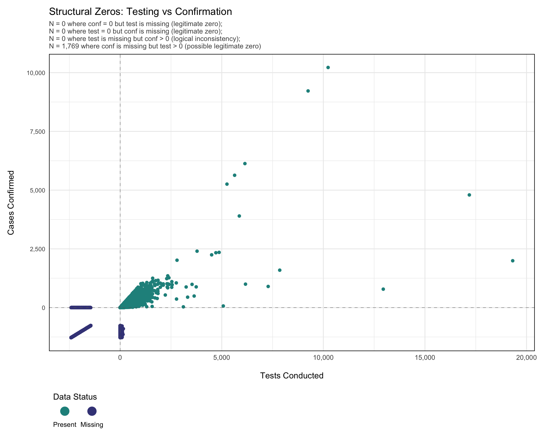
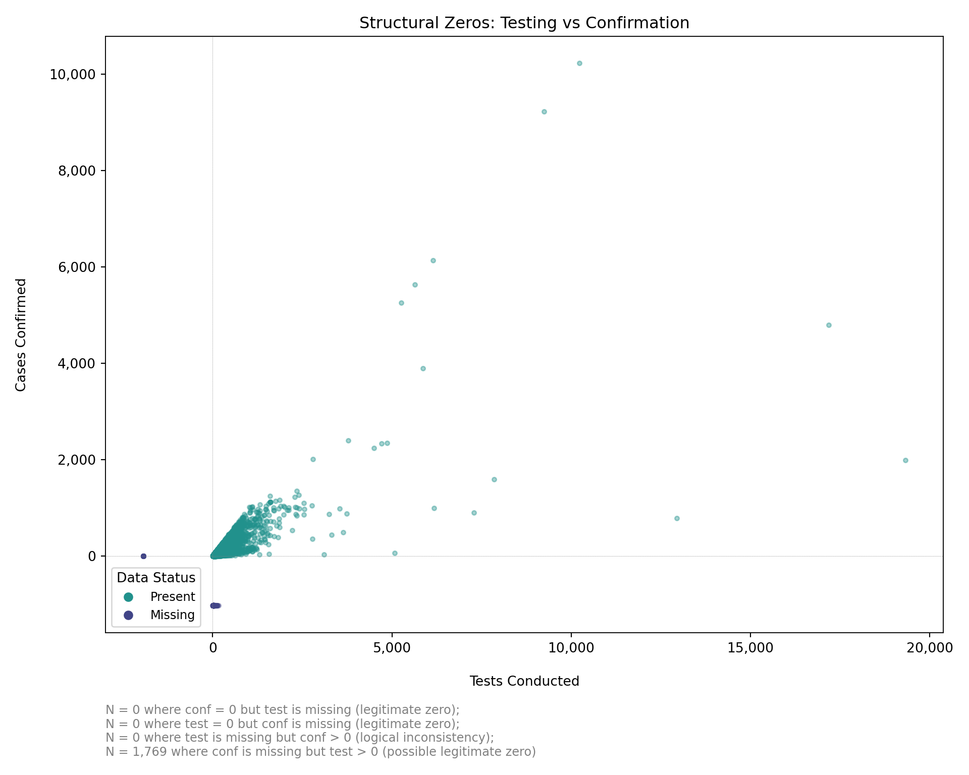
Step 7: Visualizing Structural Zeros and Logical Relationships
Before classifying missing values, we visualize the relationships between related indicators. This plot highlights likely structural zeros (e.g., no testing with missing confirmation), possible structural zeros (e.g., confirmed cases equal to zero with missing test values), and logical inconsistencies (e.g., confirmed cases recorded but testing data missing). These patterns reflect the clinical care pathway and help identify where values can be logically inferred, structurally imputed as zero, or require statistical methods.
Specifically:
test= 0,confmissing: Likely legitimate zero (no testing = confirmation not possible).conf= 0,testmissing: Possibly legitimate zero (no confirmed cases suggests no positives, but testing may have occurred).conf> 0,testmissing: Logical inconsistency (confirmed cases imply testing occurred, value should be imputed).test> 0,confmissing: Possibly legitimate zero (testing occurred but no positive cases; confirmation may be legitimately zero or missing).
Note: Below, we use the naniar package to explore missingness. Unlike geom_point(), which silently drops missing values, geom_miss_point() shows where one or both variables are missing by shifting them to plot margins. This makes it easier to detect structural zeros, reporting gaps, and logical inconsistencies.
Show the code
# transform data to wide format to examine relationships between indicators
df_wide <- df_routine_disagg_long |>
  dplyr::select(
    dplyr::any_of(core_indicators),
    facility_type,
    age_group,
    indicator,
    value
  ) |>
  tidyr::pivot_wider(
    names_from = indicator,
    values_from = value
  )

# calculate comprehensive missing counts for subtitle
n_test_missing_conf_zero <- df_wide |>
  dplyr::filter(conf == 0, is.na(test)) |>
  nrow()

n_conf_missing_test_zero <- df_wide |>
  dplyr::filter(test == 0, is.na(conf)) |>
  nrow()

n_test_na_conf_positive <- df_wide |>
  dplyr::filter(is.na(test), conf > 0) |>
  nrow()

n_conf_na_test_positive <- df_wide |>
  dplyr::filter(is.na(conf), test > 0) |>
  nrow()

# create comprehensive subtitle with all missing count scenarios
subtitle_text <- paste0(
  "N = ",
  scales::comma(n_test_missing_conf_zero),
  " where conf = 0 but test is missing (legitimate zero); \n",
  "N = ",
  scales::comma(n_conf_missing_test_zero),
  " where test = 0 but conf is missing (legitimate zero); \n",
  "N = ",
  scales::comma(n_test_na_conf_positive),
  " where test is missing but conf > 0 (logical inconsistency); \n",
  "N = ",
  scales::comma(n_conf_na_test_positive),
  " where conf is missing but test > 0 (possible legitimate zero)"
)

# create scatter plot showing relationship between test and confirmed counts
structural_zeros_plot <- ggplot2::ggplot(
  data = df_wide,
  mapping = ggplot2::aes(x = test, y = conf)
) +
  naniar::geom_miss_point() +
  ggplot2::geom_vline(
    xintercept = 0,
    linetype = "dashed",
    color = "grey40",
    linewidth = 0.2
  ) +
  ggplot2::geom_hline(
    yintercept = 0,
    linetype = "dashed",
    color = "grey40",
    linewidth = 0.2
  ) +
  ggplot2::scale_x_continuous(
    labels = scales::comma_format()
  ) +
  ggplot2::scale_y_continuous(
    labels = scales::comma_format()
  ) +
  ggplot2::scale_color_viridis_d(
    option = "D",
    begin = 0.2,
    end = 0.5,
    breaks = c("Not Missing", "Missing"),
    labels = c("Present", "Missing")
  ) +
  ggplot2::guides(
    color = ggplot2::guide_legend(
      title.position = "top",
      title.hjust = 0,
      override.aes = list(
        size = 5
      ),
      label.position = "bottom"
    )
  ) +
  ggplot2::labs(
    title = "Structural Zeros: Testing vs Confirmation",
    subtitle = subtitle_text,
    x = "\nTests Conducted",
    y = "Cases Confirmed\n",
    color = "Data Status"
  ) +
  ggplot2::theme_minimal() +
  ggplot2::theme(
    legend.position = "bottom",
    legend.direction = "horizontal",
    legend.justification = "left",
    legend.box.just = "left",
    axis.text.y = ggplot2::element_text(size = 8),
    strip.text = ggplot2::element_text(
      family = "sans",
      face = "bold"
    ),
    panel.border = ggplot2::element_rect(
      colour = "black",
      fill = NA,
      size = .7
    ),
    panel.spacing.x = ggplot2::unit(0.5, "cm"),
    plot.margin = ggplot2::margin(10, 20, 10, 10),
    plot.subtitle = ggplot2::element_text(size = 9, color = "grey30")
  )


# display the plot
structural_zeros_plot
NoteOutput
To adapt the code:
- Lines 17, 21, 25, 29: Update the variable names (
test,conf) in the filter conditions to match the dataset’s variable names of interest. - Lines 3-9: Update the
core_indicatorsand column selection to match the dataset structure. - Lines 10-13: Modify the
pivot_wider()transformation to include the specific indicators to examine for structural relationships. - Line 51: Change the x and y aesthetic mappings to examine different variable pairs (e.g.,
x = maltreat, y = confto examine treatment vs confirmation relationships).
Note: Below, we replicate the naniar::geom_miss_point() approach in Python. Missing values on one axis are shifted to the plot margin (10% below the minimum observed value) so the structural-zero patterns remain visible.
Show the code
import matplotlib.cm as cm
import matplotlib.pyplot as plt
import matplotlib.ticker as mticker
import numpy as np
import pandas as pd

# transform to wide format to examine relationships between indicators
keep_core = [
    "adm0", "adm1", "adm2", "adm3",
    "hf", "hf_uid", "year", "month", "ym", "date"
]
keep_cols = [c for c in keep_core if c in df_routine_disagg_long.columns]

df_wide = (
    df_routine_disagg_long[keep_cols + ["facility_type", "age_group",
                                         "indicator", "value"]]
    .pivot_table(
        index=keep_cols + ["facility_type", "age_group"],
        columns="indicator",
        values="value",
        aggfunc="first",
        observed=True
    )
    .reset_index()
)
df_wide.columns.name = None

# calculate missing counts for subtitle
n_test_missing_conf_zero = df_wide.loc[
    (df_wide["conf"] == 0) & df_wide["test"].isna()
].shape[0]

n_conf_missing_test_zero = df_wide.loc[
    (df_wide["test"] == 0) & df_wide["conf"].isna()
].shape[0]

n_test_na_conf_positive = df_wide.loc[
    df_wide["test"].isna() & (df_wide["conf"] > 0)
].shape[0]

n_conf_na_test_positive = df_wide.loc[
    df_wide["conf"].isna() & (df_wide["test"] > 0)
].shape[0]

subtitle_text = (
    f"N = {n_test_missing_conf_zero:,} where conf = 0 but test is missing "
    f"(legitimate zero); \n"
    f"N = {n_conf_missing_test_zero:,} where test = 0 but conf is missing "
    f"(legitimate zero); \n"
    f"N = {n_test_na_conf_positive:,} where test is missing but conf > 0 "
    f"(logical inconsistency); \n"
    f"N = {n_conf_na_test_positive:,} where conf is missing but test > 0 "
    f"(possible legitimate zero)"
)

# create demo data matching the R render chunk:
# rows 400-600 where conf is NA get test = 0 (legitimate zero pattern)
# rows 490-900 where test is NA get conf = 0 (legitimate zero pattern)
df_wide_demo = df_wide.copy().reset_index(drop=True)
mask1 = (df_wide_demo.index.isin(range(400, 601))) & df_wide_demo["conf"].isna()
df_wide_demo.loc[mask1, "test"] = 0.0
mask2 = (df_wide_demo.index.isin(range(490, 901))) & df_wide_demo["test"].isna()
df_wide_demo.loc[mask2, "conf"] = 0.0

# compute margin offsets for miss_point behavior
test_obs = df_wide_demo["test"].dropna()
conf_obs = df_wide_demo["conf"].dropna()
test_range = test_obs.max() - test_obs.min() if len(test_obs) > 1 else 1.0
conf_range = conf_obs.max() - conf_obs.min() if len(conf_obs) > 1 else 1.0
test_margin = test_obs.min() - 0.1 * test_range
conf_margin = conf_obs.min() - 0.1 * conf_range

viridis = cm.get_cmap("viridis")
color_present = viridis(0.5)   # "Not Missing"
color_missing = viridis(0.2)   # "Missing"

fig, ax = plt.subplots(figsize=(10, 8))

# --- present-present points ---
mask_pp = df_wide_demo["test"].notna() & df_wide_demo["conf"].notna()
ax.scatter(
    df_wide_demo.loc[mask_pp, "test"],
    df_wide_demo.loc[mask_pp, "conf"],
    color=color_present, alpha=0.4, s=10, label="Present", rasterized=True
)

# --- test missing, conf present: shift test to left margin ---
mask_tm = df_wide_demo["test"].isna() & df_wide_demo["conf"].notna()
ax.scatter(
    [test_margin] * mask_tm.sum(),
    df_wide_demo.loc[mask_tm, "conf"],
    color=color_missing, alpha=0.4, s=10, label="Missing", rasterized=True
)

# --- conf missing, test present: shift conf to bottom margin ---
mask_cm = df_wide_demo["conf"].isna() & df_wide_demo["test"].notna()
ax.scatter(
    df_wide_demo.loc[mask_cm, "test"],
    [conf_margin] * mask_cm.sum(),
    color=color_missing, alpha=0.4, s=10, rasterized=True
)

# reference lines at zero
ax.axvline(0, linestyle="dashed", color="grey", linewidth=0.2)
ax.axhline(0, linestyle="dashed", color="grey", linewidth=0.2)

# comma-formatted tick labels
ax.xaxis.set_major_formatter(mticker.FuncFormatter(
    lambda x, _: f"{x:,.0f}"
))
ax.yaxis.set_major_formatter(mticker.FuncFormatter(
    lambda y, _: f"{y:,.0f}"
))

ax.set_xlabel("\nTests Conducted")
ax.set_ylabel("Cases Confirmed\n")
ax.set_title("Structural Zeros: Testing vs Confirmation", fontsize=12)
ax.text(
    0.0, -0.12, subtitle_text,
    transform=ax.transAxes, fontsize=9, color="grey",
    verticalalignment="top"
)

handles = [
    plt.Line2D([0], [0], marker="o", color="w",
               markerfacecolor=color_present, markersize=8),
    plt.Line2D([0], [0], marker="o", color="w",
               markerfacecolor=color_missing, markersize=8),
]
ax.legend(
    handles, ["Present", "Missing"],
    title="Data Status",
    loc="lower left",
    frameon=True,
    fontsize=9
)

for spine in ax.spines.values():
    spine.set_linewidth(0.7)
plt.tight_layout()
NoteOutput
To adapt the code:
- Lines 30, 34, 38, 42: Update the variable names (
test,conf) in the filter conditions to match the dataset’s variable names of interest. - Lines 9-12: Update
keep_coreand column selection to match the dataset structure. - Lines 13-16: Modify the
pivot_table()transformation to include the specific indicators to examine for structural relationships. - Lines 66, 67: Change the scatter x and y column references to examine different variable pairs (e.g.,
maltreatandconf).
The plot shows key patterns in missingness between malaria testing (test) and confirmation (conf) counts. The vertical dashed line marks zero tests; the horizontal dashed line marks zero confirmations. This visualization shows there were 1,769 instances where conf is missing but test > 0. These are likely structural zeros, where testing was done but no confirmed cases were recorded. In such cases, missing confirmation counts can reasonably be set to zero.
What to look for in this plot on any dataset:
- A cluster of “Missing” markers along the y-axis margin with
test> 0: tests were recorded but confirmations were left blank. Likely a structural zero; setconfto 0. - A cluster of “Missing” markers along the x-axis margin with
conf> 0: confirmations were recorded but tests were left blank. Logical inconsistency; flag for review, or imputetestfromconfand a historical positivity rate. - “Missing” markers at the origin: both indicators are missing, which points to reporting failure rather than a structural zero.
- Asymmetry along one axis: indicator-specific data entry practice. Check whether the form distinguishes 0 from blank.
Summary
This section introduced approaches for visualising and diagnosing missing data in routine surveillance systems. By examining patterns across time, geography, facility type, and indicator relationships, we showed how missingness can be systematically assessed rather than treated as random gaps. The section demonstrated how simple plots and logical checks help distinguish between true missing values and structural reporting issues, providing a clearer understanding of the data’s reliability. These methods establish a foundation for classifying the nature of missingness and for selecting appropriate strategies for addressing them. Structural and statistical imputation techniques are implemented in detail on the Imputation Methods page.
Further Reading
- Rubin, D. B. (1976). Inference and missing data. Biometrika, 63(3), 581–592. Foundational paper introducing the MCAR / MAR / MNAR framework.
- van Buuren, S. (2018). Flexible Imputation of Missing Data (2nd ed.). Chapman & Hall/CRC. Canonical reference for multiple imputation; freely available at https://stefvanbuuren.name/fimd/.
- WHO. (2017). Data Quality Review (DQR) toolkit. Recommended framework for assessing completeness, timeliness, internal consistency, and external consistency in routine health information system data.
- Maïga, A. et al. (2019). Generating statistics from health facility data: the state of routine health information systems in Eastern and Southern Africa. BMJ Global Health, 4(5), e001849.
naniarpackage documentation: https://naniar.njtierney.com. Practical guide to missing data visualisation in R, including upset plots and Little’s MCAR test.
Full Code
Find the full code script for missing data detection methods below.
Show full code
################################################################################
################# ~ Missing data detection methods full code ~ #################
################################################################################

### Step 1: Install and Load Libraries -----------------------------------------

# install `pacman` if not already installed
if (!requireNamespace("pacman", quietly = TRUE)) {
  install.packages("pacman")
}

# load required packages using pacman
pacman::p_load(
  dplyr,        # data manipulation
  ggplot2,      # plotting
  ggtext,       # markdown text in ggplot2
  here,         # file path management
  lubridate,    # date handling
  naniar,       # missing data visualization and analysis
  tidyr,        # data reshaping
  cli,          # clean logging and CLI-style messages
  scales,       # number formatting
  UpSetR,       # upset plots for co-missingness
  wesanderson   # color palettes
)

### Step 2: Load Data ----------------------------------------------------------

# read the processed surveillance data produced by the import workflow
df_routine <- readRDS(
  here::here(
    "01_data",
    "1.2_epidemiology",
    "1.2a_routine_surveillance",
    "processed",
    "clean_malaria_routine_data_final.rds"
  )
) |>
  # drop the import-source label carried over from import.qmd
  dplyr::select(-dplyr::any_of("sheet_admin")) |>
  # filter to the past five years
  dplyr::filter(year >= 2019) |>
  dplyr::rename(maladm_hf_u5 = maladm_u5) |>
  dplyr::mutate(
    # ym: human-readable year-month label used as a discrete x-axis
    ym = format(date, "%Y-%m"),
    # date stays as Date (already Date in the .rds produced by import.qmd)
    date = as.Date(date)
  )

### Step 3: Distinguish Reporting Gaps from Indicator-Level Missingness --------

#### Step 3.1: Conditional missingness within submitted reports ----------------

# define the core indicators that signal a report was submitted
core_inds <- c("test", "conf", "maltreat")

# flag each facility-month as reporting or non-reporting
df_routine <- df_routine |>
  dplyr::mutate(
    report_submitted = dplyr::if_any(
      dplyr::all_of(core_inds),
      ~ !is.na(.x)
    )
  )

# conditional missingness: within submitted reports only,
# what % of each indicator was left blank?
conditional_missing <- df_routine |>
  dplyr::filter(report_submitted) |>
  dplyr::summarise(
    dplyr::across(
      dplyr::all_of(core_inds),
      ~ round(mean(is.na(.x)) * 100, 1)
    )
  ) |>
  tidyr::pivot_longer(
    dplyr::everything(),
    names_to = "indicator",
    values_to = "pct_missing_given_reported"
  )

conditional_missing |>
  dplyr::rename(
    Indicator = indicator,
    `% missing given reported` = pct_missing_given_reported
  ) |>
  knitr::kable(align = "lr", digits = 1)

#### Step 3.2: Quantitative summary across variables ---------------------------

# variables to summarise
summary_vars <- c("test", "susp", "pres", "conf", "maltreat")

# compute % missing for the core aggregated indicators
miss_summary <- naniar::miss_var_summary(
  df_routine |>
    dplyr::select(dplyr::all_of(summary_vars))
) |>
  dplyr::mutate(pct_miss = as.numeric(pct_miss))

# bar chart of % missing per variable
miss_summary |>
  dplyr::mutate(
    variable = factor(variable, levels = rev(variable)),
    label_text = paste0(round(pct_miss, 1), "%"),
    inside = pct_miss > max(pct_miss) * 0.15
  ) |>
  ggplot2::ggplot(ggplot2::aes(x = pct_miss, y = variable)) +
  ggplot2::geom_col(fill = "#3B9AB2", width = 0.75) +
  ggplot2::geom_text(
    ggplot2::aes(
      label = label_text,
      hjust = ifelse(inside, 1.15, -0.15),
      colour = ifelse(inside, "white", "grey20")
    ),
    size = 4,
    fontface = "bold",
    family = "sans"
  ) +
  ggplot2::scale_colour_identity() +
  ggplot2::scale_x_continuous(
    expand = ggplot2::expansion(mult = c(0, 0.05)),
    labels = function(x) paste0(x, "%")
  ) +
  ggplot2::labs(
    title = "Proportion of missing data per indicator",
    subtitle = paste(
      "% missing across submitted reports for each",
      "core malaria indicator"
    ),
    x = NULL,
    y = NULL
  ) +
  ggplot2::theme_minimal(base_family = "sans") +
  ggplot2::theme(
    plot.title = ggplot2::element_text(
      size = 16,
      face = "bold",
      margin = ggplot2::margin(b = 4)
    ),
    plot.subtitle = ggplot2::element_text(
      size = 12,
      colour = "grey30",
      margin = ggplot2::margin(b = 14)
    ),
    axis.text.y = ggplot2::element_text(size = 11, colour = "black"),
    axis.text.x = ggplot2::element_text(size = 10, colour = "grey30"),
    panel.grid.major.y = ggplot2::element_blank(),
    panel.grid.minor = ggplot2::element_blank(),
    panel.grid.major.x = ggplot2::element_line(
      colour = "grey90",
      size = 0.3
    ),
    axis.ticks = ggplot2::element_blank(),
    plot.margin = ggplot2::margin(15, 30, 10, 10)
  )

### Step 4: Check Missingness over Time ----------------------------------------

# get the variables of interest (aggregated and age-specific)
vars <- c(
  "test",        # aggregated malaria tests
  "test_u5",
  "test_5_14",
  "test_ov15",
  "susp",        # aggregated suspected cases
  "susp_u5",
  "susp_5_14",
  "susp_ov15",
  "pres",        # aggregated presumed cases
  "pres_u5",
  "pres_5_14",
  "pres_ov15",
  "conf",        # aggregated confirmed cases
  "conf_u5",
  "conf_5_14",
  "conf_ov15",
  "maltreat",    # aggregated treatments
  "maltreat_u5",
  "maltreat_5_14",
  "maltreat_ov15"
)

# calculate missing rates by date for each variable
missing_rate_date <- df_routine |>
  dplyr::group_by(date) |>
  dplyr::summarise(
    dplyr::across(
      dplyr::all_of(vars),
      ~ mean(is.na(.x)) * 100
    ),
    .groups = "drop"
  ) |>
  dplyr::arrange(date) |>
  tidyr::pivot_longer(
    cols = -ym,
    names_to = "variables",
    values_to = "missing_rate"
  ) |>
  # enforce the explicit `vars` order on the y-axis so R and Python match
  dplyr::mutate(variables = factor(variables, levels = vars))

# option to control the color scale range for the heatmap
# if TRUE: color scale goes from 0-100% (full range of possible missing rates,
# even if actual data doesnt cover this range)
# if FALSE: color scale is limited to actual range of missingness in the data
# (e.g., if missing rates range from 20-70%, color scale only
# covers that range)
full_range <- FALSE

# set fill scale limits based on full_range option
fill_limits <- if (full_range) {
  c(0, 100) # use full 0-100% range for color scale
} else {
  # use actual range of missing rates in the data for color scale
  fill_var_values <- missing_rate_date$missing_rate
  c(
    floor(min(fill_var_values, na.rm = TRUE)),
    ceiling(max(fill_var_values, na.rm = TRUE))
  )
}

# plot the missing range across variables
missing_plot_date <- ggplot2::ggplot(
  missing_rate_date,
  ggplot2::aes(
    y = variables,
    x = ym,
    fill = missing_rate
  )
) +
  ggplot2::geom_tile(colour = "white", linewidth = .2) +
  ggplot2::scale_fill_gradientn(
    colours = wesanderson::wes_palette(
      "Zissou1",
      100,
      type = "continuous"
    ),
    limits = fill_limits
  ) +
  ggplot2::guides(
    fill = ggplot2::guide_colorbar(
      title.position = "top",
      nrow = 1,
      label.position = "bottom",
      direction = "horizontal",
      barheight = ggplot2::unit(0.3, "cm"),
      barwidth = ggplot2::unit(4, "cm"),
      ticks = TRUE,
      draw.ulim = TRUE,
      draw.llim = TRUE
    )
  ) +

  ggplot2::scale_x_discrete(expand = c(0, 0)) +
  ggplot2::scale_y_discrete(expand = c(0, 0)) +
  ggplot2::theme_bw() +
  ggplot2::theme(
    legend.title = ggplot2::element_text(
      size = 12,
      face = "bold",
      family = "sans"
    ),
    legend.position = "bottom",
    legend.direction = "horizontal",
    legend.box = "horizontal",
    legend.box.just = "center",
    legend.margin = ggplot2::margin(t = 0, unit = "cm"),
    legend.text = ggplot2::element_text(
      size = 8,
      family = "sans"
    ),
    axis.title.x = ggplot2::element_text(
      margin = ggplot2::margin(t = 5, unit = "pt")
    ),
    axis.title.y = ggplot2::element_text(
      margin = ggplot2::margin(r = 10, unit = "pt")
    ),
    axis.text.x = ggplot2::element_text(
      angle = 75,
      hjust = 1,
      family = "sans"
    ),
    axis.text = ggplot2::element_text(family = "sans"),
    axis.title = ggplot2::element_text(family = "sans"),
    plot.title = ggtext::element_markdown(
      size = 12,
      family = "sans",
      margin = ggplot2::margin(b = 10)
    ),
    strip.text = ggplot2::element_text(
      family = "sans",
      face = "bold"
    ),
    panel.grid.minor = ggplot2::element_blank(),
    panel.grid.major = ggplot2::element_blank(),
    panel.background = ggplot2::element_blank(),
    strip.background = ggplot2::element_rect(fill = "grey90")
  ) +
  ggplot2::labs(
    fill = "Missing rate (%)",
    y = "Variable",
    x = "",
    title = "The proportion of missing data for selected variables by year-month"
  )

# display the plot
missing_plot_date

### Step 5: Check Missingness over Time and Administrative Level ---------------

# calculate missing rates by year-month and adm2 for each variable
missing_rate_adm2 <- df_routine |>
  dplyr::group_by(ym, adm2) |>
  dplyr::summarise(
    missing_rate = mean(is.na(test_hf_u5)) * 100,
    .groups = "drop"
  )

# option to control the color scale range for the heatmap
# if TRUE: color scale goes from 0-100% (full range of possible missing rates,
# even if actual data doesnt cover this range)
# if FALSE: color scale is limited to actual range of missingness in the data
# (e.g., if missing rates range from 20-70%, color scale only
# covers that range)
full_range <- FALSE

# set fill scale limits based on full_range option
fill_limits <- if (full_range) {
  c(0, 100) # use full 0-100% range for color scale
} else {
  # use actual range of missing rates in the data for color scale
  fill_var_values <- missing_rate_adm2$missing_rate
  c(
    floor(min(fill_var_values, na.rm = TRUE)),
    ceiling(max(fill_var_values, na.rm = TRUE))
  )
}

# plot the missing range across location
missing_plot_adm2 <- ggplot2::ggplot(
  missing_rate_adm2,
  ggplot2::aes(
    y = adm2,
    x = ym,
    fill = missing_rate
  )
) +
  ggplot2::geom_tile(colour = "white", linewidth = .2) +
  ggplot2::scale_fill_gradientn(
    colours = wesanderson::wes_palette(
      "Zissou1",
      100,
      type = "continuous"
    ),
    limits = fill_limits
  ) +
  ggplot2::guides(
    fill = ggplot2::guide_colorbar(
      title.position = "top",
      nrow = 1,
      label.position = "bottom",
      direction = "horizontal",
      barheight = ggplot2::unit(0.3, "cm"),
      barwidth = ggplot2::unit(4, "cm"),
      ticks = TRUE,
      draw.ulim = TRUE,
      draw.llim = TRUE
    )
  ) +

  ggplot2::scale_x_discrete(expand = c(0, 0)) +
  ggplot2::scale_y_discrete(expand = c(0, 0)) +
  ggplot2::theme_bw() +
  ggplot2::theme(
    legend.title = ggplot2::element_text(
      size = 12,
      face = "bold",
      family = "sans"
    ),
    legend.position = "bottom",
    legend.direction = "horizontal",
    legend.box = "horizontal",
    legend.box.just = "center",
    legend.margin = ggplot2::margin(t = 0, unit = "cm"),
    legend.text = ggplot2::element_text(
      size = 8,
      family = "sans"
    ),
    axis.title.x = ggplot2::element_text(
      margin = ggplot2::margin(t = 5, unit = "pt")
    ),
    axis.title.y = ggplot2::element_text(
      margin = ggplot2::margin(r = 10, unit = "pt")
    ),
    axis.text.x = ggplot2::element_text(
      angle = 75,
      hjust = 1,
      family = "sans"
    ),
    axis.text = ggplot2::element_text(family = "sans"),
    axis.title = ggplot2::element_text(family = "sans"),
    plot.title = ggtext::element_markdown(
      size = 12,
      family = "sans",
      margin = ggplot2::margin(b = 10)
    ),
    strip.text = ggplot2::element_text(
      family = "sans",
      face = "bold"
    ),
    panel.grid.minor = ggplot2::element_blank(),
    panel.grid.major = ggplot2::element_blank(),
    panel.background = ggplot2::element_blank(),
    strip.background = ggplot2::element_rect(fill = "grey90")
  ) +
  ggplot2::labs(
    fill = "Missing rate (%)",
    y = "District",
    x = "",
    title = "The proportion of missing data for test_hf_u5 by year-month and adm2"
  )

# display the plot
missing_plot_adm2

### Step 6: Check Missingness by Health Facility Type and Age Groups -----------

# define core indicators to retain during disaggregation
core_indicators <- c(
  "adm0",
  "adm1",
  "adm2",
  "adm3",
  "hf",
  "hf_uid",
  "year",
  "month",
  "ym",
  "date"
)

# select core indicators and disaggregated variables
df_routine_disagg <- df_routine |>
  dplyr::select(
    dplyr::any_of(core_indicators),
    dplyr::matches("_(com|hf)_(u5|5_14|ov15)$")
  )

# transform to long format with separate facility type and age group columns
df_routine_disagg_long <- df_routine_disagg |>
  # drop maladm_hf_u5: lacks community-level and other age-group
  # counterparts, so it cannot be pivoted into the long format below
  dplyr::select(-maladm_hf_u5) |>
  tidyr::pivot_longer(
    cols = dplyr::matches("_(com|hf)_(u5|5_14|ov15)$"),
    names_to = c("indicator", "facility_type", "age_group"),
    names_pattern = "(.+)_(com|hf)_(u5|5_14|ov15)$",
    values_to = "value"
  ) |>
  # relabel factors
  dplyr::mutate(
    age_group = factor(
      age_group,
      levels = c("u5", "5_14", "ov15"),
      labels = c("Under 5", "5 to 15", "Over 15")
    ),
    facility_type = factor(
      facility_type,
      levels = c("hf", "com"),
      labels = c("Health Facility", "Community")
    )
  )

# preview the disaggregated data structure
df_routine_disagg_long |>
  utils::head() |>
  knitr::kable()

# prepare data for stacked bar chart with both age group and facility type
missing_present_data_facility <- df_routine_disagg_long |>
  dplyr::group_by(indicator, age_group, facility_type) |>
  dplyr::summarise(
    total_records = dplyr::n(),
    missing_count = sum(is.na(value)),
    present_count = sum(!is.na(value)),
    missing_pct = round(missing_count / total_records * 100, 2),
    present_pct = round(present_count / total_records * 100, 2),
    .groups = "drop"
  ) |>
  tidyr::pivot_longer(
    cols = c(missing_pct, present_pct),
    names_to = "status",
    values_to = "percentage",
    names_pattern = "(.+)_pct"
  ) |>
  dplyr::mutate(
    status = factor(
      status,
      levels = c("missing", "present"),
      labels = c("Missing", "Present")
    )
  )

# create stacked bar plot faceted by age group and facility type
age_facility_miss_plot <- missing_present_data_facility |>
  ggplot2::ggplot(ggplot2::aes(
    x = percentage,
    y = factor(age_group, levels = rev(levels(factor(age_group)))),
    fill = status
  )) +
  ggplot2::geom_col(alpha = 0.8) +
  ggplot2::facet_grid(indicator ~ facility_type) +
  ggplot2::scale_fill_viridis_d(
    option = "D",
    begin = 0.2,
    end = 0.5,
    breaks = c("Present", "Missing")
  ) +
  ggplot2::guides(
    fill = ggplot2::guide_legend(
      title.position = "top",
      title.hjust = 0,
      label.position = "bottom"
    )
  ) +
  ggplot2::labs(
    title = "Missing vs Present Data by Indicator, Age Group, and Facility Type",
    x = "\nPercentage (%)",
    y = "Age Group (years)\n",
    fill = "Data Status"
  ) +
  ggplot2::scale_x_continuous(expand = c(0, 0)) +
  ggplot2::scale_y_discrete(expand = c(0, 0)) +
  ggplot2::theme_minimal() +
  ggplot2::theme(
    legend.position = "bottom",
    legend.direction = "horizontal",
    legend.justification = "left",
    legend.box.just = "left",
    axis.text.y = ggplot2::element_text(size = 8),
    strip.text = ggplot2::element_text(
      family = "sans",
      face = "bold"
    ),
    panel.grid.minor = ggplot2::element_blank(),
    panel.grid.major = ggplot2::element_blank(),
    panel.background = ggplot2::element_blank(),
    panel.border = ggplot2::element_rect(
      colour = "black",
      fill = NA,
      size = .7
    ),
    panel.spacing.x = ggplot2::unit(0.5, "cm"),
    plot.margin = ggplot2::margin(10, 20, 10, 10)
  )

# display the plot
age_facility_miss_plot

### Step 7: Visualizing Structural Zeros and Logical Relationships -------------

# transform data to wide format to examine relationships between indicators
df_wide <- df_routine_disagg_long |>
  dplyr::select(
    dplyr::any_of(core_indicators),
    facility_type,
    age_group,
    indicator,
    value
  ) |>
  tidyr::pivot_wider(
    names_from = indicator,
    values_from = value
  )

# calculate comprehensive missing counts for subtitle
n_test_missing_conf_zero <- df_wide |>
  dplyr::filter(conf == 0, is.na(test)) |>
  nrow()

n_conf_missing_test_zero <- df_wide |>
  dplyr::filter(test == 0, is.na(conf)) |>
  nrow()

n_test_na_conf_positive <- df_wide |>
  dplyr::filter(is.na(test), conf > 0) |>
  nrow()

n_conf_na_test_positive <- df_wide |>
  dplyr::filter(is.na(conf), test > 0) |>
  nrow()

# create comprehensive subtitle with all missing count scenarios
subtitle_text <- paste0(
  "N = ",
  scales::comma(n_test_missing_conf_zero),
  " where conf = 0 but test is missing (legitimate zero); \n",
  "N = ",
  scales::comma(n_conf_missing_test_zero),
  " where test = 0 but conf is missing (legitimate zero); \n",
  "N = ",
  scales::comma(n_test_na_conf_positive),
  " where test is missing but conf > 0 (logical inconsistency); \n",
  "N = ",
  scales::comma(n_conf_na_test_positive),
  " where conf is missing but test > 0 (possible legitimate zero)"
)

# create scatter plot showing relationship between test and confirmed counts
structural_zeros_plot <- ggplot2::ggplot(
  data = df_wide,
  mapping = ggplot2::aes(x = test, y = conf)
) +
  naniar::geom_miss_point() +
  ggplot2::geom_vline(
    xintercept = 0,
    linetype = "dashed",
    color = "grey40",
    linewidth = 0.2
  ) +
  ggplot2::geom_hline(
    yintercept = 0,
    linetype = "dashed",
    color = "grey40",
    linewidth = 0.2
  ) +
  ggplot2::scale_x_continuous(
    labels = scales::comma_format()
  ) +
  ggplot2::scale_y_continuous(
    labels = scales::comma_format()
  ) +
  ggplot2::scale_color_viridis_d(
    option = "D",
    begin = 0.2,
    end = 0.5,
    breaks = c("Not Missing", "Missing"),
    labels = c("Present", "Missing")
  ) +
  ggplot2::guides(
    color = ggplot2::guide_legend(
      title.position = "top",
      title.hjust = 0,
      override.aes = list(
        size = 5
      ),
      label.position = "bottom"
    )
  ) +
  ggplot2::labs(
    title = "Structural Zeros: Testing vs Confirmation",
    subtitle = subtitle_text,
    x = "\nTests Conducted",
    y = "Cases Confirmed\n",
    color = "Data Status"
  ) +
  ggplot2::theme_minimal() +
  ggplot2::theme(
    legend.position = "bottom",
    legend.direction = "horizontal",
    legend.justification = "left",
    legend.box.just = "left",
    axis.text.y = ggplot2::element_text(size = 8),
    strip.text = ggplot2::element_text(
      family = "sans",
      face = "bold"
    ),
    panel.border = ggplot2::element_rect(
      colour = "black",
      fill = NA,
      size = .7
    ),
    panel.spacing.x = ggplot2::unit(0.5, "cm"),
    plot.margin = ggplot2::margin(10, 20, 10, 10),
    plot.subtitle = ggplot2::element_text(size = 9, color = "grey30")
  )

# display the plot
structural_zeros_plot
Show full code
################################################################################
################# ~ Missing data detection methods full code ~ #################
################################################################################

### Step 1: Install and Load Libraries -----------------------------------------

from pathlib import Path

import matplotlib.pyplot as plt
import matplotlib.colors as mcolors
import matplotlib.ticker as mticker
import numpy as np
import pandas as pd
from pyprojroot import here

# ── cli helpers ──────────────────────────────────────────────────────────────
def cli_header(message):
    print(f"\n{message}")

def cli_info(message):
    print(f"INFO: {message}")

def cli_success(message):
    print(f"SUCCESS: {message}")

def cli_warning(message):
    print(f"WARNING: {message}")

def cli_danger(message):
    print(f"ERROR: {message}")

def anti_join(left, right, on):
    """Return rows in left with no matching key in right."""
    right_keys = right[on].drop_duplicates()
    return (
        left.merge(right_keys, on=on, how="left", indicator=True)
        .loc[lambda x: x["_merge"] == "left_only"]
        .drop(columns="_merge")
    )

### Step 2: Load Data ----------------------------------------------------------

from pathlib import Path

import pandas as pd
from pyprojroot import here

# read the processed surveillance data produced by the import workflow.
# the .rds (loaded by R) and .parquet (loaded here) are written from the
# same dhis2_df in import.qmd, so both languages see identical data.
data_path = Path(here(
    "01_data/1.2_epidemiology/1.2a_routine_surveillance/processed/"
    "clean_malaria_routine_data_final.parquet"
))

df_routine = (
    pd.read_parquet(data_path)
    # drop the import-source label carried over from import.qmd
    .drop(columns="sheet_admin", errors="ignore")
    # filter to the past five years
    .loc[lambda d: d["year"] >= 2019]
    .rename(columns={"maladm_u5": "maladm_hf_u5"})
    .assign(date=lambda d: pd.to_datetime(d["date"], errors="coerce"))
    .assign(ym=lambda d: d["date"].dt.strftime("%Y-%m"))
    .reset_index(drop=True)
)

### Step 3: Distinguish Reporting Gaps from Indicator-Level Missingness --------

#### Step 3.1: Conditional missingness within submitted reports ----------------

import pandas as pd

# define the core indicators that signal a report was submitted
core_inds = ["test", "conf", "maltreat"]

# flag each facility-month as reporting or non-reporting
df_routine = df_routine.assign(
    report_submitted=lambda d: d[core_inds].notna().any(axis=1)
)

# conditional missingness: within submitted reports only,
# what % of each indicator was left blank?
conditional_missing = (
    df_routine.loc[df_routine["report_submitted"]]
    [core_inds]
    .isna()
    .mean()
    .mul(100)
    .round(1)
    .rename_axis("indicator")
    .reset_index(name="pct_missing_given_reported")
)

conditional_missing

#### Step 3.2: Quantitative summary across variables ---------------------------

import matplotlib.pyplot as plt
import matplotlib.ticker as mticker
import pandas as pd

# tabular summary of % missing for the core aggregated indicators
summary_vars = ["test", "susp", "pres", "conf", "maltreat"]

miss_summary = (
    pd.DataFrame({
        "variable": summary_vars,
        "n_miss": [df_routine[v].isna().sum() for v in summary_vars],
        "pct_miss": [
            round(df_routine[v].isna().mean() * 100, 1)
            for v in summary_vars
        ],
    })
    .sort_values("pct_miss", ascending=False)
    .reset_index(drop=True)
)

# bar chart of % missing per variable (horizontal, sorted descending)
vmax = float(miss_summary["pct_miss"].max())
threshold = vmax * 0.15

fig, ax = plt.subplots(figsize=(9, 5.2))
bars = ax.barh(
    miss_summary["variable"],
    miss_summary["pct_miss"],
    color="#3B9AB2",
    height=0.75
)
ax.invert_yaxis()

# value labels: inside the bar (white) when there is room,
# outside (grey) for short bars
for bar, val in zip(bars, miss_summary["pct_miss"]):
    label = f"{round(val, 1)}%"
    if val > threshold:
        ax.text(
            val - vmax * 0.012,
            bar.get_y() + bar.get_height() / 2,
            label,
            va="center",
            ha="right",
            color="white",
            fontsize=11,
            fontweight="bold"
        )
    else:
        ax.text(
            val + vmax * 0.012,
            bar.get_y() + bar.get_height() / 2,
            label,
            va="center",
            ha="left",
            color="#333333",
            fontsize=11,
            fontweight="bold"
        )

# title (large, bold) + subtitle (smaller, grey)
fig.suptitle(
    "Proportion of missing data per indicator",
    fontsize=16,
    fontweight="bold",
    x=0.05,
    ha="left",
    y=0.98
)
ax.set_title(
    "% missing across submitted reports for each core malaria indicator",
    fontsize=12,
    color="#555555",
    loc="left",
    pad=8
)

ax.set_xlabel("")
ax.set_ylabel("")
ax.xaxis.set_major_formatter(
    mticker.FuncFormatter(lambda x, _: f"{int(x)}%")
)
ax.tick_params(left=False, labelsize=11, colors="#333333")
ax.tick_params(axis="x", colors="#555555", labelsize=10)

# clean look: no border, only faint x gridlines
for spine in ax.spines.values():
    spine.set_visible(False)
ax.grid(axis="x", color="#E5E5E5", linewidth=0.6)
ax.grid(axis="y", visible=False)
ax.set_axisbelow(True)
ax.set_xlim(0, max(vmax * 1.05, 10))

plt.tight_layout(rect=[0, 0, 1, 0.94])

### Step 4: Check Missingness over Time ----------------------------------------

import matplotlib.pyplot as plt
import matplotlib.colors as mcolors
import numpy as np
import pandas as pd

# variables of interest (aggregated and age-specific)
vars_of_interest = [
    "test",           # aggregated malaria tests
    "test_u5",
    "test_5_14",
    "test_ov15",
    "susp",           # aggregated suspected cases
    "susp_u5",
    "susp_5_14",
    "susp_ov15",
    "pres",           # aggregated presumed cases
    "pres_u5",
    "pres_5_14",
    "pres_ov15",
    "conf",           # aggregated confirmed cases
    "conf_u5",
    "conf_5_14",
    "conf_ov15",
    "maltreat",       # aggregated treatments
    "maltreat_u5",
    "maltreat_5_14",
    "maltreat_ov15",
]

# calculate missing rates by year-month for each variable
missing_rate_date = (
    df_routine.groupby("ym", as_index=False)[vars_of_interest]
    .apply(lambda g: g[vars_of_interest].isna().mean() * 100)
    .reset_index()
    .rename(columns={"level_0": "ym"})
)
# rebuild from groupby to preserve ym correctly
_grouped = df_routine.groupby("ym")
missing_rate_date = pd.DataFrame(
    {v: _grouped[v].apply(lambda s: s.isna().mean() * 100)
     for v in vars_of_interest}
).reset_index()

# pivot to long format
missing_rate_long = missing_rate_date.melt(
    id_vars="ym",
    value_vars=vars_of_interest,
    var_name="variables",
    value_name="missing_rate"
).sort_values("ym")

# option to control the color scale range for the heatmap
full_range = False

if full_range:
    vmin, vmax = 0.0, 100.0
else:
    vals = missing_rate_long["missing_rate"].dropna()
    vmin = float(np.floor(vals.min()))
    vmax = float(np.ceil(vals.max()))

# Zissou1 colormap (mirrors wesanderson::wes_palette("Zissou1", 100))
zissou1_colors = ["#3B9AB2", "#78B7C5", "#EBCC2A", "#E1AF00", "#F21A00"]
zissou1_cmap = mcolors.LinearSegmentedColormap.from_list(
    "Zissou1", zissou1_colors, N=100
)

# pivot back to matrix for pcolormesh
ym_order = sorted(missing_rate_long["ym"].unique())
var_order = vars_of_interest  # top-to-bottom order on y-axis

pivot = (
    missing_rate_long
    .pivot(index="variables", columns="ym", values="missing_rate")
    .reindex(index=var_order, columns=ym_order)
)

fig, ax = plt.subplots(figsize=(12, 8))
mesh = ax.pcolormesh(
    np.arange(len(ym_order) + 1),
    np.arange(len(var_order) + 1),
    pivot.values,
    cmap=zissou1_cmap,
    vmin=vmin,
    vmax=vmax,
    linewidth=0.2,
    edgecolors="white"
)
ax.set_aspect("auto")

# x-axis ticks and labels
ax.set_xticks(np.arange(len(ym_order)) + 0.5)
ax.set_xticklabels(ym_order, rotation=75, ha="right", fontsize=8)

# y-axis ticks and labels
ax.set_yticks(np.arange(len(var_order)) + 0.5)
ax.set_yticklabels(var_order, fontsize=8)

ax.set_xlabel("")
ax.set_ylabel("Variable")
ax.set_title(
    "The proportion of missing data for selected variables by year-month",
    fontsize=12, pad=10
)

# horizontal colorbar at the bottom
cbar = fig.colorbar(
    mesh, ax=ax, orientation="horizontal",
    fraction=0.03, pad=0.18, aspect=40
)
cbar.set_label("Missing rate (%)", fontsize=12, fontweight="bold")
cbar.ax.tick_params(labelsize=8)

# remove grid lines
ax.grid(False)
plt.tight_layout()

### Step 5: Check Missingness over Time and Administrative Level ---------------

import matplotlib.pyplot as plt
import matplotlib.colors as mcolors
import numpy as np
import pandas as pd

# calculate missing rates by year-month and adm2 for test_hf_u5
missing_rate_adm2 = (
    df_routine.groupby(["ym", "adm2"], as_index=False)
    .agg(missing_rate=("test_hf_u5", lambda s: s.isna().mean() * 100))
)

# option to control the color scale range for the heatmap
full_range = False

if full_range:
    vmin, vmax = 0.0, 100.0
else:
    vals = missing_rate_adm2["missing_rate"].dropna()
    vmin = float(np.floor(vals.min()))
    vmax = float(np.ceil(vals.max()))

# Zissou1 colormap
zissou1_colors = ["#3B9AB2", "#78B7C5", "#EBCC2A", "#E1AF00", "#F21A00"]
zissou1_cmap = mcolors.LinearSegmentedColormap.from_list(
    "Zissou1", zissou1_colors, N=100
)

ym_order = sorted(missing_rate_adm2["ym"].unique())
adm2_order = sorted(missing_rate_adm2["adm2"].unique())

pivot = (
    missing_rate_adm2
    .pivot(index="adm2", columns="ym", values="missing_rate")
    .reindex(index=adm2_order, columns=ym_order)
)

fig, ax = plt.subplots(figsize=(12, 8))
mesh = ax.pcolormesh(
    np.arange(len(ym_order) + 1),
    np.arange(len(adm2_order) + 1),
    pivot.values,
    cmap=zissou1_cmap,
    vmin=vmin,
    vmax=vmax,
    linewidth=0.2,
    edgecolors="white"
)
ax.set_aspect("auto")

ax.set_xticks(np.arange(len(ym_order)) + 0.5)
ax.set_xticklabels(ym_order, rotation=75, ha="right", fontsize=8)

ax.set_yticks(np.arange(len(adm2_order)) + 0.5)
ax.set_yticklabels(adm2_order, fontsize=8)

ax.set_xlabel("")
ax.set_ylabel("District")
ax.set_title(
    "The proportion of missing data for test_hf_u5 by year-month and adm2",
    fontsize=12, pad=10
)

cbar = fig.colorbar(
    mesh, ax=ax, orientation="horizontal",
    fraction=0.03, pad=0.18, aspect=40
)
cbar.set_label("Missing rate (%)", fontsize=12, fontweight="bold")
cbar.ax.tick_params(labelsize=8)

ax.grid(False)
plt.tight_layout()

### Step 6: Check Missingness by Health Facility Type and Age Groups -----------

import re

import pandas as pd

# define core columns to retain during disaggregation
core_indicators = [
    "adm0", "adm1", "adm2", "adm3",
    "hf", "hf_uid",
    "year", "month", "ym", "date"
]

# select core indicators and disaggregated columns
disagg_pattern = re.compile(r".+_(com|hf)_(u5|5_14|ov15)$")
disagg_cols = [c for c in df_routine.columns if disagg_pattern.match(c)]
keep_core = [c for c in core_indicators if c in df_routine.columns]

df_routine_disagg = df_routine[keep_core + disagg_cols].copy()

# drop maladm_hf_u5: lacks community-level and other age-group counterparts
if "maladm_hf_u5" in df_routine_disagg.columns:
    df_routine_disagg = df_routine_disagg.drop(columns=["maladm_hf_u5"])

# re-identify disaggregated columns after the drop
disagg_cols_final = [
    c for c in df_routine_disagg.columns
    if c not in keep_core
]

# transform to long format with separate facility_type and age_group columns
def _parse_col(col):
    """Extract (indicator, facility_type, age_group) from column name."""
    m = re.match(r"^(.+)_(com|hf)_(u5|5_14|ov15)$", col)
    if m:
        return m.group(1), m.group(2), m.group(3)
    return None, None, None

long_rows = []
for col in disagg_cols_final:
    ind, ftype, age = _parse_col(col)
    if ind is None:
        continue
    tmp = df_routine_disagg[keep_core + [col]].copy()
    tmp = tmp.rename(columns={col: "value"})
    tmp["indicator"] = ind
    tmp["facility_type"] = ftype
    tmp["age_group"] = age
    long_rows.append(tmp)

df_routine_disagg_long = pd.concat(long_rows, ignore_index=True)

# relabel factors to match R output
age_order = ["u5", "5_14", "ov15"]
age_labels = ["Under 5", "5 to 15", "Over 15"]
ftype_order = ["hf", "com"]
ftype_labels = ["Health Facility", "Community"]

df_routine_disagg_long["age_group"] = pd.Categorical(
    df_routine_disagg_long["age_group"].map(
        dict(zip(age_order, age_labels))
    ),
    categories=age_labels,
    ordered=True
)
df_routine_disagg_long["facility_type"] = pd.Categorical(
    df_routine_disagg_long["facility_type"].map(
        dict(zip(ftype_order, ftype_labels))
    ),
    categories=ftype_labels,
    ordered=True
)

# preview the disaggregated data structure as an HTML table
df_routine_disagg_long.head().style.hide(axis="index")

import matplotlib.pyplot as plt
import matplotlib.colors as mcolors
import numpy as np
import pandas as pd

# prepare data for stacked bar chart with age group and facility type
missing_present_data_facility = (
    df_routine_disagg_long
    .groupby(["indicator", "age_group", "facility_type"], observed=True,
             as_index=False)
    .agg(
        total_records=("value", "count"),
        missing_count=("value", lambda s: s.isna().sum()),
        present_count=("value", lambda s: s.notna().sum()),
    )
    .assign(
        missing_pct=lambda d: (d["missing_count"] / d["total_records"] * 100)
                              .round(2),
        present_pct=lambda d: (d["present_count"] / d["total_records"] * 100)
                              .round(2),
    )
)

# pivot to long format for status column
mp_long = missing_present_data_facility.melt(
    id_vars=["indicator", "age_group", "facility_type"],
    value_vars=["missing_pct", "present_pct"],
    var_name="status",
    value_name="percentage"
).assign(
    status=lambda d: pd.Categorical(
        d["status"].map({"missing_pct": "Missing", "present_pct": "Present"}),
        categories=["Missing", "Present"],
        ordered=True
    )
)

# viridis D palette: begin=0.2, end=0.5 for two categories
import matplotlib.cm as cm
viridis = cm.get_cmap("viridis")
color_missing = viridis(0.2)
color_present = viridis(0.5)
status_colors = {"Missing": color_missing, "Present": color_present}

indicators = list(mp_long["indicator"].unique())
facility_types = list(mp_long["facility_type"].cat.categories)
age_labels_ordered = list(mp_long["age_group"].cat.categories)
age_rev = list(reversed(age_labels_ordered))

n_ind = len(indicators)
n_ftype = len(facility_types)

fig, axes = plt.subplots(
    n_ind, n_ftype,
    figsize=(12, 8),
    sharex=True,
    sharey="row"
)

for i, ind in enumerate(indicators):
    for j, ftype in enumerate(facility_types):
        ax = axes[i][j] if n_ind > 1 else axes[j]
        subset = mp_long.loc[
            (mp_long["indicator"] == ind) &
            (mp_long["facility_type"] == ftype)
        ]
        for status in ["Present", "Missing"]:
            s_sub = subset.loc[subset["status"] == status]
            s_sub = s_sub.set_index("age_group").reindex(age_rev)
            ax.barh(
                s_sub.index,
                s_sub["percentage"],
                color=status_colors[status],
                alpha=0.8,
                label=status
            )
        ax.set_xlim(0, 100)
        ax.set_xlabel("")
        ax.set_ylabel("")
        # panel border
        for spine in ax.spines.values():
            spine.set_linewidth(0.7)
        # strip labels
        if i == 0:
            ax.set_title(str(ftype), fontsize=9, fontweight="bold")
        if j == n_ftype - 1:
            ax.yaxis.set_label_position("right")
            ax.set_ylabel(str(ind), rotation=270, labelpad=12,
                          fontsize=9, fontweight="bold")
        # no grid
        ax.grid(False)

# shared axis labels
fig.supxlabel("Percentage (%)", y=0.02, fontsize=10)
fig.supylabel("Age Group (years)", x=0.02, fontsize=10)
fig.suptitle(
    "Missing vs Present Data by Indicator, Age Group, and Facility Type",
    fontsize=12, y=1.01
)

# shared legend
handles = [
    plt.Rectangle((0, 0), 1, 1, color=status_colors["Present"], alpha=0.8),
    plt.Rectangle((0, 0), 1, 1, color=status_colors["Missing"], alpha=0.8),
]
fig.legend(
    handles, ["Present", "Missing"],
    title="Data Status",
    loc="lower left",
    bbox_to_anchor=(0.0, -0.04),
    ncol=2,
    frameon=False,
    fontsize=9
)
plt.tight_layout()

### Step 7: Visualizing Structural Zeros and Logical Relationships -------------

import matplotlib.cm as cm
import matplotlib.pyplot as plt
import matplotlib.ticker as mticker
import numpy as np
import pandas as pd

# transform to wide format to examine relationships between indicators
keep_core = [
    "adm0", "adm1", "adm2", "adm3",
    "hf", "hf_uid", "year", "month", "ym", "date"
]
keep_cols = [c for c in keep_core if c in df_routine_disagg_long.columns]

df_wide = (
    df_routine_disagg_long[keep_cols + ["facility_type", "age_group",
                                         "indicator", "value"]]
    .pivot_table(
        index=keep_cols + ["facility_type", "age_group"],
        columns="indicator",
        values="value",
        aggfunc="first",
        observed=True
    )
    .reset_index()
)
df_wide.columns.name = None

# calculate missing counts for subtitle
n_test_missing_conf_zero = df_wide.loc[
    (df_wide["conf"] == 0) & df_wide["test"].isna()
].shape[0]

n_conf_missing_test_zero = df_wide.loc[
    (df_wide["test"] == 0) & df_wide["conf"].isna()
].shape[0]

n_test_na_conf_positive = df_wide.loc[
    df_wide["test"].isna() & (df_wide["conf"] > 0)
].shape[0]

n_conf_na_test_positive = df_wide.loc[
    df_wide["conf"].isna() & (df_wide["test"] > 0)
].shape[0]

subtitle_text = (
    f"N = {n_test_missing_conf_zero:,} where conf = 0 but test is missing "
    f"(legitimate zero); \n"
    f"N = {n_conf_missing_test_zero:,} where test = 0 but conf is missing "
    f"(legitimate zero); \n"
    f"N = {n_test_na_conf_positive:,} where test is missing but conf > 0 "
    f"(logical inconsistency); \n"
    f"N = {n_conf_na_test_positive:,} where conf is missing but test > 0 "
    f"(possible legitimate zero)"
)

# create demo data matching the R render chunk:
# rows 400-600 where conf is NA get test = 0 (legitimate zero pattern)
# rows 490-900 where test is NA get conf = 0 (legitimate zero pattern)
df_wide_demo = df_wide.copy().reset_index(drop=True)
mask1 = (df_wide_demo.index.isin(range(400, 601))) & df_wide_demo["conf"].isna()
df_wide_demo.loc[mask1, "test"] = 0.0
mask2 = (df_wide_demo.index.isin(range(490, 901))) & df_wide_demo["test"].isna()
df_wide_demo.loc[mask2, "conf"] = 0.0

# compute margin offsets for miss_point behavior
test_obs = df_wide_demo["test"].dropna()
conf_obs = df_wide_demo["conf"].dropna()
test_range = test_obs.max() - test_obs.min() if len(test_obs) > 1 else 1.0
conf_range = conf_obs.max() - conf_obs.min() if len(conf_obs) > 1 else 1.0
test_margin = test_obs.min() - 0.1 * test_range
conf_margin = conf_obs.min() - 0.1 * conf_range

viridis = cm.get_cmap("viridis")
color_present = viridis(0.5)   # "Not Missing"
color_missing = viridis(0.2)   # "Missing"

fig, ax = plt.subplots(figsize=(10, 8))

# --- present-present points ---
mask_pp = df_wide_demo["test"].notna() & df_wide_demo["conf"].notna()
ax.scatter(
    df_wide_demo.loc[mask_pp, "test"],
    df_wide_demo.loc[mask_pp, "conf"],
    color=color_present, alpha=0.4, s=10, label="Present", rasterized=True
)

# --- test missing, conf present: shift test to left margin ---
mask_tm = df_wide_demo["test"].isna() & df_wide_demo["conf"].notna()
ax.scatter(
    [test_margin] * mask_tm.sum(),
    df_wide_demo.loc[mask_tm, "conf"],
    color=color_missing, alpha=0.4, s=10, label="Missing", rasterized=True
)

# --- conf missing, test present: shift conf to bottom margin ---
mask_cm = df_wide_demo["conf"].isna() & df_wide_demo["test"].notna()
ax.scatter(
    df_wide_demo.loc[mask_cm, "test"],
    [conf_margin] * mask_cm.sum(),
    color=color_missing, alpha=0.4, s=10, rasterized=True
)

# reference lines at zero
ax.axvline(0, linestyle="dashed", color="grey", linewidth=0.2)
ax.axhline(0, linestyle="dashed", color="grey", linewidth=0.2)

# comma-formatted tick labels
ax.xaxis.set_major_formatter(mticker.FuncFormatter(
    lambda x, _: f"{x:,.0f}"
))
ax.yaxis.set_major_formatter(mticker.FuncFormatter(
    lambda y, _: f"{y:,.0f}"
))

ax.set_xlabel("\nTests Conducted")
ax.set_ylabel("Cases Confirmed\n")
ax.set_title("Structural Zeros: Testing vs Confirmation", fontsize=12)
ax.text(
    0.0, -0.12, subtitle_text,
    transform=ax.transAxes, fontsize=9, color="grey",
    verticalalignment="top"
)

handles = [
    plt.Line2D([0], [0], marker="o", color="w",
               markerfacecolor=color_present, markersize=8),
    plt.Line2D([0], [0], marker="o", color="w",
               markerfacecolor=color_missing, markersize=8),
]
ax.legend(
    handles, ["Present", "Missing"],
    title="Data Status",
    loc="lower left",
    frameon=True,
    fontsize=9
)

for spine in ax.spines.values():
    spine.set_linewidth(0.7)
plt.tight_layout()