# Install pacman if not already installed
if (!require("pacman")) install.packages("pacman")

# Load all required packages using pacman
pacman::p_load(
  here,          # For file path management
  sf,            # For spatial data
  dplyr,         # For data manipulation
  ggplot2,       # For visualization
  readxl,        # For reading Excel files
  knitr          # For creating tables
)Access to Care
Overview
What is Access to Care Analysis?
Access to care analysis evaluates the geographic accessibility of health services for populations within defined administrative areas. This analysis measures the proportion of the population that can reach health facilities within a specified travel time threshold.
Health facility accessibility is a critical indicator for health system performance and helps identify areas where populations face barriers to receiving timely medical care.
Importance of Access to Care Analysis
Identify Underserved Areas
Access to care analysis reveals geographic gaps in health service coverage, highlighting communities with limited access to health facilities.
Support Resource Allocation
Understanding accessibility patterns helps decision-makers prioritize infrastructure investments and mobile health services in areas with poor access.
Improve Health Outcomes
Better access to health facilities is associated with improved health outcomes, as populations can seek care earlier and receive timely treatment.
Inform Intervention Planning
Accessibility data guides the placement of new health facilities, community health worker deployment, and mobile clinic routes.
Example: If a chiefdom shows that only 45% of the population can reach a health facility within the threshold, it may require additional health posts or mobile health services.
Key Terms
Accessibility Threshold
The accessibility threshold defines the maximum acceptable travel time or distance to reach a health facility. Common thresholds include 1 hour or 5 kilometers.
Example: A 1-hour walking threshold means measuring how many people can reach a health facility within 60 minutes of walking.
Proportion Within Threshold
This metric represents the percentage of the population in an area that can reach a health facility within the defined threshold.
Example: If 85% of a chiefdom’s population can reach a facility within 1 hour, the proportion within threshold is 85%.
Low Access Areas
Locations where less than 75% of the population can reach a health facility within the threshold are classified as low access areas.
High Access Areas
Locations where 75% or more of the population can reach a health facility within the threshold are classified as high access areas.
Administrative Level 3 (Admin 3)
The third level of administrative subdivision. In Sierra Leone, this corresponds to chiefdoms.
Analytical Approach
Geographic Accessibility Modeling
The analysis uses geographic information systems (GIS) to model travel times from population locations to health facilities, considering terrain, road networks, and travel modes.
Population-Weighted Metrics
Accessibility calculations are weighted by population distribution to ensure the metrics reflect the actual number of people affected, not just geographic area.
Threshold-Based Classification
Locations are classified into accessibility categories based on whether they meet minimum accessibility standards (e.g., 75% of population within threshold).
Spatial Visualization
Maps display accessibility patterns across administrative units, making it easy to identify geographic clusters of low or high access.
NoteObjectives
The analysis framework aims to:
- Measure population accessibility to health facilities at chiefdom level
- Classify locations into accessibility categories based on defined thresholds
- Identify underserved areas requiring health system strengthening
- Create maps that visualize accessibility patterns for decision-making
In summary, this analysis provides evidence-based insights into geographic barriers to health care access.
Step-by-Step
Step 1: Install and load required packages
To adapt the code:
- Lines 11-18: Add or remove packages based on your specific needs.
Step 2: Configure file paths
To adapt the code:
- Line 8: Update the shapefile path to match your processed sf RDS file location.
- Line 11: Update the access to care data path to match your data file location.
Step 3: Load and inspect data
Step 3.1: Read spatial and tabular data
Reading data files...Data files loaded successfully.To adapt the code:
- Do not change anything in the code.
Step 3.2: Initial data inspection
=== DATA INSPECTION ===Number of rows in shapefile: 208 Number of rows in Excel file: 208 Districts in shapefile: [1] "BO" "BOMBALI" "BONTHE" "FALABA"
[5] "KAILAHUN" "KAMBIA" "KARENE" "KENEMA"
[9] "KOINADUGU" "KONO" "MOYAMBA" "PORT LOKO"
[13] "PUJEHUN" "TONKOLILI" "WESTERN RURAL" "WESTERN URBAN"
Districts in Excel file: [1] "BO" "BOMBALI" "BONTHE" "FALABA"
[5] "KAILAHUN" "KAMBIA" "KARENE" "KENEMA"
[9] "KOINADUGU" "KONO" "MOYAMBA" "PORT LOKO"
[13] "PUJEHUN" "TONKOLILI" "WESTERN RURAL" "WESTERN URBAN"
Number of unique chiefdoms in shapefile: 207 Number of unique chiefdoms in Excel file: 207 To adapt the code:
- Lines 13, 15: Replace “adm2” / “FIRST_DNAM” with your district column names.
- Lines 18, 20: Replace “adm3” / “FIRST_CHIE” with your admin 3 column names.
Step 4: Data processing and classification
Step 4.1: Merge spatial and tabular data
Merging datasets...Datasets merged successfully.To adapt the code:
- Line 11: Update join column names to match your dataset (e.g.,
by = c("adm2" = "district", "adm3" = "chiefdom")).
Step 4.2: Calculate accessibility metrics
Calculating accessibility metrics...gdf <- gdf %>%
dplyr::mutate(
prop_within = as.numeric(prop_within),
prop_within = prop_within * 100
) %>%
dplyr::mutate(
accessibility = dplyr::case_when(
prop_within >= 0 & prop_within <= 74 ~ "0-74%: Low access to a HF",
prop_within >= 75 & prop_within <= 100 ~ "75-100%: High access to a HF",
TRUE ~ NA_character_
)
)
cat("Accessibility metrics calculated.\n")Accessibility metrics calculated.To adapt the code:
- Lines 11, 12: Replace “prop_within” with your accessibility proportion column name.
- Line 12: Remove
* 100if your data is already in percentage format (not decimal). - Lines 16-17: Modify thresholds (currently 74% and 75%) to match your accessibility standards.
- Lines 16-17: Update category labels as needed.
Step 4.3: Data quality checks
=== DATA QUALITY CHECKS ===Number of missing values in prop_within: 0 To adapt the code:
- Lines 9, 15: Replace “prop_within” with your accessibility column name.
- Line 16: Update column names to match your administrative unit identifiers.
Step 5: Create accessibility map
Step 5.1: Prepare legend labels with counts
To adapt the code:
- Do not change anything in the code.
Step 5.2: Generate map
Generating accessibility map...map <- ggplot2::ggplot() +
ggplot2::geom_sf(data = gdf, ggplot2::aes(fill = accessibility),
color = "black", size = 0.2) +
ggplot2::scale_fill_manual(
values = c(
"0-74%: Low access to a HF" = "#E6F3FF",
"75-100%: High access to a HF" = "#CCEEFF"
),
name = "Accessibility Level",
labels = legend_labels,
na.value = "gray90"
) +
ggplot2::theme_void() +
ggplot2::theme(
legend.position = c(0.9, 0.95),
legend.justification = c(0, 1),
plot.title = ggplot2::element_text(hjust = 0.5,
margin = ggplot2::margin(t = 20, b = 10)),
plot.margin = ggplot2::margin(t = 30, r = 10, b = 10, l = 10)
) +
ggplot2::ggtitle("Access to Care at Admin 3 Level in Sierra Leone")
# Display map
print(map)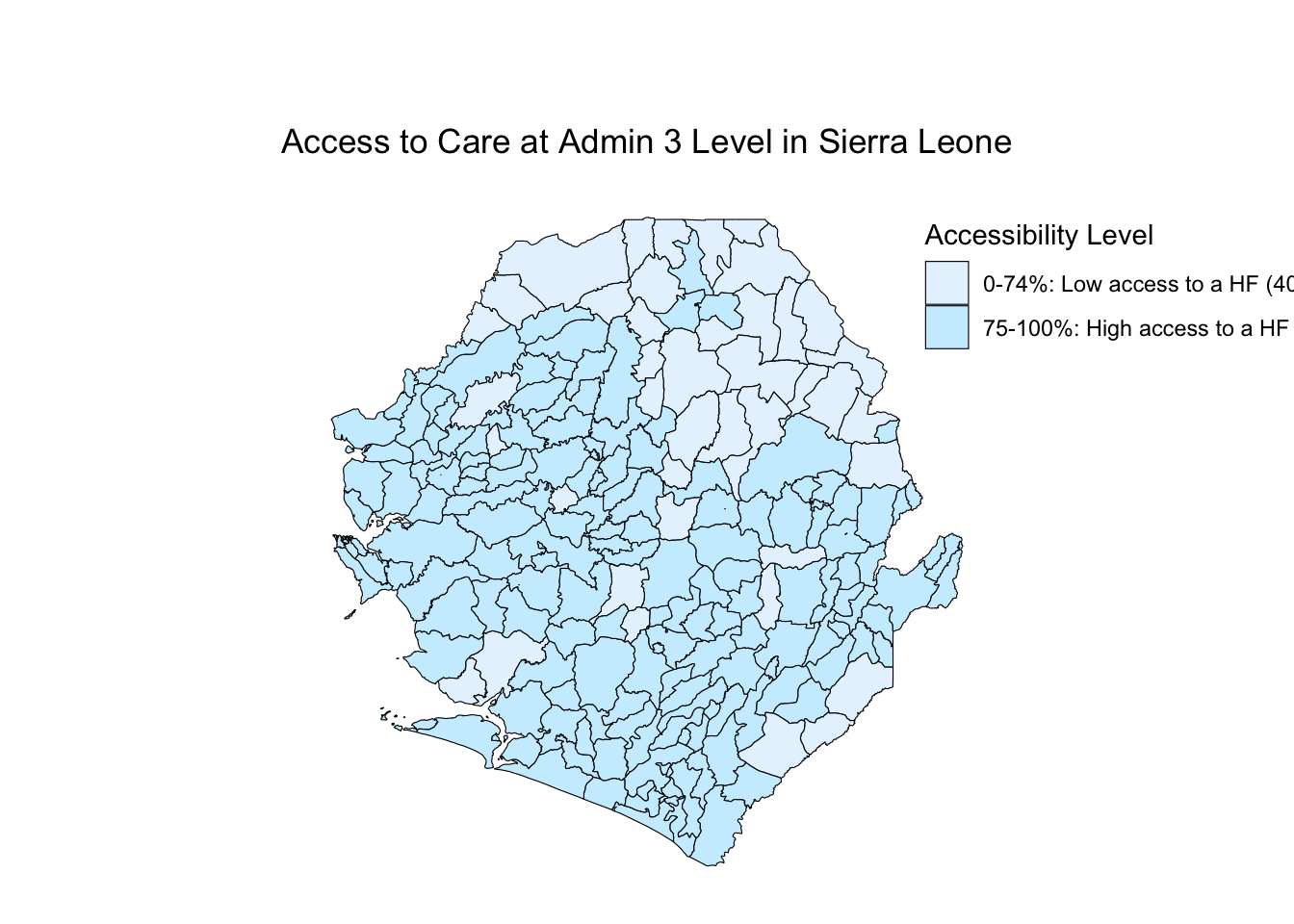
To adapt the code:
- Lines 15-16: Update category names to match those defined in Step 4.2.
- Lines 15-16: Change colors using hex codes (e.g., “#FF5733” for orange).
- Line 18: Modify legend title as needed.
- Line 24: Adjust legend position using coordinates (0-1 scale for x and y).
- Line 29: Update map title to reflect your study area.
Step 5.3: Save map
Map saved successfully as 'Access_to_care_map.png'To adapt the code:
- Line 7: Change output filename as needed.
- Line 8: Adjust width and height (in inches) for different aspect ratios.
- Line 8: Change dpi (dots per inch) for different resolution (300 is standard for publication).
Step 6: Summary statistics
=== ACCESSIBILITY SUMMARY ===summary_stats <- gdf %>%
sf::st_drop_geometry() %>%
dplyr::group_by(accessibility) %>%
dplyr::summarise(
n = n(),
mean_accessibility = mean(prop_within, na.rm = TRUE),
median_accessibility = median(prop_within, na.rm = TRUE),
min_accessibility = min(prop_within, na.rm = TRUE),
max_accessibility = max(prop_within, na.rm = TRUE),
.groups = "drop"
)
print(summary_stats)# A tibble: 2 × 6
accessibility n mean_accessibility median_accessibility min_accessibility
<chr> <int> <dbl> <dbl> <dbl>
1 0-74%: Low ac… 40 54.8 54.5 24
2 75-100%: High… 168 95.1 100 75
# ℹ 1 more variable: max_accessibility <dbl>| accessibility | n | mean_accessibility | median_accessibility | min_accessibility | max_accessibility |
|---|---|---|---|---|---|
| 0-74%: Low access to a HF | 40 | 54.77 | 54.5 | 24 | 74 |
| 75-100%: High access to a HF | 168 | 95.07 | 100.0 | 75 | 100 |
To adapt the code:
- Line 13: Replace “prop_within” with your accessibility column name.
- Lines 14-16: Add or remove summary statistics as needed (e.g., add
sd()for standard deviation).
Summary
This analysis provides a comprehensive assessment of geographic access to health care by:
- Measuring Accessibility: Calculating the proportion of population within travel time thresholds to health facilities
- Classifying Areas: Categorizing chiefdoms into low and high access groups based on defined standards
- Quality Assurance: Checking for missing data and validating merge operations
- Visualization: Creating maps that clearly display accessibility patterns
- Statistical Summary: Providing quantitative summaries of accessibility by category
The results identify priority areas for health system strengthening and guide resource allocation decisions.
Full Code
# ==============================================================================
# ACCESS TO CARE ANALYSIS AT ADMINISTRATIVE LEVEL 3
# ==============================================================================
# STEP 1: INSTALL AND LOAD REQUIRED PACKAGES
# ==============================================================================
# Install pacman if not already installed
if (!require("pacman")) install.packages("pacman")
# Load all required packages using pacman
pacman::p_load(
here, # For file path management
sf, # For spatial data
dplyr, # For data manipulation
ggplot2, # For visualization
readxl, # For reading Excel files
knitr # For creating tables
)
# ==============================================================================
# STEP 2: CONFIGURE FILE PATHS
# ==============================================================================
# Configure file paths
shapefile_path <- here::here(
  "data/shapefiles/processed/sle_spatial_adm3_2021.rds"
)
access_data_path <- here::here("english/data_r/access_to_care", "SL_Access_to_care_results.xlsx")
# ==============================================================================
# STEP 3: LOAD AND INSPECT DATA
# ==============================================================================
# Step 3.1: Read spatial and tabular data
cat("Reading data files...\n")
gdf <- readRDS(shapefile_path) |> sf::st_as_sf()
df <- readxl::read_excel(access_data_path)
cat("Data files loaded successfully.\n")
# Step 3.2: Initial data inspection
cat("=== DATA INSPECTION ===\n")
cat("Number of rows in shapefile:", nrow(gdf), "\n")
cat("Number of rows in Excel file:", nrow(df), "\n\n")
cat("Districts in shapefile:\n")
print(sort(unique(gdf$adm2)))
cat("\nDistricts in Excel file:\n")
print(sort(unique(df$FIRST_DNAM)))
cat("\nNumber of unique chiefdoms in shapefile:",
    length(unique(gdf$adm3)), "\n")
cat("Number of unique chiefdoms in Excel file:",
    length(unique(df$FIRST_CHIE)), "\n")
# ==============================================================================
# STEP 4: DATA PROCESSING AND CLASSIFICATION
# ==============================================================================
# Step 4.1: Merge spatial and tabular data
cat("Merging datasets...\n")
gdf <- gdf %>%
dplyr::left_join(df, by = c("adm2" = "FIRST_DNAM",
"adm3" = "FIRST_CHIE"))
cat("Datasets merged successfully.\n")
# Step 4.2: Calculate accessibility metrics
cat("Calculating accessibility metrics...\n")
gdf <- gdf %>%
  dplyr::mutate(
    prop_within = as.numeric(prop_within),
    prop_within = prop_within * 100
  ) %>%
  dplyr::mutate(
    accessibility = dplyr::case_when(
      prop_within >= 0 & prop_within <= 74 ~ "0-74%: Low access to a HF",
      prop_within >= 75 & prop_within <= 100 ~ "75-100%: High access to a HF",
      TRUE ~ NA_character_
    )
  )
cat("Accessibility metrics calculated.\n")
# Step 4.3: Data quality checks
cat("\n=== DATA QUALITY CHECKS ===\n")
missing_count <- sum(is.na(gdf$prop_within))
cat("Number of missing values in prop_within:", missing_count, "\n")
if (missing_count > 0) {
  cat("\nChiefdoms with missing accessibility data:\n")
  print(gdf %>%
    sf::st_drop_geometry() %>%
    dplyr::filter(is.na(prop_within)) %>%
    dplyr::select(adm2, adm3))
}
# ==============================================================================
# STEP 5: CREATE ACCESSIBILITY MAP
# ==============================================================================
# Step 5.1: Prepare legend labels with counts
category_counts <- table(gdf$accessibility, useNA = "ifany")
legend_labels <- paste0(names(category_counts), " (", category_counts, ")")
# Step 5.2: Generate map
cat("\nGenerating accessibility map...\n")
map <- ggplot2::ggplot() +
ggplot2::geom_sf(data = gdf, ggplot2::aes(fill = accessibility),
color = "black", size = 0.2) +
ggplot2::scale_fill_manual(
values = c(
"0-74%: Low access to a HF" = "#E6F3FF",
"75-100%: High access to a HF" = "#CCEEFF"
),
name = "Accessibility Level",
labels = legend_labels,
na.value = "gray90"
) +
ggplot2::theme_void() +
ggplot2::theme(
legend.position = c(0.9, 0.95),
legend.justification = c(0, 1),
plot.title = ggplot2::element_text(hjust = 0.5,
margin = ggplot2::margin(t = 20, b = 10)),
plot.margin = ggplot2::margin(t = 30, r = 10, b = 10, l = 10)
) +
ggplot2::ggtitle("Access to Care at Admin 3 Level in Sierra Leone")
print(map)
# Step 5.3: Save map
ggplot2::ggsave("Access_to_care_map.png", map,
width = 15, height = 10, dpi = 300, bg = 'white')
cat("Map saved successfully as 'Access_to_care_map.png'\n")
# ==============================================================================
# STEP 6: SUMMARY STATISTICS
# ==============================================================================
cat("\n=== ACCESSIBILITY SUMMARY ===\n")
summary_stats <- gdf %>%
  sf::st_drop_geometry() %>%
  dplyr::group_by(accessibility) %>%
  dplyr::summarise(
    n = n(),
    mean_accessibility = mean(prop_within, na.rm = TRUE),
    median_accessibility = median(prop_within, na.rm = TRUE),
    min_accessibility = min(prop_within, na.rm = TRUE),
    max_accessibility = max(prop_within, na.rm = TRUE),
    .groups = "drop"
  )

print(summary_stats)
cat("\nAnalysis complete!\n")