pacman::p_load(
  dplyr,         # data manipulation
  tidyr,         # data tidying
  purrr,         # functional iteration
  lubridate,     # date handling
  slider,        # rolling-window operations for weighted reporting rate
  ggplot2,       # data visualization
  ggtext,        # markdown text in ggplot titles
  wesanderson,   # color palettes (Zissou1)
  scales,        # axis formatting
  forcats,       # factor ordering
  stringr,       # string manipulation
  tibble,        # tidy data frames
  knitr,         # html table rendering
  cli,           # informative messages
  here           # reproducible file paths
)Health facility reporting rate
Overview
In SNT, routine surveillance data feed every downstream stratification, burden estimate, and intervention target, and their reliability hinges on two complementary questions. The Missing data detection methods page asks which values are missing within the data that arrived. This page asks which facilities arrived in the first place: what proportion of the health facilities that should have reported actually did, across geography and time. Reporting rate is the other side of the missing-data coin.
A reporting rate is observed / expected for a given facility-month and indicator. The observed count is the number of facilities that submitted a non-missing value for the indicator in that period. The expected count is the number of facilities that were active and reasonably expected to report, defined by activity status, facility type, and indicator. The Determining active and inactive status page produces the balanced facility × month panel (panel_df) with an is_active column that this page consumes.
Reporting rates feed two downstream uses in SNT:
- System assessment: diagnosing where and when routine reporting is incomplete so the team can prioritize where to strengthen surveillance. For example, identifying districts whose
confreporting falls below 70% during the rainy season, or facility types that consistently under-reportIPTp3even when other indicators are submitted. - Burden adjustment: estimating cases that would have been reported if every expected facility had reported. The unweighted reporting rate is the right metric for system assessment; the weighted version, which gives larger facilities proportionally more influence, is what most burden corrections need because missing a major hospital’s confirmed-case count distorts the district estimate far more than missing a small clinic’s.
The reporting rate is also the R term that drives the second step of the stepwise incidence adjustment: once cases have been adjusted for incomplete testing (N₁), the next step inflates them by the inverse of the reporting rate to recover cases missed because facilities did not submit data, \(N_2 = N_1 / R\). The bias we are correcting here is underreporting bias: without this step, districts with weaker reporting systems look healthier than districts with strong reporting even when their true burden is identical, and SNT intervention targeting would be pushed toward the better-reporting districts rather than the higher-burden ones. Every choice made on this page, including the indicator, denominator, and weighting, flows directly into that adjustment.
NoteObjectives
- Calculate monthly unweighted and weighted reporting rates for any routine indicator at any admin level
- Visualise reporting-rate patterns across indicators, admin units, and time using heatmaps and line plots
- Generate validated reporting-rate outputs that downstream stratification and burden-correction workflows can consume
Understanding Reporting Rate
Three decisions shape every reporting-rate output: which facilities are counted as expected, which indicator defines a report, and whether facilities are weighted by their typical caseload. We unpack each below before implementing them in code.
Establishing the Denominator
Before evaluating the proportion of facilities that reported in a given period, we determine the number of facilities that should report. A denominator that is too broad (including facilities that shouldn’t have reported on this indicator) underestimates the rate and gives an inaccurate picture of surveillance quality. The SNT team may, for example, consider:
- When calculating reporting rate for confirmed malaria cases, exclude facility types that do not test or treat malaria. For example, HIV clinics or maternity wards.
- When calculating reporting rate for malaria admissions, exclude facility types that only handle outpatients, for example community health workers or health posts.
- When calculating reporting rate for an indicator, exclude facilities that have closed, that are not yet active, or are temporarily nonfunctional. This avoids penalizing newly opened facilities that weren’t expected to report in earlier months, or facilities that are permanently or temporarily closed and therefore are not expected to report.
Up-to-date master facility lists (MFL) that track facility type and activity status are helpful for determining which health facilities should be included in the denominator for reporting rate of each indicator, for each reporting period. In the absence of an MFL, or official determination of activity status, we can still infer activity status from the reporting data itself; the Determining active and inactive status page covers the three methods (Method 1: Permanent, Method 2: First-to-Last, Method 3: Dynamic Run-Length) and produces the balanced panel (panel_df) with the is_active flag we consume here.
ImportantConsult with SNT team
Consult the SNT team on which facility types, if any, should be excluded from the denominator for each indicator. National practice varies, and the surveillance focal person on the SNT team can explain what is appropriate for each indicator in the country context.
What Incomplete Reporting Looks Like
Before calculating reporting rate, it helps to distinguish two distinct ways a facility can fail to report, only one of which we can see in the data:
- Type A: submitted but partial. The facility submits the monthly form but with only a subset of the cases observed in that month. The form is non-missing, so a reporting-rate calculation counts the facility as “reporting”, but the cases inside are an undercount. This failure mode is invisible to the data alone and can only be detected through Data Quality Audits (DQAs) or by triangulating against related indicators (e.g., confirmed cases far below tested).
- Type B: did not submit. The facility did not submit any value for the indicator that month, so the field is
NA. This failure mode is what the reporting-rate metric measures: the denominator counts the facility as expected, the numerator does not count it as observed.
Everything below, including observed / expected, weighted vs unweighted, the heatmaps and line plots, addresses Type B. A high reporting rate does not rule out Type A under-reporting, and a low reporting rate often co-occurs with Type A in the months that were submitted. Both types matter for downstream burden adjustment; one is solved here, the other escalates to DQA workflows.
Calculating the Reporting Rate
Reporting rate is calculated per indicator, not across indicators. Reporting practice varies across indicators within the same facility. For example, a facility may prioritize reporting confirmed cases (because stock replenishment depends on consistent reporting) but neglect all-cause outpatient visits. When an aggregate reporting rate is required (a facility counted as reporting only if it reports several indicators together), it is bounded by the minimum of the individual indicator rates, because a facility that misses any one indicator is dropped from the numerator while staying in the denominator for all of them.
For each indicator of interest, reporting rate is defined as:
\[ \text{Indicator Reporting Rate}_{a,t} = \frac{o_{a,t}}{e_{a,t}} \]
Where:
- \(a\) is the administrative unit (e.g., chiefdom or district)
- \(t\) is the time period (e.g., “2022-03”)
- \(o_{a,t}\) is the number of observed facilities in unit \(a\) during time \(t\)
- \(e_{a,t}\) is the number of expected facilities in unit \(a\) during time \(t\)
Worked example
Suppose we are calculating the reporting rate for total confirmed cases for Kailahun (adm2 = "KAILAHUN") in March 2022.
- There are 89 health facilities in Kailahun that have ever submitted data on any key malaria indicator
- All 89 submitted their first report on or before March 2022, so they are assumed to be active and expected to report that month
- Of these, 80 facilities reported a valid value for
conf(total confirmed cases) in March 2022 → 80 are observed reporting - The other 9 do not have a valid value for total confirmed cases (they show
NAin the database) for March 2022
The reporting rate is calculated as:
\[ \text{Reporting Rate for Total Confirmed Cases}_{\text{Kailahun},\text{Mar 2022}} = \frac{80}{89} = 0.899 \]
Weighted vs Unweighted Reporting Rates
The unweighted reporting rate treats every facility equally. The weighted reporting rate gives larger facilities proportionally more influence, so it estimates the proportion of an indicator’s typical caseload that was reported into routine surveillance, rather than the proportion of facilities that reported.
The two metrics can move in opposite directions for the same district:
- If a non-reporting facility is typically a small contributor to its district’s caseload, the weighted reporting rate is higher than the unweighted (fewer cases are missing than the facility count would suggest).
- If a non-reporting facility is typically a large contributor, the weighted reporting rate is lower than the unweighted (more cases are missing than the facility count suggests).
Why the unweighted rate is not enough
Consider a single district in 2022 with three facilities reporting confirmed cases: a referral hospital (high caseload), and two peripheral health centres HF1 and HF2 (low caseload). A check mark (✓) means the facility reported that month; a dash (–) means it did not.
| Month | 1 | 2 | 3 | 4 | 5 | 6 | 7 | 8 | 9 | 10 | 11 | 12 |
|---|---|---|---|---|---|---|---|---|---|---|---|---|
| Hospital | ✓ | ✓ | – | ✓ | ✓ | ✓ | – | ✓ | – | ✓ | ✓ | ✓ |
| HF1 | ✓ | ✓ | ✓ | ✓ | – | ✓ | – | – | ✓ | ✓ | ✓ | ✓ |
| HF2 | – | ✓ | ✓ | – | ✓ | ✓ | ✓ | ✓ | – | – | ✓ | ✓ |
| Reported | 2 | 3 | 2 | 2 | 2 | 3 | 1 | 2 | 1 | 2 | 3 | 3 |
| Expected | 3 | 3 | 3 | 3 | 3 | 3 | 3 | 3 | 3 | 3 | 3 | 3 |
| Unweighted RR | 66% | 100% | 66% | 66% | 66% | 100% | 33% | 66% | 33% | 66% | 100% | 100% |
The unweighted rate reports the same 66% for months 1, 3, 4, 5, 8 and 10. In month 3 the missing facility is the hospital; in month 5 it is a peripheral HF1. Those two months are not equivalent. The month missing the hospital loses far more cases than the month missing HF1, even though both show 66%. The weighted rate would assign the hospital a much larger weight, pull month 3 closer to the hospital’s share of district cases (perhaps 20–30%), and leave month 5 close to 90%+. Standard reporting-rate calculations assume the same weight per record reported or missed, which is wrong whenever facility caseloads differ, i.e., almost always.
Calculating the weighted reporting rate
For each facility-month, the facility’s weight is its average value of a chosen size proxy (typically test or allout) over the previous 12 months, divided by the sum of those rolling averages across all facilities in the same admin unit and month. By default the current period is excluded from its own window, so a facility’s weight in month t is set by what it was doing in months t-12 … t-1. Months in which a facility was inactive contribute zero to that average, so chronically inactive facilities carry small weights. The district’s weighted reporting rate for a given month-year is then the sum of weights of facilities that submitted a non-missing value that month.
Other weighting strategies exist (for example, a calendar-month-of- year average across all years of data); the Step-by-Step implements the rolling 12-month, exclude-current window and notes alternatives where they apply.
When to use which
| Use case | Metric | Why |
|---|---|---|
| Diagnosing surveillance system performance | Unweighted | Each facility counts equally, so a 70% rate means 70% of facilities reported. |
| Estimating unreported cases for burden correction | Weighted | Accounts for the fact that a missing major hospital represents far more caseload than a missing small clinic. |
If we use the weighted version for downstream analysis, we also calculate the unweighted version and compare; the comparison itself reveals whether the largest contributors are reporting consistently.
Assumptions Baked into Every Reporting-Rate Adjustment
Whenever a reporting rate is used to inflate reported cases as the R in \(N_2 = N_1 / R\), three assumptions ride along. These are not failures of the metric; they are the load-bearing simplifications that make the adjustment tractable. Stating them up front makes it easier to judge when the adjusted estimate is trustworthy and when it is not.
WarningThree assumptions to keep in mind
- Non-reporters look like reporters. Cases inflated from
cases_reported / Rassume the missing facility-months follow the same case distribution as the reporting ones. If facilities go silent precisely during outbreaks, stock-outs, or staff shortages (exactly when their caseload is unusual), this assumption breaks and the adjustment is biased. - Annual reporting rates miss seasonal swings. Reporting completeness varies within the year: rainy seasons, holiday months, and stock-out periods all suppress submission. Always compute and apply reporting rates monthly, not annually, especially in seasonal transmission settings.
- District-level rates hide which facilities are silent. A district at 70% could be missing every small clinic equally, or it could be systematically missing its referral hospital month after month. The two have very different implications for burden. Inspect facility-level reporting alongside the district rate, and use the weighted version to surface the hospital-shaped gaps.
Step-by-Step
We now walk through the steps for calculating and visualising monthly reporting rates using example DHIS2 data from Sierra Leone. The cleaned routine data come from the DHIS2 preprocessing page; the active-facility denominator comes from the active status page.
Step 1: Load Packages and Data
Step 1.1: Load required R packages
To adapt the code:
- Do not modify anything in the code above.
from pathlib import Path

import geopandas as gpd
import matplotlib.colors as mcolors
import matplotlib.pyplot as plt
import matplotlib.ticker as mticker
import numpy as np
import pandas as pd
import pyreadr
from pyprojroot import here

# ── cli helpers ───────────────────────────────────────────────────────────────
def cli_header(message):
    print(f"\n{message}")

def cli_info(message):
    print(f"INFO: {message}")

def cli_success(message):
    print(f"SUCCESS: {message}")

def cli_warning(message):
    print(f"WARNING: {message}")

def cli_danger(message):
    print(f"ERROR: {message}")

def anti_join(left, right, on):
    """Return rows in left with no matching key in right."""
    right_keys = right[on].drop_duplicates()
    return (
        left.merge(right_keys, on=on, how="left", indicator=True)
        .loc[lambda x: x["_merge"] == "left_only"]
        .drop(columns="_merge")
    )

# ── html table helper (mirrors R show_table) ─────────────────────────────────
def show_table(df, n=10, caption=None, digits=2):
    """Render first n rows as scrollable HTML matching the .out-table style."""
    subset = df.head(n).copy()
    for col in subset.select_dtypes(include="number").columns:
        subset[col] = subset[col].round(digits)
    html = subset.to_html(
        index=False,
        border=0,
        classes="out-table",
        na_rep="",
    )
    if caption:
        html = f"<caption>{caption}</caption>" + html
    print(f'<div class="out-scroll">{html}</div>')
To adapt the code:
- Do not modify anything in the code above.
Step 1.2: Import preprocessed routine data
Load the preprocessed routine data exported by the import step (clean_malaria_routine_data_final.parquet) and derive a year-month (yearmon) column we will group by throughout the page.
To adapt the code:
- Lines 2-6: Adjust the path components if the data is stored elsewhere.
from pathlib import Path
import pandas as pd
from pyprojroot import here
dhis2_df = pd.read_parquet(Path(here(
"01_data/1.2_epidemiology"
"/1.2a_routine_surveillance/processed"
"/clean_malaria_routine_data_final.parquet"
)))
dhis2_df = dhis2_df.assign(
date=lambda d: pd.to_datetime(d["date"], errors="coerce"),
yearmon=lambda d: d["date"].dt.strftime("%Y-%m"),
)To adapt the code:
- Lines 6-10: Adjust the path components if the data is stored elsewhere.
Step 1.3: Build the active facility panel inline
The expected count we compare observed reports against is the number of facilities that were active in each month-admin combination. The active status page covers the three methods of classifying activity in full; here we re-apply Method 2 (first-to-last with a 6-month grace period) inline so this page runs standalone, without depending on the active status page having been rendered first.
The block produces two things: panel_df, the balanced facility × month panel carrying an is_active column, which is the input that compute_rep_rate() (Step 2) and compute_rep_rate_weighted() (Step 4.1) consume, and df_expected, a per-yearmon × adm summary of the active-facility counts, shown for reference so we can spot-check the denominators that feed into the unweighted rate.
ImportantConsult with SNT team
The denominator used here must be validated by the SNT team. The set of indicators used to define active status, and whether the denominator should be filtered for specific facility types, vary by country and by indicator.
Show the code
# method 2 parameters: indicators that signal service delivery and the
# grace period (months) past a facility's last report before it counts
# as inactive
key_indicators <- c("allout", "test", "pres", "conf", "maltreat", "maladm")
nonreport_window <- 6L
# balanced facility × month panel: any missing facility-month is a
# non-reporting month
month_seq <- seq(min(dhis2_df$date), max(dhis2_df$date), by = "month")
panel <- tidyr::expand_grid(
hf_uid = unique(dhis2_df$hf_uid),
date = month_seq
)
panel_df <- dhis2_df |>
dplyr::right_join(panel, by = c("hf_uid", "date")) |>
dplyr::arrange(hf_uid, date) |>
dplyr::group_by(hf_uid) |>
tidyr::fill(adm0, adm1, adm2, adm3, .direction = "downup") |>
dplyr::ungroup() |>
dplyr::mutate(
yearmon = format(date, "%Y-%m"),
reported_any = dplyr::if_any(
dplyr::all_of(key_indicators),
~ !is.na(.x)
)
)
# first / last reporting dates plus panel last date per facility
panel_df <- panel_df |>
dplyr::arrange(hf_uid, date) |>
dplyr::group_by(hf_uid) |>
dplyr::mutate(
first_rep = if (any(reported_any)) min(date[reported_any]) else as.Date(NA),
last_rep = if (any(reported_any)) max(date[reported_any]) else as.Date(NA),
last_date = max(date)
) |>
dplyr::ungroup()
# method 2: active from first report onward; inactive only after the
# grace period has elapsed past the last report
panel_df <- panel_df |>
dplyr::mutate(
months_since_last = dplyr::if_else(
is.na(last_rep),
Inf,
as.numeric(
lubridate::interval(last_rep, last_date) / lubridate::dmonths(1)
)
),
is_active = dplyr::case_when(
is.na(first_rep) ~ FALSE,
date < first_rep ~ FALSE,
date <= last_rep ~ TRUE,
months_since_last < nonreport_window ~ TRUE,
TRUE ~ FALSE
)
)
# aggregate to yearmon × admin unit
df_expected <- panel_df |>
dplyr::group_by(yearmon, adm0, adm1, adm2, adm3) |>
dplyr::summarise(
denominator = sum(is_active, na.rm = TRUE),
.groups = "drop"
) |>
dplyr::arrange(yearmon, adm0, adm1, adm2, adm3)To adapt the code:
- Line 4: Replace
key_indicatorswith the columns the program treats as reporting indicators. - Line 5: Tune
nonreport_windowto match the country’s preferred grace period (months). - To use a different activity method, swap the Method 2 block (the
case_whensettingis_active) for the Method 1 or Method 3 logic from the active status page.
Show the code
import numpy as np
import pandas as pd
# method 2 parameters
key_indicators = ["allout", "test", "pres", "conf", "maltreat", "maladm"]
nonreport_window = 6
# balanced facility × month panel
month_seq = pd.date_range(dhis2_df["date"].min(), dhis2_df["date"].max(), freq="MS")
panel = pd.MultiIndex.from_product(
[dhis2_df["hf_uid"].unique(), month_seq],
names=["hf_uid", "date"]
).to_frame(index=False)
panel_df = (
panel.merge(dhis2_df, on=["hf_uid", "date"], how="left")
.sort_values(["hf_uid", "date"])
)
# forward-fill then back-fill admin metadata within each facility group
meta_cols = ["adm0", "adm1", "adm2", "adm3"]
panel_df[meta_cols] = (
panel_df.groupby("hf_uid")[meta_cols]
.transform(lambda s: s.ffill().bfill())
)
# add missing key indicator columns so the predicate is consistent
for _col in key_indicators:
if _col not in panel_df.columns:
panel_df[_col] = np.nan
panel_df = panel_df.assign(
yearmon=lambda d: d["date"].dt.strftime("%Y-%m"),
reported_any=lambda d: d[key_indicators].notna().any(axis=1),
)
# per-facility first / last reporting dates and panel last date
def _facility_dates(g):
g = g.copy()
mask = g["reported_any"]
if mask.any():
g["first_rep"] = g.loc[mask, "date"].min()
g["last_rep"] = g.loc[mask, "date"].max()
else:
g["first_rep"] = pd.NaT
g["last_rep"] = pd.NaT
g["last_date"] = g["date"].max()
return g
panel_df = (
panel_df.sort_values(["hf_uid", "date"])
.groupby("hf_uid", group_keys=False)
.apply(_facility_dates)
.reset_index(drop=True)
)
# months_since_last per facility (match lubridate::dmonths(1) = 30.4375 days)
def _months_since(g):
g = g.copy()
if g["last_rep"].isna().all():
g["months_since_last"] = np.inf
else:
last_rep = g["last_rep"].iloc[0]
last_date = g["last_date"].iloc[0]
g["months_since_last"] = (last_date - last_rep).days / 30.4375
return g
panel_df = (
panel_df.groupby("hf_uid", group_keys=False)
.apply(_months_since)
.reset_index(drop=True)
)
# method 2: active from first report; inactive only after grace period elapses
panel_df["is_active"] = np.select(
[
panel_df["first_rep"].isna(),
panel_df["date"] < panel_df["first_rep"],
panel_df["date"] <= panel_df["last_rep"],
(panel_df["date"] > panel_df["last_rep"])
& (panel_df["months_since_last"] < nonreport_window),
],
[0, 0, 1, 1],
default=0,
).astype(bool)
# per yearmon × admin expected-facility counts
df_expected = (
panel_df
.groupby(["yearmon", "adm0", "adm1", "adm2", "adm3"], as_index=False)
.agg(denominator=("is_active", "sum"))
.sort_values(["yearmon", "adm0", "adm1", "adm2", "adm3"])
.reset_index(drop=True)
)To adapt the code:
- Line 5: Replace
key_indicatorswith the columns the program treats as reporting indicators. - Line 6: Tune
nonreport_windowto match the country’s preferred grace period (months). - To use a different activity method, swap the
np.selectblock that setsis_activefor the Method 1 or Method 3 logic from the active status page.
Step 2: Define the Reporting Rate Function
We define one function that computes the monthly reporting rate for any indicator at any admin unit level. It filters the balanced panel to active facility-months (is_active), then per yearmon × adm group counts the distinct facilities that reported a non-NA value for the indicator (the numerator) and the distinct facilities that were expected to report (the denominator). The output columns are:
rep: number of distinct facilities that reported a non-NAvalue for the indicator in that month-admin group (the numerator)exp: number of distinct facilities that were active and therefore expected to report in that month-admin group (the denominator)reprate:rep / exp, the unweighted reporting ratemissrate:1 − reprate, the missing-data complement
Show the code
compute_rep_rate <- function(panel_df, level, indicator) {
level_col <- paste0("adm", level)
group_vars <- c("yearmon", level_col)
# active filter: keep only facility-months where the facility was
# expected to report (is_active). this is what makes `exp` the
# active-facility count, not every facility in the export.
panel_df |>
dplyr::filter(is_active) |>
dplyr::mutate(
reported_any_var = !is.na(.data[[indicator]])
) |>
dplyr::group_by(dplyr::across(dplyr::all_of(group_vars))) |>
dplyr::summarise(
# count distinct facilities, not rows, in case the panel ever
# carries duplicate facility-month rows.
rep = dplyr::n_distinct(hf_uid[reported_any_var]),
exp = dplyr::n_distinct(hf_uid),
.groups = "drop"
) |>
dplyr::mutate(
reprate = dplyr::if_else(exp > 0, rep / exp, NA_real_),
missrate = dplyr::if_else(!is.na(reprate), 1 - reprate, NA_real_),
indicator = indicator
) |>
dplyr::select(
dplyr::all_of(group_vars),
indicator,
rep, exp, reprate, missrate
)
}To adapt the code:
- Do not modify anything in the code above.
Show the code
def compute_rep_rate(panel_df, level, indicator):
"""
Compute the monthly unweighted reporting rate for one indicator at one
admin level. Mirrors R compute_rep_rate() column-for-column.
Returns a DataFrame with columns:
yearmon, adm<level>, indicator, rep, exp, reprate, missrate
"""
level_col = f"adm{level}"
group_vars = ["yearmon", level_col]
active = panel_df.loc[panel_df["is_active"]].copy()
active["reported_any_var"] = active[indicator].notna()
# n_distinct(hf_uid where reported) and n_distinct(hf_uid total)
def _agg(g):
rep = g.loc[g["reported_any_var"], "hf_uid"].nunique()
exp = g["hf_uid"].nunique()
return pd.Series({"rep": rep, "exp": exp})
result = (
active
.groupby(group_vars, as_index=False)
.apply(_agg, include_groups=False)
.reset_index(drop=True)
)
result = result.assign(
reprate=lambda d: np.where(
d["exp"] > 0, d["rep"] / d["exp"], np.nan
),
missrate=lambda d: np.where(
d["reprate"].notna(), 1 - d["reprate"], np.nan
),
indicator=indicator,
)
col_order = group_vars + ["indicator", "rep", "exp", "reprate", "missrate"]
return result[col_order]To adapt the code:
- Do not modify anything in the code above.
Step 3: Unweighted Reporting Rate
Step 3.1: Compute the rate for a single indicator
Set the indicator (conf) and the admin unit level (adm3), call the function defined in Step 2, and save the result for downstream use.
indicator <- "conf"
level <- 3
df_rr <- compute_rep_rate(panel_df, level, indicator)
# save for downstream stratification and burden-correction workflows
save_path <- here::here(
"01_data",
"1.2_epidemiology",
"1.2a_routine_surveillance",
"processed"
)
saveRDS(
df_rr,
here::here(
save_path,
paste0("monthly_", indicator, "_reprate_adm", level, ".rds")
)
)To adapt the code:
- Line 1: Replace
"conf"with the indicator to compute. - Line 2: Set
levelto 0–3 for national through chiefdom.
from pathlib import Path
import pandas as pd
from pyprojroot import here
indicator = "conf"
level = 3
df_rr = compute_rep_rate(panel_df, level, indicator)
# save for downstream stratification and burden-correction workflows
save_path = Path(here(
"01_data/1.2_epidemiology"
"/1.2a_routine_surveillance/processed"
))
df_rr.to_parquet(
save_path / f"monthly_{indicator}_reprate_adm{level}.parquet",
index=False,
)To adapt the code:
- Line 6: Replace
"conf"with the indicator to compute. - Line 7: Set
levelto 0–3 for national through chiefdom.
TipAlternative code option using
sntutils package
sntutils::calculate_reporting_metrics() does the same thing in one call (facility-activity classification plus per-group reporting rate) and returns a frame with the same rep, exp, reprate, missrate columns our compute_rep_rate() produces.
df_rr <- sntutils::calculate_reporting_metrics(
data = dhis2_df,
vars_of_interest = "conf",
x_var = "yearmon",
y_var = paste0("adm", level),
hf_col = "hf_uid",
key_indicators = c("allout", "conf", "test", "treat", "pres"),
# method: 1 = permanent, 2 = first-to-last, 3 = dynamic
method = 2,
# grace / dynamic window in months
nonreport_window = 6
)Step 4: Weighted Reporting Rate
Step 4.1: Compute the weighted rate
We now run the weighted version of the reporting rate, using the rolling 12-month approach described in Calculating the weighted reporting rate above. We reach for it whenever we plan to feed the result into burden adjustment, because a district missing a referral hospital one month loses far more cases than a district missing a small clinic, and only the weighted rate captures that. Same panel_df, same indicator, and same admin level as Step 3.1; the function returns the same rep / exp / reprate / missrate columns plus the weighted equivalents reprate_w and missrate_w, along with summary stats for the size-proxy variable.
Show the code
compute_rep_rate_weighted <- function(
panel_df,
level,
indicator,
weight_var = "test",
weight_window = 12,
exclude_current_x = TRUE,
cold_start = "median_within_y"
) {
level_col <- paste0("adm", level)
group_vars <- c("yearmon", level_col)
# 1. typical_size: rolling mean of weight_var over the previous
# weight_window months for each facility. computed on the full
# balanced panel so the window respects calendar spacing — months a
# facility was inactive enter as NA and drop out via na.rm.
before_n <- if (exclude_current_x) weight_window else weight_window - 1
after_n <- if (exclude_current_x) -1L else 0L
weight_data <- panel_df |>
dplyr::arrange(hf_uid, date) |>
dplyr::group_by(hf_uid) |>
dplyr::mutate(
typical_size = slider::slide_dbl(
.data[[weight_var]],
base::mean,
na.rm = TRUE,
.before = before_n,
.after = after_n,
.complete = FALSE
),
is_cold_start = is.na(typical_size)
) |>
dplyr::ungroup()
# 2. cold-start fallback.
# a facility-month is a "cold-start" if its rolling window had no
# usable data — typically a newly opened facility whose first
# weight_window months in the panel are NA, or a facility in the
# first months of the dataset where no prior history exists. we
# cannot drop these rows (they are still active facility-months
# that need a weight), and we cannot leave typical_size as NA
# (the row would then drop out of the within-group normalisation
# silently). so we fill typical_size by borrowing a neighbour's:
#
# - cold_start = "median_within_y" (default): the median
# typical_size of facilities in the same admin unit that do
# have history. assumes a new facility looks like a typical
# facility in its district.
# - cold_start = "median_global": the global median across all
# warm facility-months. use this when admins are small or the
# within-admin median is itself unreliable.
#
# is_cold_start is captured before coalesce so the qa check below
# can still report how many facility-months needed the fallback.
global_median <- stats::median(
weight_data$typical_size[!weight_data$is_cold_start],
na.rm = TRUE
)
if (cold_start == "median_within_y") {
within_y_median <- weight_data |>
dplyr::filter(!is_cold_start) |>
dplyr::group_by(dplyr::across(dplyr::all_of(level_col))) |>
dplyr::summarise(
cold_start_value = stats::median(typical_size, na.rm = TRUE),
.groups = "drop"
)
weight_data <- weight_data |>
dplyr::left_join(within_y_median, by = level_col) |>
dplyr::mutate(
typical_size = dplyr::coalesce(
typical_size, cold_start_value, global_median
)
)
} else {
weight_data <- weight_data |>
dplyr::mutate(
typical_size = dplyr::coalesce(typical_size, global_median)
)
}
# 3. normalise weights so they sum to 1 within yearmon × adm.
weight_data <- weight_data |>
dplyr::group_by(dplyr::across(dplyr::all_of(group_vars))) |>
dplyr::mutate(
weight = typical_size / sum(typical_size, na.rm = TRUE),
weight = dplyr::if_else(
is.na(weight) | is.infinite(weight), 0, weight
)
) |>
dplyr::ungroup()
# 4. qa: warn if any group's weights don't sum to 1, and if more
# than 25% of *active* facility-months in any period are cold-starts.
weight_check <- weight_data |>
dplyr::group_by(dplyr::across(dplyr::all_of(group_vars))) |>
dplyr::summarise(
weight_sum = sum(weight, na.rm = TRUE),
.groups = "drop"
) |>
dplyr::filter(abs(weight_sum - 1) > 1e-6)
if (nrow(weight_check) > 0) {
cli::cli_warn(c(
"!" = "Weights do not sum to 1 in {nrow(weight_check)} groups",
"i" = "Check data quality and weight calculations"
))
}
cold_start_check <- weight_data |>
dplyr::filter(is_active) |>
dplyr::group_by(yearmon) |>
dplyr::summarise(
n_total = dplyr::n(),
n_cold_start = sum(is_cold_start),
prop_cold_start = n_cold_start / n_total,
.groups = "drop"
) |>
dplyr::filter(prop_cold_start > 0.25)
if (nrow(cold_start_check) > 0) {
cli::cli_warn(c(
"!" = ">25% cold starts in {nrow(cold_start_check)} periods",
"i" = "Consider adjusting weight_window or data range"
))
}
# 5. active filter: drop inactive facility-months before
# aggregation so the weighted denominator matches the unweighted
# one.
data_with_weights <- weight_data |>
dplyr::filter(is_active) |>
dplyr::mutate(
reported_any_var = !is.na(.data[[indicator]])
)
# 6. per-facility aggregation within yearmon × adm. each facility
# has one row per period in the balanced panel so this collapses to
# identity, but the explicit step makes the per-group summary below
# easy to read.
facility_summary <- data_with_weights |>
dplyr::group_by(
dplyr::across(dplyr::all_of(c(group_vars, "hf_uid")))
) |>
dplyr::summarise(
reported_facility = any(reported_any_var),
weight_facility = base::mean(weight, na.rm = TRUE),
weight_value_facility = base::mean(.data[[weight_var]], na.rm = TRUE),
.groups = "drop"
)
# 7. per-group aggregation: unweighted rep / exp / reprate /
# missrate, weighted reprate_w / missrate_w, and weight_var
# summary stats.
facility_summary |>
dplyr::group_by(dplyr::across(dplyr::all_of(group_vars))) |>
dplyr::summarise(
rep = sum(reported_facility),
exp = dplyr::n(),
w_num = sum(weight_facility * reported_facility, na.rm = TRUE),
w_den = sum(weight_facility, na.rm = TRUE),
reprate_w = dplyr::if_else(w_den > 0, w_num / w_den, NA_real_),
missrate_w = dplyr::if_else(!is.na(reprate_w), 1 - reprate_w, NA_real_),
!!paste0("avg_", weight_var) :=
base::mean(weight_value_facility, na.rm = TRUE),
!!paste0("min_", weight_var) :=
base::min(weight_value_facility, na.rm = TRUE),
!!paste0("max_", weight_var) :=
base::max(weight_value_facility, na.rm = TRUE),
.groups = "drop"
) |>
dplyr::mutate(
reprate = dplyr::if_else(exp > 0, rep / exp, NA_real_),
missrate = dplyr::if_else(!is.na(reprate), 1 - reprate, NA_real_),
indicator = indicator
) |>
dplyr::select(
dplyr::all_of(group_vars),
indicator,
rep, exp, reprate, missrate,
reprate_w, missrate_w,
dplyr::starts_with("avg_"),
dplyr::starts_with("min_"),
dplyr::starts_with("max_")
)
}
df_rr_w <- compute_rep_rate_weighted(
panel_df, level, indicator,
weight_var = "test"
)To adapt the code:
- Line 5: Pass a different
weight_var(e.g.,"allout","conf") if the program weights facilities by a different indicator. - Line 6: Tune
weight_windowfor a longer or shorter rolling history. - Line 7: Set
exclude_current_x = FALSEto include the current period in its own window (matches some legacy implementations). - Line 8: Set
cold_start = "median_global"to fall back to the global median directly instead of the within-admin median.
Show the code
import numpy as np
import pandas as pd
def compute_rep_rate_weighted(
panel_df,
level,
indicator,
weight_var="test",
weight_window=12,
exclude_current_x=True,
cold_start="median_within_y",
):
"""
Compute monthly weighted reporting rate. Mirrors R
compute_rep_rate_weighted() column-for-column.
"""
level_col = f"adm{level}"
group_vars = ["yearmon", level_col]
# 1. typical_size: rolling mean over the previous weight_window months,
# excluding the current period when exclude_current_x is True.
# pandas rolling is over rows; sort by hf_uid + date first.
weight_data = panel_df.sort_values(["hf_uid", "date"]).copy()
# shift window boundaries to match slider::slide_dbl
# before = weight_window, after = -1 ➜ exclude current row
# before = weight_window - 1, after = 0 ➜ include current row
window = weight_window # always look back this many rows total
def _rolling_mean(g):
g = g.copy()
vals = g[weight_var].copy()
if exclude_current_x:
# exclude current: shift forward by 1 so the window covers t-12..t-1
shifted = vals.shift(1)
g["typical_size"] = (
shifted.rolling(window=window, min_periods=1).mean()
)
else:
# include current: window covers t-(window-1)..t
g["typical_size"] = (
vals.rolling(window=window, min_periods=1).mean()
)
g["is_cold_start"] = g["typical_size"].isna()
return g
weight_data = (
weight_data
.groupby("hf_uid", group_keys=False)
.apply(_rolling_mean)
.reset_index(drop=True)
)
# 2. cold-start fallback
global_median = weight_data.loc[
~weight_data["is_cold_start"], "typical_size"
].median()
if cold_start == "median_within_y" and level > 0:
within_y_median = (
weight_data.loc[~weight_data["is_cold_start"]]
.groupby(level_col, as_index=False)
.agg(cold_start_value=("typical_size", "median"))
)
weight_data = weight_data.merge(within_y_median, on=level_col, how="left")
weight_data["typical_size"] = (
weight_data["typical_size"]
.fillna(weight_data["cold_start_value"])
.fillna(global_median)
)
else:
weight_data["typical_size"] = (
weight_data["typical_size"].fillna(global_median)
)
# 3. normalise weights so they sum to 1 within yearmon × adm
grp_cols_w = group_vars
weight_data["_group_sum"] = (
weight_data.groupby(grp_cols_w)["typical_size"]
.transform("sum")
)
weight_data["weight"] = np.where(
weight_data["_group_sum"] > 0,
weight_data["typical_size"] / weight_data["_group_sum"],
0.0,
)
weight_data["weight"] = weight_data["weight"].replace(
[np.inf, -np.inf], 0.0
).fillna(0.0)
# 4. qa warnings
weight_check = (
weight_data
.groupby(grp_cols_w, as_index=False)
.agg(weight_sum=("weight", "sum"))
.loc[lambda d: (d["weight_sum"] - 1).abs() > 1e-6]
)
if len(weight_check) > 0:
cli_warning(
f"Weights do not sum to 1 in {len(weight_check)} groups — "
"check data quality and weight calculations"
)
cold_check = (
weight_data.loc[weight_data["is_active"]]
.groupby("yearmon", as_index=False)
.apply(
lambda g: pd.Series({
"n_total": len(g),
"n_cold_start": g["is_cold_start"].sum(),
}),
include_groups=False,
)
.reset_index(drop=True)
)
cold_check["prop_cold_start"] = (
cold_check["n_cold_start"] / cold_check["n_total"]
)
cold_check = cold_check.loc[cold_check["prop_cold_start"] > 0.25]
if len(cold_check) > 0:
cli_warning(
f">25% cold starts in {len(cold_check)} periods — "
"consider adjusting weight_window or data range"
)
# 5. active filter
active_w = weight_data.loc[weight_data["is_active"]].copy()
active_w["reported_any_var"] = active_w[indicator].notna()
# 6. per-facility aggregation within yearmon × adm
fac_grp = grp_cols_w + ["hf_uid"]
facility_summary = (
active_w
.groupby(fac_grp, as_index=False)
.agg(
reported_facility=("reported_any_var", "any"),
weight_facility=(f"weight", "mean"),
weight_value_facility=(weight_var, "mean"),
)
)
# 7. per-group aggregation
def _group_agg(g):
rep = int(g["reported_facility"].sum())
exp = len(g)
w_num = (g["weight_facility"] * g["reported_facility"]).sum()
w_den = g["weight_facility"].sum()
rr_w = w_num / w_den if w_den > 0 else np.nan
return pd.Series({
"rep": rep,
"exp": exp,
"w_num": w_num,
"w_den": w_den,
"reprate_w": rr_w,
"missrate_w": (1 - rr_w) if not np.isnan(rr_w) else np.nan,
f"avg_{weight_var}": g["weight_value_facility"].mean(),
f"min_{weight_var}": g["weight_value_facility"].min(),
f"max_{weight_var}": g["weight_value_facility"].max(),
})
result = (
facility_summary
.groupby(grp_cols_w, as_index=False)
.apply(_group_agg, include_groups=False)
.reset_index(drop=True)
)
result = result.assign(
reprate=lambda d: np.where(d["exp"] > 0, d["rep"] / d["exp"], np.nan),
missrate=lambda d: np.where(
d["reprate"].notna(), 1 - d["reprate"], np.nan
),
indicator=indicator,
)
col_order = (
grp_cols_w
+ ["indicator", "rep", "exp", "reprate", "missrate",
"reprate_w", "missrate_w",
f"avg_{weight_var}", f"min_{weight_var}", f"max_{weight_var}"]
)
return result[col_order]
df_rr_w = compute_rep_rate_weighted(
panel_df, level, indicator,
weight_var="test",
)To adapt the code:
- Line 8: Pass a different
weight_var(e.g.,"allout","conf") if the program weights facilities by a different indicator. - Line 9: Tune
weight_windowfor a longer or shorter rolling history. - Line 10: Set
exclude_current_x=Falseto include the current period in its own window (matches some legacy implementations). - Line 11: Set
cold_start="median_global"to fall back to the global median directly instead of the within-admin median.
TipAlternative code option using
sntutils package
sntutils::calculate_reporting_metrics(weighting = TRUE) does the same thing in one call (facility-activity classification, rolling typical-size weights, cold-start fallback, and weighted aggregation) and returns a frame with the same rep, exp, reprate, missrate, reprate_w, missrate_w columns our compute_rep_rate_weighted() produces.
df_rr_w <- sntutils::calculate_reporting_metrics(
data = dhis2_df,
vars_of_interest = "conf",
x_var = "yearmon",
y_var = paste0("adm", level),
hf_col = "hf_uid",
key_indicators = c("allout", "conf", "test", "treat", "pres"),
method = 2,
nonreport_window = 6,
weighting = TRUE,
weight_var = "test",
weight_window = 12,
exclude_current_x = TRUE,
cold_start = "median_within_y"
)Step 4.2: Compare weighted and unweighted rates
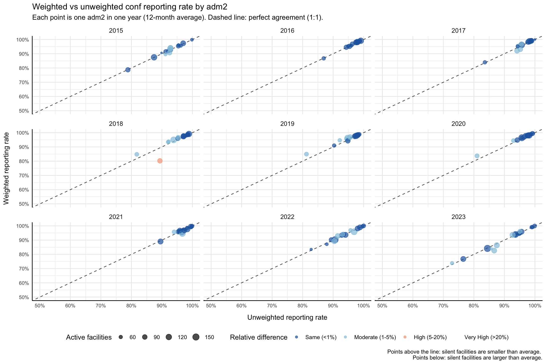
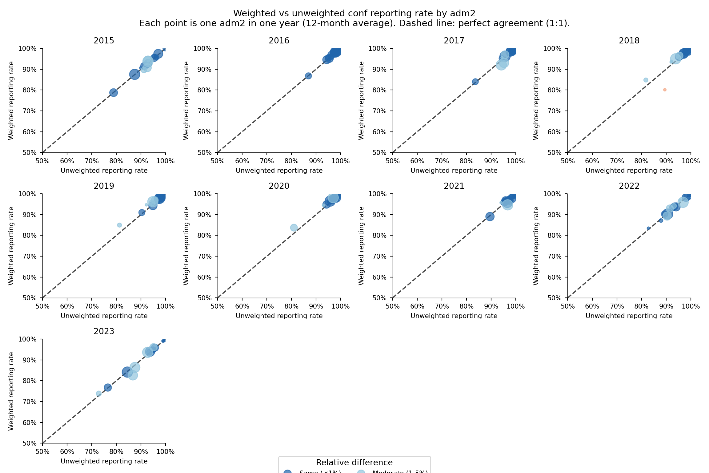
The comparison is diagnostic: a large gap between weighted and unweighted reveals that the largest contributors are reporting differently from the average facility. We plot a per-adm2 scatter of unweighted (x-axis) against weighted (y-axis) against a dashed 1:1 line. Points above the line mean silent facilities are smaller than average; points below mean silent facilities are larger (the failure mode that hurts burden estimates most). We recompute both rates at adm2, average each (adm2 × year) pair over its 12 months, tier the relative difference into four bands, and plot.
Show the code
# adm2 unweighted and weighted reporting rate for the working indicator
df_rr_adm2 <- compute_rep_rate(panel_df, 2, indicator)
df_rr_w_adm2 <- compute_rep_rate_weighted(
panel_df, 2, indicator,
weight_var = "test"
)
# one point per (adm2 × year): average the 12 months in each year so
# each panel of the scatter shows the same set of districts.
df_compare_adm2 <- df_rr_adm2 |>
dplyr::select(yearmon, adm2, reprate, exp) |>
dplyr::left_join(
df_rr_w_adm2 |> dplyr::select(yearmon, adm2, reprate_w),
by = c("yearmon", "adm2")
) |>
dplyr::mutate(year = substr(yearmon, 1, 4)) |>
dplyr::group_by(adm2, year) |>
dplyr::summarise(
reprate = base::mean(reprate, na.rm = TRUE),
reprate_w = base::mean(reprate_w, na.rm = TRUE),
n_active = base::mean(exp, na.rm = TRUE),
.groups = "drop"
) |>
dplyr::mutate(
# relative difference in percent (protect against div-by-zero)
relat_diff_pct = 100 *
base::abs(reprate_w - reprate) /
base::pmax(reprate, .Machine$double.eps),
diff_tier = dplyr::case_when(
relat_diff_pct >= 20 ~ "Very High",
relat_diff_pct >= 5 ~ "High",
relat_diff_pct >= 1 ~ "Moderate",
TRUE ~ "Same"
),
diff_tier = base::factor(
diff_tier,
levels = c("Same", "Moderate", "High", "Very High")
)
)
# x = unweighted, y = weighted; dashed line marks perfect agreement.
ggplot2::ggplot(
df_compare_adm2,
ggplot2::aes(x = reprate, y = reprate_w)
) +
ggplot2::geom_abline(
slope = 1, intercept = 0,
color = "black", linetype = "dashed", alpha = 0.7
) +
ggplot2::geom_point(
ggplot2::aes(color = diff_tier, size = n_active),
alpha = 0.7, na.rm = TRUE
) +
ggplot2::scale_color_manual(
name = "Relative difference",
values = c(
"Same" = "#2166ac",
"Moderate" = "#92c5de",
"High" = "#f4a582",
"Very High" = "#b2182b"
),
labels = c(
"Same" = "Same (<1%)",
"Moderate" = "Moderate (1-5%)",
"High" = "High (5-20%)",
"Very High" = "Very High (>20%)"
),
drop = FALSE
) +
ggplot2::scale_size_continuous(
name = "Active facilities",
range = c(0.5, 4.5),
labels = scales::comma_format()
) +
ggplot2::scale_x_continuous(labels = scales::percent_format(accuracy = 1)) +
ggplot2::scale_y_continuous(labels = scales::percent_format(accuracy = 1)) +
ggplot2::coord_cartesian(xlim = c(0.5, 1), ylim = c(0.5, 1)) +
ggplot2::facet_wrap(~ year) +
ggplot2::labs(
title = paste0(
"Weighted vs unweighted ", indicator,
" reporting rate by adm2"
),
subtitle = paste(
"Each point is one adm2 in one year (12-month average).",
"Dashed line: perfect agreement (1:1)."
),
x = "Unweighted reporting rate",
y = "Weighted reporting rate",
caption = paste(
"Points above the line: silent facilities are smaller than average.",
"\nPoints below: silent facilities are larger than average."
)
) +
ggplot2::theme_minimal() +
ggplot2::theme(
strip.text = ggplot2::element_text(size = 10),
axis.text = ggplot2::element_text(size = 8),
axis.line = ggplot2::element_line(color = "black", linewidth = 0.5),
legend.position = "bottom",
legend.spacing.x = ggplot2::unit(0.5, "cm"),
axis.title.x = ggplot2::element_text(margin = ggplot2::margin(t = 10)),
axis.title.y = ggplot2::element_text(margin = ggplot2::margin(r = 10))
)
NoteOutput
To adapt the code:
- Do not modify anything in the code above.
Show the code
import matplotlib.pyplot as plt
import numpy as np
import pandas as pd
# adm2 unweighted and weighted reporting rate for the working indicator
df_rr_adm2 = compute_rep_rate(panel_df, 2, indicator)
df_rr_w_adm2 = compute_rep_rate_weighted(
panel_df, 2, indicator, weight_var="test"
)
# one point per (adm2 × year): average the 12 months in each year
df_compare_adm2 = (
df_rr_adm2[["yearmon", "adm2", "reprate", "exp"]]
.merge(
df_rr_w_adm2[["yearmon", "adm2", "reprate_w"]],
on=["yearmon", "adm2"],
)
.assign(year=lambda d: d["yearmon"].str[:4])
.groupby(["adm2", "year"], as_index=False)
.agg(
reprate=("reprate", "mean"),
reprate_w=("reprate_w", "mean"),
n_active=("exp", "mean"),
)
)
# tier the relative difference
eps = np.finfo(float).eps
df_compare_adm2 = df_compare_adm2.assign(
relat_diff_pct=lambda d: (
100 * (d["reprate_w"] - d["reprate"]).abs()
/ d["reprate"].clip(lower=eps)
),
diff_tier=lambda d: pd.Categorical(
np.select(
[
d["relat_diff_pct"] >= 20,
d["relat_diff_pct"] >= 5,
d["relat_diff_pct"] >= 1,
],
["Very High", "High", "Moderate"],
default="Same",
),
categories=["Same", "Moderate", "High", "Very High"],
ordered=True,
),
)
tier_colors = {
"Same": "#2166ac",
"Moderate": "#92c5de",
"High": "#f4a582",
"Very High": "#b2182b",
}
tier_labels = {
"Same": "Same (<1%)",
"Moderate": "Moderate (1-5%)",
"High": "High (5-20%)",
"Very High": "Very High (>20%)",
}
years = sorted(df_compare_adm2["year"].unique())
n_cols = min(len(years), 4)
n_rows = (len(years) + n_cols - 1) // n_cols
fig, axes = plt.subplots(n_rows, n_cols, figsize=(12, 8), squeeze=False)
axes_flat = axes.flatten()
for ax_idx, yr in enumerate(years):
ax = axes_flat[ax_idx]
sub = df_compare_adm2.loc[df_compare_adm2["year"] == yr]
# dashed 1:1 reference line
ax.axline((0.5, 0.5), slope=1, color="black", linestyle="--", alpha=0.7)
for tier in ["Same", "Moderate", "High", "Very High"]:
pts = sub.loc[sub["diff_tier"] == tier]
if pts.empty:
continue
# scale bubble size to match ggplot scale_size range(0.5, 4.5)
sz_norm = (pts["n_active"] - pts["n_active"].min()) / (
pts["n_active"].max() - pts["n_active"].min() + 1e-9
)
sizes = 10 + sz_norm * 150
ax.scatter(
pts["reprate"],
pts["reprate_w"],
c=tier_colors[tier],
s=sizes,
alpha=0.7,
label=tier_labels[tier],
zorder=3,
)
ax.set_xlim(0.5, 1)
ax.set_ylim(0.5, 1)
ax.xaxis.set_major_formatter(mticker.PercentFormatter(xmax=1, decimals=0))
ax.yaxis.set_major_formatter(mticker.PercentFormatter(xmax=1, decimals=0))
ax.set_title(yr, fontsize=10)
ax.tick_params(labelsize=8)
ax.spines[["top", "right"]].set_visible(False)
ax.spines[["left", "bottom"]].set_linewidth(0.5)
ax.set_xlabel("Unweighted reporting rate", fontsize=8)
ax.set_ylabel("Weighted reporting rate", fontsize=8)
# hide unused axes
for ax in axes_flat[len(years):]:
ax.set_visible(False)
# shared legend at the bottom
handles, labels_leg = axes_flat[0].get_legend_handles_labels()
seen = {}
unique_h, unique_l = [], []
for h, lbl in zip(handles, labels_leg):
if lbl not in seen:
seen[lbl] = True
unique_h.append(h)
unique_l.append(lbl)
fig.legend(
unique_h, unique_l,
title="Relative difference",
loc="lower center",
ncol=4,
fontsize=8,
bbox_to_anchor=(0.5, -0.02),
)
fig.suptitle(
f"Weighted vs unweighted {indicator} reporting rate by adm2\n"
"Each point is one adm2 in one year (12-month average). "
"Dashed line: perfect agreement (1:1).",
fontsize=11,
y=1.01,
)
plt.tight_layout()
NoteOutput
To adapt the code:
- Do not modify anything in the code above.
Step 5: Visualize National-Level Reporting Rates
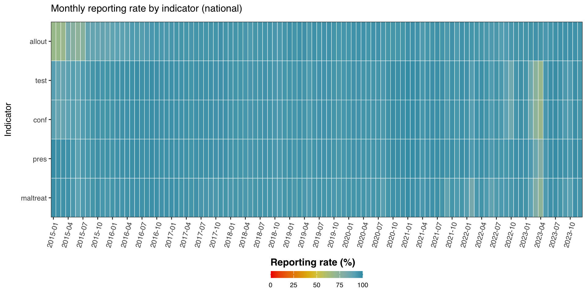
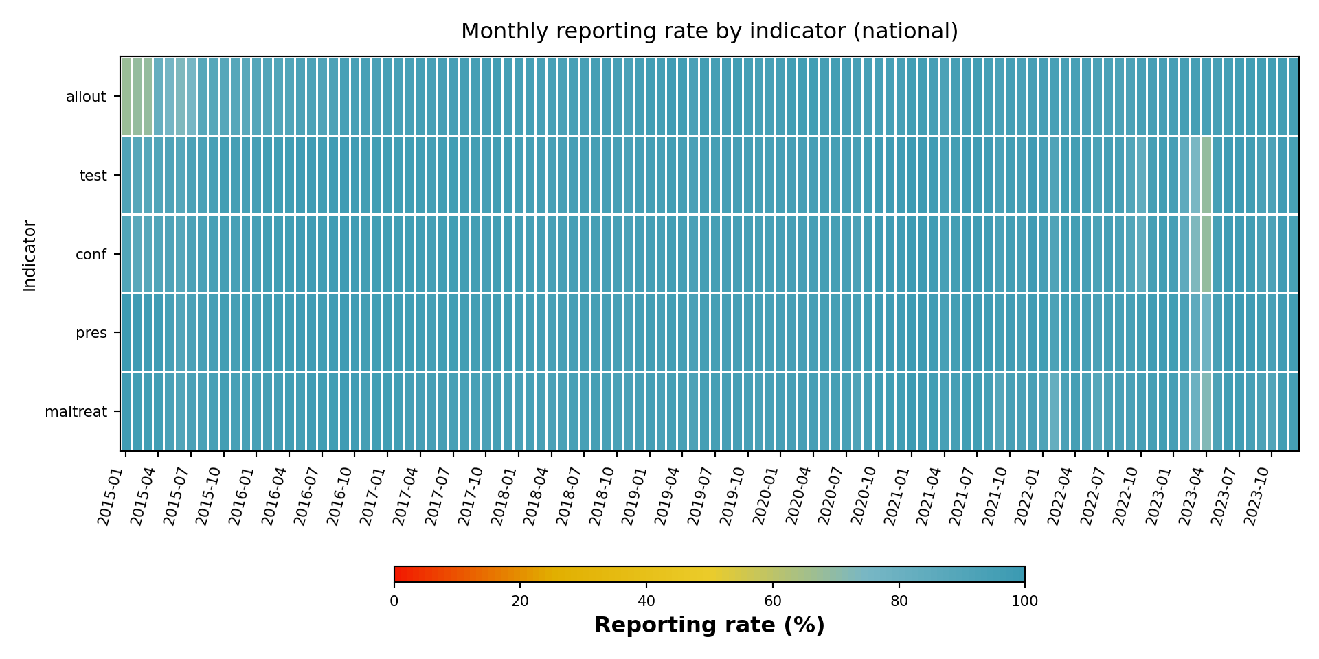
Step 5.1: Multi-indicator heatmap
Heatmaps make it easy to compare reporting rate across indicators (y-axis) and time (x-axis) at a glance. We compute the reporting rate for several indicators at the national level (level = 0), assemble them into one tidy frame, and render a viridis-coloured heatmap.
Show the code
indicators <- c("allout", "test", "conf", "pres", "maltreat")
plot_data <- purrr::map_dfr(indicators, function(i) {
compute_rep_rate(panel_df, level = 0, indicator = i) |>
dplyr::transmute(
yearmon,
indicator,
rr_pct = reprate * 100
)
})
# every third month on the x-axis to keep labels readable
yearmon_levels <- unique(plot_data$yearmon)
x_breaks <- yearmon_levels[seq(1, length(yearmon_levels), by = 3)]
ggplot2::ggplot(
plot_data,
ggplot2::aes(
x = yearmon,
y = forcats::fct_relevel(indicator, rev(indicators)),
fill = rr_pct
)
) +
ggplot2::geom_tile(colour = "white", linewidth = .2) +
ggplot2::scale_fill_gradientn(
colours = rev(wesanderson::wes_palette(
"Zissou1", 100, type = "continuous"
)),
limits = c(0, 100),
na.value = "grey90"
) +
ggplot2::guides(
fill = ggplot2::guide_colorbar(
title.position = "top",
nrow = 1,
label.position = "bottom",
direction = "horizontal",
barheight = ggplot2::unit(0.3, "cm"),
barwidth = ggplot2::unit(4, "cm"),
ticks = TRUE,
draw.ulim = TRUE,
draw.llim = TRUE
)
) +
ggplot2::scale_x_discrete(breaks = x_breaks, expand = c(0, 0)) +
ggplot2::scale_y_discrete(expand = c(0, 0)) +
ggplot2::labs(
fill = "Reporting rate (%)",
x = NULL,
y = "Indicator",
title = "Monthly reporting rate by indicator (national)"
) +
ggplot2::theme_bw() +
ggplot2::theme(
legend.title = ggplot2::element_text(
size = 12,
face = "bold",
family = "sans"
),
legend.position = "bottom",
legend.direction = "horizontal",
legend.box = "horizontal",
legend.box.just = "center",
legend.margin = ggplot2::margin(t = 0, unit = "cm"),
legend.text = ggplot2::element_text(
size = 8,
family = "sans"
),
axis.title.x = ggplot2::element_text(
margin = ggplot2::margin(t = 5, unit = "pt")
),
axis.title.y = ggplot2::element_text(
margin = ggplot2::margin(r = 10, unit = "pt")
),
axis.text.x = ggplot2::element_text(
angle = 75,
hjust = 1,
family = "sans"
),
axis.text = ggplot2::element_text(family = "sans"),
axis.title = ggplot2::element_text(family = "sans"),
plot.title = ggtext::element_markdown(
size = 12,
family = "sans",
margin = ggplot2::margin(b = 10)
),
panel.grid.minor = ggplot2::element_blank(),
panel.grid.major = ggplot2::element_blank(),
panel.background = ggplot2::element_blank()
)
NoteOutput
To adapt the code:
- Line 1: Change
indicatorsto compare a different set of indicators.
Show the code
import matplotlib.colors as mcolors
import matplotlib.pyplot as plt
import numpy as np
import pandas as pd
indicators = ["allout", "test", "conf", "pres", "maltreat"]
_frames = []
for i in indicators:
_df = compute_rep_rate(panel_df, level=0, indicator=i)
_df["rr_pct"] = _df["reprate"] * 100
_frames.append(_df[["yearmon", "indicator", "rr_pct"]])
plot_data = pd.concat(_frames, ignore_index=True)
yearmon_levels = sorted(plot_data["yearmon"].unique())
# every third month on the x-axis to keep labels readable
x_breaks = yearmon_levels[::3]
# reversed Zissou1 colormap for reporting rate (high = blue = good)
zissou1_colors = ["#3B9AB2", "#78B7C5", "#EBCC2A", "#E1AF00", "#F21A00"]
zissou1_cmap = mcolors.LinearSegmentedColormap.from_list(
"Zissou1", zissou1_colors, N=100
)
zissou1_r_cmap = zissou1_cmap.reversed()
# pivot to matrix: rows = indicators (bottom-to-top), cols = yearmon
# R uses fct_relevel(indicator, rev(indicators)) → first indicator on top
ind_order = list(reversed(indicators))
pivot = (
plot_data
.pivot(index="indicator", columns="yearmon", values="rr_pct")
.reindex(index=ind_order, columns=yearmon_levels)
)
fig, ax = plt.subplots(figsize=(10, 5))
mesh = ax.pcolormesh(
np.arange(len(yearmon_levels) + 1),
np.arange(len(ind_order) + 1),
pivot.values,
cmap=zissou1_r_cmap,
vmin=0,
vmax=100,
linewidth=0.5,
edgecolors="white",
antialiased=False,
)
ax.set_aspect("auto")
# x-axis: show only x_breaks labels
xtick_pos = [yearmon_levels.index(ym) + 0.5 for ym in x_breaks]
ax.set_xticks(xtick_pos)
ax.set_xticklabels(x_breaks, rotation=75, ha="right", fontsize=8)
ax.set_yticks(np.arange(len(ind_order)) + 0.5)
ax.set_yticklabels(ind_order, fontsize=8)
ax.set_xlabel("")
ax.set_ylabel("Indicator", fontsize=9)
ax.set_title(
"Monthly reporting rate by indicator (national)", fontsize=12, pad=10
)
ax.grid(False)
# horizontal colorbar at the bottom
cbar = fig.colorbar(
mesh, ax=ax, orientation="horizontal",
fraction=0.03, pad=0.22, aspect=40,
)
cbar.set_label("Reporting rate (%)", fontsize=12, fontweight="bold")
cbar.ax.tick_params(labelsize=8)
plt.tight_layout()
NoteOutput
To adapt the code:
- Line 6: Change
indicatorsto compare a different set of indicators.
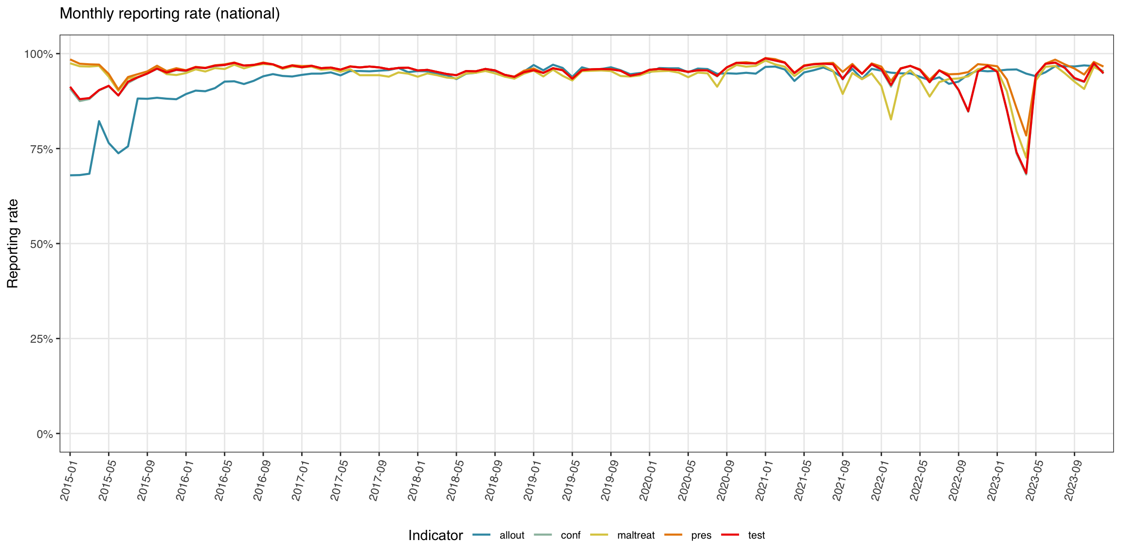
Step 5.2: Multi-indicator line plot
The line plot is the more traditional view: reporting rate on the y-axis, time on the x-axis, one line per indicator.
Show the code
yearmon_levels <- unique(plot_data$yearmon)
x_breaks <- yearmon_levels[seq(1, length(yearmon_levels), by = 4)]
ggplot2::ggplot(
plot_data,
ggplot2::aes(
x = yearmon,
y = rr_pct / 100,
color = indicator,
group = indicator
)
) +
ggplot2::geom_line(linewidth = 0.75) +
ggplot2::scale_color_manual(
values = wesanderson::wes_palette("Zissou1", length(indicators),
type = "continuous")
) +
ggplot2::scale_x_discrete(breaks = x_breaks, expand = c(0.01, 0.01)) +
ggplot2::scale_y_continuous(labels = scales::percent_format(accuracy = 1)) +
ggplot2::coord_cartesian(ylim = c(0, 1)) +
ggplot2::labs(
x = NULL,
y = "Reporting rate",
title = "Monthly reporting rate (national)",
color = "Indicator"
) +
ggplot2::theme_bw() +
ggplot2::theme(
legend.position = "bottom",
legend.text = ggplot2::element_text(size = 8, family = "sans"),
axis.text.x = ggplot2::element_text(
angle = 75, hjust = 1, family = "sans"
),
axis.text = ggplot2::element_text(family = "sans"),
axis.title = ggplot2::element_text(family = "sans"),
plot.title = ggtext::element_markdown(
size = 12, family = "sans",
margin = ggplot2::margin(b = 10)
),
panel.grid.minor = ggplot2::element_blank()
)
NoteOutput
To adapt the code:
- Do not modify anything in the code above.
Show the code
import matplotlib.colors as mcolors
import matplotlib.pyplot as plt
import numpy as np
yearmon_levels_line = sorted(plot_data["yearmon"].unique())
# every fourth month on the x-axis
x_breaks_line = yearmon_levels_line[::4]
# Zissou1 palette sampled at len(indicators) positions (not reversed for lines)
zissou1_line = mcolors.LinearSegmentedColormap.from_list(
"Zissou1", ["#3B9AB2", "#78B7C5", "#EBCC2A", "#E1AF00", "#F21A00"], N=100
)
n_ind = len(indicators)
line_colors = [zissou1_line(i / max(n_ind - 1, 1)) for i in range(n_ind)]
fig, ax = plt.subplots(figsize=(12, 6))
for idx, ind in enumerate(indicators):
sub = (
plot_data.loc[plot_data["indicator"] == ind]
.sort_values("yearmon")
)
# convert percent back to proportion for y-axis
ax.plot(
sub["yearmon"],
sub["rr_pct"] / 100,
linewidth=0.75,
color=line_colors[idx],
label=ind,
)
ax.set_xticks(
[yearmon_levels_line.index(ym) for ym in x_breaks_line]
)
ax.set_xticklabels(x_breaks_line, rotation=75, ha="right", fontsize=8)
ax.yaxis.set_major_formatter(mticker.PercentFormatter(xmax=1, decimals=0))
ax.set_ylim(0, 1)
ax.set_xlabel("")
ax.set_ylabel("Reporting rate", fontsize=9)
ax.set_title("Monthly reporting rate (national)", fontsize=12, pad=10)
ax.tick_params(labelsize=8)
ax.legend(title="Indicator", fontsize=8, loc="lower center",
ncol=len(indicators), bbox_to_anchor=(0.5, -0.35))
ax.grid(axis="y", linewidth=0.4, alpha=0.5)
ax.grid(axis="x", visible=False)
for spine in ["top", "right"]:
ax.spines[spine].set_visible(False)
plt.tight_layout()
NoteOutput
(0.0, 1.0)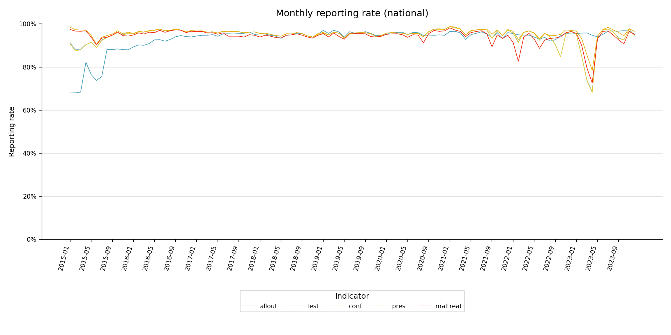
To adapt the code:
- Do not modify anything in the code above.
Step 6: Visualize Reporting Rates by Admin Unit
Step 6.1: Single-indicator heatmap by admin unit
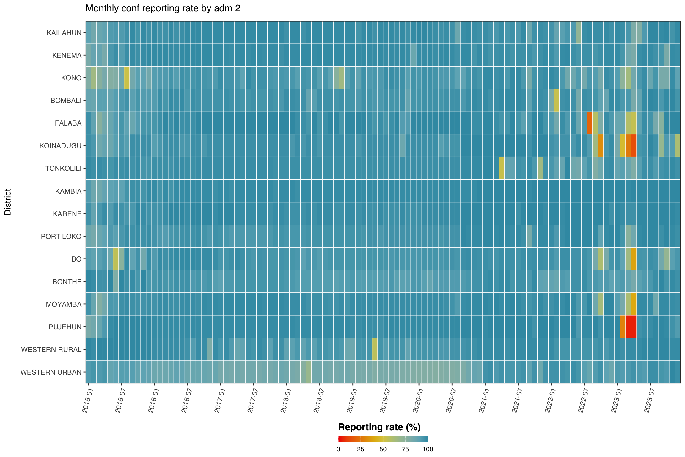
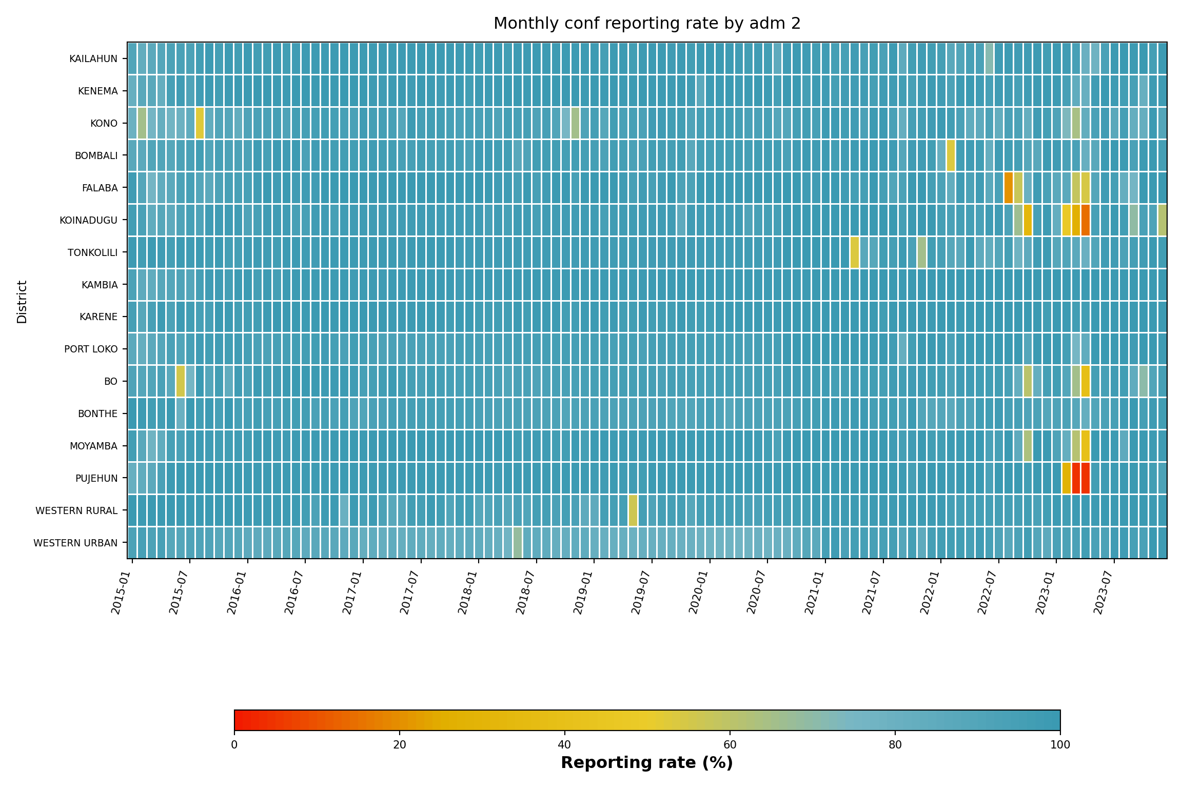
Now we focus on one indicator (conf) and disaggregate by admin unit (adm2), grouped by adm1. The heatmap shows time on the x-axis and admin unit on the y-axis.
Show the code
indicator <- "conf"
level <- 2
group_lvl <- 1 # group rows by this higher admin level
# compute and convert to %
df_admin <- compute_rep_rate(panel_df, level, indicator) |>
dplyr::mutate(rr_pct = reprate * 100)
# attach the grouping admin column
tree <- dhis2_df |>
dplyr::select(
dplyr::all_of(c(paste0("adm", level), paste0("adm", group_lvl)))
) |>
dplyr::distinct()
df_admin <- df_admin |>
dplyr::left_join(tree, by = paste0("adm", level)) |>
dplyr::arrange(
.data[[paste0("adm", group_lvl)]],
.data[[paste0("adm", level)]]
)
# order admin units by group then alphabetical
adm_order <- df_admin |>
dplyr::distinct(
dplyr::across(dplyr::all_of(
c(paste0("adm", group_lvl), paste0("adm", level))
))
) |>
dplyr::pull(paste0("adm", level))
yearmon_levels <- sort(unique(df_admin$yearmon))
x_breaks <- yearmon_levels[seq(1, length(yearmon_levels), by = 6)]
ggplot2::ggplot(
df_admin,
ggplot2::aes(
x = yearmon,
y = forcats::fct_relevel(.data[[paste0("adm", level)]], rev(adm_order)),
fill = rr_pct
)
) +
ggplot2::geom_tile(colour = "white", linewidth = .2) +
ggplot2::scale_fill_gradientn(
colours = rev(wesanderson::wes_palette(
"Zissou1", 100, type = "continuous"
)),
limits = c(0, 100),
na.value = "grey85"
) +
ggplot2::guides(
fill = ggplot2::guide_colorbar(
title.position = "top",
nrow = 1,
label.position = "bottom",
direction = "horizontal",
barheight = ggplot2::unit(0.3, "cm"),
barwidth = ggplot2::unit(4, "cm"),
ticks = TRUE,
draw.ulim = TRUE,
draw.llim = TRUE
)
) +
ggplot2::scale_x_discrete(breaks = x_breaks, expand = c(0, 0)) +
ggplot2::scale_y_discrete(expand = c(0, 0)) +
ggplot2::labs(
fill = "Reporting rate (%)",
x = NULL,
y = "District",
title = paste("Monthly", indicator, "reporting rate by adm", level)
) +
ggplot2::theme_bw() +
ggplot2::theme(
legend.title = ggplot2::element_text(
size = 12,
face = "bold",
family = "sans"
),
legend.position = "bottom",
legend.direction = "horizontal",
legend.box = "horizontal",
legend.box.just = "center",
legend.margin = ggplot2::margin(t = 0, unit = "cm"),
legend.text = ggplot2::element_text(
size = 8,
family = "sans"
),
axis.title.x = ggplot2::element_text(
margin = ggplot2::margin(t = 5, unit = "pt")
),
axis.title.y = ggplot2::element_text(
margin = ggplot2::margin(r = 10, unit = "pt")
),
axis.text.x = ggplot2::element_text(
angle = 75,
hjust = 1,
family = "sans"
),
axis.text = ggplot2::element_text(family = "sans"),
axis.title = ggplot2::element_text(family = "sans"),
plot.title = ggtext::element_markdown(
size = 12,
family = "sans",
margin = ggplot2::margin(b = 10)
),
panel.grid.minor = ggplot2::element_blank(),
panel.grid.major = ggplot2::element_blank(),
panel.background = ggplot2::element_blank()
)
NoteOutput
To adapt the code:
- Line 1: Change
indicatorto focus on a different indicator. - Line 2: Adjust
levelto plot at a different admin level. - Line 3: Adjust
group_lvlto group rows by a different higher admin level.
Show the code
import matplotlib.colors as mcolors
import matplotlib.pyplot as plt
import numpy as np
import pandas as pd
indicator_h = "conf"
level_h = 2
group_lvl_h = 1
# compute reporting rate and convert to %
df_admin = compute_rep_rate(panel_df, level_h, indicator_h).assign(
rr_pct=lambda d: d["reprate"] * 100
)
# attach the grouping admin column
tree = (
dhis2_df[[f"adm{level_h}", f"adm{group_lvl_h}"]]
.drop_duplicates()
)
df_admin = (
df_admin
.merge(tree, on=f"adm{level_h}", how="left")
.sort_values([f"adm{group_lvl_h}", f"adm{level_h}"])
)
# adm order: sorted by group then alphabetically within group
adm_order = (
df_admin[[f"adm{group_lvl_h}", f"adm{level_h}"]]
.drop_duplicates()
.sort_values([f"adm{group_lvl_h}", f"adm{level_h}"])
[f"adm{level_h}"]
.tolist()
)
yearmon_levels_h = sorted(df_admin["yearmon"].unique())
# every 6th month on x-axis
x_breaks_h = yearmon_levels_h[::6]
# reversed Zissou1
zissou1_colors = ["#3B9AB2", "#78B7C5", "#EBCC2A", "#E1AF00", "#F21A00"]
zissou1_r_cmap = mcolors.LinearSegmentedColormap.from_list(
"Zissou1", zissou1_colors, N=100
).reversed()
# y-axis order: first indicator at top (R uses rev(adm_order))
ind_order_h = list(reversed(adm_order))
pivot_h = (
df_admin
.pivot_table(
index=f"adm{level_h}", columns="yearmon",
values="rr_pct", aggfunc="mean"
)
.reindex(index=ind_order_h, columns=yearmon_levels_h)
)
fig, ax = plt.subplots(figsize=(12, 8))
mesh = ax.pcolormesh(
np.arange(len(yearmon_levels_h) + 1),
np.arange(len(ind_order_h) + 1),
pivot_h.values,
cmap=zissou1_r_cmap,
vmin=0,
vmax=100,
linewidth=0.5,
edgecolors="white",
antialiased=False,
)
ax.set_aspect("auto")
xtick_pos_h = [yearmon_levels_h.index(ym) + 0.5 for ym in x_breaks_h]
ax.set_xticks(xtick_pos_h)
ax.set_xticklabels(x_breaks_h, rotation=75, ha="right", fontsize=8)
ax.set_yticks(np.arange(len(ind_order_h)) + 0.5)
ax.set_yticklabels(ind_order_h, fontsize=7)
ax.set_xlabel("")
ax.set_ylabel("District", fontsize=9)
ax.set_title(
f"Monthly {indicator_h} reporting rate by adm {level_h}",
fontsize=12, pad=10,
)
ax.grid(False)
cbar = fig.colorbar(
mesh, ax=ax, orientation="horizontal",
fraction=0.03, pad=0.22, aspect=40,
)
cbar.set_label("Reporting rate (%)", fontsize=12, fontweight="bold")
cbar.ax.tick_params(labelsize=8)
plt.tight_layout()
NoteOutput
To adapt the code:
- Line 6: Change
indicator_hto focus on a different indicator. - Line 7: Adjust
level_hto plot at a different admin level. - Line 8: Adjust
group_lvl_hto group rows by a different higher admin level.
Step 6.2: Single-indicator line plot by admin unit
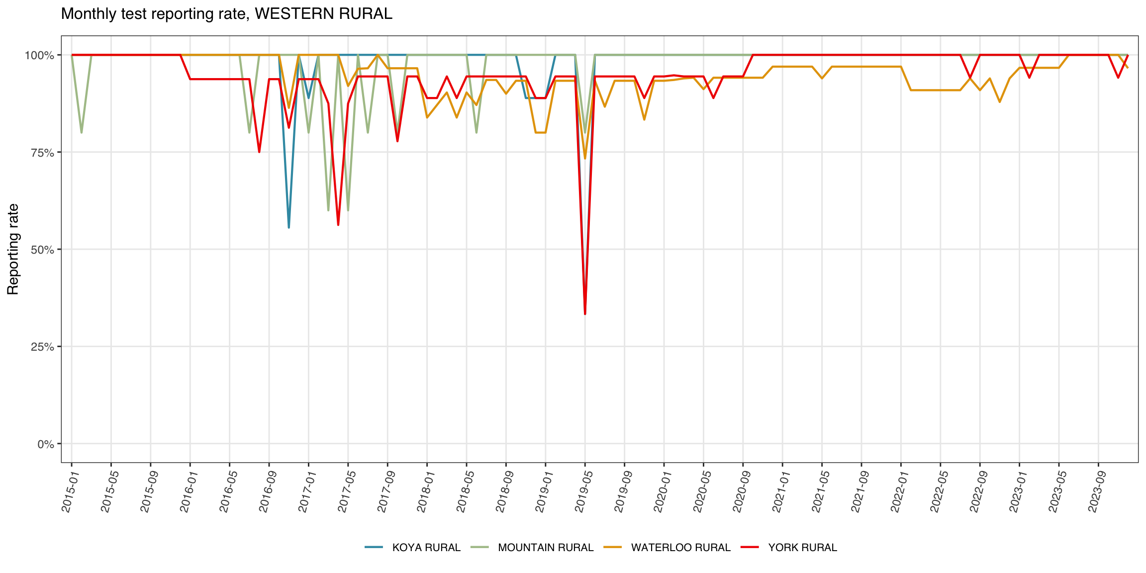
The line plot is useful when the focus is on one parent admin unit and its children, e.g., one district (adm2) and its chiefdoms (adm3).
Show the code
indicator <- "test"
level <- 3
target_adm2 <- "WESTERN RURAL"
df_line <- compute_rep_rate(panel_df, level, indicator)
tree <- dhis2_df |>
dplyr::select(adm2, dplyr::all_of(paste0("adm", level))) |>
dplyr::distinct()
df_line <- df_line |>
dplyr::left_join(tree, by = paste0("adm", level)) |>
dplyr::filter(adm2 == target_adm2)
yearmon_levels <- sort(unique(df_line$yearmon))
x_breaks <- yearmon_levels[seq(1, length(yearmon_levels), by = 4)]
n_adm <- dplyr::n_distinct(df_line[[paste0("adm", level)]])
ggplot2::ggplot(
df_line,
ggplot2::aes(
x = yearmon,
y = reprate,
color = .data[[paste0("adm", level)]],
group = .data[[paste0("adm", level)]]
)
) +
ggplot2::geom_line(linewidth = 0.75) +
ggplot2::scale_color_manual(
values = wesanderson::wes_palette("Zissou1", n_adm,
type = "continuous")
) +
ggplot2::scale_x_discrete(breaks = x_breaks, expand = c(0.01, 0.01)) +
ggplot2::scale_y_continuous(labels = scales::percent_format(accuracy = 1)) +
ggplot2::coord_cartesian(ylim = c(0, 1)) +
ggplot2::labs(
x = NULL,
y = "Reporting rate",
title = paste0("Monthly ", indicator, " reporting rate, ", target_adm2),
color = NULL
) +
ggplot2::theme_bw() +
ggplot2::theme(
legend.position = "bottom",
legend.text = ggplot2::element_text(size = 8, family = "sans"),
axis.text.x = ggplot2::element_text(
angle = 75, hjust = 1, family = "sans"
),
axis.text = ggplot2::element_text(family = "sans"),
axis.title = ggplot2::element_text(family = "sans"),
plot.title = ggtext::element_markdown(
size = 12, family = "sans",
margin = ggplot2::margin(b = 10)
),
panel.grid.minor = ggplot2::element_blank()
)
NoteOutput
To adapt the code:
- Line 1: Change
indicatorto focus on a different indicator. - Line 3: Change
target_adm2to a different district name.
Show the code
import matplotlib.colors as mcolors
import matplotlib.pyplot as plt
import numpy as np
indicator_l = "test"
level_l = 3
target_adm2_l = "WESTERN RURAL"
df_line = compute_rep_rate(panel_df, level_l, indicator_l)
# attach adm2 to filter
tree_l = (
dhis2_df[["adm2", f"adm{level_l}"]]
.drop_duplicates()
)
df_line = (
df_line
.merge(tree_l, on=f"adm{level_l}", how="left")
.loc[lambda d: d["adm2"] == target_adm2_l]
)
yearmon_levels_l = sorted(df_line["yearmon"].unique())
x_breaks_l = yearmon_levels_l[::4]
n_adm_l = df_line[f"adm{level_l}"].nunique()
# Zissou1 sampled at n_adm_l positions
zissou1_lc = mcolors.LinearSegmentedColormap.from_list(
"Zissou1", ["#3B9AB2", "#78B7C5", "#EBCC2A", "#E1AF00", "#F21A00"], N=100
)
line_colors_l = [
zissou1_lc(i / max(n_adm_l - 1, 1)) for i in range(n_adm_l)
]
adm3_list = sorted(df_line[f"adm{level_l}"].unique())
fig, ax = plt.subplots(figsize=(12, 6))
for idx, adm_val in enumerate(adm3_list):
sub = (
df_line.loc[df_line[f"adm{level_l}"] == adm_val]
.sort_values("yearmon")
)
ax.plot(
sub["yearmon"],
sub["reprate"],
linewidth=0.75,
color=line_colors_l[idx],
label=adm_val,
)
ax.set_xticks(
[yearmon_levels_l.index(ym) for ym in x_breaks_l]
)
ax.set_xticklabels(x_breaks_l, rotation=75, ha="right", fontsize=8)
ax.yaxis.set_major_formatter(mticker.PercentFormatter(xmax=1, decimals=0))
ax.set_ylim(0, 1)
ax.set_xlabel("")
ax.set_ylabel("Reporting rate", fontsize=9)
ax.set_title(
f"Monthly {indicator_l} reporting rate, {target_adm2_l}",
fontsize=12, pad=10,
)
ax.tick_params(labelsize=8)
ax.legend(fontsize=7, loc="lower center",
ncol=min(n_adm_l, 6), bbox_to_anchor=(0.5, -0.40))
ax.grid(axis="y", linewidth=0.4, alpha=0.5)
ax.grid(axis="x", visible=False)
for spine in ["top", "right"]:
ax.spines[spine].set_visible(False)
plt.tight_layout()
NoteOutput
(0.0, 1.0)
To adapt the code:
- Line 5: Change
indicator_lto focus on a different indicator. - Line 7: Change
target_adm2_lto a different district name.
Step 6.3: Single-indicator map by admin unit
The heatmap and line plot pin one axis to time. The map drops time into a small-multiple facet and uses geography as the y-axis, making it easy to spot which corners of the country are dragging the rate down. We aggregate to annual averages per adm2, join with the adm2 shapefile, and render one choropleth per year.
Show the code
indicator <- "conf"
# load processed adm2 spatial object
adm2_sf <- readRDS(here::here(
"01_data",
"1.1_foundational",
"1.1a_admin_boundaries",
"processed",
"sle_spatial_adm2_2021.rds"
)) |>
sf::st_as_sf()
# annual average reporting rate per adm2 for the chosen indicator
df_map <- compute_rep_rate(panel_df, 2, indicator) |>
dplyr::mutate(year = substr(yearmon, 1, 4)) |>
dplyr::group_by(adm2, year) |>
dplyr::summarise(
rr_pct = base::mean(reprate, na.rm = TRUE) * 100,
.groups = "drop"
)
# lower bound of the colour scale: floor of the smallest annual
# reprate we actually observed. swap this for a fixed value (e.g.
# 0 or 50) if you want the legend pinned to a constant range across
# rerenders.
fill_min <- floor(min(df_map$rr_pct, na.rm = TRUE))
# attach reporting rate to the polygons
df_map_sf <- adm2_sf |>
dplyr::left_join(df_map, by = "adm2")
ggplot2::ggplot(df_map_sf) +
ggplot2::geom_sf(
ggplot2::aes(fill = rr_pct),
colour = "white", linewidth = .2
) +
ggplot2::scale_fill_gradientn(
colours = rev(wesanderson::wes_palette(
"Zissou1", 100, type = "continuous"
)),
limits = c(fill_min, 100),
na.value = "grey90",
name = "Reporting rate (%)"
) +
ggplot2::guides(
fill = ggplot2::guide_colorbar(
title.position = "top",
nrow = 1,
label.position = "bottom",
direction = "horizontal",
barheight = ggplot2::unit(0.3, "cm"),
barwidth = ggplot2::unit(4, "cm"),
ticks = TRUE,
draw.ulim = TRUE,
draw.llim = TRUE
)
) +
ggplot2::facet_wrap(~ year, nrow = 3) +
ggplot2::labs(
title = paste0(
"Annual ", indicator, " reporting rate by adm2"
)
) +
ggplot2::theme_bw() +
ggplot2::theme(
legend.title = ggplot2::element_text(
size = 12, face = "bold", family = "sans"
),
legend.position = "bottom",
legend.direction = "horizontal",
legend.box = "horizontal",
legend.box.just = "center",
legend.margin = ggplot2::margin(t = 0, unit = "cm"),
legend.text = ggplot2::element_text(size = 8, family = "sans"),
axis.text = ggplot2::element_blank(),
axis.title = ggplot2::element_blank(),
axis.ticks = ggplot2::element_blank(),
panel.grid.minor = ggplot2::element_blank(),
panel.grid.major = ggplot2::element_blank(),
panel.background = ggplot2::element_blank(),
strip.text = ggplot2::element_text(family = "sans", face = "bold"),
strip.background = ggplot2::element_blank(),
plot.title = ggtext::element_markdown(
size = 12, family = "sans",
margin = ggplot2::margin(b = 10)
)
)
NoteOutput
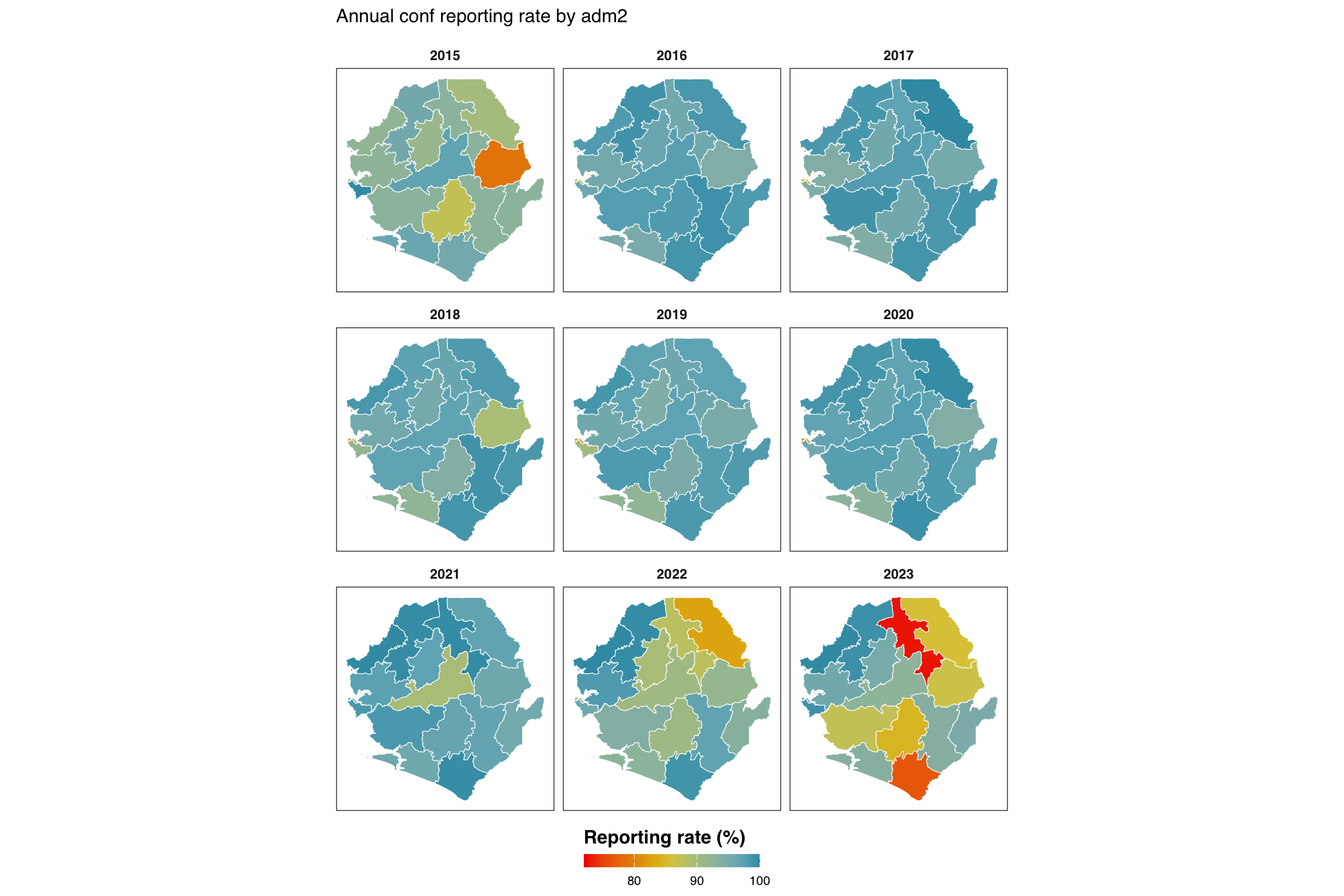
To adapt the code:
- Line 1: Change
indicatorto map a different indicator. - Lines 4-9: Update the shapefile path if processed
adm2spatial files live elsewhere. - Line 26: Set
fill_minmanually (e.g.,fill_min <- 0orfill_min <- 50) if you want a fixed legend range across rerenders instead of one that adapts to the data minimum.
Show the code
import math
from pathlib import Path
import geopandas as gpd
import matplotlib.colors as mcolors
import matplotlib.pyplot as plt
import numpy as np
import pandas as pd
from pyprojroot import here
indicator_m = "conf"
# load processed adm2 spatial object (GeoJSON sibling of the .rds)
adm2_gdf = gpd.read_file(Path(here(
"01_data/1.1_foundational/1.1a_admin_boundaries/processed"
"/sle_spatial_adm2_2021.geojson"
)))
if adm2_gdf.crs is None:
adm2_gdf = adm2_gdf.set_crs("EPSG:4326")
# annual average reporting rate per adm2
df_map = (
compute_rep_rate(panel_df, 2, indicator_m)
.assign(year=lambda d: d["yearmon"].str[:4])
.groupby(["adm2", "year"], as_index=False)
.agg(rr_pct=("reprate", lambda x: x.mean() * 100))
)
# fill_min: floor of the smallest annual reprate observed
fill_min = math.floor(df_map["rr_pct"].min())
# attach to polygons (left join so every polygon-year appears)
years_m = sorted(df_map["year"].unique())
df_map_gdf = adm2_gdf.merge(df_map, on="adm2", how="left")
# reversed Zissou1 for reporting rate (high rate = blue = good)
zissou1_colors = ["#3B9AB2", "#78B7C5", "#EBCC2A", "#E1AF00", "#F21A00"]
zissou1_r_cmap = mcolors.LinearSegmentedColormap.from_list(
"Zissou1", zissou1_colors, N=100
).reversed()
norm = plt.Normalize(vmin=fill_min, vmax=100)
# 3-row facet layout (matches ggplot2 facet_wrap(nrow=3))
n_years = len(years_m)
n_cols_m = math.ceil(n_years / 3)
n_rows_m = 3
fig, axes = plt.subplots(
n_rows_m, n_cols_m,
figsize=(12, 8),
squeeze=False,
)
for idx, yr in enumerate(years_m):
row = idx // n_cols_m
col = idx % n_cols_m
ax = axes[row][col]
sub = df_map_gdf.loc[df_map_gdf["year"] == yr]
# grey background for missing polygons
adm2_gdf.plot(ax=ax, color="grey90", edgecolor="white", linewidth=0.2)
sub.plot(
column="rr_pct",
ax=ax,
cmap=zissou1_r_cmap,
norm=norm,
edgecolor="white",
linewidth=0.2,
missing_kwds={"color": "#EBEBEB"},
)
ax.set_title(yr, fontsize=9, fontweight="bold")
ax.set_axis_off()
# hide unused axes
for idx in range(n_years, n_rows_m * n_cols_m):
axes[idx // n_cols_m][idx % n_cols_m].set_visible(False)
# horizontal colorbar at the bottom (shared)
sm = plt.cm.ScalarMappable(cmap=zissou1_r_cmap, norm=norm)
sm.set_array([])
cbar = fig.colorbar(
sm, ax=axes, orientation="horizontal",
fraction=0.02, pad=0.02, aspect=50,
shrink=0.5,
)
cbar.set_label("Reporting rate (%)", fontsize=12, fontweight="bold")
cbar.ax.tick_params(labelsize=8)
fig.suptitle(
f"Annual {indicator_m} reporting rate by adm2",
fontsize=12, y=1.01,
)
plt.tight_layout()
NoteOutput
To adapt the code:
- Line 11: Change
indicator_mto map a different indicator. - Lines 14-19: Update the shapefile path if processed
adm2spatial files live elsewhere. - Line 30: Set
fill_minmanually (e.g.,fill_min = 0orfill_min = 50) if you want a fixed legend range across rerenders instead of one that adapts to the data minimum.
TipAlternative code option using
sntutils package
sntutils::reporting_rate_map() does the same thing in one call: facility-activity classification, reporting rate calculation, and a faceted choropleth with consistent styling.
Summary
This page computed monthly reporting rates per indicator at any admin unit level, both unweighted and weighted, and visualised the results across indicators, admin units, and time. The unweighted rate is the right metric for diagnosing surveillance performance; the weighted rate is what most burden corrections need, because a missing referral hospital represents far more caseload than a missing peripheral clinic. Comparing the two reveals whether the largest contributors are reporting consistently. The validated outputs from this page feed directly into downstream stratification and into the second step of the stepwise incidence adjustment (\(N_2 = N_1 / R\)).
Full code
Find the full code script for reporting rate below.
Show full code
################################################################################
################# ~ Health facility reporting rate full code ~ #################
################################################################################
### Step 1: Load Packages and Data ---------------------------------------------
#### Step 1.1: Load required R packages ----------------------------------------
pacman::p_load(
dplyr, # data manipulation
tidyr, # data tidying
purrr, # functional iteration
lubridate, # date handling
slider, # rolling-window operations for weighted reporting rate
ggplot2, # data visualization
ggtext, # markdown text in ggplot titles
wesanderson, # color palettes (Zissou1)
scales, # axis formatting
forcats, # factor ordering
stringr, # string manipulation
tibble, # tidy data frames
knitr, # html table rendering
cli, # informative messages
here # reproducible file paths
)
#### Step 1.2: Import preprocessed routine data --------------------------------
dhis2_df <- arrow::read_parquet(here::here(
  "01_data",
  "1.2_epidemiology",
  "1.2a_routine_surveillance",
  "processed",
  "clean_malaria_routine_data_final.parquet"
))

dhis2_df <- dhis2_df |>
  dplyr::mutate(
    date = as.Date(date),
    yearmon   = format(date, "%Y-%m")
  )
#### Step 1.3: Build the active facility panel inline --------------------------
# method 2 parameters: indicators that signal service delivery and the
# grace period (months) past a facility's last report before it counts
# as inactive
key_indicators <- c("allout", "test", "pres", "conf", "maltreat", "maladm")
nonreport_window <- 6L
# balanced facility × month panel: any missing facility-month is a
# non-reporting month
month_seq <- seq(min(dhis2_df$date), max(dhis2_df$date), by = "month")
panel <- tidyr::expand_grid(
hf_uid = unique(dhis2_df$hf_uid),
date = month_seq
)
panel_df <- dhis2_df |>
dplyr::right_join(panel, by = c("hf_uid", "date")) |>
dplyr::arrange(hf_uid, date) |>
dplyr::group_by(hf_uid) |>
tidyr::fill(adm0, adm1, adm2, adm3, .direction = "downup") |>
dplyr::ungroup() |>
dplyr::mutate(
yearmon = format(date, "%Y-%m"),
reported_any = dplyr::if_any(
dplyr::all_of(key_indicators),
~ !is.na(.x)
)
)
# first / last reporting dates plus panel last date per facility
panel_df <- panel_df |>
dplyr::arrange(hf_uid, date) |>
dplyr::group_by(hf_uid) |>
dplyr::mutate(
first_rep = if (any(reported_any)) min(date[reported_any]) else as.Date(NA),
last_rep = if (any(reported_any)) max(date[reported_any]) else as.Date(NA),
last_date = max(date)
) |>
dplyr::ungroup()
# method 2: active from first report onward; inactive only after the
# grace period has elapsed past the last report
panel_df <- panel_df |>
dplyr::mutate(
months_since_last = dplyr::if_else(
is.na(last_rep),
Inf,
as.numeric(
lubridate::interval(last_rep, last_date) / lubridate::dmonths(1)
)
),
is_active = dplyr::case_when(
is.na(first_rep) ~ FALSE,
date < first_rep ~ FALSE,
date <= last_rep ~ TRUE,
months_since_last < nonreport_window ~ TRUE,
TRUE ~ FALSE
)
)
# aggregate to yearmon × admin unit
df_expected <- panel_df |>
dplyr::group_by(yearmon, adm0, adm1, adm2, adm3) |>
dplyr::summarise(
denominator = sum(is_active, na.rm = TRUE),
.groups = "drop"
) |>
dplyr::arrange(yearmon, adm0, adm1, adm2, adm3)
### Step 2: Define the Reporting Rate Function ---------------------------------
compute_rep_rate <- function(panel_df, level, indicator) {
level_col <- paste0("adm", level)
group_vars <- c("yearmon", level_col)
# active filter: keep only facility-months where the facility was
# expected to report (is_active). this is what makes `exp` the
# active-facility count, not every facility in the export.
panel_df |>
dplyr::filter(is_active) |>
dplyr::mutate(
reported_any_var = !is.na(.data[[indicator]])
) |>
dplyr::group_by(dplyr::across(dplyr::all_of(group_vars))) |>
dplyr::summarise(
# count distinct facilities, not rows, in case the panel ever
# carries duplicate facility-month rows.
rep = dplyr::n_distinct(hf_uid[reported_any_var]),
exp = dplyr::n_distinct(hf_uid),
.groups = "drop"
) |>
dplyr::mutate(
reprate = dplyr::if_else(exp > 0, rep / exp, NA_real_),
missrate = dplyr::if_else(!is.na(reprate), 1 - reprate, NA_real_),
indicator = indicator
) |>
dplyr::select(
dplyr::all_of(group_vars),
indicator,
rep, exp, reprate, missrate
)
}
### Step 3: Unweighted Reporting Rate ------------------------------------------
#### Step 3.1: Compute the rate for a single indicator -------------------------
indicator <- "conf"
level <- 3
df_rr <- compute_rep_rate(panel_df, level, indicator)
# save for downstream stratification and burden-correction workflows
save_path <- here::here(
"01_data",
"1.2_epidemiology",
"1.2a_routine_surveillance",
"processed"
)
saveRDS(
df_rr,
here::here(
save_path,
paste0("monthly_", indicator, "_reprate_adm", level, ".rds")
)
)
df_rr <- sntutils::calculate_reporting_metrics(
data = dhis2_df,
vars_of_interest = "conf",
x_var = "yearmon",
y_var = paste0("adm", level),
hf_col = "hf_uid",
key_indicators = c("allout", "conf", "test", "treat", "pres"),
# method: 1 = permanent, 2 = first-to-last, 3 = dynamic
method = 2,
# grace / dynamic window in months
nonreport_window = 6
)
### Step 4: Weighted Reporting Rate --------------------------------------------
#### Step 4.1: Compute the weighted rate ---------------------------------------
compute_rep_rate_weighted <- function(
panel_df,
level,
indicator,
weight_var = "test",
weight_window = 12,
exclude_current_x = TRUE,
cold_start = "median_within_y"
) {
level_col <- paste0("adm", level)
group_vars <- c("yearmon", level_col)
# 1. typical_size: rolling mean of weight_var over the previous
# weight_window months for each facility. computed on the full
# balanced panel so the window respects calendar spacing — months a
# facility was inactive enter as NA and drop out via na.rm.
before_n <- if (exclude_current_x) weight_window else weight_window - 1
after_n <- if (exclude_current_x) -1L else 0L
weight_data <- panel_df |>
dplyr::arrange(hf_uid, date) |>
dplyr::group_by(hf_uid) |>
dplyr::mutate(
typical_size = slider::slide_dbl(
.data[[weight_var]],
base::mean,
na.rm = TRUE,
.before = before_n,
.after = after_n,
.complete = FALSE
),
is_cold_start = is.na(typical_size)
) |>
dplyr::ungroup()
# 2. cold-start fallback.
# a facility-month is a "cold-start" if its rolling window had no
# usable data — typically a newly opened facility whose first
# weight_window months in the panel are NA, or a facility in the
# first months of the dataset where no prior history exists. we
# cannot drop these rows (they are still active facility-months
# that need a weight), and we cannot leave typical_size as NA
# (the row would then drop out of the within-group normalisation
# silently). so we fill typical_size by borrowing a neighbour's:
#
# - cold_start = "median_within_y" (default): the median
# typical_size of facilities in the same admin unit that do
# have history. assumes a new facility looks like a typical
# facility in its district.
# - cold_start = "median_global": the global median across all
# warm facility-months. use this when admins are small or the
# within-admin median is itself unreliable.
#
# is_cold_start is captured before coalesce so the qa check below
# can still report how many facility-months needed the fallback.
global_median <- stats::median(
weight_data$typical_size[!weight_data$is_cold_start],
na.rm = TRUE
)
if (cold_start == "median_within_y") {
within_y_median <- weight_data |>
dplyr::filter(!is_cold_start) |>
dplyr::group_by(dplyr::across(dplyr::all_of(level_col))) |>
dplyr::summarise(
cold_start_value = stats::median(typical_size, na.rm = TRUE),
.groups = "drop"
)
weight_data <- weight_data |>
dplyr::left_join(within_y_median, by = level_col) |>
dplyr::mutate(
typical_size = dplyr::coalesce(
typical_size, cold_start_value, global_median
)
)
} else {
weight_data <- weight_data |>
dplyr::mutate(
typical_size = dplyr::coalesce(typical_size, global_median)
)
}
# 3. normalise weights so they sum to 1 within yearmon × adm.
weight_data <- weight_data |>
dplyr::group_by(dplyr::across(dplyr::all_of(group_vars))) |>
dplyr::mutate(
weight = typical_size / sum(typical_size, na.rm = TRUE),
weight = dplyr::if_else(
is.na(weight) | is.infinite(weight), 0, weight
)
) |>
dplyr::ungroup()
# 4. qa: warn if any group's weights don't sum to 1, and if more
# than 25% of *active* facility-months in any period are cold-starts.
weight_check <- weight_data |>
dplyr::group_by(dplyr::across(dplyr::all_of(group_vars))) |>
dplyr::summarise(
weight_sum = sum(weight, na.rm = TRUE),
.groups = "drop"
) |>
dplyr::filter(abs(weight_sum - 1) > 1e-6)
if (nrow(weight_check) > 0) {
cli::cli_warn(c(
"!" = "Weights do not sum to 1 in {nrow(weight_check)} groups",
"i" = "Check data quality and weight calculations"
))
}
cold_start_check <- weight_data |>
dplyr::filter(is_active) |>
dplyr::group_by(yearmon) |>
dplyr::summarise(
n_total = dplyr::n(),
n_cold_start = sum(is_cold_start),
prop_cold_start = n_cold_start / n_total,
.groups = "drop"
) |>
dplyr::filter(prop_cold_start > 0.25)
if (nrow(cold_start_check) > 0) {
cli::cli_warn(c(
"!" = ">25% cold starts in {nrow(cold_start_check)} periods",
"i" = "Consider adjusting weight_window or data range"
))
}
# 5. active filter: drop inactive facility-months before
# aggregation so the weighted denominator matches the unweighted
# one.
data_with_weights <- weight_data |>
dplyr::filter(is_active) |>
dplyr::mutate(
reported_any_var = !is.na(.data[[indicator]])
)
# 6. per-facility aggregation within yearmon × adm. each facility
# has one row per period in the balanced panel so this collapses to
# identity, but the explicit step makes the per-group summary below
# easy to read.
facility_summary <- data_with_weights |>
dplyr::group_by(
dplyr::across(dplyr::all_of(c(group_vars, "hf_uid")))
) |>
dplyr::summarise(
reported_facility = any(reported_any_var),
weight_facility = base::mean(weight, na.rm = TRUE),
weight_value_facility = base::mean(.data[[weight_var]], na.rm = TRUE),
.groups = "drop"
)
# 7. per-group aggregation: unweighted rep / exp / reprate /
# missrate, weighted reprate_w / missrate_w, and weight_var
# summary stats.
facility_summary |>
dplyr::group_by(dplyr::across(dplyr::all_of(group_vars))) |>
dplyr::summarise(
rep = sum(reported_facility),
exp = dplyr::n(),
w_num = sum(weight_facility * reported_facility, na.rm = TRUE),
w_den = sum(weight_facility, na.rm = TRUE),
reprate_w = dplyr::if_else(w_den > 0, w_num / w_den, NA_real_),
missrate_w = dplyr::if_else(!is.na(reprate_w), 1 - reprate_w, NA_real_),
!!paste0("avg_", weight_var) :=
base::mean(weight_value_facility, na.rm = TRUE),
!!paste0("min_", weight_var) :=
base::min(weight_value_facility, na.rm = TRUE),
!!paste0("max_", weight_var) :=
base::max(weight_value_facility, na.rm = TRUE),
.groups = "drop"
) |>
dplyr::mutate(
reprate = dplyr::if_else(exp > 0, rep / exp, NA_real_),
missrate = dplyr::if_else(!is.na(reprate), 1 - reprate, NA_real_),
indicator = indicator
) |>
dplyr::select(
dplyr::all_of(group_vars),
indicator,
rep, exp, reprate, missrate,
reprate_w, missrate_w,
dplyr::starts_with("avg_"),
dplyr::starts_with("min_"),
dplyr::starts_with("max_")
)
}
df_rr_w <- compute_rep_rate_weighted(
panel_df, level, indicator,
weight_var = "test"
)
df_rr_w <- sntutils::calculate_reporting_metrics(
data = dhis2_df,
vars_of_interest = "conf",
x_var = "yearmon",
y_var = paste0("adm", level),
hf_col = "hf_uid",
key_indicators = c("allout", "conf", "test", "treat", "pres"),
method = 2,
nonreport_window = 6,
weighting = TRUE,
weight_var = "test",
weight_window = 12,
exclude_current_x = TRUE,
cold_start = "median_within_y"
)
#### Step 4.2: Compare weighted and unweighted rates ---------------------------
# adm2 unweighted and weighted reporting rate for the working indicator
df_rr_adm2 <- compute_rep_rate(panel_df, 2, indicator)
df_rr_w_adm2 <- compute_rep_rate_weighted(
panel_df, 2, indicator,
weight_var = "test"
)
# one point per (adm2 × year): average the 12 months in each year so
# each panel of the scatter shows the same set of districts.
df_compare_adm2 <- df_rr_adm2 |>
dplyr::select(yearmon, adm2, reprate, exp) |>
dplyr::left_join(
df_rr_w_adm2 |> dplyr::select(yearmon, adm2, reprate_w),
by = c("yearmon", "adm2")
) |>
dplyr::mutate(year = substr(yearmon, 1, 4)) |>
dplyr::group_by(adm2, year) |>
dplyr::summarise(
reprate = base::mean(reprate, na.rm = TRUE),
reprate_w = base::mean(reprate_w, na.rm = TRUE),
n_active = base::mean(exp, na.rm = TRUE),
.groups = "drop"
) |>
dplyr::mutate(
# relative difference in percent (protect against div-by-zero)
relat_diff_pct = 100 *
base::abs(reprate_w - reprate) /
base::pmax(reprate, .Machine$double.eps),
diff_tier = dplyr::case_when(
relat_diff_pct >= 20 ~ "Very High",
relat_diff_pct >= 5 ~ "High",
relat_diff_pct >= 1 ~ "Moderate",
TRUE ~ "Same"
),
diff_tier = base::factor(
diff_tier,
levels = c("Same", "Moderate", "High", "Very High")
)
)
# x = unweighted, y = weighted; dashed line marks perfect agreement.
ggplot2::ggplot(
df_compare_adm2,
ggplot2::aes(x = reprate, y = reprate_w)
) +
ggplot2::geom_abline(
slope = 1, intercept = 0,
color = "black", linetype = "dashed", alpha = 0.7
) +
ggplot2::geom_point(
ggplot2::aes(color = diff_tier, size = n_active),
alpha = 0.7, na.rm = TRUE
) +
ggplot2::scale_color_manual(
name = "Relative difference",
values = c(
"Same" = "#2166ac",
"Moderate" = "#92c5de",
"High" = "#f4a582",
"Very High" = "#b2182b"
),
labels = c(
"Same" = "Same (<1%)",
"Moderate" = "Moderate (1-5%)",
"High" = "High (5-20%)",
"Very High" = "Very High (>20%)"
),
drop = FALSE
) +
ggplot2::scale_size_continuous(
name = "Active facilities",
range = c(0.5, 4.5),
labels = scales::comma_format()
) +
ggplot2::scale_x_continuous(labels = scales::percent_format(accuracy = 1)) +
ggplot2::scale_y_continuous(labels = scales::percent_format(accuracy = 1)) +
ggplot2::coord_cartesian(xlim = c(0.5, 1), ylim = c(0.5, 1)) +
ggplot2::facet_wrap(~ year) +
ggplot2::labs(
title = paste0(
"Weighted vs unweighted ", indicator,
" reporting rate by adm2"
),
subtitle = paste(
"Each point is one adm2 in one year (12-month average).",
"Dashed line: perfect agreement (1:1)."
),
x = "Unweighted reporting rate",
y = "Weighted reporting rate",
caption = paste(
"Points above the line: silent facilities are smaller than average.",
"\nPoints below: silent facilities are larger than average."
)
) +
ggplot2::theme_minimal() +
ggplot2::theme(
strip.text = ggplot2::element_text(size = 10),
axis.text = ggplot2::element_text(size = 8),
axis.line = ggplot2::element_line(color = "black", linewidth = 0.5),
legend.position = "bottom",
legend.spacing.x = ggplot2::unit(0.5, "cm"),
axis.title.x = ggplot2::element_text(margin = ggplot2::margin(t = 10)),
axis.title.y = ggplot2::element_text(margin = ggplot2::margin(r = 10))
)
### Step 5: Visualize National-Level Reporting Rates ---------------------------
#### Step 5.1: Multi-indicator heatmap -----------------------------------------
indicators <- c("allout", "test", "conf", "pres", "maltreat")
plot_data <- purrr::map_dfr(indicators, function(i) {
compute_rep_rate(panel_df, level = 0, indicator = i) |>
dplyr::transmute(
yearmon,
indicator,
rr_pct = reprate * 100
)
})
# every third month on the x-axis to keep labels readable
yearmon_levels <- unique(plot_data$yearmon)
x_breaks <- yearmon_levels[seq(1, length(yearmon_levels), by = 3)]
ggplot2::ggplot(
plot_data,
ggplot2::aes(
x = yearmon,
y = forcats::fct_relevel(indicator, rev(indicators)),
fill = rr_pct
)
) +
ggplot2::geom_tile(colour = "white", linewidth = .2) +
ggplot2::scale_fill_gradientn(
colours = rev(wesanderson::wes_palette(
"Zissou1", 100, type = "continuous"
)),
limits = c(0, 100),
na.value = "grey90"
) +
ggplot2::guides(
fill = ggplot2::guide_colorbar(
title.position = "top",
nrow = 1,
label.position = "bottom",
direction = "horizontal",
barheight = ggplot2::unit(0.3, "cm"),
barwidth = ggplot2::unit(4, "cm"),
ticks = TRUE,
draw.ulim = TRUE,
draw.llim = TRUE
)
) +
ggplot2::scale_x_discrete(breaks = x_breaks, expand = c(0, 0)) +
ggplot2::scale_y_discrete(expand = c(0, 0)) +
ggplot2::labs(
fill = "Reporting rate (%)",
x = NULL,
y = "Indicator",
title = "Monthly reporting rate by indicator (national)"
) +
ggplot2::theme_bw() +
ggplot2::theme(
legend.title = ggplot2::element_text(
size = 12,
face = "bold",
family = "sans"
),
legend.position = "bottom",
legend.direction = "horizontal",
legend.box = "horizontal",
legend.box.just = "center",
legend.margin = ggplot2::margin(t = 0, unit = "cm"),
legend.text = ggplot2::element_text(
size = 8,
family = "sans"
),
axis.title.x = ggplot2::element_text(
margin = ggplot2::margin(t = 5, unit = "pt")
),
axis.title.y = ggplot2::element_text(
margin = ggplot2::margin(r = 10, unit = "pt")
),
axis.text.x = ggplot2::element_text(
angle = 75,
hjust = 1,
family = "sans"
),
axis.text = ggplot2::element_text(family = "sans"),
axis.title = ggplot2::element_text(family = "sans"),
plot.title = ggtext::element_markdown(
size = 12,
family = "sans",
margin = ggplot2::margin(b = 10)
),
panel.grid.minor = ggplot2::element_blank(),
panel.grid.major = ggplot2::element_blank(),
panel.background = ggplot2::element_blank()
)
#### Step 5.2: Multi-indicator line plot ---------------------------------------
yearmon_levels <- unique(plot_data$yearmon)
x_breaks <- yearmon_levels[seq(1, length(yearmon_levels), by = 4)]
ggplot2::ggplot(
plot_data,
ggplot2::aes(
x = yearmon,
y = rr_pct / 100,
color = indicator,
group = indicator
)
) +
ggplot2::geom_line(linewidth = 0.75) +
ggplot2::scale_color_manual(
values = wesanderson::wes_palette("Zissou1", length(indicators),
type = "continuous")
) +
ggplot2::scale_x_discrete(breaks = x_breaks, expand = c(0.01, 0.01)) +
ggplot2::scale_y_continuous(labels = scales::percent_format(accuracy = 1)) +
ggplot2::coord_cartesian(ylim = c(0, 1)) +
ggplot2::labs(
x = NULL,
y = "Reporting rate",
title = "Monthly reporting rate (national)",
color = "Indicator"
) +
ggplot2::theme_bw() +
ggplot2::theme(
legend.position = "bottom",
legend.text = ggplot2::element_text(size = 8, family = "sans"),
axis.text.x = ggplot2::element_text(
angle = 75, hjust = 1, family = "sans"
),
axis.text = ggplot2::element_text(family = "sans"),
axis.title = ggplot2::element_text(family = "sans"),
plot.title = ggtext::element_markdown(
size = 12, family = "sans",
margin = ggplot2::margin(b = 10)
),
panel.grid.minor = ggplot2::element_blank()
)
### Step 6: Visualize Reporting Rates by Admin Unit ----------------------------
#### Step 6.1: Single-indicator heatmap by admin unit --------------------------
indicator <- "conf"
level <- 2
group_lvl <- 1 # group rows by this higher admin level
# compute and convert to %
df_admin <- compute_rep_rate(panel_df, level, indicator) |>
dplyr::mutate(rr_pct = reprate * 100)
# attach the grouping admin column
tree <- dhis2_df |>
dplyr::select(
dplyr::all_of(c(paste0("adm", level), paste0("adm", group_lvl)))
) |>
dplyr::distinct()
df_admin <- df_admin |>
dplyr::left_join(tree, by = paste0("adm", level)) |>
dplyr::arrange(
.data[[paste0("adm", group_lvl)]],
.data[[paste0("adm", level)]]
)
# order admin units by group then alphabetical
adm_order <- df_admin |>
dplyr::distinct(
dplyr::across(dplyr::all_of(
c(paste0("adm", group_lvl), paste0("adm", level))
))
) |>
dplyr::pull(paste0("adm", level))
yearmon_levels <- sort(unique(df_admin$yearmon))
x_breaks <- yearmon_levels[seq(1, length(yearmon_levels), by = 6)]
ggplot2::ggplot(
df_admin,
ggplot2::aes(
x = yearmon,
y = forcats::fct_relevel(.data[[paste0("adm", level)]], rev(adm_order)),
fill = rr_pct
)
) +
ggplot2::geom_tile(colour = "white", linewidth = .2) +
ggplot2::scale_fill_gradientn(
colours = rev(wesanderson::wes_palette(
"Zissou1", 100, type = "continuous"
)),
limits = c(0, 100),
na.value = "grey85"
) +
ggplot2::guides(
fill = ggplot2::guide_colorbar(
title.position = "top",
nrow = 1,
label.position = "bottom",
direction = "horizontal",
barheight = ggplot2::unit(0.3, "cm"),
barwidth = ggplot2::unit(4, "cm"),
ticks = TRUE,
draw.ulim = TRUE,
draw.llim = TRUE
)
) +
ggplot2::scale_x_discrete(breaks = x_breaks, expand = c(0, 0)) +
ggplot2::scale_y_discrete(expand = c(0, 0)) +
ggplot2::labs(
fill = "Reporting rate (%)",
x = NULL,
y = "District",
title = paste("Monthly", indicator, "reporting rate by adm", level)
) +
ggplot2::theme_bw() +
ggplot2::theme(
legend.title = ggplot2::element_text(
size = 12,
face = "bold",
family = "sans"
),
legend.position = "bottom",
legend.direction = "horizontal",
legend.box = "horizontal",
legend.box.just = "center",
legend.margin = ggplot2::margin(t = 0, unit = "cm"),
legend.text = ggplot2::element_text(
size = 8,
family = "sans"
),
axis.title.x = ggplot2::element_text(
margin = ggplot2::margin(t = 5, unit = "pt")
),
axis.title.y = ggplot2::element_text(
margin = ggplot2::margin(r = 10, unit = "pt")
),
axis.text.x = ggplot2::element_text(
angle = 75,
hjust = 1,
family = "sans"
),
axis.text = ggplot2::element_text(family = "sans"),
axis.title = ggplot2::element_text(family = "sans"),
plot.title = ggtext::element_markdown(
size = 12,
family = "sans",
margin = ggplot2::margin(b = 10)
),
panel.grid.minor = ggplot2::element_blank(),
panel.grid.major = ggplot2::element_blank(),
panel.background = ggplot2::element_blank()
)
#### Step 6.2: Single-indicator line plot by admin unit ------------------------
indicator <- "test"
level <- 3
target_adm2 <- "WESTERN RURAL"
df_line <- compute_rep_rate(panel_df, level, indicator)
tree <- dhis2_df |>
dplyr::select(adm2, dplyr::all_of(paste0("adm", level))) |>
dplyr::distinct()
df_line <- df_line |>
dplyr::left_join(tree, by = paste0("adm", level)) |>
dplyr::filter(adm2 == target_adm2)
yearmon_levels <- sort(unique(df_line$yearmon))
x_breaks <- yearmon_levels[seq(1, length(yearmon_levels), by = 4)]
n_adm <- dplyr::n_distinct(df_line[[paste0("adm", level)]])
ggplot2::ggplot(
df_line,
ggplot2::aes(
x = yearmon,
y = reprate,
color = .data[[paste0("adm", level)]],
group = .data[[paste0("adm", level)]]
)
) +
ggplot2::geom_line(linewidth = 0.75) +
ggplot2::scale_color_manual(
values = wesanderson::wes_palette("Zissou1", n_adm,
type = "continuous")
) +
ggplot2::scale_x_discrete(breaks = x_breaks, expand = c(0.01, 0.01)) +
ggplot2::scale_y_continuous(labels = scales::percent_format(accuracy = 1)) +
ggplot2::coord_cartesian(ylim = c(0, 1)) +
ggplot2::labs(
x = NULL,
y = "Reporting rate",
title = paste0("Monthly ", indicator, " reporting rate, ", target_adm2),
color = NULL
) +
ggplot2::theme_bw() +
ggplot2::theme(
legend.position = "bottom",
legend.text = ggplot2::element_text(size = 8, family = "sans"),
axis.text.x = ggplot2::element_text(
angle = 75, hjust = 1, family = "sans"
),
axis.text = ggplot2::element_text(family = "sans"),
axis.title = ggplot2::element_text(family = "sans"),
plot.title = ggtext::element_markdown(
size = 12, family = "sans",
margin = ggplot2::margin(b = 10)
),
panel.grid.minor = ggplot2::element_blank()
)
#### Step 6.3: Single-indicator map by admin unit ------------------------------
indicator <- "conf"
# load processed adm2 spatial object
adm2_sf <- readRDS(here::here(
"01_data",
"1.1_foundational",
"1.1a_admin_boundaries",
"processed",
"sle_spatial_adm2_2021.rds"
)) |>
sf::st_as_sf()
# annual average reporting rate per adm2 for the chosen indicator
df_map <- compute_rep_rate(panel_df, 2, indicator) |>
dplyr::mutate(year = substr(yearmon, 1, 4)) |>
dplyr::group_by(adm2, year) |>
dplyr::summarise(
rr_pct = base::mean(reprate, na.rm = TRUE) * 100,
.groups = "drop"
)
# lower bound of the colour scale: floor of the smallest annual
# reprate we actually observed. swap this for a fixed value (e.g.
# 0 or 50) if you want the legend pinned to a constant range across
# rerenders.
fill_min <- floor(min(df_map$rr_pct, na.rm = TRUE))
# attach reporting rate to the polygons
df_map_sf <- adm2_sf |>
dplyr::left_join(df_map, by = "adm2")
ggplot2::ggplot(df_map_sf) +
ggplot2::geom_sf(
ggplot2::aes(fill = rr_pct),
colour = "white", linewidth = .2
) +
ggplot2::scale_fill_gradientn(
colours = rev(wesanderson::wes_palette(
"Zissou1", 100, type = "continuous"
)),
limits = c(fill_min, 100),
na.value = "grey90",
name = "Reporting rate (%)"
) +
ggplot2::guides(
fill = ggplot2::guide_colorbar(
title.position = "top",
nrow = 1,
label.position = "bottom",
direction = "horizontal",
barheight = ggplot2::unit(0.3, "cm"),
barwidth = ggplot2::unit(4, "cm"),
ticks = TRUE,
draw.ulim = TRUE,
draw.llim = TRUE
)
) +
ggplot2::facet_wrap(~ year, nrow = 3) +
ggplot2::labs(
title = paste0(
"Annual ", indicator, " reporting rate by adm2"
)
) +
ggplot2::theme_bw() +
ggplot2::theme(
legend.title = ggplot2::element_text(
size = 12, face = "bold", family = "sans"
),
legend.position = "bottom",
legend.direction = "horizontal",
legend.box = "horizontal",
legend.box.just = "center",
legend.margin = ggplot2::margin(t = 0, unit = "cm"),
legend.text = ggplot2::element_text(size = 8, family = "sans"),
axis.text = ggplot2::element_blank(),
axis.title = ggplot2::element_blank(),
axis.ticks = ggplot2::element_blank(),
panel.grid.minor = ggplot2::element_blank(),
panel.grid.major = ggplot2::element_blank(),
panel.background = ggplot2::element_blank(),
strip.text = ggplot2::element_text(family = "sans", face = "bold"),
strip.background = ggplot2::element_blank(),
plot.title = ggtext::element_markdown(
size = 12, family = "sans",
margin = ggplot2::margin(b = 10)
)
)
sntutils::reporting_rate_map(
data = dhis2_df,
shapefile = adm2_sf,
x_var = "yearmon",
adm_var = "adm2",
vars_of_interest = "conf",
hf_col = "hf_uid",
key_indicators = c("allout", "conf", "test", "treat", "pres"),
method = 2,
nonreport_window = 6
)Show full code
################################################################################
################# ~ Health facility reporting rate full code ~ #################
################################################################################
### Step 1: Load Packages and Data ---------------------------------------------
#### Step 1.1: Load required R packages ----------------------------------------
from pathlib import Path
import geopandas as gpd
import matplotlib.colors as mcolors
import matplotlib.pyplot as plt
import matplotlib.ticker as mticker
import numpy as np
import pandas as pd
import pyreadr
from pyprojroot import here
# ── cli helpers ───────────────────────────────────────────────────────────────
def cli_header(message):
print(f"\n{message}")
def cli_info(message):
print(f"INFO: {message}")
def cli_success(message):
print(f"SUCCESS: {message}")
def cli_warning(message):
print(f"WARNING: {message}")
def cli_danger(message):
print(f"ERROR: {message}")
def anti_join(left, right, on):
"""Return rows in left with no matching key in right."""
right_keys = right[on].drop_duplicates()
return (
left.merge(right_keys, on=on, how="left", indicator=True)
.loc[lambda x: x["_merge"] == "left_only"]
.drop(columns="_merge")
)
# ── html table helper (mirrors R show_table) ─────────────────────────────────
def show_table(df, n=10, caption=None, digits=2):
"""Render first n rows as scrollable HTML matching the .out-table style."""
subset = df.head(n).copy()
for col in subset.select_dtypes(include="number").columns:
subset[col] = subset[col].round(digits)
html = subset.to_html(
index=False,
border=0,
classes="out-table",
na_rep="",
)
if caption:
html = f"<caption>{caption}</caption>" + html
print(f'<div class="out-scroll">{html}</div>')
#### Step 1.2: Import preprocessed routine data --------------------------------
from pathlib import Path

import pandas as pd
from pyprojroot import here

dhis2_df = pd.read_parquet(Path(here(
    "01_data/1.2_epidemiology"
    "/1.2a_routine_surveillance/processed"
    "/clean_malaria_routine_data_final.parquet"
)))

dhis2_df = dhis2_df.assign(
    date=lambda d: pd.to_datetime(d["date"], errors="coerce"),
    yearmon=lambda d: d["date"].dt.strftime("%Y-%m"),
)
#### Step 1.3: Build the active facility panel inline --------------------------
import numpy as np
import pandas as pd

# method 2 parameters
key_indicators   = ["allout", "test", "pres", "conf", "maltreat", "maladm"]
nonreport_window = 6

# balanced facility × month panel
month_seq = pd.date_range(dhis2_df["date"].min(), dhis2_df["date"].max(), freq="MS")
panel = pd.MultiIndex.from_product(
    [dhis2_df["hf_uid"].unique(), month_seq],
    names=["hf_uid", "date"]
).to_frame(index=False)

panel_df = (
    panel.merge(dhis2_df, on=["hf_uid", "date"], how="left")
    .sort_values(["hf_uid", "date"])
)

# forward-fill then back-fill admin metadata within each facility group
meta_cols = ["adm0", "adm1", "adm2", "adm3"]
panel_df[meta_cols] = (
    panel_df.groupby("hf_uid")[meta_cols]
    .transform(lambda s: s.ffill().bfill())
)

# add missing key indicator columns so the predicate is consistent
for _col in key_indicators:
    if _col not in panel_df.columns:
        panel_df[_col] = np.nan

panel_df = panel_df.assign(
    yearmon=lambda d: d["date"].dt.strftime("%Y-%m"),
    reported_any=lambda d: d[key_indicators].notna().any(axis=1),
)

# per-facility first / last reporting dates and panel last date
def _facility_dates(g):
    g = g.copy()
    mask = g["reported_any"]
    if mask.any():
        g["first_rep"] = g.loc[mask, "date"].min()
        g["last_rep"]  = g.loc[mask, "date"].max()
    else:
        g["first_rep"] = pd.NaT
        g["last_rep"]  = pd.NaT
    g["last_date"] = g["date"].max()
    return g

panel_df = (
    panel_df.sort_values(["hf_uid", "date"])
    .groupby("hf_uid", group_keys=False)
    .apply(_facility_dates)
    .reset_index(drop=True)
)

# months_since_last per facility (match lubridate::dmonths(1) = 30.4375 days)
def _months_since(g):
    g = g.copy()
    if g["last_rep"].isna().all():
        g["months_since_last"] = np.inf
    else:
        last_rep  = g["last_rep"].iloc[0]
        last_date = g["last_date"].iloc[0]
        g["months_since_last"] = (last_date - last_rep).days / 30.4375
    return g

panel_df = (
    panel_df.groupby("hf_uid", group_keys=False)
    .apply(_months_since)
    .reset_index(drop=True)
)

# method 2: active from first report; inactive only after grace period elapses
panel_df["is_active"] = np.select(
    [
        panel_df["first_rep"].isna(),
        panel_df["date"] < panel_df["first_rep"],
        panel_df["date"] <= panel_df["last_rep"],
        (panel_df["date"] > panel_df["last_rep"])
        & (panel_df["months_since_last"] < nonreport_window),
    ],
    [0, 0, 1, 1],
    default=0,
).astype(bool)

# per yearmon × admin expected-facility counts
df_expected = (
    panel_df
    .groupby(["yearmon", "adm0", "adm1", "adm2", "adm3"], as_index=False)
    .agg(denominator=("is_active", "sum"))
    .sort_values(["yearmon", "adm0", "adm1", "adm2", "adm3"])
    .reset_index(drop=True)
)
### Step 2: Define the Reporting Rate Function ---------------------------------
def compute_rep_rate(panel_df, level, indicator):
    """
    Compute the monthly unweighted reporting rate for one indicator at one
    admin level.  Mirrors R compute_rep_rate() column-for-column.

    Returns a DataFrame with columns:
        yearmon, adm<level>, indicator, rep, exp, reprate, missrate
    """
    level_col  = f"adm{level}"
    group_vars = ["yearmon", level_col]

    active = panel_df.loc[panel_df["is_active"]].copy()
    active["reported_any_var"] = active[indicator].notna()

    # n_distinct(hf_uid where reported) and n_distinct(hf_uid total)
    def _agg(g):
        rep = g.loc[g["reported_any_var"], "hf_uid"].nunique()
        exp = g["hf_uid"].nunique()
        return pd.Series({"rep": rep, "exp": exp})

    result = (
        active
        .groupby(group_vars, as_index=False)
        .apply(_agg, include_groups=False)
        .reset_index(drop=True)
    )

    result = result.assign(
        reprate=lambda d: np.where(
            d["exp"] > 0, d["rep"] / d["exp"], np.nan
        ),
        missrate=lambda d: np.where(
            d["reprate"].notna(), 1 - d["reprate"], np.nan
        ),
        indicator=indicator,
    )

    col_order = group_vars + ["indicator", "rep", "exp", "reprate", "missrate"]
    return result[col_order]
### Step 3: Unweighted Reporting Rate ------------------------------------------
#### Step 3.1: Compute the rate for a single indicator -------------------------
from pathlib import Path

import pandas as pd
from pyprojroot import here

indicator = "conf"
level     = 3

df_rr = compute_rep_rate(panel_df, level, indicator)

# save for downstream stratification and burden-correction workflows
save_path = Path(here(
    "01_data/1.2_epidemiology"
    "/1.2a_routine_surveillance/processed"
))

df_rr.to_parquet(
    save_path / f"monthly_{indicator}_reprate_adm{level}.parquet",
    index=False,
)
### Step 4: Weighted Reporting Rate --------------------------------------------
#### Step 4.1: Compute the weighted rate ---------------------------------------
import numpy as np
import pandas as pd

def compute_rep_rate_weighted(
    panel_df,
    level,
    indicator,
    weight_var="test",
    weight_window=12,
    exclude_current_x=True,
    cold_start="median_within_y",
):
    """
    Compute monthly weighted reporting rate.  Mirrors R
    compute_rep_rate_weighted() column-for-column.
    """
    level_col  = f"adm{level}"
    group_vars = ["yearmon", level_col]

    # 1. typical_size: rolling mean over the previous weight_window months,
    #    excluding the current period when exclude_current_x is True.
    #    pandas rolling is over rows; sort by hf_uid + date first.
    weight_data = panel_df.sort_values(["hf_uid", "date"]).copy()

    # shift window boundaries to match slider::slide_dbl
    # before = weight_window, after = -1  ➜  exclude current row
    # before = weight_window - 1, after = 0 ➜  include current row
    window = weight_window  # always look back this many rows total

    def _rolling_mean(g):
        g = g.copy()
        vals = g[weight_var].copy()
        if exclude_current_x:
            # exclude current: shift forward by 1 so the window covers t-12..t-1
            shifted = vals.shift(1)
            g["typical_size"] = (
                shifted.rolling(window=window, min_periods=1).mean()
            )
        else:
            # include current: window covers t-(window-1)..t
            g["typical_size"] = (
                vals.rolling(window=window, min_periods=1).mean()
            )
        g["is_cold_start"] = g["typical_size"].isna()
        return g

    weight_data = (
        weight_data
        .groupby("hf_uid", group_keys=False)
        .apply(_rolling_mean)
        .reset_index(drop=True)
    )

    # 2. cold-start fallback
    global_median = weight_data.loc[
        ~weight_data["is_cold_start"], "typical_size"
    ].median()

    if cold_start == "median_within_y" and level > 0:
        within_y_median = (
            weight_data.loc[~weight_data["is_cold_start"]]
            .groupby(level_col, as_index=False)
            .agg(cold_start_value=("typical_size", "median"))
        )
        weight_data = weight_data.merge(within_y_median, on=level_col, how="left")
        weight_data["typical_size"] = (
            weight_data["typical_size"]
            .fillna(weight_data["cold_start_value"])
            .fillna(global_median)
        )
    else:
        weight_data["typical_size"] = (
            weight_data["typical_size"].fillna(global_median)
        )

    # 3. normalise weights so they sum to 1 within yearmon × adm
    grp_cols_w = group_vars
    weight_data["_group_sum"] = (
        weight_data.groupby(grp_cols_w)["typical_size"]
        .transform("sum")
    )
    weight_data["weight"] = np.where(
        weight_data["_group_sum"] > 0,
        weight_data["typical_size"] / weight_data["_group_sum"],
        0.0,
    )
    weight_data["weight"] = weight_data["weight"].replace(
        [np.inf, -np.inf], 0.0
    ).fillna(0.0)

    # 4. qa warnings
    weight_check = (
        weight_data
        .groupby(grp_cols_w, as_index=False)
        .agg(weight_sum=("weight", "sum"))
        .loc[lambda d: (d["weight_sum"] - 1).abs() > 1e-6]
    )
    if len(weight_check) > 0:
        cli_warning(
            f"Weights do not sum to 1 in {len(weight_check)} groups — "
            "check data quality and weight calculations"
        )

    cold_check = (
        weight_data.loc[weight_data["is_active"]]
        .groupby("yearmon", as_index=False)
        .apply(
            lambda g: pd.Series({
                "n_total": len(g),
                "n_cold_start": g["is_cold_start"].sum(),
            }),
            include_groups=False,
        )
        .reset_index(drop=True)
    )
    cold_check["prop_cold_start"] = (
        cold_check["n_cold_start"] / cold_check["n_total"]
    )
    cold_check = cold_check.loc[cold_check["prop_cold_start"] > 0.25]
    if len(cold_check) > 0:
        cli_warning(
            f">25% cold starts in {len(cold_check)} periods — "
            "consider adjusting weight_window or data range"
        )

    # 5. active filter
    active_w = weight_data.loc[weight_data["is_active"]].copy()
    active_w["reported_any_var"] = active_w[indicator].notna()

    # 6. per-facility aggregation within yearmon × adm
    fac_grp = grp_cols_w + ["hf_uid"]
    facility_summary = (
        active_w
        .groupby(fac_grp, as_index=False)
        .agg(
            reported_facility=("reported_any_var", "any"),
            weight_facility=(f"weight", "mean"),
            weight_value_facility=(weight_var, "mean"),
        )
    )

    # 7. per-group aggregation
    def _group_agg(g):
        rep    = int(g["reported_facility"].sum())
        exp    = len(g)
        w_num  = (g["weight_facility"] * g["reported_facility"]).sum()
        w_den  = g["weight_facility"].sum()
        rr_w   = w_num / w_den if w_den > 0 else np.nan
        return pd.Series({
            "rep": rep,
            "exp": exp,
            "w_num": w_num,
            "w_den": w_den,
            "reprate_w": rr_w,
            "missrate_w": (1 - rr_w) if not np.isnan(rr_w) else np.nan,
            f"avg_{weight_var}": g["weight_value_facility"].mean(),
            f"min_{weight_var}": g["weight_value_facility"].min(),
            f"max_{weight_var}": g["weight_value_facility"].max(),
        })

    result = (
        facility_summary
        .groupby(grp_cols_w, as_index=False)
        .apply(_group_agg, include_groups=False)
        .reset_index(drop=True)
    )

    result = result.assign(
        reprate=lambda d: np.where(d["exp"] > 0, d["rep"] / d["exp"], np.nan),
        missrate=lambda d: np.where(
            d["reprate"].notna(), 1 - d["reprate"], np.nan
        ),
        indicator=indicator,
    )

    col_order = (
        grp_cols_w
        + ["indicator", "rep", "exp", "reprate", "missrate",
           "reprate_w", "missrate_w",
           f"avg_{weight_var}", f"min_{weight_var}", f"max_{weight_var}"]
    )
    return result[col_order]


df_rr_w = compute_rep_rate_weighted(
    panel_df, level, indicator,
    weight_var="test",
)
#### Step 4.2: Compare weighted and unweighted rates ---------------------------
import matplotlib.pyplot as plt
import numpy as np
import pandas as pd

# adm2 unweighted and weighted reporting rate for the working indicator
df_rr_adm2   = compute_rep_rate(panel_df, 2, indicator)
df_rr_w_adm2 = compute_rep_rate_weighted(
    panel_df, 2, indicator, weight_var="test"
)

# one point per (adm2 × year): average the 12 months in each year
df_compare_adm2 = (
    df_rr_adm2[["yearmon", "adm2", "reprate", "exp"]]
    .merge(
        df_rr_w_adm2[["yearmon", "adm2", "reprate_w"]],
        on=["yearmon", "adm2"],
    )
    .assign(year=lambda d: d["yearmon"].str[:4])
    .groupby(["adm2", "year"], as_index=False)
    .agg(
        reprate=("reprate", "mean"),
        reprate_w=("reprate_w", "mean"),
        n_active=("exp", "mean"),
    )
)

# tier the relative difference
eps = np.finfo(float).eps
df_compare_adm2 = df_compare_adm2.assign(
    relat_diff_pct=lambda d: (
        100 * (d["reprate_w"] - d["reprate"]).abs()
        / d["reprate"].clip(lower=eps)
    ),
    diff_tier=lambda d: pd.Categorical(
        np.select(
            [
                d["relat_diff_pct"] >= 20,
                d["relat_diff_pct"] >= 5,
                d["relat_diff_pct"] >= 1,
            ],
            ["Very High", "High", "Moderate"],
            default="Same",
        ),
        categories=["Same", "Moderate", "High", "Very High"],
        ordered=True,
    ),
)

tier_colors = {
    "Same":      "#2166ac",
    "Moderate":  "#92c5de",
    "High":      "#f4a582",
    "Very High": "#b2182b",
}
tier_labels = {
    "Same":      "Same (<1%)",
    "Moderate":  "Moderate (1-5%)",
    "High":      "High (5-20%)",
    "Very High": "Very High (>20%)",
}

years = sorted(df_compare_adm2["year"].unique())
n_cols = min(len(years), 4)
n_rows = (len(years) + n_cols - 1) // n_cols

fig, axes = plt.subplots(n_rows, n_cols, figsize=(12, 8), squeeze=False)
axes_flat = axes.flatten()

for ax_idx, yr in enumerate(years):
    ax = axes_flat[ax_idx]
    sub = df_compare_adm2.loc[df_compare_adm2["year"] == yr]

    # dashed 1:1 reference line
    ax.axline((0.5, 0.5), slope=1, color="black", linestyle="--", alpha=0.7)

    for tier in ["Same", "Moderate", "High", "Very High"]:
        pts = sub.loc[sub["diff_tier"] == tier]
        if pts.empty:
            continue
        # scale bubble size to match ggplot scale_size range(0.5, 4.5)
        sz_norm = (pts["n_active"] - pts["n_active"].min()) / (
            pts["n_active"].max() - pts["n_active"].min() + 1e-9
        )
        sizes = 10 + sz_norm * 150
        ax.scatter(
            pts["reprate"],
            pts["reprate_w"],
            c=tier_colors[tier],
            s=sizes,
            alpha=0.7,
            label=tier_labels[tier],
            zorder=3,
        )

    ax.set_xlim(0.5, 1)
    ax.set_ylim(0.5, 1)
    ax.xaxis.set_major_formatter(mticker.PercentFormatter(xmax=1, decimals=0))
    ax.yaxis.set_major_formatter(mticker.PercentFormatter(xmax=1, decimals=0))
    ax.set_title(yr, fontsize=10)
    ax.tick_params(labelsize=8)
    ax.spines[["top", "right"]].set_visible(False)
    ax.spines[["left", "bottom"]].set_linewidth(0.5)
    ax.set_xlabel("Unweighted reporting rate", fontsize=8)
    ax.set_ylabel("Weighted reporting rate", fontsize=8)

# hide unused axes
for ax in axes_flat[len(years):]:
    ax.set_visible(False)

# shared legend at the bottom
handles, labels_leg = axes_flat[0].get_legend_handles_labels()
seen = {}
unique_h, unique_l = [], []
for h, lbl in zip(handles, labels_leg):
    if lbl not in seen:
        seen[lbl] = True
        unique_h.append(h)
        unique_l.append(lbl)

fig.legend(
    unique_h, unique_l,
    title="Relative difference",
    loc="lower center",
    ncol=4,
    fontsize=8,
    bbox_to_anchor=(0.5, -0.02),
)
fig.suptitle(
    f"Weighted vs unweighted {indicator} reporting rate by adm2\n"
    "Each point is one adm2 in one year (12-month average). "
    "Dashed line: perfect agreement (1:1).",
    fontsize=11,
    y=1.01,
)
plt.tight_layout()
### Step 5: Visualize National-Level Reporting Rates ---------------------------
#### Step 5.1: Multi-indicator heatmap -----------------------------------------
import matplotlib.colors as mcolors
import matplotlib.pyplot as plt
import numpy as np
import pandas as pd

indicators = ["allout", "test", "conf", "pres", "maltreat"]

_frames = []
for i in indicators:
    _df = compute_rep_rate(panel_df, level=0, indicator=i)
    _df["rr_pct"] = _df["reprate"] * 100
    _frames.append(_df[["yearmon", "indicator", "rr_pct"]])
plot_data = pd.concat(_frames, ignore_index=True)

yearmon_levels = sorted(plot_data["yearmon"].unique())
# every third month on the x-axis to keep labels readable
x_breaks = yearmon_levels[::3]

# reversed Zissou1 colormap for reporting rate (high = blue = good)
zissou1_colors = ["#3B9AB2", "#78B7C5", "#EBCC2A", "#E1AF00", "#F21A00"]
zissou1_cmap   = mcolors.LinearSegmentedColormap.from_list(
    "Zissou1", zissou1_colors, N=100
)
zissou1_r_cmap = zissou1_cmap.reversed()

# pivot to matrix: rows = indicators (bottom-to-top), cols = yearmon
# R uses fct_relevel(indicator, rev(indicators)) → first indicator on top
ind_order  = list(reversed(indicators))
pivot = (
    plot_data
    .pivot(index="indicator", columns="yearmon", values="rr_pct")
    .reindex(index=ind_order, columns=yearmon_levels)
)

fig, ax = plt.subplots(figsize=(10, 5))
mesh = ax.pcolormesh(
    np.arange(len(yearmon_levels) + 1),
    np.arange(len(ind_order) + 1),
    pivot.values,
    cmap=zissou1_r_cmap,
    vmin=0,
    vmax=100,
    linewidth=0.5,
    edgecolors="white",
    antialiased=False,
)
ax.set_aspect("auto")

# x-axis: show only x_breaks labels
xtick_pos = [yearmon_levels.index(ym) + 0.5 for ym in x_breaks]
ax.set_xticks(xtick_pos)
ax.set_xticklabels(x_breaks, rotation=75, ha="right", fontsize=8)

ax.set_yticks(np.arange(len(ind_order)) + 0.5)
ax.set_yticklabels(ind_order, fontsize=8)

ax.set_xlabel("")
ax.set_ylabel("Indicator", fontsize=9)
ax.set_title(
    "Monthly reporting rate by indicator (national)", fontsize=12, pad=10
)
ax.grid(False)

# horizontal colorbar at the bottom
cbar = fig.colorbar(
    mesh, ax=ax, orientation="horizontal",
    fraction=0.03, pad=0.22, aspect=40,
)
cbar.set_label("Reporting rate (%)", fontsize=12, fontweight="bold")
cbar.ax.tick_params(labelsize=8)

plt.tight_layout()
#### Step 5.2: Multi-indicator line plot ---------------------------------------
import matplotlib.colors as mcolors
import matplotlib.pyplot as plt
import numpy as np

yearmon_levels_line = sorted(plot_data["yearmon"].unique())
# every fourth month on the x-axis
x_breaks_line = yearmon_levels_line[::4]

# Zissou1 palette sampled at len(indicators) positions (not reversed for lines)
zissou1_line = mcolors.LinearSegmentedColormap.from_list(
    "Zissou1", ["#3B9AB2", "#78B7C5", "#EBCC2A", "#E1AF00", "#F21A00"], N=100
)
n_ind = len(indicators)
line_colors = [zissou1_line(i / max(n_ind - 1, 1)) for i in range(n_ind)]

fig, ax = plt.subplots(figsize=(12, 6))

for idx, ind in enumerate(indicators):
    sub = (
        plot_data.loc[plot_data["indicator"] == ind]
        .sort_values("yearmon")
    )
    # convert percent back to proportion for y-axis
    ax.plot(
        sub["yearmon"],
        sub["rr_pct"] / 100,
        linewidth=0.75,
        color=line_colors[idx],
        label=ind,
    )

ax.set_xticks(
    [yearmon_levels_line.index(ym) for ym in x_breaks_line]
)
ax.set_xticklabels(x_breaks_line, rotation=75, ha="right", fontsize=8)
ax.yaxis.set_major_formatter(mticker.PercentFormatter(xmax=1, decimals=0))
ax.set_ylim(0, 1)
ax.set_xlabel("")
ax.set_ylabel("Reporting rate", fontsize=9)
ax.set_title("Monthly reporting rate (national)", fontsize=12, pad=10)
ax.tick_params(labelsize=8)
ax.legend(title="Indicator", fontsize=8, loc="lower center",
          ncol=len(indicators), bbox_to_anchor=(0.5, -0.35))
ax.grid(axis="y", linewidth=0.4, alpha=0.5)
ax.grid(axis="x", visible=False)
for spine in ["top", "right"]:
    ax.spines[spine].set_visible(False)
plt.tight_layout()
### Step 6: Visualize Reporting Rates by Admin Unit ----------------------------
#### Step 6.1: Single-indicator heatmap by admin unit --------------------------
import matplotlib.colors as mcolors
import matplotlib.pyplot as plt
import numpy as np
import pandas as pd

indicator_h = "conf"
level_h     = 2
group_lvl_h = 1

# compute reporting rate and convert to %
df_admin = compute_rep_rate(panel_df, level_h, indicator_h).assign(
    rr_pct=lambda d: d["reprate"] * 100
)

# attach the grouping admin column
tree = (
    dhis2_df[[f"adm{level_h}", f"adm{group_lvl_h}"]]
    .drop_duplicates()
)
df_admin = (
    df_admin
    .merge(tree, on=f"adm{level_h}", how="left")
    .sort_values([f"adm{group_lvl_h}", f"adm{level_h}"])
)

# adm order: sorted by group then alphabetically within group
adm_order = (
    df_admin[[f"adm{group_lvl_h}", f"adm{level_h}"]]
    .drop_duplicates()
    .sort_values([f"adm{group_lvl_h}", f"adm{level_h}"])
    [f"adm{level_h}"]
    .tolist()
)

yearmon_levels_h = sorted(df_admin["yearmon"].unique())
# every 6th month on x-axis
x_breaks_h = yearmon_levels_h[::6]

# reversed Zissou1
zissou1_colors = ["#3B9AB2", "#78B7C5", "#EBCC2A", "#E1AF00", "#F21A00"]
zissou1_r_cmap = mcolors.LinearSegmentedColormap.from_list(
    "Zissou1", zissou1_colors, N=100
).reversed()

# y-axis order: first indicator at top (R uses rev(adm_order))
ind_order_h = list(reversed(adm_order))
pivot_h = (
    df_admin
    .pivot_table(
        index=f"adm{level_h}", columns="yearmon",
        values="rr_pct", aggfunc="mean"
    )
    .reindex(index=ind_order_h, columns=yearmon_levels_h)
)

fig, ax = plt.subplots(figsize=(12, 8))
mesh = ax.pcolormesh(
    np.arange(len(yearmon_levels_h) + 1),
    np.arange(len(ind_order_h) + 1),
    pivot_h.values,
    cmap=zissou1_r_cmap,
    vmin=0,
    vmax=100,
    linewidth=0.5,
    edgecolors="white",
    antialiased=False,
)
ax.set_aspect("auto")

xtick_pos_h = [yearmon_levels_h.index(ym) + 0.5 for ym in x_breaks_h]
ax.set_xticks(xtick_pos_h)
ax.set_xticklabels(x_breaks_h, rotation=75, ha="right", fontsize=8)

ax.set_yticks(np.arange(len(ind_order_h)) + 0.5)
ax.set_yticklabels(ind_order_h, fontsize=7)

ax.set_xlabel("")
ax.set_ylabel("District", fontsize=9)
ax.set_title(
    f"Monthly {indicator_h} reporting rate by adm {level_h}",
    fontsize=12, pad=10,
)
ax.grid(False)

cbar = fig.colorbar(
    mesh, ax=ax, orientation="horizontal",
    fraction=0.03, pad=0.22, aspect=40,
)
cbar.set_label("Reporting rate (%)", fontsize=12, fontweight="bold")
cbar.ax.tick_params(labelsize=8)

plt.tight_layout()
#### Step 6.2: Single-indicator line plot by admin unit ------------------------
import matplotlib.colors as mcolors
import matplotlib.pyplot as plt
import numpy as np

indicator_l   = "test"
level_l       = 3
target_adm2_l = "WESTERN RURAL"

df_line = compute_rep_rate(panel_df, level_l, indicator_l)

# attach adm2 to filter
tree_l = (
    dhis2_df[["adm2", f"adm{level_l}"]]
    .drop_duplicates()
)
df_line = (
    df_line
    .merge(tree_l, on=f"adm{level_l}", how="left")
    .loc[lambda d: d["adm2"] == target_adm2_l]
)

yearmon_levels_l = sorted(df_line["yearmon"].unique())
x_breaks_l = yearmon_levels_l[::4]

n_adm_l = df_line[f"adm{level_l}"].nunique()

# Zissou1 sampled at n_adm_l positions
zissou1_lc = mcolors.LinearSegmentedColormap.from_list(
    "Zissou1", ["#3B9AB2", "#78B7C5", "#EBCC2A", "#E1AF00", "#F21A00"], N=100
)
line_colors_l = [
    zissou1_lc(i / max(n_adm_l - 1, 1)) for i in range(n_adm_l)
]

adm3_list = sorted(df_line[f"adm{level_l}"].unique())

fig, ax = plt.subplots(figsize=(12, 6))

for idx, adm_val in enumerate(adm3_list):
    sub = (
        df_line.loc[df_line[f"adm{level_l}"] == adm_val]
        .sort_values("yearmon")
    )
    ax.plot(
        sub["yearmon"],
        sub["reprate"],
        linewidth=0.75,
        color=line_colors_l[idx],
        label=adm_val,
    )

ax.set_xticks(
    [yearmon_levels_l.index(ym) for ym in x_breaks_l]
)
ax.set_xticklabels(x_breaks_l, rotation=75, ha="right", fontsize=8)
ax.yaxis.set_major_formatter(mticker.PercentFormatter(xmax=1, decimals=0))
ax.set_ylim(0, 1)
ax.set_xlabel("")
ax.set_ylabel("Reporting rate", fontsize=9)
ax.set_title(
    f"Monthly {indicator_l} reporting rate, {target_adm2_l}",
    fontsize=12, pad=10,
)
ax.tick_params(labelsize=8)
ax.legend(fontsize=7, loc="lower center",
          ncol=min(n_adm_l, 6), bbox_to_anchor=(0.5, -0.40))
ax.grid(axis="y", linewidth=0.4, alpha=0.5)
ax.grid(axis="x", visible=False)
for spine in ["top", "right"]:
    ax.spines[spine].set_visible(False)
plt.tight_layout()
#### Step 6.3: Single-indicator map by admin unit ------------------------------
import math
from pathlib import Path

import geopandas as gpd
import matplotlib.colors as mcolors
import matplotlib.pyplot as plt
import numpy as np
import pandas as pd
from pyprojroot import here

indicator_m = "conf"

# load processed adm2 spatial object (GeoJSON sibling of the .rds)
adm2_gdf = gpd.read_file(Path(here(
    "01_data/1.1_foundational/1.1a_admin_boundaries/processed"
    "/sle_spatial_adm2_2021.geojson"
)))
if adm2_gdf.crs is None:
    adm2_gdf = adm2_gdf.set_crs("EPSG:4326")

# annual average reporting rate per adm2
df_map = (
    compute_rep_rate(panel_df, 2, indicator_m)
    .assign(year=lambda d: d["yearmon"].str[:4])
    .groupby(["adm2", "year"], as_index=False)
    .agg(rr_pct=("reprate", lambda x: x.mean() * 100))
)

# fill_min: floor of the smallest annual reprate observed
fill_min = math.floor(df_map["rr_pct"].min())

# attach to polygons (left join so every polygon-year appears)
years_m = sorted(df_map["year"].unique())
df_map_gdf = adm2_gdf.merge(df_map, on="adm2", how="left")

# reversed Zissou1 for reporting rate (high rate = blue = good)
zissou1_colors = ["#3B9AB2", "#78B7C5", "#EBCC2A", "#E1AF00", "#F21A00"]
zissou1_r_cmap = mcolors.LinearSegmentedColormap.from_list(
    "Zissou1", zissou1_colors, N=100
).reversed()
norm = plt.Normalize(vmin=fill_min, vmax=100)

# 3-row facet layout (matches ggplot2 facet_wrap(nrow=3))
n_years = len(years_m)
n_cols_m = math.ceil(n_years / 3)
n_rows_m = 3

fig, axes = plt.subplots(
    n_rows_m, n_cols_m,
    figsize=(12, 8),
    squeeze=False,
)

for idx, yr in enumerate(years_m):
    row = idx // n_cols_m
    col = idx % n_cols_m
    ax = axes[row][col]

    sub = df_map_gdf.loc[df_map_gdf["year"] == yr]

    # grey background for missing polygons
    adm2_gdf.plot(ax=ax, color="grey90", edgecolor="white", linewidth=0.2)

    sub.plot(
        column="rr_pct",
        ax=ax,
        cmap=zissou1_r_cmap,
        norm=norm,
        edgecolor="white",
        linewidth=0.2,
        missing_kwds={"color": "#EBEBEB"},
    )

    ax.set_title(yr, fontsize=9, fontweight="bold")
    ax.set_axis_off()

# hide unused axes
for idx in range(n_years, n_rows_m * n_cols_m):
    axes[idx // n_cols_m][idx % n_cols_m].set_visible(False)

# horizontal colorbar at the bottom (shared)
sm = plt.cm.ScalarMappable(cmap=zissou1_r_cmap, norm=norm)
sm.set_array([])
cbar = fig.colorbar(
    sm, ax=axes, orientation="horizontal",
    fraction=0.02, pad=0.02, aspect=50,
    shrink=0.5,
)
cbar.set_label("Reporting rate (%)", fontsize=12, fontweight="bold")
cbar.ax.tick_params(labelsize=8)

fig.suptitle(
    f"Annual {indicator_m} reporting rate by adm2",
    fontsize=12, y=1.01,
)
plt.tight_layout()