################################################################################
########### ~ Health facility coordinates and point data full code ~ ###########
################################################################################
### Step 1: Install and Load Packages ------------------------------------------
from pathlib import Path

import geopandas as gpd
import matplotlib.colors as mcolors
import matplotlib.pyplot as plt
import matplotlib.patches as mpatches
import numpy as np
import pandas as pd
import pyreadr
from matplotlib.cm import ScalarMappable
from pyprojroot import here


def read_rds(path):
    """Read a single-object RDS file as a pandas object."""
    result = pyreadr.read_r(str(path))
    return next(iter(result.values()))


def cli_header(message):
    print(f"\n{message}")


def cli_info(message):
    print(f"INFO: {message}")


def cli_success(message):
    print(f"SUCCESS: {message}")


def cli_warning(message):
    print(f"WARNING: {message}")


def cli_danger(message):
    print(f"ERROR: {message}")


def anti_join(left, right, on):
    """Return rows in left with no matching key in right."""
    right_keys = right[on].drop_duplicates()
    return (
        left.merge(right_keys, on=on, how="left", indicator=True)
        .loc[lambda x: x["_merge"] == "left_only"]
        .drop(columns="_merge")
    )


def finish_map(ax, title=None, subtitle=None):
    """Apply the shared static map styling used on this page."""
    if title and subtitle:
        ax.set_title(
            f"{title}\n{subtitle}", loc="left", fontsize=14, fontweight="bold"
        )
    elif title:
        ax.set_title(title, loc="left", fontsize=14, fontweight="bold")
    ax.set_axis_off()


def save_figure(fig, filename, width, height, dpi=300):
    """Save a matplotlib figure with dimensions matching the R examples."""
    Path(filename).parent.mkdir(parents=True, exist_ok=True)
    fig.set_size_inches(width, height)
    fig.savefig(filename, dpi=dpi, bbox_inches="tight")


def show_table(df, n=10, caption=None):
    """Render a compact scrollable HTML table matching the R show_table helper.

    Produces a <table class="out-table"> wrapped in <div class="out-scroll">
    so the output matches the R kable-based renderer exactly.
    """
    from IPython.display import display, HTML
    html = df.head(n).to_html(index=False, border=0, classes="out-table")
    if caption:
        html = f"<caption>{caption}</caption>" + html
    display(HTML(f'<div class="out-scroll">{html}</div>'))
### Step 2: Load and Prepare Input Data ----------------------------------------
# set up the path to the processed administrative boundaries
spat_path = Path(
    here(
        "01_data/1.1_foundational/"
        "1.1a_admin_boundaries/processed"
    )
)

# load processed chiefdom (adm3) spatial object
gdf = gpd.read_file(spat_path / "sle_spatial_adm3_2021.geojson")

# load processed district (adm2) spatial object
adm2_gdf = gpd.read_file(spat_path / "sle_spatial_adm2_2021.geojson")

# set up the path to the processed health facility data
hf_path = Path(
    here(
        "01_data/1.1_foundational/"
        "1.1c_health_facilities/processed"
    )
)

# load the health facility master list
hf_data = pd.read_excel(hf_path / "mfl_hfs.xlsx")

# inspect the loaded data
cli_header("Administrative boundary columns")
print(list(gdf.columns))
cli_header("Health facility data columns")
print(list(hf_data.columns))
cli_header("Sample of health facility data")
print(hf_data.head(3))
### Step 3: Define, Validate, and Clean Coordinates ----------------------------
#### Step 3.1: Split coordinates column (if needed) ----------------------------
# this step is only required if longitude and latitude are combined
# in a single column. if columns are separate, skip this step.

# replace separators (; or space) with a comma
hf_data["coordinates"] = (
    hf_data["coordinates"].str.replace(r"[; ]+", ",", regex=True)
)

# split the combined column into two columns
coord_split = hf_data["coordinates"].str.split(",", expand=True)
hf_data = hf_data.assign(
    w_lat=pd.to_numeric(coord_split[0], errors="coerce"),
    w_long=pd.to_numeric(coord_split[1], errors="coerce"),
)

cli_success("Coordinates split into separate columns")
cli_header("Sample of split coordinates")
print(hf_data[["w_lat", "w_long"]].head(3).to_string(index=False))
#### Step 3.2: Detect coordinate quality issues --------------------------------
# load the national boundary (adm0) for the spatial checks
adm0 = gpd.read_file(
Path(
here(
"01_data/1.1_foundational/"
"1.1a_admin_boundaries/processed/"
"sle_spatial_adm0_2021.geojson"
)
)
)
# helper: count decimal places in a coordinate value
def count_decimals(value):
if pd.isna(value):
return 0
text = f"{abs(value):.10f}".rstrip("0")
if "." not in text:
return 0
return len(text.split(".")[1])
# define longitude (x) and latitude (y)
hf_data = hf_data.assign(x=hf_data["w_long"], y=hf_data["w_lat"])
# rows with valid, in-range coordinates (used for the spatial checks)
valid = (
hf_data["x"].notna() & hf_data["y"].notna()
& hf_data["x"].between(-180, 180)
& hf_data["y"].between(-90, 90)
)
# missing, out-of-range, and null-island (0, 0)
n_missing = (hf_data["x"].isna() | hf_data["y"].isna()).sum()
n_out_range = (
hf_data["x"].notna() & hf_data["y"].notna() & ~valid
).sum()
n_zero = (
(hf_data["x"] == 0) & (hf_data["y"] == 0)
).sum()
# low precision (fewer than 4 decimal places)
lon_dp = hf_data["x"].apply(count_decimals)
lat_dp = hf_data["y"].apply(count_decimals)
n_imprecise = int((valid & ((lon_dp < 4) | (lat_dp < 4))).sum())
# duplicate facility + coordinate, and shared locations
valid_data = hf_data.loc[valid].copy()
keys = (
valid_data["hf"].astype(str) + "_"
+ valid_data["x"].astype(str) + "_"
+ valid_data["y"].astype(str)
)
n_duplicate = int(keys.duplicated().sum())
coord_key = (
valid_data["x"].astype(str) + "_" + valid_data["y"].astype(str)
)
n_shared = int(
coord_key.isin(coord_key[coord_key.duplicated()]).sum()
)
# build a GeoDataFrame of the valid points for the spatial checks
if adm0.crs is None:
adm0 = adm0.set_crs("EPSG:4326")
hf_points = gpd.GeoDataFrame(
valid_data,
geometry=gpd.points_from_xy(valid_data["x"], valid_data["y"]),
crs="EPSG:4326",
)
if hf_points.crs != adm0.crs:
hf_points = hf_points.to_crs(adm0.crs)
# points outside the national boundary
inside = hf_points.within(adm0.union_all())
n_outside = int((~inside).sum())
# likely flipped lon/lat: outside as-is, but inside when swapped
swapped = gpd.GeoDataFrame(
geometry=gpd.points_from_xy(hf_points["y"], hf_points["x"]),
crs="EPSG:4326",
)
inside_swapped = swapped.within(adm0.union_all())
n_flipped = int((~inside & inside_swapped).sum())
# report the issue counts
cli_header(
f"Coordinate quality summary ({len(hf_data)} facilities)"
)
cli_info(f"Missing coordinates: {n_missing}")
cli_info(f"Out-of-range coordinates: {n_out_range}")
cli_info(f"Null-island (0, 0): {n_zero}")
cli_info(f"Low precision (< 4 dp): {n_imprecise}")
cli_info(f"Duplicate facility and coordinate: {n_duplicate}")
cli_info(f"Records at shared locations: {n_shared}")
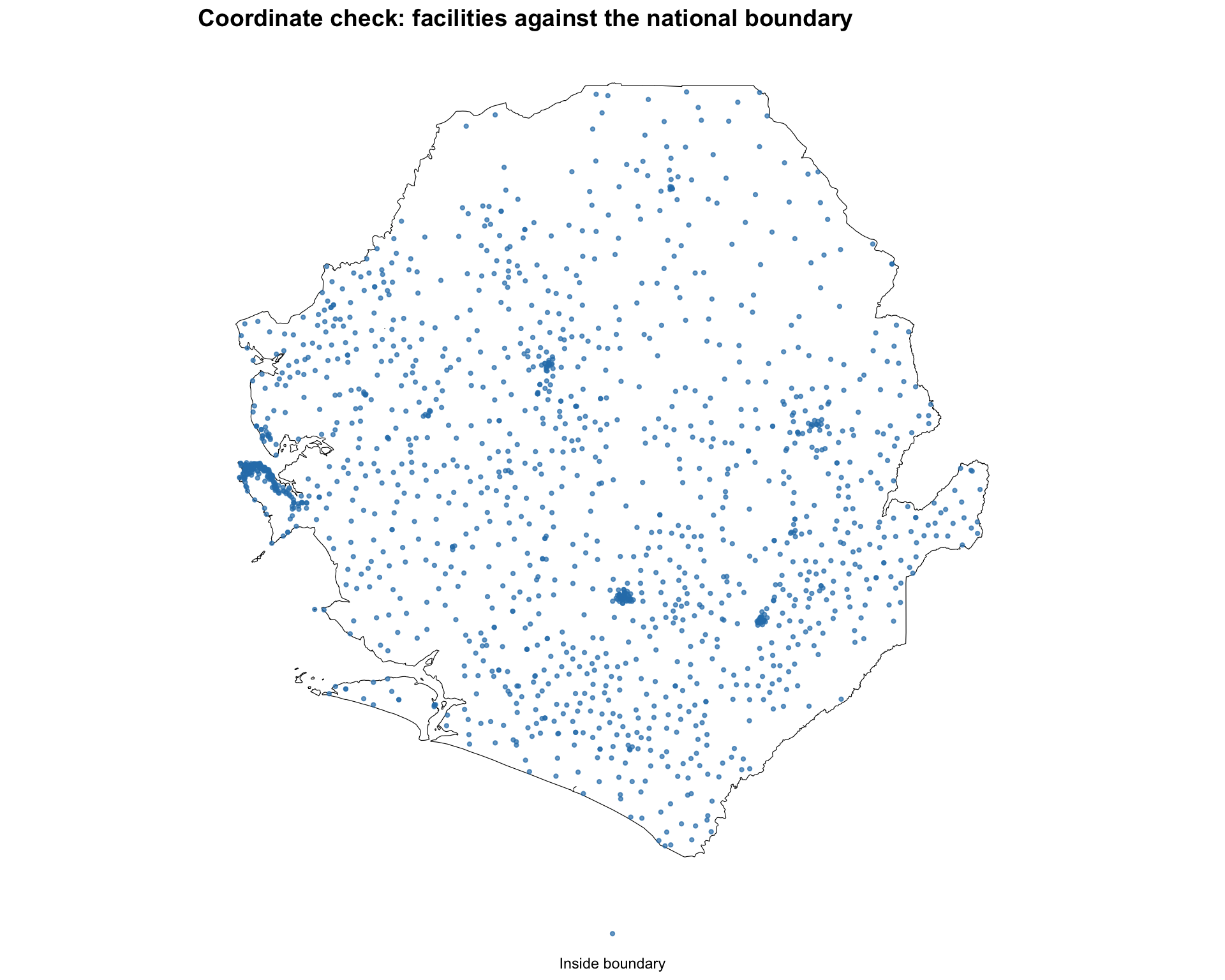
cli_info(f"Outside the national boundary: {n_outside}")
cli_info(f"Likely flipped lon/lat: {n_flipped}")
# flag each valid point by whether it falls inside the national boundary
hf_points = hf_points.assign(
    location=inside.map(
        {True: "Inside boundary", False: "Outside boundary"}
    )
)

# map the points over the national boundary
color_map = {"Inside boundary": "#2c7fb8", "Outside boundary": "#e31a1c"}
fig, ax = plt.subplots(figsize=(10, 8))
adm0.plot(ax=ax, facecolor="white", edgecolor="black", linewidth=0.8,
          aspect="equal")
for label, color in color_map.items():
    subset = hf_points.loc[hf_points["location"] == label]
    subset.plot(
        ax=ax, color=color, markersize=3, alpha=0.7, label=label,
        aspect="equal",
    )
ax.legend(
    loc="lower center", bbox_to_anchor=(0.5, -0.05),
    frameon=False, fontsize=9, ncol=2,
)
finish_map(
    ax,
    title="Coordinate check: facilities against the national boundary",
)
#### Step 3.3: Clean coordinates -----------------------------------------------
# define longitude (x) and latitude (y) coordinates
hf_data = hf_data.assign(x=hf_data["w_long"], y=hf_data["w_lat"])

# identify facilities with invalid coordinates for follow-up
facilities_to_review = hf_data.loc[
    hf_data["x"].isna()
    | hf_data["y"].isna()
    | (hf_data["x"] < -180) | (hf_data["x"] > 180)
    | (hf_data["y"] < -90) | (hf_data["y"] > 90)
]

# filter to keep only valid, in-range coordinates
facilities_clean = hf_data.loc[
    hf_data["x"].notna()
    & hf_data["y"].notna()
    & hf_data["x"].between(-180, 180)
    & hf_data["y"].between(-90, 90)
]

# print cleaning results
cli_header("Data cleaning results")
cli_info(f"Original health facilities: {len(hf_data)}")
cli_info(f"Clean health facilities: {len(facilities_clean)}")
cli_info(
    f"Removed facilities: {len(hf_data) - len(facilities_clean)}"
)
cli_info(
    f"Facilities flagged for review: {len(facilities_to_review)}"
)
cli_info(
    f"Longitude range: {facilities_clean['x'].min()} to "
    f"{facilities_clean['x'].max()}"
)
cli_info(
    f"Latitude range: {facilities_clean['y'].min()} to "
    f"{facilities_clean['y'].max()}"
)
### Step 4: Convert to Spatial Object ------------------------------------------
# convert the cleaned table to a GeoDataFrame using point coordinates
facilities_sf = gpd.GeoDataFrame(
    facilities_clean,
    geometry=gpd.points_from_xy(
        facilities_clean["w_long"], facilities_clean["w_lat"]
    ),
    crs="EPSG:4326",
)

cli_success("Converted to spatial object")
cli_header("Spatial object summary")
print(facilities_sf.head(3).to_string(index=False))
### Step 5: Assign Facilities to Administrative Units --------------------------
# keep only the admin boundary columns, renamed to avoid clashing
# with the facility data's own admin columns
boundary_lookup = gdf[["adm2", "adm3", "geometry"]].rename(
    columns={"adm2": "adm2_boundary", "adm3": "adm3_boundary"}
)

# assign a CRS fallback if missing before the spatial join
if boundary_lookup.crs is None:
    boundary_lookup = boundary_lookup.set_crs("EPSG:4326")
if facilities_sf.crs is None:
    facilities_sf = facilities_sf.set_crs("EPSG:4326")

# assign each facility to the chiefdom (adm3) polygon it falls within
facilities_admin = gpd.sjoin(
    facilities_sf,
    boundary_lookup,
    how="left",
    predicate="within",
)

# facilities that did not fall within any polygon
n_unmatched = facilities_admin["adm3_boundary"].isna().sum()

cli_header("Facilities assigned to an administrative unit")
cli_info(f"Facilities joined: {len(facilities_admin)}")
cli_info(f"Unmatched (outside all polygons): {n_unmatched}")

# compare the recorded chiefdom with the polygon the point falls in
print(
    facilities_admin[["hf", "adm3", "adm3_boundary"]]
    .head(5)
    .to_string(index=False)
)
### Step 6: Save Cleaned and Spatial Data --------------------------------------
# set up the output directory for processed datasets
out_path = Path(
    here(
        "01_data/1.1_foundational/"
        "1.1c_health_facilities/processed"
    )
)
out_path.mkdir(parents=True, exist_ok=True)

# save the cleaned facility table as a CSV
facilities_clean.to_csv(
    out_path / "facilities_clean.csv", index=False
)

# save the facility points as a GeoPackage
facilities_sf.to_file(
    out_path / "facilities_spatial.gpkg",
    layer="facilities",
    driver="GPKG",
)
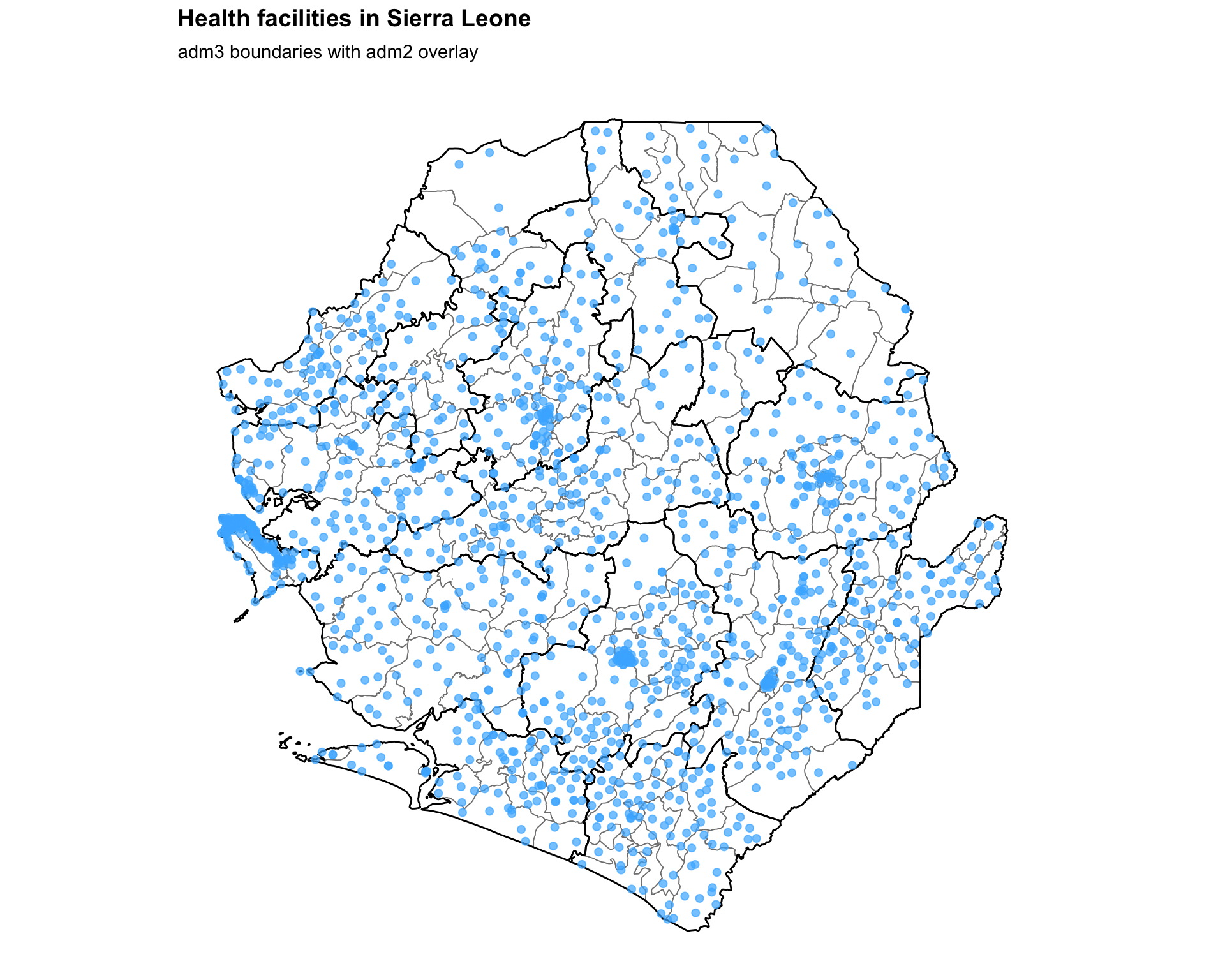
### Step 7: Create Health Facility Maps ----------------------------------------
#### Step 7.1: Basic health facility map ---------------------------------------
# define the map title
title = "Health facilities in Sierra Leone"

# create the basic map
fig, ax = plt.subplots(figsize=(10, 8))
gdf.plot(ax=ax, facecolor="white", edgecolor="grey", linewidth=0.3,
         aspect="equal")
adm2_gdf.plot(ax=ax, facecolor="none", edgecolor="black",
              linewidth=0.5, aspect="equal")
ax.scatter(
    facilities_clean["x"],
    facilities_clean["y"],
    color="#47B5FF",
    s=15,
    alpha=0.7,
    zorder=5,
)
finish_map(ax, title=title, subtitle="adm3 boundaries with adm2 overlay")

# save the map
save_figure(
    fig,
    here("03_output/3a_figures/health_facility_locations.png"),
    width=10,
    height=7,
)
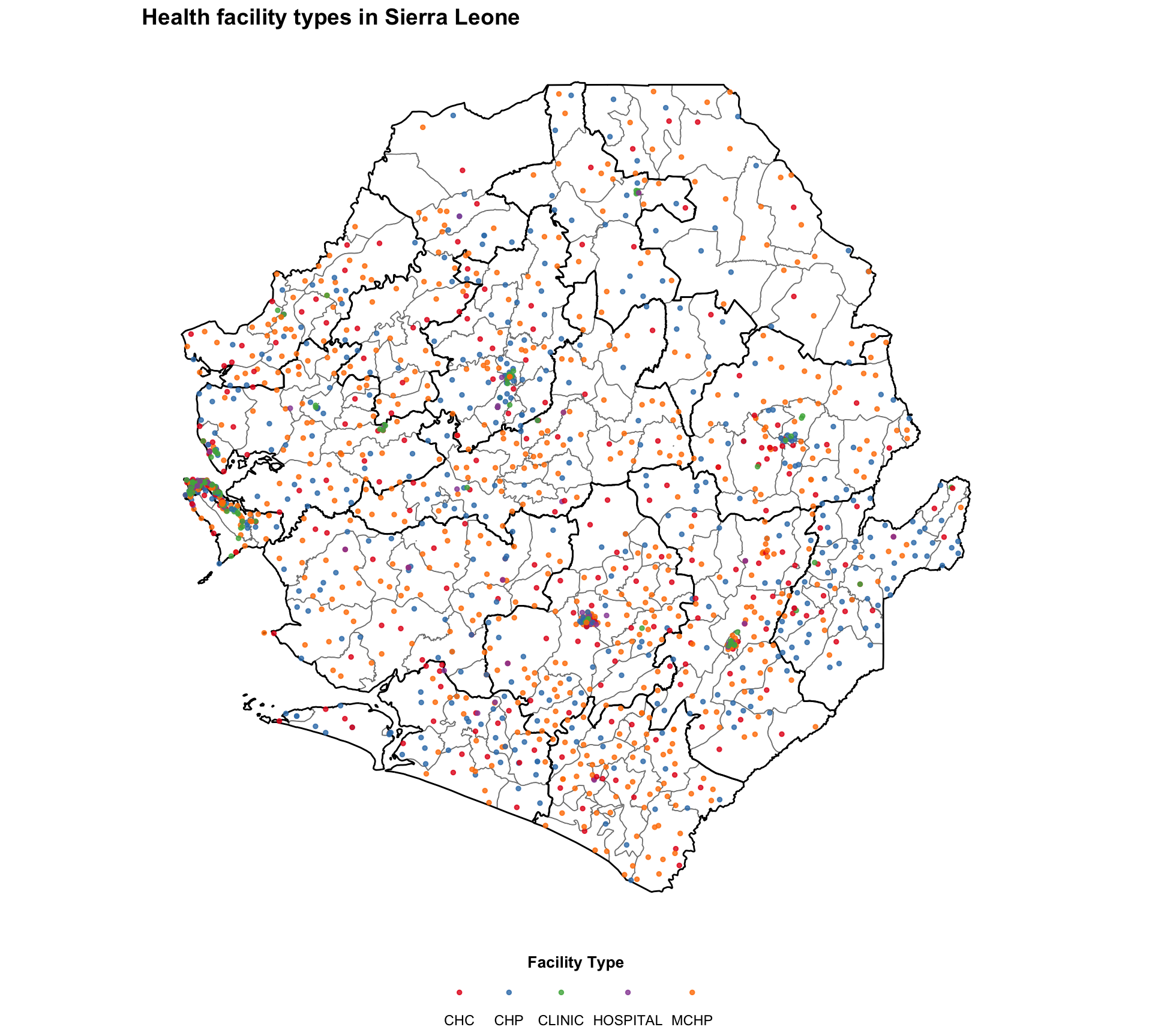
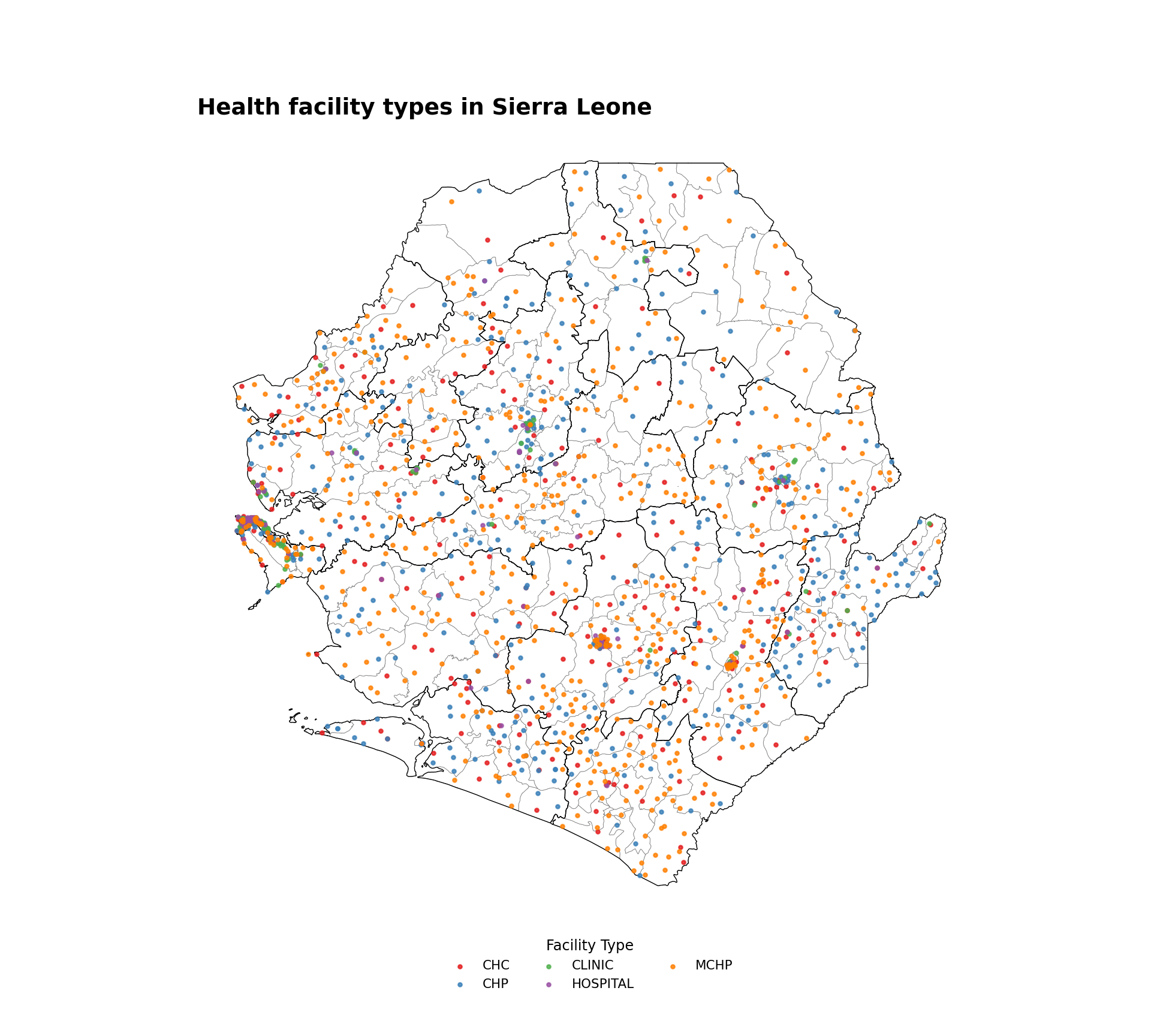
#### Step 7.2: Health facilities by type ---------------------------------------
# define the facility type map title
title_type = "Health facility types in Sierra Leone"

# get the ordered facility types and assign a Set1 color to each
facility_types = sorted(facilities_clean["type"].dropna().unique())
set1_colors = plt.get_cmap("Set1").colors
type_palette = {
    t: set1_colors[i % len(set1_colors)]
    for i, t in enumerate(facility_types)
}

# create health facility type map
fig, ax = plt.subplots(figsize=(10, 9))
gdf.plot(ax=ax, facecolor="white", edgecolor="gray", linewidth=0.3,
         aspect="equal")
adm2_gdf.plot(ax=ax, facecolor="none", edgecolor="black",
              linewidth=0.5, aspect="equal")
for ftype, color in type_palette.items():
    subset = facilities_clean.loc[facilities_clean["type"] == ftype]
    ax.scatter(
        subset["x"], subset["y"],
        color=color, s=5, alpha=0.8, label=ftype, zorder=5,
    )
ax.legend(
    title="Facility Type",
    loc="lower center",
    bbox_to_anchor=(0.5, -0.10),
    ncol=3,
    frameon=False,
    fontsize=8,
    title_fontsize=9,
)
finish_map(ax, title=title_type)

# save the type map
save_figure(
    fig,
    here("03_output/3a_figures/health_facility_by_type.png"),
    width=10,
    height=7,
)
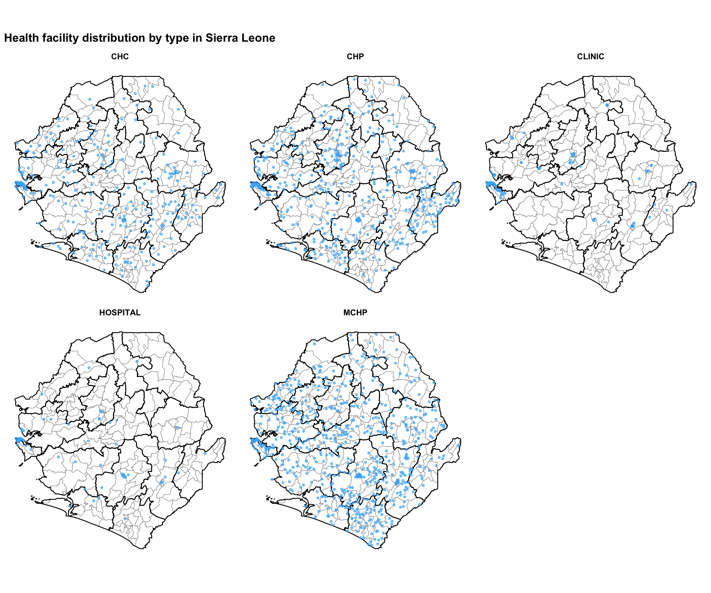
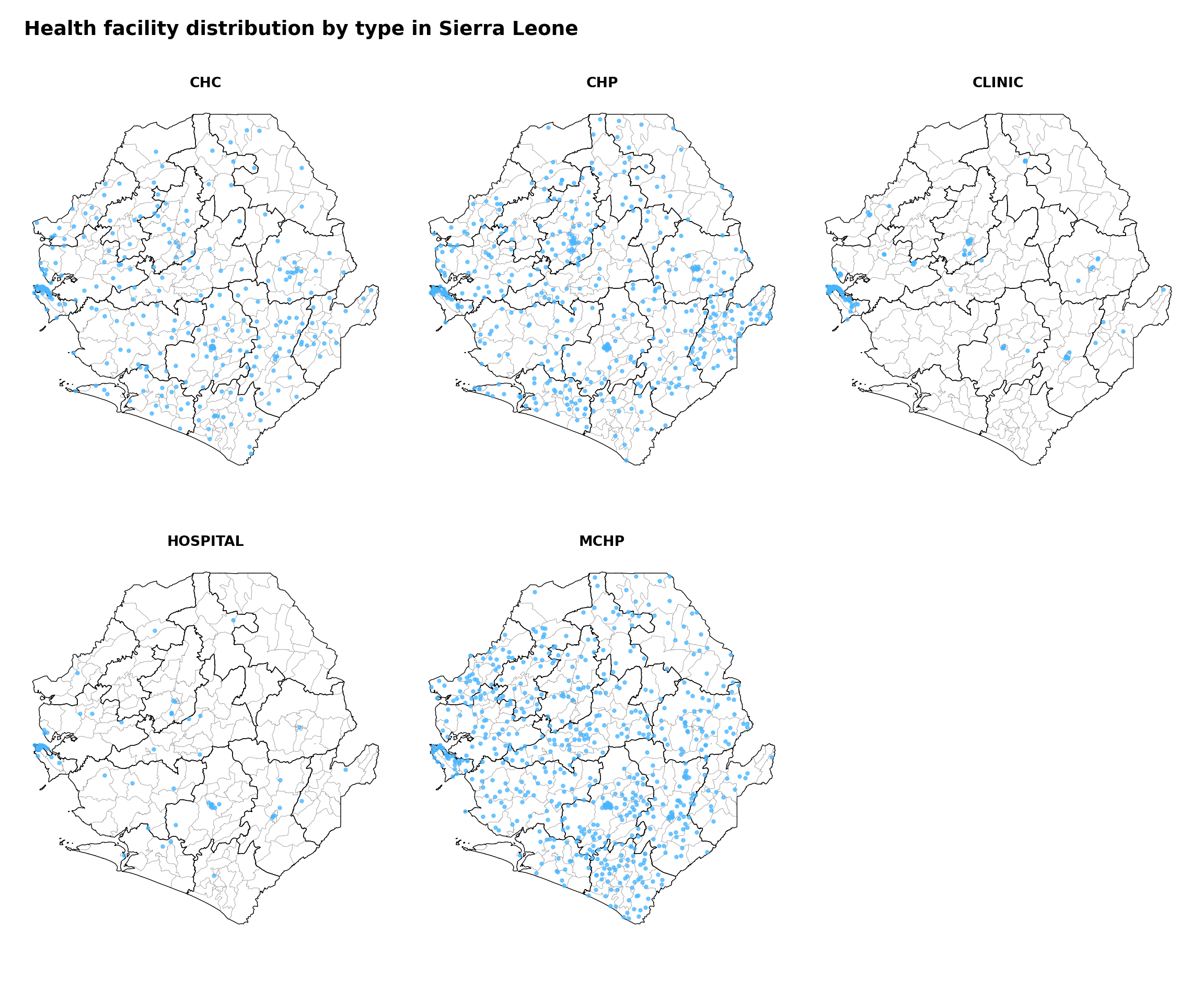
#### Step 7.3: Specific health facility types ----------------------------------
# define the faceted map title
title_facet = "Health facility distribution by type in Sierra Leone"

# get the unique facility types for faceting
facility_types = sorted(facilities_clean["type"].dropna().unique())
n_types = len(facility_types)
ncols = 3
nrows = -(-n_types // ncols)  # ceiling division

fig, axes = plt.subplots(nrows, ncols, figsize=(12, 9))
axes_flat = axes.flatten()

for i, ftype in enumerate(facility_types):
    ax = axes_flat[i]
    gdf.plot(ax=ax, facecolor="white", edgecolor="gray",
             linewidth=0.2, aspect="equal")
    adm2_gdf.plot(ax=ax, facecolor="none", edgecolor="black",
                  linewidth=0.5, aspect="equal")
    subset = facilities_clean.loc[facilities_clean["type"] == ftype]
    ax.scatter(
        subset["x"], subset["y"],
        color="#47B5FF", s=5, alpha=0.7, zorder=5,
    )
    ax.set_title(ftype, fontsize=10, fontweight="bold")
    ax.set_axis_off()

# hide any unused axes panels
for j in range(n_types, len(axes_flat)):
    axes_flat[j].set_visible(False)

fig.suptitle(title_facet, fontsize=14, fontweight="bold", x=0.02,
             ha="left")
plt.tight_layout()

# save the faceted map
save_figure(
    fig,
    here("03_output/3a_figures/health_facility_faceted_by_type.png"),
    width=12,
    height=9,
)
### Step 8: Advanced Point Coordinates Visualizations --------------------------
#### Step 8.1: Point coordinates data summary ----------------------------------
# load the merged DHIS2-MFL dataset
final_dhis2_mfl_integrated = pd.read_parquet(
    Path(
        here(
            "01_data/1.1_foundational/"
            "1.1c_health_facilities/processed/"
            "final_dhis2_mfl_integrated.parquet"
        )
    )
)

# the year column may arrive as a string; coerce it to a nullable
# integer so the year filter below behaves the same way as R's lenient
# comparison ("2023" == 2023 is TRUE in R but False in Python)
final_dhis2_mfl_integrated["year"] = pd.to_numeric(
    final_dhis2_mfl_integrated["year"], errors="coerce"
).astype("Int64")

# back-fill missing lat/long from the MFL by facility name; many DHIS2
# rows arrive without coordinates because the upstream fuzzy match
# only confirmed a subset of facility identities
mfl_coords = (
    pd.read_excel(hf_path / "mfl_hfs.xlsx")
    [["hf", "w_lat", "w_long"]]
    .drop_duplicates("hf")
)
final_dhis2_mfl_integrated = final_dhis2_mfl_integrated.merge(
    mfl_coords, on="hf", how="left"
)
final_dhis2_mfl_integrated["lat"] = (
    final_dhis2_mfl_integrated["lat"]
    .combine_first(final_dhis2_mfl_integrated["w_lat"])
)
final_dhis2_mfl_integrated["long"] = (
    final_dhis2_mfl_integrated["long"]
    .combine_first(final_dhis2_mfl_integrated["w_long"])
)

# calculate annual summaries for each health facility
annual_summary = (
    final_dhis2_mfl_integrated
    .assign(
        total_tests=lambda d: (
            d["test_u5"].fillna(0)
            + d["test_5_14"].fillna(0)
            + d["test_ov15"].fillna(0)
        ),
        positive_tests=lambda d: (
            d["conf_u5"].fillna(0)
            + d["conf_5_14"].fillna(0)
            + d["conf_ov15"].fillna(0)
        ),
    )
    .groupby(["hf_uid", "hf", "year", "lat", "long"], as_index=False)
    .agg(
        total_tests=("total_tests", "sum"),
        positive_tests=("positive_tests", "sum"),
    )
    .assign(
        tpr=lambda d: np.where(
            d["total_tests"] > 0,
            (d["positive_tests"] / d["total_tests"]) * 100,
            np.nan,
        )
    )
    .loc[lambda d: d["total_tests"] > 0]
)

# filter for 2023 and assign a testing-volume category
size_levels = ["≤100", "101-500", "501-1,000", "1,001-5,000", "5,000+"]
annual_summary_2023 = (
    annual_summary
    .loc[lambda d: (
        (d["year"] == 2023)
        & d["tpr"].notna()
        & (d["total_tests"] > 0)
        & d["lat"].notna()
        & d["long"].notna()
    )]
    .assign(
        size_category=lambda d: pd.Categorical(
            np.select(
                [
                    d["total_tests"] <= 100,
                    d["total_tests"] <= 500,
                    d["total_tests"] <= 1000,
                    d["total_tests"] <= 5000,
                ],
                ["≤100", "101-500", "501-1,000", "1,001-5,000"],
                default="5,000+",
            ),
            categories=size_levels,
            ordered=True,
        )
    )
)
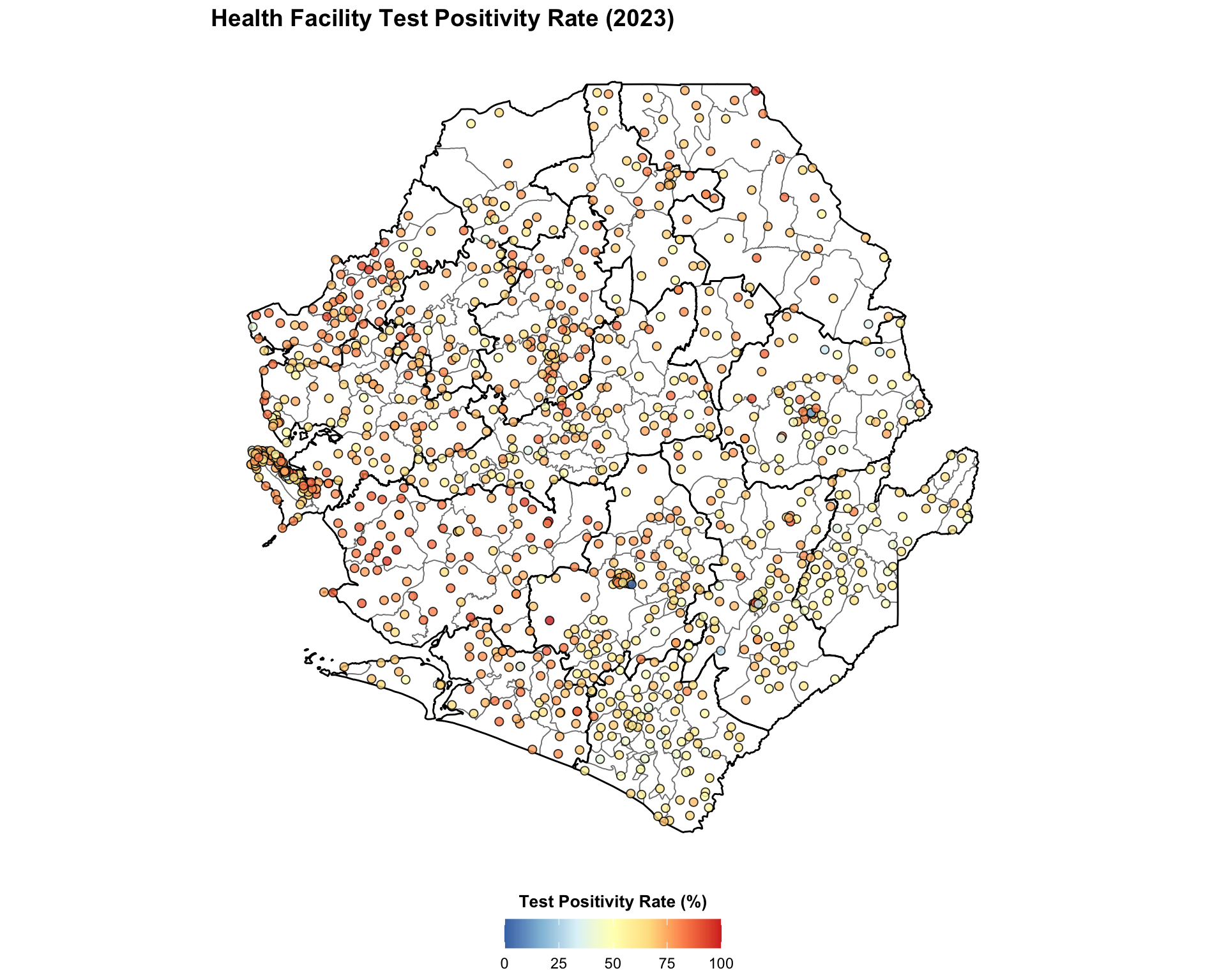
#### Step 8.2: Single indicator points coordinate visualization ----------------
# build the color map matching R's rev(brewer.pal(7, "RdYlBu"))
rdylbu_7_rev = [
    "#4575b4", "#91bfdb", "#e0f3f8",
    "#ffffbf", "#fee090", "#fc8d59", "#d73027",
]
cmap_tpr = mcolors.LinearSegmentedColormap.from_list(
    "rdylbu_rev", rdylbu_7_rev
)

fig, ax = plt.subplots(figsize=(10, 10))
gdf.plot(ax=ax, facecolor="white", edgecolor="gray", linewidth=0.3,
         aspect="equal")
adm2_gdf.plot(ax=ax, facecolor="none", edgecolor="black",
              linewidth=0.5, aspect="equal")
norm = mcolors.Normalize(vmin=0, vmax=100)
sc = ax.scatter(
    annual_summary_2023["long"],
    annual_summary_2023["lat"],
    c=annual_summary_2023["tpr"],
    cmap=cmap_tpr,
    norm=norm,
    s=15,
    alpha=0.8,
    edgecolors="black",
    linewidths=0.5,
    zorder=5,
)
sm = ScalarMappable(cmap=cmap_tpr, norm=norm)
sm.set_array([])
cbar = fig.colorbar(
    sm, ax=ax, orientation="horizontal", fraction=0.04, pad=0.04
)
cbar.set_label("Test Positivity Rate (%)", fontweight="bold")
finish_map(ax, title="Health Facility Test Positivity Rate (2023)")

# save the map
save_figure(
    fig,
    here("03_output/3a_figures/health_facility_tpr_2023.png"),
    width=10,
    height=7,
)
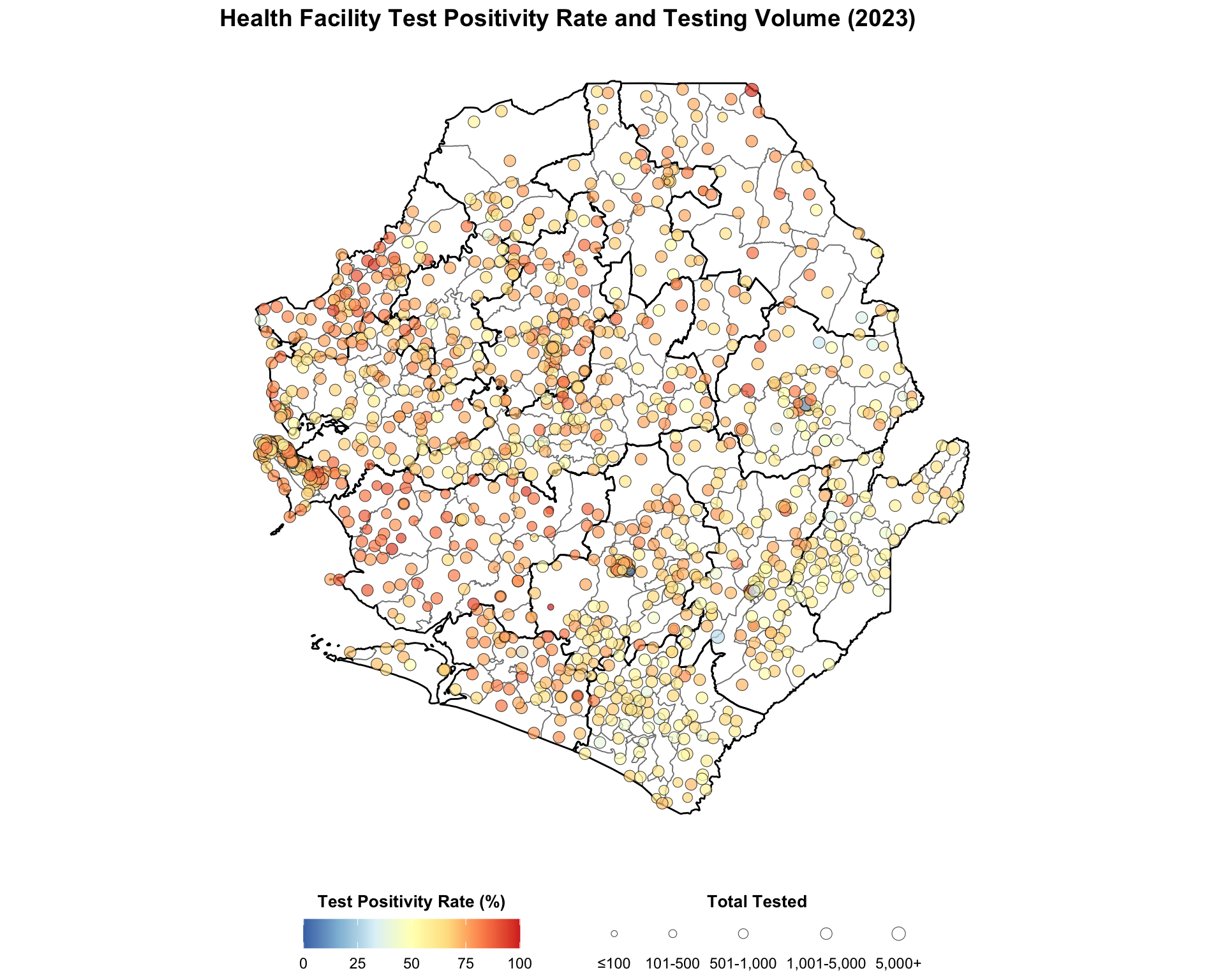
#### Step 8.3: Multiple indicator points coordinate visualization --------------
# size mapping matching the R size_scale
size_map = {
    "≤100": 20, "101-500": 30, "501-1,000": 50,
    "1,001-5,000": 80, "5,000+": 120,
}

# build the color map matching R's rev(brewer.pal(7, "RdYlBu"))
rdylbu_7_rev = [
    "#4575b4", "#91bfdb", "#e0f3f8",
    "#ffffbf", "#fee090", "#fc8d59", "#d73027",
]
cmap_tpr = mcolors.LinearSegmentedColormap.from_list(
    "rdylbu_rev", rdylbu_7_rev
)

fig, ax = plt.subplots(figsize=(10, 12))
gdf.plot(ax=ax, facecolor="white", edgecolor="gray", linewidth=0.3,
         aspect="equal")
adm2_gdf.plot(ax=ax, facecolor="none", edgecolor="black",
              linewidth=0.5, aspect="equal")
norm = mcolors.Normalize(vmin=0, vmax=100)

# derive the marker size for every row from the size_category column,
# falling back to the smallest size when the category is missing
size_levels = ["≤100", "101-500", "501-1,000", "1,001-5,000", "5,000+"]
point_sizes = (
    annual_summary_2023["size_category"]
    .astype(str)
    .map(size_map)
    .fillna(size_map["≤100"])
)

# plot all facilities in a single scatter call so every point renders
ax.scatter(
    annual_summary_2023["long"],
    annual_summary_2023["lat"],
    c=annual_summary_2023["tpr"],
    cmap=cmap_tpr,
    norm=norm,
    s=point_sizes,
    alpha=0.7,
    edgecolors="black",
    linewidths=0.3,
    zorder=5,
)

# colorbar for TPR
sm = ScalarMappable(cmap=cmap_tpr, norm=norm)
sm.set_array([])
cbar = fig.colorbar(
    sm, ax=ax, orientation="horizontal", fraction=0.04, pad=0.04
)
cbar.set_label("Test Positivity Rate (%)", fontweight="bold")

# build proxy handles for the size legend so it always renders, even if a
# size category has no facilities
size_handles = [
    plt.scatter(
        [], [], s=size_map[cat], color="lightgray",
        edgecolors="black", linewidths=0.3, alpha=0.7,
    )
    for cat in size_levels
]
ax.legend(
    size_handles, size_levels,
    title="Total Tested",
    loc="upper center",
    bbox_to_anchor=(0.5, -0.18),
    ncol=5,
    frameon=False,
    fontsize=8,
    title_fontsize=9,
)
finish_map(
    ax,
    title=(
        "Health Facility Test Positivity Rate and Testing Volume (2023)"
    ),
)

# save the map
save_figure(
    fig,
    here("03_output/3a_figures/health_facility_tpr_test_2023.png"),
    width=10,
    height=7,
)