# install `pacman` if not already installed
if (!requireNamespace("pacman", quietly = TRUE)) {
  install.packages("pacman")
}

# load required packages using pacman
pacman::p_load(
  readxl,     # read Excel files
  tidyr,      # data organization
  sf,         # handling shapefile data
  dplyr,      # data manipulation
  ggplot2,    # plotting
  viridis,    # color palettes
  shadowtext, # plot labels
  cli,        # styled console output
  here,       # file path management
  stringr     # cleaning up character strings
)Basic shapefile use and visualization
Beginner/Intermediate
Overview
In the context of SNT, having official, accurate, and current shapefiles is important. These files form the backbone for linking data to the geographic units. This page provides a step-by-step guide on how to load, visualize, and use shapefile data effectively.
Effective visualization of shapefiles serves two critical purposes in SNT:
- Validating the geometric integrity of the boundaries themselves
- Providing the spatial framework for all subsequent data analysis
A well-prepared shapefile should render cleanly at both national and subnational scales, with boundaries that align precisely with known geographic features and administrative divisions.
TipMore on spatial data
For background information on shapefiles and links to all the spatial data content in the SNT code library, including rasters and point data, please visit Spatial data overview. For suggestions on troubleshooting your shapefile, please visit Shapefile management and customization.
NoteObjectives
- Import the cleaned, processed shapefiles produced in Shapefile management and customization
- Create basic maps from shapefile data
- Overlay multiple administrative levels
- Use shapefiles to visualize different types of data
Using the right shapefiles
ImportantConsult with SNT team
Not every shapefile is the correct one to use for SNT.
One of the key first steps prior to the initiation of any SNT analysis is the discussion amongst the SNT team regarding the lowest operational administrative unit for decision making in the country where specific interventions can be feasibly implemented. We must always confirm this decision before embarking on the analysis, or initiate discussion if this has not already taken place. The unit of analysis affects the unit for data collection and the geographical scale at which the analysis is conducted. The latter will determine the shapefile used for SNT.
All shapefiles used in SNT must be reviewed and validated by the SNT team and must represent the official national boundary set. This ensures alignment with national standards, guarantees boundary accuracy, and avoids discrepancies in spatial data.
Do not forget to also request all the official shapefiles of higher (less granular levels) than the shapefile of the chosen unit of analysis. For example, if the SNT team has selected adm2 as the unit of analysis, you will also need adm1 shapefiles. This is important because output maps for SNT should always include all the official boundaries for ease of interpretation.
If a custom mix of shapefiles (for example, a mix of adm2 and adm3) is required for SNT, please see Shapefile management and customization.
Step-by-step
In this section, we walk through the essential steps to load and view shapefile data.
The example uses administrative boundary shapefiles from Sierra Leone, with focus on chiefdom (adm3) and district (adm2) levels. The principles can be applied to shapefiles from any country.
Step 1: Install and load packages
First, install and load the necessary packages for handling spatial data, data manipulation, and visualization. These libraries provide essential functions for working with spatial data.
The sf package is particularly important as it implements simple features standards for handling geographic vector data in R.
To adapt the code:
- Do not modify anything in the code above
WarningTerminal Installation Required
Install packages in your terminal, if not already installed. If you need help installing packages, please refer to the Getting Started page.
from pathlib import Path

import geopandas as gpd
import matplotlib.colors as mcolors
import matplotlib.patches as mpatches
import matplotlib.patheffects as path_effects
import matplotlib.pyplot as plt
import numpy as np
import pandas as pd
import pyreadr
from matplotlib.cm import ScalarMappable
from matplotlib_scalebar.scalebar import ScaleBar
from pyprojroot import here


def read_rds(path):
    """Read a single-object RDS file as a pandas object."""
    result = pyreadr.read_r(str(path))
    return next(iter(result.values()))


def ensure_output_dir(path):
    """Create the parent directory before saving figures or data."""
    Path(path).parent.mkdir(parents=True, exist_ok=True)


def add_title(ax, title=None, subtitle=None):
    """Use one matplotlib title block to match ggplot title/subtitle output."""
    if title and subtitle:
        ax.set_title(f"{title}\n{subtitle}", loc="left", fontsize=14, fontweight="bold")
    elif title:
        ax.set_title(title, loc="left", fontsize=14, fontweight="bold")


def finish_map(ax, title=None, subtitle=None):
    """Apply the shared static map styling used on this page."""
    add_title(ax, title, subtitle)
    ax.set_axis_off()


def save_figure(fig, filename, width, height, dpi=300):
    """Save a matplotlib figure with dimensions matching the R examples."""
    ensure_output_dir(filename)
    fig.set_size_inches(width, height)
    fig.savefig(filename, dpi=dpi, bbox_inches="tight")


def label_points(ax, data, label_col, x_col="lon", y_col="lat", dy=0.08, size=8):
    """Add point labels with a white halo for legibility."""
    for _, row in data.iterrows():
        text = ax.text(
            row[x_col],
            row[y_col] + dy,
            row[label_col],
            ha="center",
            va="center",
            fontsize=size,
            fontweight="bold",
            color="black",
        )
        text.set_path_effects([
            path_effects.Stroke(linewidth=3, foreground="white"),
            path_effects.Normal(),
        ])


def legend_patches(palette, labels=None):
    """Create categorical legend handles from a named color dictionary."""
    labels = labels or {}
    return [
        mpatches.Patch(facecolor=color, edgecolor="black", label=labels.get(key, key))
        for key, color in palette.items()
    ]


def add_bottom_legend(ax, handles, title=None, ncol=None):
    """Place a compact horizontal legend below a map."""
    ncol = ncol or len(handles)
    ax.legend(
        handles=handles,
        title=title,
        loc="lower center",
        bbox_to_anchor=(0.5, -0.10),
        ncol=ncol,
        frameon=False,
        fontsize=8,
        title_fontsize=9,
    )


def plot_binned_map(ax, data, fill_col, palette, title=None, subtitle=None,
                    overlay=None, overlay_color="black", overlay_width=0.5):
    """Draw a binned choropleth with a bottom legend and optional overlay."""
    plot_colors = data[fill_col].map(palette).fillna("#E5E5E5")
    data.plot(
        ax=ax,
        color=plot_colors,
        edgecolor="white",
        linewidth=0.2,
    )
    if overlay is not None:
        overlay.plot(ax=ax, facecolor="none", edgecolor=overlay_color, linewidth=overlay_width)
    finish_map(ax, title, subtitle)
    present_keys = [key for key in palette if key in set(data[fill_col].dropna().astype(str))]
    handles = legend_patches({key: palette[key] for key in present_keys})
    add_bottom_legend(ax, handles, title="Test positivity rate (%)", ncol=len(handles))


def plot_gradient_map(ax, data, fill_col, colors, title=None, subtitle=None,
                      overlay=None, legend_label="Test positivity rate (%)",
                      vmin=0, vmax=100):
    """Draw a continuous choropleth with a horizontal color bar."""
    cmap = mcolors.LinearSegmentedColormap.from_list("snt_gradient", colors)
    data.plot(
        ax=ax,
        column=fill_col,
        cmap=cmap,
        vmin=vmin,
        vmax=vmax,
        edgecolor="white",
        linewidth=0.2,
        missing_kwds={"color": "#E5E5E5"},
    )
    if overlay is not None:
        overlay.plot(ax=ax, facecolor="none", edgecolor="black", linewidth=0.5)
    finish_map(ax, title, subtitle)
    sm = ScalarMappable(norm=mcolors.Normalize(vmin=vmin, vmax=vmax), cmap=cmap)
    sm.set_array([])
    cbar = ax.figure.colorbar(sm, ax=ax, orientation="horizontal", fraction=0.04, pad=0.04)
    cbar.set_label(legend_label, fontweight="bold")


snt_palettes = {
    "blues": ["#deebf7", "#c6dbef", "#9ecae1", "#6baed6", "#4292c6", "#2171b5", "#08519c"],
    "ylord": ["#ffffcc", "#ffeda0", "#fed976", "#feb24c", "#fd8d3c", "#fc4e2a", "#bd0026"],
    "viridis": [
        "#440154", "#482878", "#3e4a89", "#31688e", "#26828e",
        "#1f9e89", "#35b779", "#6ece58", "#b5de2b", "#fde725"
    ],
    "byor": [
        "#1a5276", "#2980b9", "#5dade2", "#85c1e9", "#aed6f1",
        "#d6eaf8", "#f7dc6f", "#e67e22", "#c0392b", "#7b0d0d"
    ],
    "rdbu": ["#b2182b", "#d6604d", "#f4a582", "#fddbc7", "#d1e5f0", "#92c5de", "#4393c3", "#2166ac"],
    "spectral": ["#d53e4f", "#f46d43", "#fdae61", "#fee08b", "#e6f598", "#abdda4", "#66c2a5", "#3288bd"],
    "set2": ["#66c2a5", "#fc8d62", "#8da0cb", "#e78ac3", "#a6d854", "#ffd92f"],
    "accent": ["#7fc97f", "#beaed4", "#fdc086", "#ffff99", "#386cb0", "#f0027f"],
}

tpr_bin_labels = [
    "0-10", "10-20", "20-30", "30-40", "40-50",
    "50-60", "60-70", "70-80", "80-90", "90-100"
]
tpr_bin_palette = dict(zip(tpr_bin_labels, snt_palettes["byor"]))
tpr_gradient_colors = [
    "#1a5276", "#5dade2", "#d6eaf8", "#f7dc6f",
    "#e67e22", "#c0392b", "#7b0d0d"
]
To adapt the code:
- Keep these imports and helpers at the top of the Python workflow. Later Python chunks use them for reading spatial files, matching map styles, creating legends, and saving figures.
Step 2: Import shapefiles
In this step, we load the cleaned, processed adm3 (Chiefdom) and adm2 (District) spatial objects produced in the Shapefile management and customization page. Those files were saved as .rds with the standard adm0 / adm1 / adm2 / adm3 naming and a consistent CRS, so no further renaming or transformation is required here.
Show the code
# set up spatial path
spat_path <- here::here(
  "1.1_foundational",
  "1.1a_administrative_boundaries"
)

# load processed chiefdom (adm3) spatial object
gdf <- readRDS(
  here::here(spat_path, "processed", "sle_spatial_adm3_2021.rds")
) |>
  # ensure output remains a valid sf object for downstream usage
  sf::st_as_sf()

# load processed district (adm2) spatial object
adm2_gdf <- readRDS(
  here::here(spat_path, "processed", "sle_spatial_adm2_2021.rds")
) |>
  sf::st_as_sf()

# load processed region (adm1) spatial object, used as the higher-level
# overlay in choropleth maps from Step 4 onward
adm1_gdf <- readRDS(
  here::here(spat_path, "processed", "sle_spatial_adm1_2021.rds")
) |>
  sf::st_as_sf()
To adapt the code:
- Lines 2–5: Update
spat_pathto point to the folder where your processed spatial.rdsfiles are stored - Lines 9 and 16: Replace
"sle_spatial_adm3_2021.rds"and"sle_spatial_adm2_2021.rds"with your processed filenames from the Shapefile management and customization step
Show the code
# set up spatial path
spat_path = here("1.1_foundational/1.1a_administrative_boundaries/processed")

# load processed chiefdom (adm3) spatial object
gdf = gpd.read_file(Path(spat_path) / "sle_spatial_adm3_2021.geojson")

# load processed district (adm2) spatial object
adm2_gdf = gpd.read_file(Path(spat_path) / "sle_spatial_adm2_2021.geojson")

# load processed region (adm1) spatial object, used as the higher-level
# overlay in choropleth maps from Step 4 onward
adm1_gdf = gpd.read_file(Path(spat_path) / "sle_spatial_adm1_2021.geojson")
To adapt the code:
- Line 2: Update
spat_pathto point to the folder where your processed spatial files are stored - Lines 5, 8, and 12: Replace the GeoJSON filenames with your processed filenames from the Shapefile management and customization step
Step 3: Visualize shapefile contents
This page assumes you are working with a clean and well-formatted shapefile. Geometry repair, CRS harmonization, attribute renaming, and other preprocessing steps belong upstream in Shapefile management and customization. Once those steps are done, the only inspection that remains here is visual: confirming that the maps render as expected.
Initial mapping serves as a diagnostic tool. Visual inspection can reveal issues like implausible boundary shapes or misaligned enclaves. A clean shapefile should:
- Maintain clean boundaries at all levels
- Preserve topological relationships (no overlapping polygons)
- Align with known geographic boundaries
- Display attribute data without rendering artifacts
In this step we generate maps to visually represent the spatial data, starting with a basic map of a single administrative level. We also define a shared map theme so every figure on this page has the same look and feel.
Step 3.1: Basic admin unit map
Show the code
# shared map theme reused by every map on this page
# (theme_void() removes axes/grid by default; the theme block below
# controls fonts, sizes, legend layout, and margins so every plot
# from Step 3 through Step 5 has identical look-and-feel)
snt_map_theme <- function() {
ggplot2::theme_void() +
ggplot2::theme(
legend.position = "bottom",
legend.direction = "horizontal",
# title sits above the legend boxes, tick labels sit below them
legend.title.position = "top",
legend.text.position = "bottom",
legend.title = ggplot2::element_text(
face = "bold",
size = 10,
hjust = 0.5,
margin = ggplot2::margin(b = 6)
),
legend.box.margin = ggplot2::margin(t = 8),
# narrow key width keeps single-row legends compact even with many
# bins; Steps 4.3 / 4.6 / 5.2 / 5.3 / 5.4 all rely on this default
legend.key.width = grid::unit(0.9, "cm"),
strip.text = ggplot2::element_text(
face = "bold",
size = 10,
margin = ggplot2::margin(t = 2, b = 6, l = 4, r = 4)
),
strip.text.y = ggplot2::element_text(angle = -90),
panel.spacing = grid::unit(4, "pt"),
plot.title = ggplot2::element_text(
face = "bold",
size = 14,
margin = ggplot2::margin(b = 8)
),
plot.subtitle = ggplot2::element_text(
size = 11,
margin = ggplot2::margin(b = 10)
),
plot.margin = ggplot2::margin(t = 5, r = 5, b = 5, l = 5)
)
}
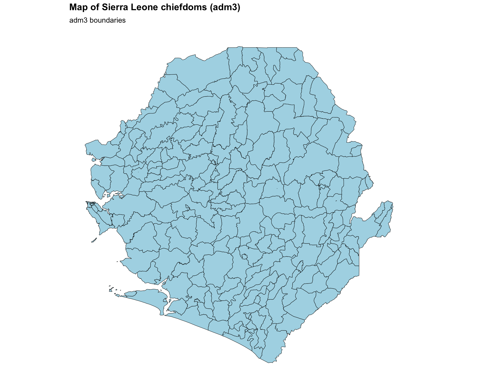
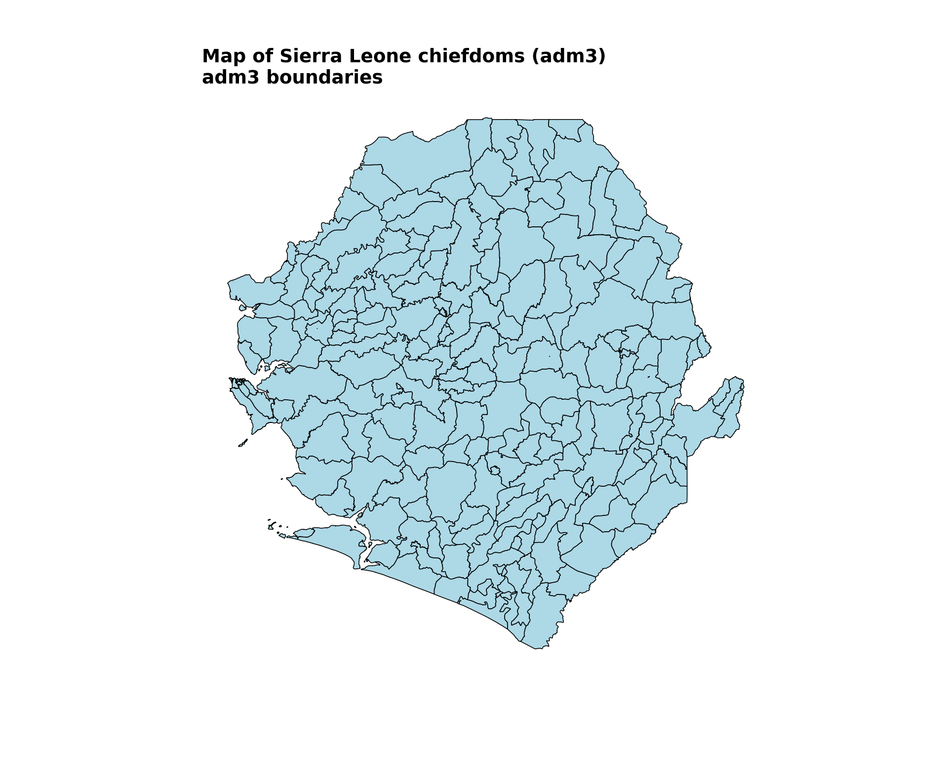
# plot the chiefdom shapefile
basic_map <- ggplot2::ggplot() +
ggplot2::geom_sf(
data = gdf,
fill = "lightblue",
color = "black"
) +
ggplot2::labs(
title = "Map of Sierra Leone chiefdoms (adm3)",
subtitle = "adm3 boundaries"
) +
snt_map_theme()
# save plot
ggplot2::ggsave(
plot = basic_map,
filename = here::here("03_output", "3a_figures", "basic_map.png"),
width = 10,
height = 8,
dpi = 300
)
NoteOutput
To adapt the code:
- Lines 17–21: Adjust
fillandcoloringeom_sf()to fit your preferences - Lines 22–25: Modify
titleandsubtitleto reflect the country you are mapping - Lines 30–35: Adjust
width,height, anddpiinggsave()based on your output needs
Show the code
fig, ax = plt.subplots(figsize=(10, 8))
gdf.plot(ax=ax, facecolor="lightblue", edgecolor="black", linewidth=0.6)
finish_map(
    ax,
    title="Map of Sierra Leone chiefdoms (adm3)",
    subtitle="adm3 boundaries"
)

# save plot
save_figure(
    fig,
    here("03_output/3a_figures/basic_map.png"),
    width=10,
    height=8,
    dpi=300
)
plt.show()
NoteOutput
To adapt the code:
- Line 8: Adjust
facecolorandedgecolorin.plot()to fit your preferences - Lines 10–13: Modify
titleandsubtitleto reflect the country you are mapping - Lines 17–22: Adjust
width,height, anddpiinsave_figure()based on your output needs
ImportantValidate with SNT team
Before proceeding with further analysis, share your shapefile maps with the SNT team for validation. The team will help ensure that:
- The shapefiles accurately represent the current administrative boundaries
- The boundaries align with the operational units for decision-making
- There are no discrepancies between the shapefile data and official boundaries
- Any mapping decisions (colors, labels, symbology) are consistent with program standards
This validation step is crucial for maintaining data integrity throughout the SNT process.
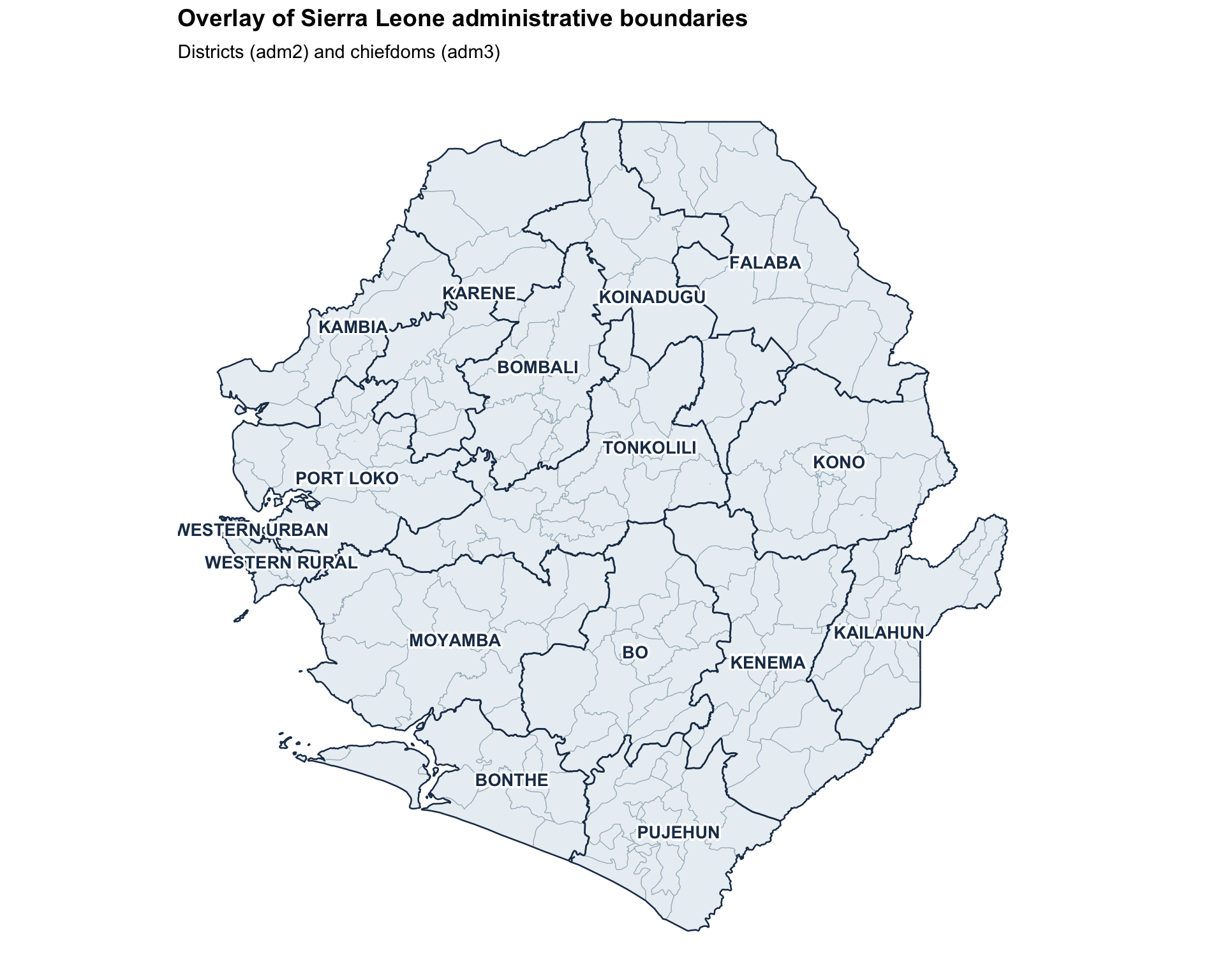
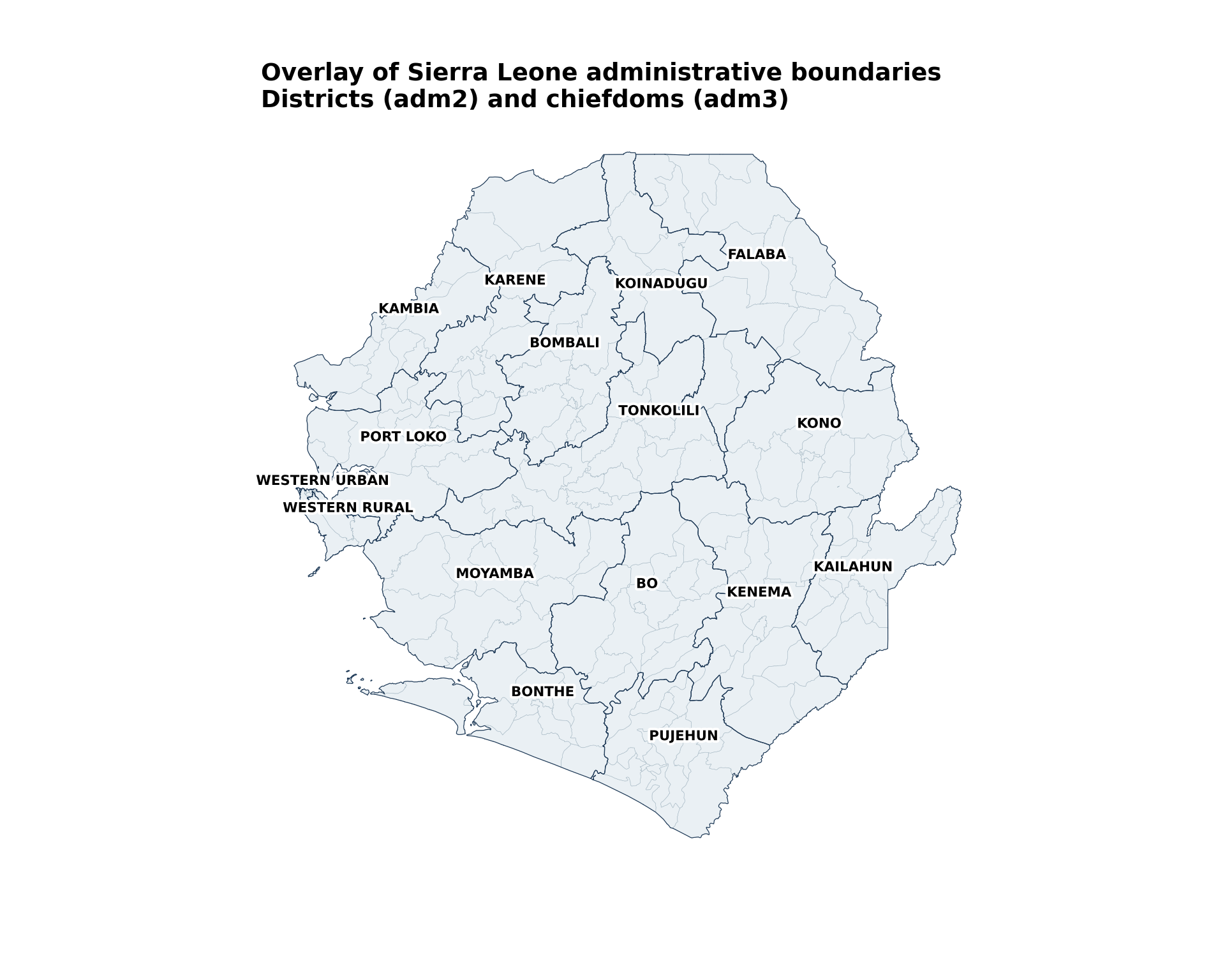
Step 3.2: Overlay multiple administrative levels
To add more contextual information onto the previous map, we overlay adm2 boundaries and labels on top of the existing adm3 map.
This plot uses shadowtext::geom_shadowtext to improve adm2 label legibility.
Show the code
# compute label positions once so labels stay inside each district polygon
adm2_labels <- adm2_gdf |>
  dplyr::mutate(
    .lab_xy = sf::st_point_on_surface(geometry),
    lon = sf::st_coordinates(.lab_xy)[, 1],
    lat = sf::st_coordinates(.lab_xy)[, 2]
  ) |>
  sf::st_drop_geometry()

overlay_map <- ggplot2::ggplot() +
  # adm3 chiefdoms: soft fill with subtle but visible outlines
  ggplot2::geom_sf(
    data = gdf,
    fill = "#EAF0F4",
    color = "#A3B6C2",
    linewidth = 0.2
  ) +
  # adm2 districts: no fill, thin dark outline to anchor the overlay
  ggplot2::geom_sf(
    data = adm2_gdf,
    fill = NA,
    color = "#1F3A57",
    linewidth = 0.45
  ) +
  # adm2 labels with a strong white halo for legibility
  shadowtext::geom_shadowtext(
    data = adm2_labels,
    ggplot2::aes(x = lon, y = lat, label = adm2),
    color = "#1F3A57",
    bg.color = "white",
    bg.r = 0.18,
    size = 3.6,
    fontface = "bold"
  ) +
  ggplot2::labs(
    title = "Overlay of Sierra Leone administrative boundaries",
    subtitle = "Districts (adm2) and chiefdoms (adm3)"
  ) +
  snt_map_theme()

# save plot
ggplot2::ggsave(
  plot = overlay_map,
  filename = here::here("03_output", "3a_figures", "overlay_map.png"),
  width = 10,
  height = 8,
  dpi = 300
)
NoteOutput
To adapt the code:
- Lines 14–16: Adjust the
adm3fill,color, andlinewidthto fit your preferences - Lines 22–23: Adjust the
adm2outlinecolorandlinewidthfor visual emphasis - Line 28: Update the
labelaesthetic ingeom_shadowtext()to match the column in your data containing unit names - Lines 29–33: Tweak the label
color,bg.color,bg.r(halo radius), andsizefor legibility - Lines 36–37: Modify the plot
titleandsubtitlebased on the country’s data you are using - To visualize more than two administrative levels, add additional
geom_sf()layers
This plot uses representative points and haloed text labels to improve adm2 label legibility.
Show the code
# compute label positions once so labels stay inside each district polygon
adm2_labels = adm2_gdf.copy()
adm2_points = adm2_labels.geometry.representative_point()
adm2_labels["lon"] = adm2_points.x
adm2_labels["lat"] = adm2_points.y

fig, ax = plt.subplots(figsize=(10, 8))

# adm3 chiefdoms: soft fill with subtle but visible outlines
gdf.plot(ax=ax, facecolor="#EAF0F4", edgecolor="#A3B6C2", linewidth=0.2)

# adm2 districts: no fill, thin dark outline to anchor the overlay
adm2_gdf.plot(ax=ax, facecolor="none", edgecolor="#1F3A57", linewidth=0.45)

# adm2 labels with a strong white halo for legibility
label_points(ax, adm2_labels, label_col="adm2", size=8)

finish_map(
    ax,
    title="Overlay of Sierra Leone administrative boundaries",
    subtitle="Districts (adm2) and chiefdoms (adm3)"
)

# save plot
save_figure(
    fig,
    here("03_output/3a_figures/overlay_map.png"),
    width=10,
    height=8,
    dpi=300
)
plt.show()
NoteOutput
To adapt the code:
- Line 15: Adjust the
adm3facecolor,edgecolor, andlinewidthto fit your preferences - Line 18: Adjust the
adm2outlineedgecolorandlinewidthfor visual emphasis - Line 21: Update
label_colto match the column in your data containing unit names - Lines 23–27: Modify the plot
titleandsubtitlebased on the country’s data you are using - To visualize more than two administrative levels, add additional
.plot()layers
Step 3.3: Troubleshooting visualization issues
If the maps above do not render as expected (missing polygons, distorted country shape, blank output, misaligned labels, or jagged boundaries), the problem is almost always in the source shapefile rather than in the plotting code.
TipWhere to fix shapefile issues
Geometry repair (R: sf::st_make_valid(), sf::st_is_empty(); Python: gdf.make_valid(), gdf.is_empty), CRS harmonization (R: sf::st_crs(), sf::st_transform(); Python: gdf.crs, gdf.to_crs()), and simplification tuning are covered in detail in Shapefile management and customization. Once the processed .rds / .geojson files produced there are loaded in Step 2, no additional preprocessing should be needed on this page.
Step 4: Advanced shapefile use and visualization
Advanced techniques to visualize shapefiles convey more information through additional plot elements. For this example, we use Sierra Leone’s merged shapefile-tabular data. See Merging spatial vectors with tabular data on how to merge admin unit data tables with your shapefile to prepare for visualization.
The merged dataset examples demonstrate how shapefiles transition from basic maps to analytical tools. When visualizing indicator data:
- Administrative boundaries provide the spatial framework
- Color scales represent indicator values
- Hierarchy is maintained through careful layer ordering
Step 4.1: Load and prepare merged data for advanced visualizations
We first load the data required to create advanced shapefile visualizations. This step loads both categorical intervention data and DHIS2 data, each of which is then merged with the shapefile. The steps for merging have been adapted from the Merging spatial vectors with tabular data page of this library.
We use dplyr::inner_join which keeps only perfectly matching records. If you need to keep all shapefile units even when data is missing, consider dplyr::left_join and handle NA values appropriately.
Show the code
# load categorical intervention data
# the Excel ships with a verbose "Dea Chiefdom"-style `adm3` column and a
# raw `FIRST_CHIE` ("DEA") column. drop the verbose one and use the raw
# code so it matches the shapefile's `adm3` field.
categorical_intervention_data <- readxl::read_excel(
  here::here(
    "1.2_epidemiology",
    "1.2a_routine_surveillance",
    "processed",
    "scenario_with_irs_no_smc_06_20_2025.xlsx"
  )
) |>
  dplyr::select(-dplyr::any_of("adm3")) |>
  dplyr::rename(
    adm2 = FIRST_DNAM,
    adm3 = FIRST_CHIE
  )

# diagnose name-only join coverage at adm2-adm3
shp_names_cat <- gdf |>
  sf::st_drop_geometry() |>
  dplyr::distinct(adm1, adm2, adm3)

shp_with_cat <- shp_names_cat |>
  dplyr::inner_join(
    categorical_intervention_data |>
      dplyr::distinct(adm2, adm3),
    by = c("adm2", "adm3")
  )

cli::cli_h2("Categorical intervention join diagnostics")
cli::cli_alert_success(
  "Exact matches across adm2-adm3: {nrow(shp_with_cat)}"
)

# perform the actual merge with adm2-adm3
gdf_cat_joined <- gdf |>
  dplyr::inner_join(
    categorical_intervention_data,
    by = c("adm2", "adm3")
  ) |>
  sf::st_as_sf()

cli::cli_alert_success(
  "Final merged row count for intervention data: {nrow(gdf_cat_joined)}"
)

# ----------------------------------------------------------------------------

# load DHIS2 data and filter to the working year at read time so we
# never carry the full multi-year dataset in memory downstream
sle_dhis2_df_coord_spatial_adm3 <- readRDS(
  here::here(
    "1.2_epidemiology",
    "1.2a_routine_surveillance",
    "processed",
    "sle_dhis2_df_coord_spatial_adm3.rds"
  )
) |>
  dplyr::filter(year == "2022")

# aggregate to annual chiefdom totals so each chiefdom appears once
# (rather than once per month) before joining
sle_dhis2_2022_annual <- sle_dhis2_df_coord_spatial_adm3 |>
  dplyr::group_by(adm0, adm1, adm2, adm3) |>
  dplyr::summarise(
    dplyr::across(
      c(conf, test, conf_u5, test_u5,
        conf_5_14, test_5_14, conf_ov15, test_ov15),
      ~ sum(.x, na.rm = TRUE)
    ),
    .groups = "drop"
  )

# diagnose name-only join coverage at adm1-adm3
dhis2_admins <- sle_dhis2_2022_annual |>
  dplyr::distinct(adm1, adm2, adm3)

shp_names <- gdf |>
  sf::st_drop_geometry() |>
  dplyr::distinct(adm1, adm2, adm3)

shp_with_dhis2 <- shp_names |>
  dplyr::inner_join(
    dhis2_admins,
    by = c("adm1", "adm2", "adm3")
  )

cli::cli_h2("DHIS2 join diagnostics")
cli::cli_alert_success(
  "Exact matches across adm1-adm3: {nrow(shp_with_dhis2)}"
)

# perform the actual merge with adm1-adm3
tabshp <- gdf |>
  dplyr::inner_join(
    sle_dhis2_2022_annual,
    by = c("adm0", "adm1", "adm2", "adm3")
  ) |>
  sf::st_as_sf()

cli::cli_alert_success(
  "Final merged row count: {nrow(tabshp)}"
)To adapt the code:
- Update file paths and column names based on the data you are merging
- If your shapefile uses different attribute names, adjust the
dplyr::rename()step in Step 2
We use merge(..., how="inner") which keeps only perfectly matching records. If you need to keep all shapefile units even when data is missing, consider how="left" and handle missing values appropriately.
Show the code
# load categorical intervention data
# the Excel ships with a verbose "Dea Chiefdom"-style `adm3` column and a
# raw `FIRST_CHIE` ("DEA") column. drop the verbose one and use the raw
# code so it matches the shapefile's `adm3` field.
categorical_intervention_data = (
    pd.read_excel(
        here(
            "1.2_epidemiology/1.2a_routine_surveillance/processed/"
            "scenario_with_irs_no_smc_06_20_2025.xlsx"
        )
    )
    .drop(columns=["adm3"], errors="ignore")
    .rename(columns={"FIRST_DNAM": "adm2", "FIRST_CHIE": "adm3"})
)

# diagnose name-only join coverage at adm2-adm3
shp_names_cat = gdf[["adm1", "adm2", "adm3"]].drop_duplicates()
shp_with_cat = shp_names_cat.merge(
    categorical_intervention_data[["adm2", "adm3"]].drop_duplicates(),
    on=["adm2", "adm3"],
    how="inner"
)

print("Categorical intervention join diagnostics")
print(f"SUCCESS: Exact matches across adm2-adm3: {len(shp_with_cat)}")

# perform the actual merge with adm2-adm3
gdf_cat_joined = gdf.merge(
    categorical_intervention_data,
    on=["adm2", "adm3"],
    how="inner"
)
gdf_cat_joined = gpd.GeoDataFrame(gdf_cat_joined, geometry="geometry", crs=gdf.crs)

print(f"SUCCESS: Final merged row count for intervention data: {len(gdf_cat_joined)}")

# ----------------------------------------------------------------------------

# load DHIS2 data and filter to the working year at read time so we
# never carry the full multi-year dataset in memory downstream
sle_dhis2_df_coord_spatial_adm3 = (
    read_rds(
        here(
            "1.2_epidemiology/1.2a_routine_surveillance/processed/"
            "sle_dhis2_df_coord_spatial_adm3.rds"
        )
    )
    .loc[lambda x: x["year"].astype(str) == "2022"]
)

# aggregate to annual chiefdom totals so each chiefdom appears once
# (rather than once per month) before joining
sum_cols = [
    "conf", "test", "conf_u5", "test_u5",
    "conf_5_14", "test_5_14", "conf_ov15", "test_ov15"
]
sle_dhis2_2022_annual = (
    sle_dhis2_df_coord_spatial_adm3
    .groupby(["adm0", "adm1", "adm2", "adm3"], as_index=False)[sum_cols]
    .sum()
)

# diagnose name-only join coverage at adm1-adm3
dhis2_admins = sle_dhis2_2022_annual[["adm1", "adm2", "adm3"]].drop_duplicates()
shp_names = gdf[["adm1", "adm2", "adm3"]].drop_duplicates()
shp_with_dhis2 = shp_names.merge(dhis2_admins, on=["adm1", "adm2", "adm3"], how="inner")

print("DHIS2 join diagnostics")
print(f"SUCCESS: Exact matches across adm1-adm3: {len(shp_with_dhis2)}")

# perform the actual merge with adm1-adm3
tabshp = gdf.merge(
    sle_dhis2_2022_annual,
    on=["adm0", "adm1", "adm2", "adm3"],
    how="inner"
)
tabshp = gpd.GeoDataFrame(tabshp, geometry="geometry", crs=gdf.crs)

print(f"SUCCESS: Final merged row count: {len(tabshp)}")To adapt the code:
- Update file paths and column names based on the data you are merging
- If your shapefile uses different attribute names, adjust the
.rename()step in Step 2
Step 4.2: Categorical color mapping
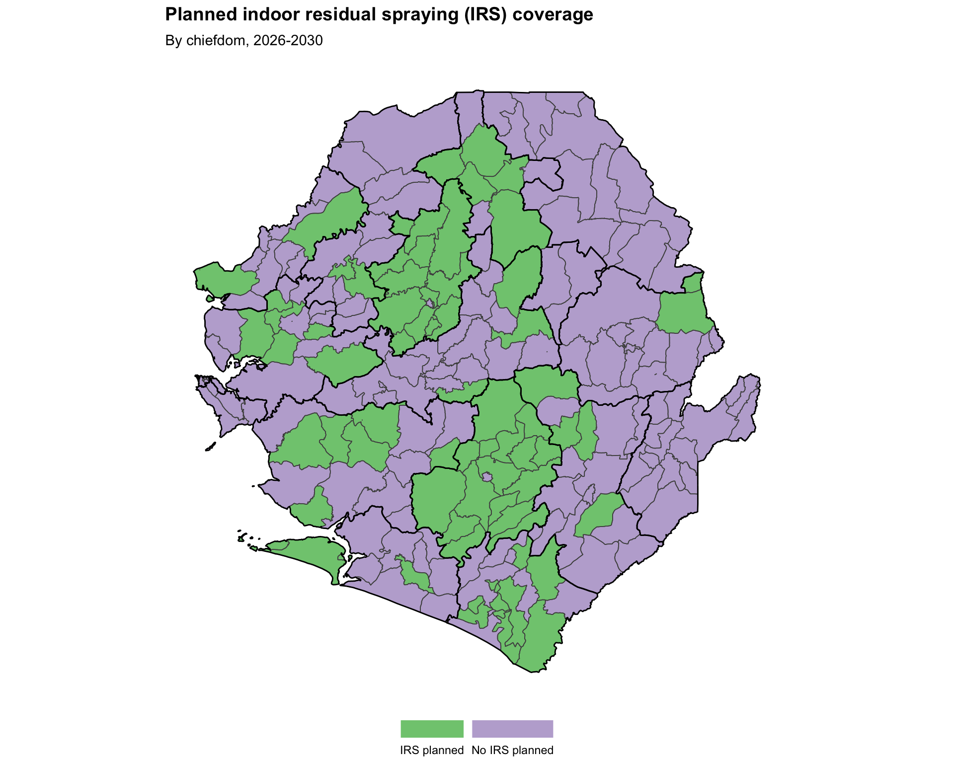
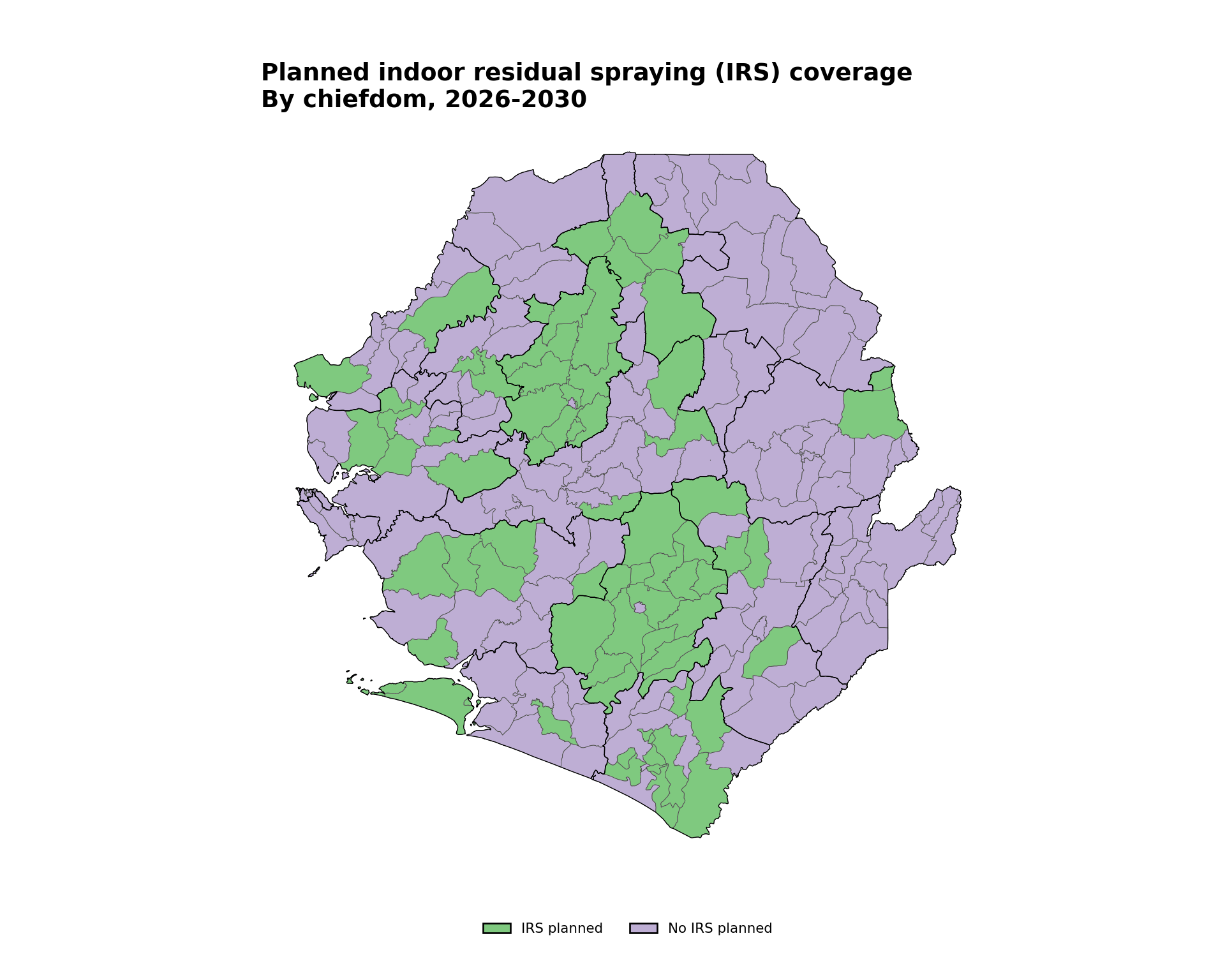
Categorical mapping is for discrete, non-numeric data or distinct groups. This example uses planned IRS coverage in Sierra Leone by chiefdom for 2026-2030. The mapping assigns distinct colors or shapes to differentiate between categories.
Show the code
categorical_map <- ggplot2::ggplot() +
  ggplot2::geom_sf(
    data = gdf_cat_joined,
    ggplot2::aes(fill = irs),
    color = "white",
    size = 0.2
  ) +
  ggplot2::scale_fill_brewer(
    # drop the legend title and use self-explanatory category labels
    name = NULL,
    palette = "Accent",
    labels = c(
      "IRS" = "IRS planned",
      "No IRS" = "No IRS planned"
    ),
    na.value = "grey90",
    na.translate = FALSE
  ) +
  ggplot2::geom_sf(
    data = gdf_cat_joined,
    fill = NA,
    color = "grey30",
    linewidth = 0.3
  ) +
  ggplot2::geom_sf(
    data = adm2_gdf,
    fill = NA,
    color = "black",
    linewidth = 0.5
  ) +
  ggplot2::labs(
    title = "Planned indoor residual spraying (IRS) coverage",
    subtitle = "By chiefdom, 2026-2030"
  ) +
  snt_map_theme() +
  ggplot2::theme(
    legend.key.size = ggplot2::unit(0.5, "cm")
  )

# save plot
ggplot2::ggsave(
  plot = categorical_map,
  filename = here::here("03_output", "3a_figures", "categorical_map.png"),
  width = 10,
  height = 8,
  dpi = 300
)
NoteOutput
To adapt the code:
- Line 4: Replace
irswith the desired categorical variable in your data - Lines 12–15: Update the
labelsnamed vector to match your data’s category values and the wording you want shown in the legend - Lines 32–33: Modify
titleandsubtitlebased on the data you are plotting
Show the code
irs_palette = {"IRS": "#7fc97f", "No IRS": "#beaed4"}
irs_labels = {"IRS": "IRS planned", "No IRS": "No IRS planned"}

fig, ax = plt.subplots(figsize=(10, 8))
gdf_cat_joined.plot(
    ax=ax,
    color=gdf_cat_joined["irs"].map(irs_palette).fillna("#E5E5E5"),
    edgecolor="white",
    linewidth=0.2,
)
gdf_cat_joined.boundary.plot(ax=ax, color="#4D4D4D", linewidth=0.3)
adm2_gdf.boundary.plot(ax=ax, color="black", linewidth=0.5)
finish_map(
    ax,
    title="Planned indoor residual spraying (IRS) coverage",
    subtitle="By chiefdom, 2026-2030"
)
add_bottom_legend(ax, legend_patches(irs_palette, irs_labels), ncol=2)

# save plot
save_figure(
    fig,
    here("03_output/3a_figures/categorical_map.png"),
    width=10,
    height=8,
    dpi=300
)
plt.show()
NoteOutput
To adapt the code:
- Line 3: Replace
irswith the desired categorical variable in your data - Lines 1–2: Update
irs_paletteandirs_labelsto match your data’s category values and the wording you want shown in the legend - Lines 18–22: Modify
titleandsubtitlebased on the data you are plotting
Step 4.3: Binned color mapping
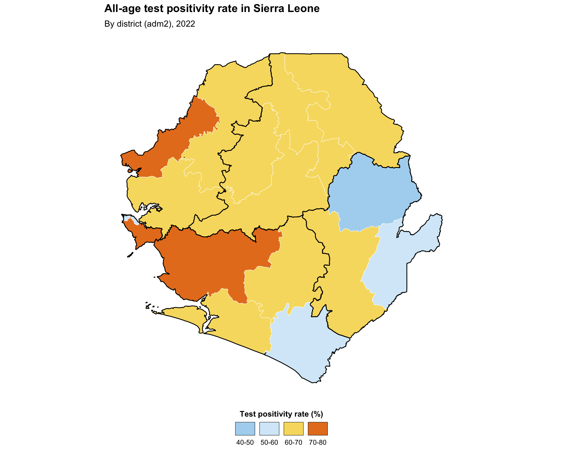
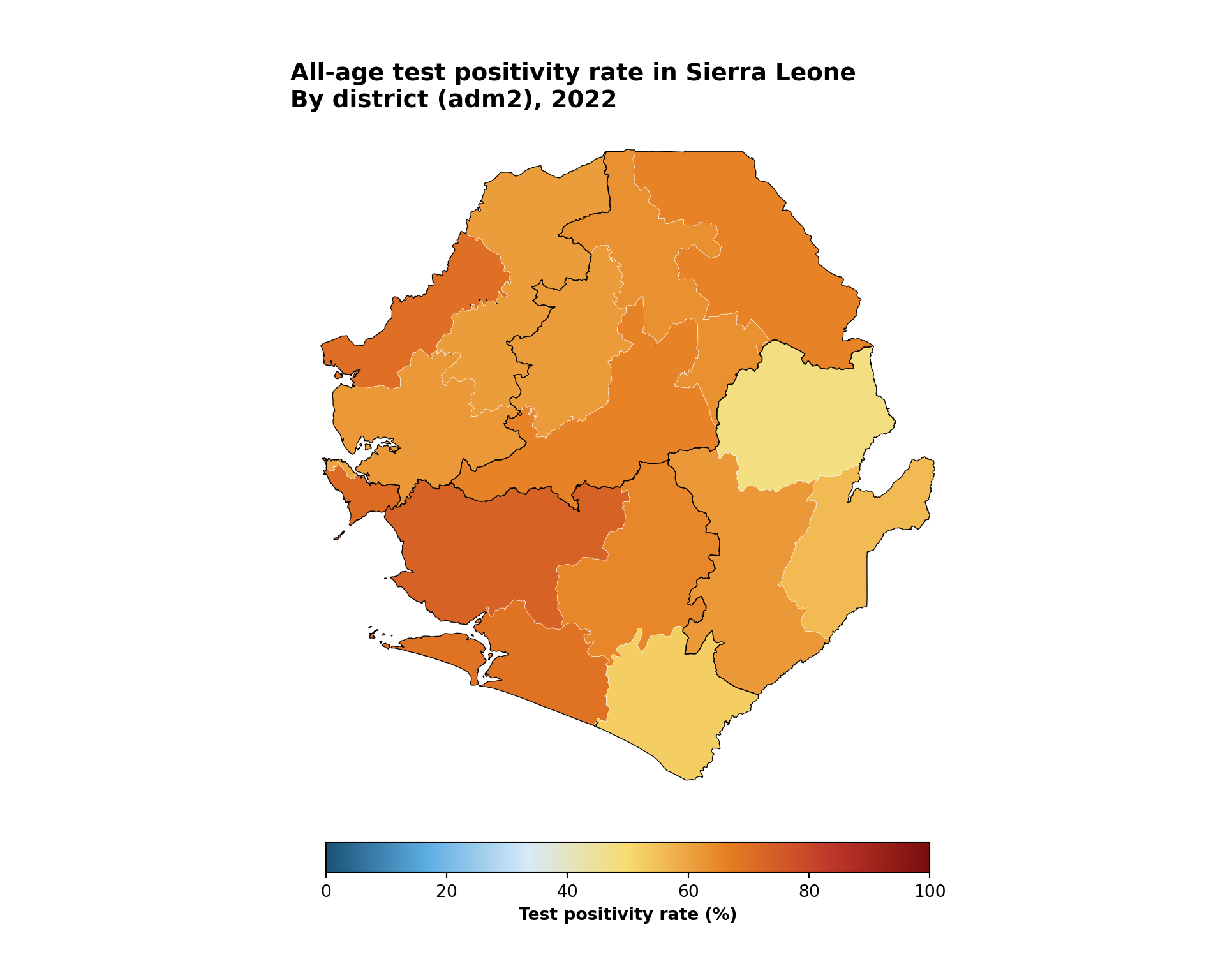
Binned mapping works well for numeric data that benefit from grouping into intervals, such as incidence levels, proportion of suspected cases that are tested, or proportion of people using an ITN. This allows the SNT team to immediately identify which admin units have met a meaningful quantitative threshold and thus facilitates decision-making. This example creates bins for the proportion of positive tests, also known as test positivity rate, by district. Test positivity rate is first aggregated to adm2 (district) and then plotted, with adm1 (region) boundaries layered on top to anchor the reader.
Show the code
# aggregate chiefdom-level counts up to district (adm2) so the choropleth
# fills the full district polygons, avoiding gaps caused by missing
# chiefdoms
tabshp_adm2 <- tabshp |>
  sf::st_drop_geometry() |>
  dplyr::group_by(adm0, adm1, adm2) |>
  dplyr::summarise(
    dplyr::across(
      c(
        conf, test,
        conf_u5, test_u5,
        conf_5_14, test_5_14,
        conf_ov15, test_ov15
      ),
      ~ sum(.x, na.rm = TRUE)
    ),
    .groups = "drop"
  ) |>
  # restore polygon geometry from the adm2 shapefile
  dplyr::left_join(adm2_gdf, by = c("adm0", "adm1", "adm2")) |>
  sf::st_as_sf()

# calculate test positivity rates as percentages at adm2 level
tabshp_with_rates <- tabshp_adm2 |>
  dplyr::mutate(
    tpr_overall_pct = dplyr::if_else(
      test > 0, (conf / test) * 100, NA_real_
    ),
    tpr_u5_pct = dplyr::if_else(
      test_u5 > 0, (conf_u5 / test_u5) * 100, NA_real_
    ),
    tpr_5_14_pct = dplyr::if_else(
      test_5_14 > 0, (conf_5_14 / test_5_14) * 100, NA_real_
    ),
    tpr_ov15_pct = dplyr::if_else(
      test_ov15 > 0, (conf_ov15 / test_ov15) * 100, NA_real_
    )
  )

# define ordered bin labels and a diverging palette where the
# blue end runs through 50-60 and warm tones take over above 60
tpr_bin_labels <- c(
  "0-10", "10-20", "20-30", "30-40", "40-50",
  "50-60", "60-70", "70-80", "80-90", "90-100"
)
tpr_bin_palette <- c(
  "0-10"   = "#1a5276",
  "10-20"  = "#2980b9",
  "20-30"  = "#5dade2",
  "30-40"  = "#85c1e9",
  "40-50"  = "#aed6f1",
  "50-60"  = "#d6eaf8",
  "60-70"  = "#f7dc6f",
  "70-80"  = "#e67e22",
  "80-90"  = "#c0392b",
  "90-100" = "#7b0d0d"
)

tabshp_with_rates <- tabshp_with_rates |>
  dplyr::mutate(
    tpr_overall_bin = cut(
      tpr_overall_pct,
      breaks = c(0, 10, 20, 30, 40, 50, 60, 70, 80, 90, 100),
      labels = tpr_bin_labels,
      include.lowest = TRUE
    )
  )

binned_map <- ggplot2::ggplot() +
  # adm2 districts coloured by tpr bin
  ggplot2::geom_sf(
    data = tabshp_with_rates,
    ggplot2::aes(fill = tpr_overall_bin),
    color = "white",
    size = 0.2
  ) +
  ggplot2::scale_fill_manual(
    name = "Test positivity rate (%)",
    values = tpr_bin_palette,
    drop = TRUE,
    na.value = "grey90",
    na.translate = FALSE,
    guide = ggplot2::guide_legend(
      title.position = "top",
      title.hjust = 0.5,
      label.position = "bottom",
      override.aes = list(
        colour = "black",
        size = 0.15,
        alpha = 1
      ),
      nrow = 1,
      byrow = TRUE
    )
  ) +
  # adm1 regions: thicker overlay so regional borders read clearly
  ggplot2::geom_sf(
    data = adm1_gdf,
    fill = NA,
    color = "black",
    linewidth = 0.5
  ) +
  ggplot2::labs(
    title = "All-age test positivity rate in Sierra Leone",
    subtitle = "By district (adm2), 2022"
  ) +
  snt_map_theme()

# save plot
ggplot2::ggsave(
  plot = binned_map,
  filename = here::here("03_output", "3a_figures", "binned_map.png"),
  width = 10,
  height = 8,
  dpi = 300
)
NoteOutput
To adapt the code:
- Lines 2–22: Modify continuous indicator calculation based on your data and desired plots. If plotting an existing continuous variable, remove this block entirely.
- Lines 26–32: Edit
tpr_bin_labelsand the colours passed tocolorRampPalette()to match the bins and colour ramp you want - Lines 38–46: Replace
tpr_overall_pctwith the continuous variable you wish to bin, and adjustbreaksto match the range and distribution of that variable - Lines 51, 56: Replace the
fill =aesthetic and the legendnamewith your variable and label - Lines 88–89: Modify the
titleandsubtitlebased on the data you are plotting
Show the code
# aggregate chiefdom-level counts up to district (adm2) so the choropleth
# fills the full district polygons, avoiding gaps caused by missing chiefdoms
tabshp_adm2 = (
    pd.DataFrame(tabshp.drop(columns="geometry"))
    .groupby(["adm0", "adm1", "adm2"], as_index=False)[sum_cols]
    .sum()
    .merge(adm2_gdf, on=["adm0", "adm1", "adm2"], how="left")
)
tabshp_adm2 = gpd.GeoDataFrame(tabshp_adm2, geometry="geometry", crs=adm2_gdf.crs)

# calculate test positivity rates as percentages at adm2 level
tabshp_with_rates = tabshp_adm2.copy()
tabshp_with_rates["tpr_overall_pct"] = np.where(
    tabshp_with_rates["test"] > 0,
    (tabshp_with_rates["conf"] / tabshp_with_rates["test"]) * 100,
    np.nan
)
tabshp_with_rates["tpr_u5_pct"] = np.where(
    tabshp_with_rates["test_u5"] > 0,
    (tabshp_with_rates["conf_u5"] / tabshp_with_rates["test_u5"]) * 100,
    np.nan
)
tabshp_with_rates["tpr_5_14_pct"] = np.where(
    tabshp_with_rates["test_5_14"] > 0,
    (tabshp_with_rates["conf_5_14"] / tabshp_with_rates["test_5_14"]) * 100,
    np.nan
)
tabshp_with_rates["tpr_ov15_pct"] = np.where(
    tabshp_with_rates["test_ov15"] > 0,
    (tabshp_with_rates["conf_ov15"] / tabshp_with_rates["test_ov15"]) * 100,
    np.nan
)

tabshp_with_rates["tpr_overall_bin"] = pd.cut(
    tabshp_with_rates["tpr_overall_pct"],
    bins=np.arange(0, 110, 10),
    labels=tpr_bin_labels,
    include_lowest=True
).astype("string")

fig, ax = plt.subplots(figsize=(10, 8))
plot_binned_map(
    ax,
    tabshp_with_rates,
    fill_col="tpr_overall_bin",
    palette=tpr_bin_palette,
    title="All-age test positivity rate in Sierra Leone",
    subtitle="By district (adm2), 2022",
    overlay=adm1_gdf,
)

# save plot
save_figure(
    fig,
    here("03_output/3a_figures/binned_map.png"),
    width=10,
    height=8,
    dpi=300
)
plt.show()
NoteOutput

To adapt the code:
- Lines 2–38: Modify continuous indicator calculation based on your data and desired plots. If plotting an existing continuous variable, remove this block entirely.
- Lines 40–45: Edit
tpr_bin_labels,tpr_bin_palette, andbinsto match the bins and colour ramp you want - Lines 51–53: Replace
tpr_overall_binwith the binned variable you wish to plot, and adjust legend labels if needed - Lines 55–56: Modify the
titleandsubtitlebased on the data you are plotting
Step 4.4: Continuous color mapping
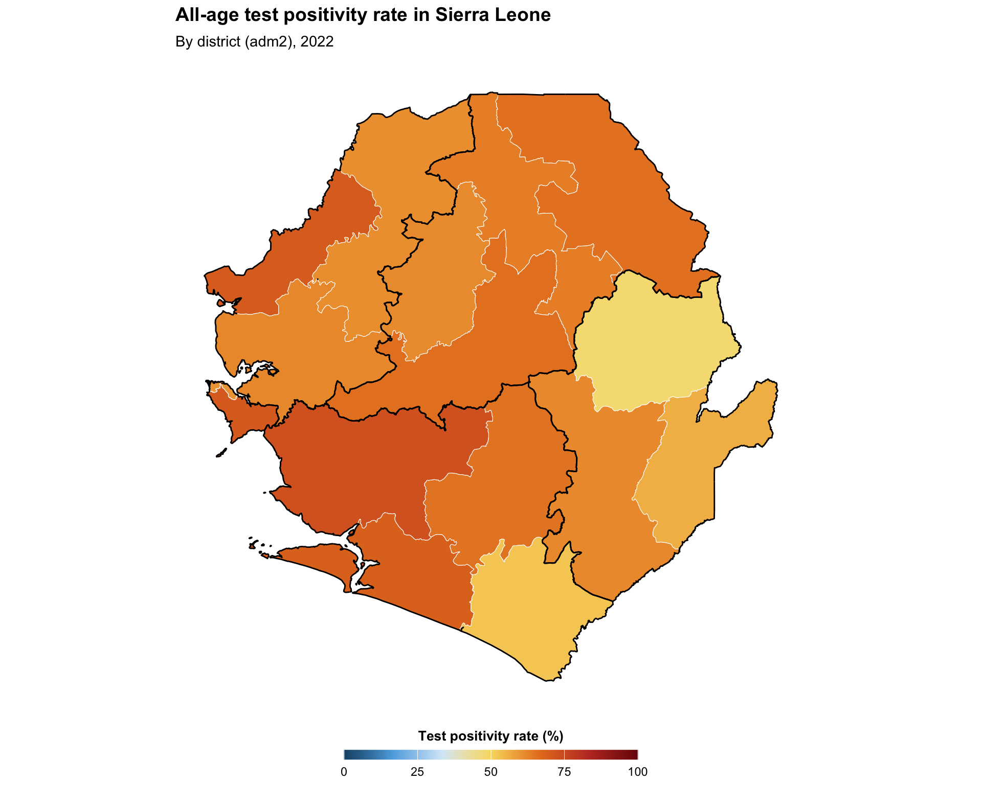
Continuous mapping is appropriate for visualizing numeric data with a smooth, uninterrupted range. It can be a helpful first step before re-making a binned version of the map, or may be appropriate on its own. In this example, we show a continuous version of the same test positivity indicator in the previous step.
Show the code
# SNT gradient default palette (high values -> dark red,
# low values -> dark blue)
tpr_gradient_colors <- c(
  "#7b0d0d", "#c0392b", "#e67e22", "#f7dc6f",
  "#d6eaf8", "#5dade2", "#1a5276"
)

continuous_map <- ggplot2::ggplot() +
  ggplot2::geom_sf(
    data = tabshp_with_rates,
    ggplot2::aes(fill = tpr_overall_pct),
    color = "white",
    size = 0.2
  ) +
  ggplot2::scale_fill_gradientn(
    name = "Test positivity rate (%)",
    colors = rev(tpr_gradient_colors),
    limits = c(0, 100),
    na.value = "grey90",
    guide = ggplot2::guide_colorbar(
      title.position = "top",
      title.hjust = 0.5,
      barwidth = grid::unit(15, "lines"),
      barheight = grid::unit(0.5, "lines")
    )
  ) +
  ggplot2::geom_sf(
    data = adm1_gdf,
    fill = NA,
    color = "black",
    linewidth = 0.5
  ) +
  ggplot2::labs(
    title = "All-age test positivity rate in Sierra Leone",
    subtitle = "By district (adm2), 2022"
  ) +
  snt_map_theme()

# save plot
ggplot2::ggsave(
  plot = continuous_map,
  filename = here::here("03_output", "3a_figures", "continuous_map.png"),
  width = 10,
  height = 8,
  dpi = 300
)
NoteOutput
To adapt the code:
- Lines 3–6: Edit
tpr_gradient_colorsto use a different colour ramp (the default order goes from dark red for high values to dark blue for low values) - Line 11: Replace
tpr_overall_pctwith the continuous variable you wish to plot - Line 16: Modify the legend
namebased on the variable you are plotting - Line 18: Modify
limitsbased on the range of the continuous variable - Lines 40–41: Modify the
titleandsubtitlebased on the data you are plotting
Show the code
fig, ax = plt.subplots(figsize=(10, 8))
plot_gradient_map(
    ax,
    tabshp_with_rates,
    fill_col="tpr_overall_pct",
    colors=tpr_gradient_colors,
    title="All-age test positivity rate in Sierra Leone",
    subtitle="By district (adm2), 2022",
    overlay=adm1_gdf,
    legend_label="Test positivity rate (%)",
    vmin=0,
    vmax=100,
)

# save plot
save_figure(
    fig,
    here("03_output/3a_figures/continuous_map.png"),
    width=10,
    height=8,
    dpi=300
)
plt.show()
NoteOutput
To adapt the code:
- Line 5: Edit
tpr_gradient_colorsto use a different colour ramp - Line 8: Replace
tpr_overall_pctwith the continuous variable you wish to plot - Line 13: Modify
legend_labelbased on the variable you are plotting - Lines 14–15: Modify
vminandvmaxbased on the range of the continuous variable - Lines 10–11: Modify the
titleandsubtitlebased on the data you are plotting
Step 4.5: Plot subdivisions by larger regions
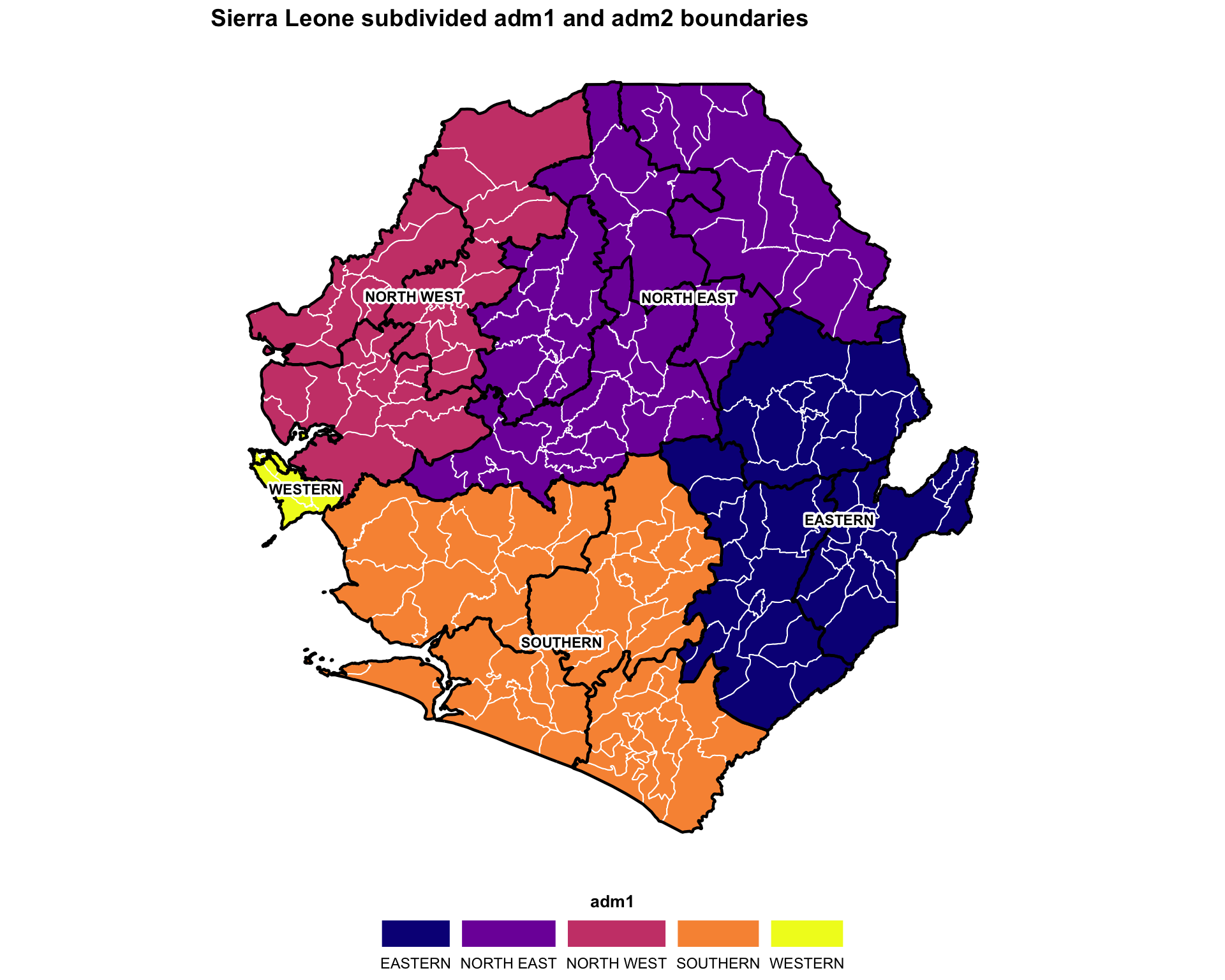
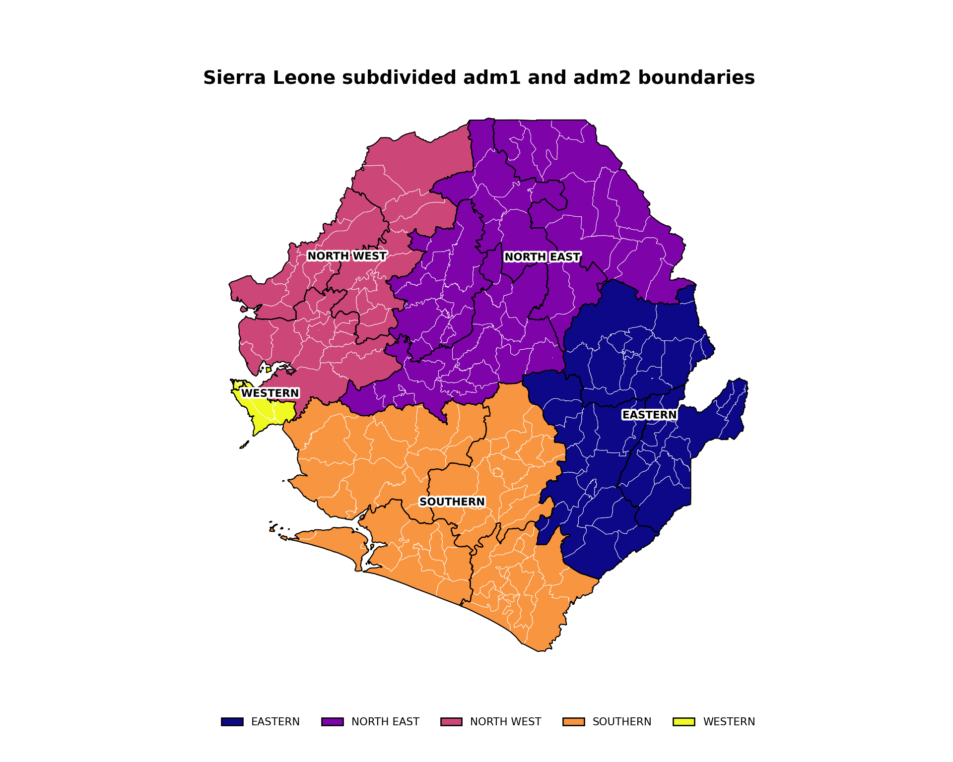
This example produces a map that shows shapes of one administrative level with coloring and labelling of another administrative level. The code plots Sierra Leone’s adm2 and adm3 shapes (black and white boundaries respectively) with adm1 labels and coloring.
Show the code
# adm1 labels with error handling
# (the processed .rds loaded in Step 2 is already valid, so no
# additional st_make_valid / st_buffer cleaning is needed here)
adm1_labels <- tryCatch(
  {
    gdf |>
      dplyr::group_by(adm1) |>
      dplyr::summarise(geometry = sf::st_union(geometry)) |>
      sf::st_make_valid() |>
      dplyr::mutate(
        centroid = sf::st_point_on_surface(geometry),
        coords = sf::st_coordinates(centroid),
        x = coords[, 1],
        y = coords[, 2]
      )
  },
  error = function(e) {
    adm2_gdf |>
      dplyr::mutate(
        centroid = sf::st_point_on_surface(geometry),
        coords = sf::st_coordinates(centroid),
        x = coords[, 1],
        y = coords[, 2]
      )
  }
)

# automatic color palette
n_adm1 <- length(unique(gdf$adm1))
adm1_colors <- viridis::plasma(n_adm1)
names(adm1_colors) <- unique(gdf$adm1)

subdivided_plot <- ggplot2::ggplot() +
  ggplot2::geom_sf(
    data = gdf,
    ggplot2::aes(fill = adm1),
    color = "white",
    linewidth = 0.35
  ) +
  ggplot2::scale_fill_manual(values = adm1_colors) +
  ggplot2::geom_sf(
    data = adm2_gdf,
    fill = NA,
    color = "black",
    linewidth = 0.8
  ) +
  shadowtext::geom_shadowtext(
    data = adm1_labels,
    ggplot2::aes(x = x, y = y, label = adm1),
    size = 3,
    fontface = "bold",
    color = "black",
    bg.color = "white",
    bg.r = 0.25
  ) +
  ggplot2::labs(
    title = "Sierra Leone subdivided adm1 and adm2 boundaries"
  ) +
  snt_map_theme()

# save plot
ggplot2::ggsave(
  plot = subdivided_plot,
  filename = here::here("03_output", "3a_figures", "subdivided_map.png"),
  width = 10,
  height = 8,
  dpi = 300
)
NoteOutput
To adapt the code:
- Lines 7, 29, 31, 36, 49: Replace
adm1with the column of your data that has the larger-region names - Line 57: Modify the
titlebased on the data you are plotting
Show the code
# adm1 labels with error handling
# (the processed files loaded in Step 2 are already valid, so no
# additional geometry cleaning is needed here)
try:
    adm1_labels = gdf.dissolve(by="adm1", as_index=False)
except Exception:
    adm1_labels = adm2_gdf.copy()

adm1_points = adm1_labels.geometry.representative_point()
adm1_labels["lon"] = adm1_points.x
adm1_labels["lat"] = adm1_points.y

# automatic color palette
adm1_values = list(gdf["adm1"].dropna().unique())
plasma = plt.get_cmap("plasma")
adm1_colors = {
    adm1: mcolors.to_hex(plasma(i / max(len(adm1_values) - 1, 1)))
    for i, adm1 in enumerate(adm1_values)
}

fig, ax = plt.subplots(figsize=(10, 8))
gdf.plot(
    ax=ax,
    color=gdf["adm1"].map(adm1_colors),
    edgecolor="white",
    linewidth=0.35,
)
adm2_gdf.boundary.plot(ax=ax, color="black", linewidth=0.8)
label_points(ax, adm1_labels, label_col="adm1", size=8)
finish_map(ax, title="Sierra Leone subdivided adm1 and adm2 boundaries")
add_bottom_legend(ax, legend_patches(adm1_colors), ncol=len(adm1_colors))

# save plot
save_figure(
    fig,
    here("03_output/3a_figures/subdivided_map.png"),
    width=10,
    height=8,
    dpi=300
)
plt.show()
NoteOutput
To adapt the code:
- Lines 5, 20, 25, 32, and 36: Replace
adm1with the column of your data that has the larger-region names - Line 38: Modify the
titlebased on the data you are plotting
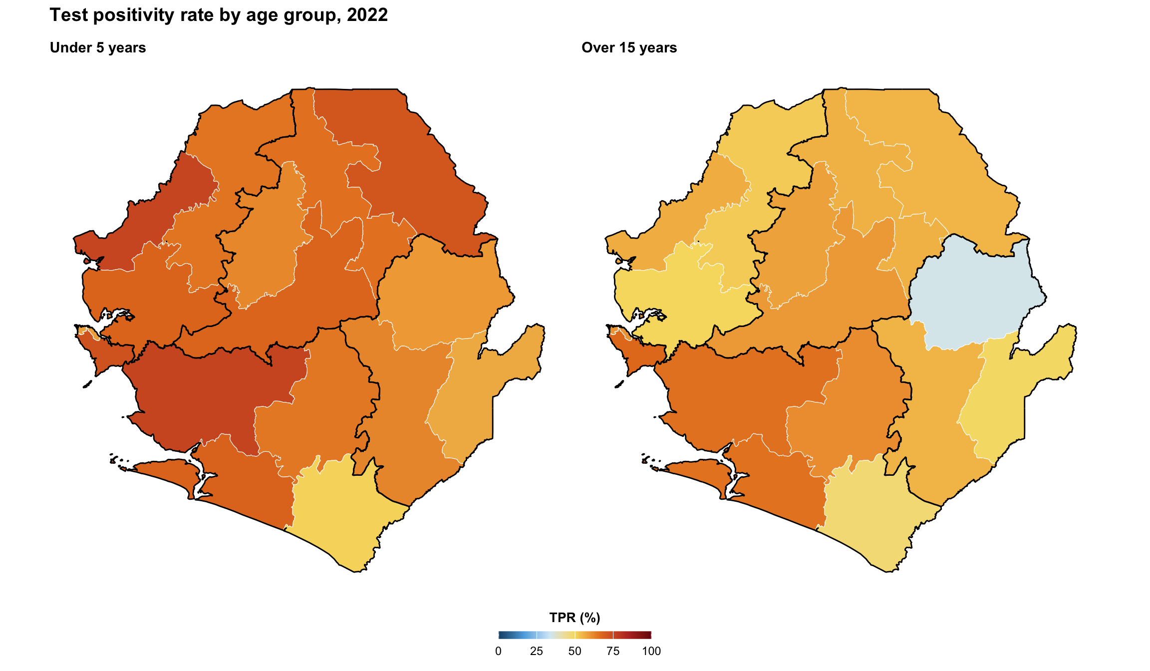
Step 4.6: Faceted maps
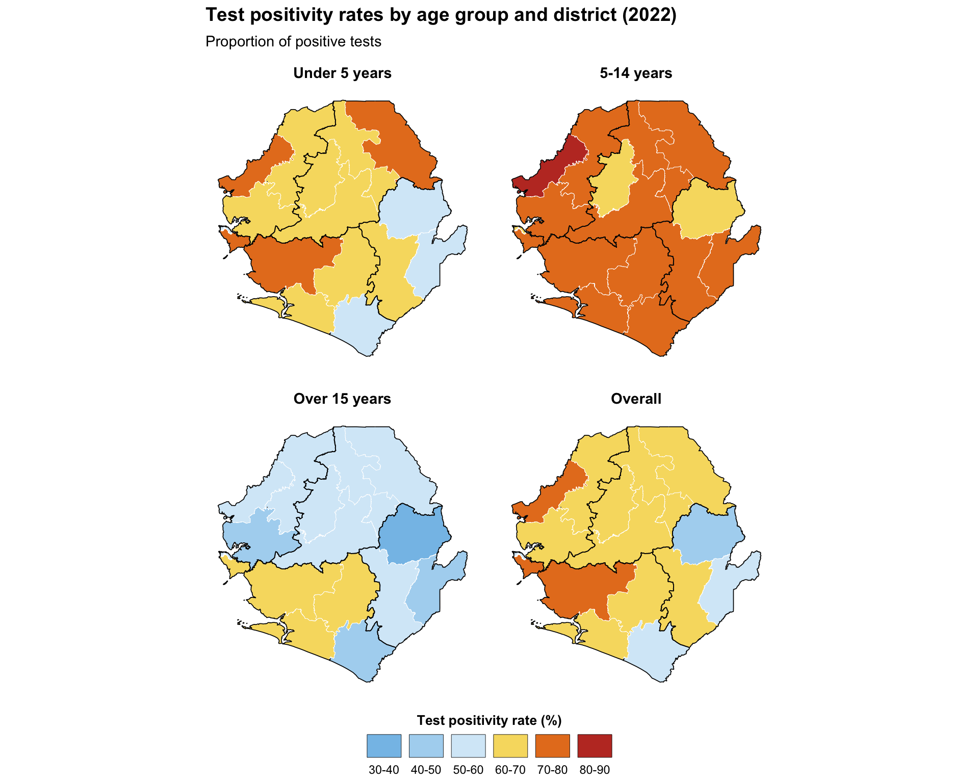
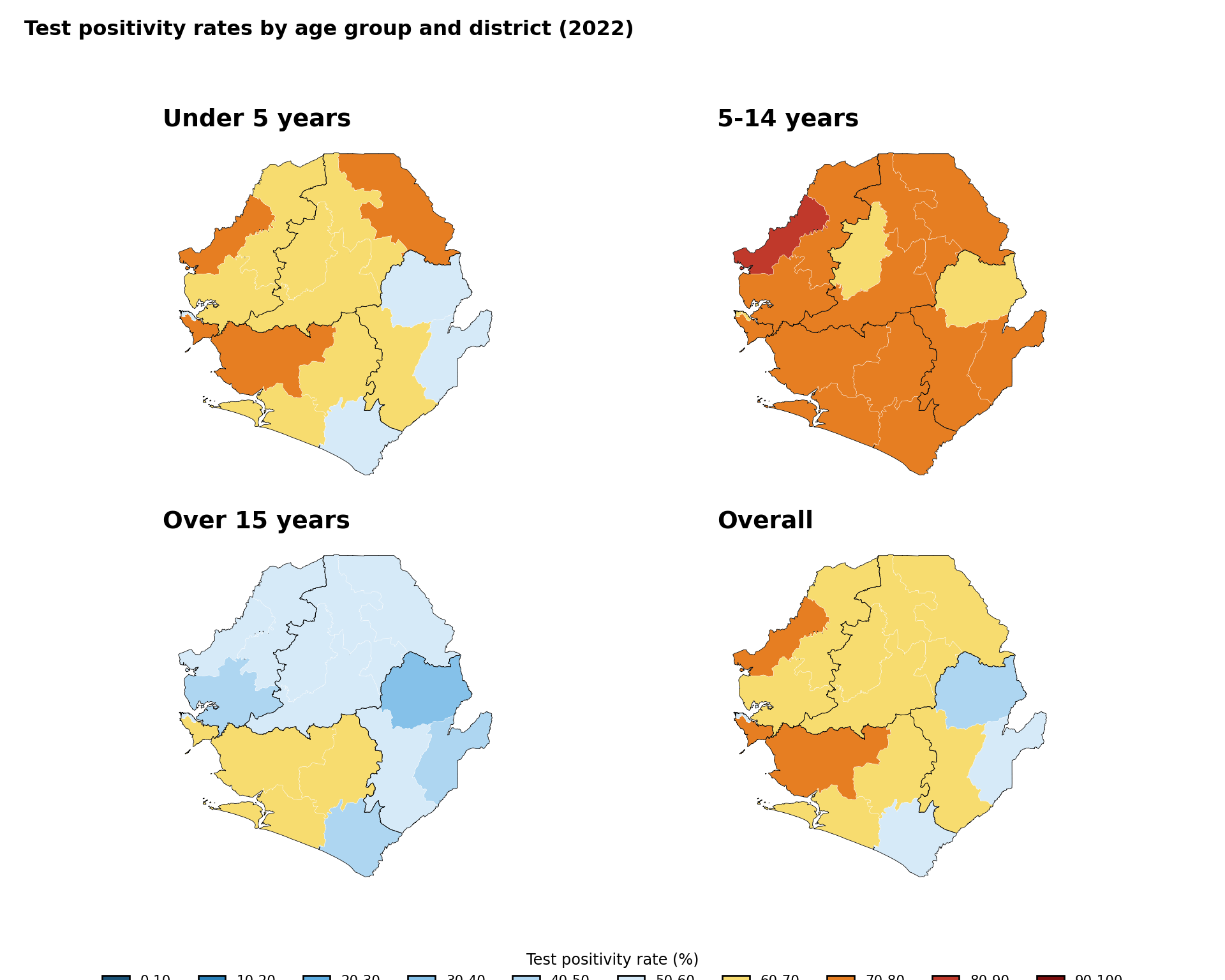
Faceted plots enable comparison across administrative units. This example demonstrates continuous test positivity indicators and displays each map in a separate panel with identical geography, applies consistent coloring and legends across facets, and maintains uniform scales for direct comparison. This requires data to be reshaped into long format to simplify plotting multiple indicators in faceted visualizations.
Show the code
# select the TPR percentage columns
tpr_cols <- c(
  "tpr_u5_pct",
  "tpr_5_14_pct",
  "tpr_ov15_pct",
  "tpr_overall_pct"
)

# convert data to long format and create binned categories
tpr_long_data <- tabshp_with_rates |>
  dplyr::select(geometry, dplyr::all_of(tpr_cols)) |>
  tidyr::pivot_longer(
    cols = -geometry,
    names_to = "age_group",
    values_to = "tpr_percentage"
  ) |>
  dplyr::mutate(
    age_group = dplyr::recode(
      age_group,
      "tpr_u5_pct" = "Under 5 years",
      "tpr_5_14_pct" = "5-14 years",
      "tpr_ov15_pct" = "Over 15 years",
      "tpr_overall_pct" = "Overall"
    ),
    age_group = factor(
      age_group,
      levels = c(
        "Under 5 years",
        "5-14 years",
        "Over 15 years",
        "Overall"
      ),
      ordered = TRUE
    ),
    tpr_binned = cut(
      tpr_percentage,
      breaks = c(0, 10, 20, 30, 40, 50, 60, 70, 80, 90, 100),
      labels = c(
        "0-10", "10-20", "20-30", "30-40", "40-50",
        "50-60", "60-70", "70-80", "80-90", "90-100"
      ),
      include.lowest = TRUE
    )
  )

faceted_tpr_plot <- ggplot2::ggplot(tpr_long_data) +
  ggplot2::geom_sf(
    ggplot2::aes(fill = tpr_binned),
    color = "white",
    linewidth = 0.15
  ) +
  ggplot2::facet_wrap(~ age_group, ncol = 2) +
  # use the same named palette and single-row legend recipe as
  # Step 4.3 so the legend layout matches throughout the page
  ggplot2::scale_fill_manual(
    name = "Test positivity rate (%)",
    values = tpr_bin_palette,
    drop = TRUE,
    na.value = "grey90",
    na.translate = FALSE,
    guide = ggplot2::guide_legend(
      title.position = "top",
      title.hjust = 0.5,
      label.position = "bottom",
      override.aes = list(
        colour = "black",
        size = 0.15,
        alpha = 1
      ),
      nrow = 1,
      byrow = TRUE
    )
  ) +
  # adm1 regions as the higher-level overlay (single source of truth
  # for boundaries on every facet)
  ggplot2::geom_sf(
    data = adm1_gdf,
    fill = NA,
    color = "black",
    linewidth = 0.3
  ) +
  ggplot2::labs(
    title = "Test positivity rates by age group and district (2022)",
    subtitle = "Proportion of positive tests"
  ) +
  snt_map_theme() +
  # facet-specific tweaks on top of the shared theme
  ggplot2::theme(
    panel.spacing = ggplot2::unit(0.5, "cm"),
    strip.text = ggplot2::element_text(face = "bold", size = 11),
    legend.key.width = ggplot2::unit(0.9, "cm")
  )

# save plot
ggplot2::ggsave(
  plot = faceted_tpr_plot,
  filename = here::here("03_output", "3a_figures", "faceted_tpr_plot.png"),
  width = 10,
  height = 8,
  dpi = 300
)
NoteOutput
To adapt the code:
- Lines 2–7: Define the vector of columns corresponding to plot facets
- Lines 16–22: Modify age groups based on the number and names of columns selected for plot facets
- Lines 35–42: Modify scale
breaksandlabelsbased on your needs and preferences - Line 53: Modify the legend
namebased on the data you are plotting - Lines 64–65: Modify the
titleandsubtitlebased on the data you are plotting - More plot facets can be added by extending the initial vector with additional column names. Adjust facet layout by modifying the
ncolparameter infacet_wrap
TipChoosing the facet layout
The number of facet rows and columns is not a stylistic choice; it sets the aspect ratio of every panel and therefore controls how readable the map is. Two practical rules:
facet_wrapvsfacet_grid. Usefacet_wrap(~ var, ncol = n)when panels share a single grouping variable (for example, four age groups). Usefacet_grid(rows ~ cols)when each row and each column carries its own meaning (for example, year on the rows and age group on the columns).facet_gridenforces shared scales across rows and columns, which is exactly what you want for a true row-by-column matrix;facet_wrapis more forgiving when one of the dimensions is “miscellaneous”.- Picking
ncol/nrow. Match the panel aspect ratio to the country’s bounding box. A tall country (for example, Chile, Malawi) reads better atncol = 4so each panel is short and wide; a wide country (for example, Sierra Leone, Niger) reads better atncol = 2so each panel keeps its natural shape. As a starting point, tryncol = ceiling(sqrt(n_panels))and then nudge up or down until each panel matches the bbox shape. Combine with thefig-width/fig-heightchunk options described in Step 5.7 so the rendered figure does not squash the geography.
Show the code
# select the TPR percentage columns
tpr_cols = ["tpr_u5_pct", "tpr_5_14_pct", "tpr_ov15_pct", "tpr_overall_pct"]

# convert data to long format and create binned categories
age_labels = {
    "tpr_u5_pct": "Under 5 years",
    "tpr_5_14_pct": "5-14 years",
    "tpr_ov15_pct": "Over 15 years",
    "tpr_overall_pct": "Overall",
}
age_order = ["Under 5 years", "5-14 years", "Over 15 years", "Overall"]

tpr_long_data = tabshp_with_rates[["geometry"] + tpr_cols].melt(
    id_vars="geometry",
    value_vars=tpr_cols,
    var_name="age_group",
    value_name="tpr_percentage"
)
tpr_long_data["age_group"] = pd.Categorical(
    tpr_long_data["age_group"].map(age_labels),
    categories=age_order,
    ordered=True
)
tpr_long_data["tpr_binned"] = pd.cut(
    tpr_long_data["tpr_percentage"],
    bins=np.arange(0, 110, 10),
    labels=tpr_bin_labels,
    include_lowest=True
).astype("string")
tpr_long_data = gpd.GeoDataFrame(tpr_long_data, geometry="geometry", crs=tabshp_with_rates.crs)

fig, axes = plt.subplots(2, 2, figsize=(10, 8))
for ax, age_group in zip(axes.flat, age_order):
    subset = tpr_long_data.loc[tpr_long_data["age_group"] == age_group]
    plot_colors = subset["tpr_binned"].map(tpr_bin_palette).fillna("#E5E5E5")
    subset.plot(
        ax=ax,
        color=plot_colors,
        edgecolor="white",
        linewidth=0.15,
    )
    adm1_gdf.boundary.plot(ax=ax, color="black", linewidth=0.3)
    finish_map(ax, title=age_group)

fig.suptitle(
    "Test positivity rates by age group and district (2022)",
    fontweight="bold",
    x=0.02,
    ha="left",
)
handles = legend_patches(tpr_bin_palette)
fig.legend(
    handles=handles,
    title="Test positivity rate (%)",
    loc="lower center",
    bbox_to_anchor=(0.5, -0.02),
    ncol=len(handles),
    frameon=False,
    fontsize=8,
    title_fontsize=9,
)
fig.tight_layout(rect=[0, 0.07, 1, 0.95])

# save plot
save_figure(
    fig,
    here("03_output/3a_figures/faceted_tpr_plot.png"),
    width=10,
    height=8,
    dpi=300
)
plt.show()
NoteOutput
To adapt the code:
- Line 2: Define the vector of columns corresponding to plot facets
- Lines 5–12: Modify age groups based on the number and names of columns selected for plot facets
- Lines 28–34: Modify scale bins and labels based on your needs and preferences
- Lines 49–61: Modify the legend title and layout based on the data you are plotting
- More plot facets can be added by extending the initial vector with additional column names. Adjust facet layout by modifying
plt.subplots()
Step 5: Customizing maps for publication
The maps produced in Step 4 are functional, but a few targeted customizations make them substantially easier to read and to publish. Each subsection below adds one piece of polish: colour choice, supplementary layers, framing, composition, interactivity, and export sizing. The patterns generalize to any map in the SNT library and are referenced from several other pages.
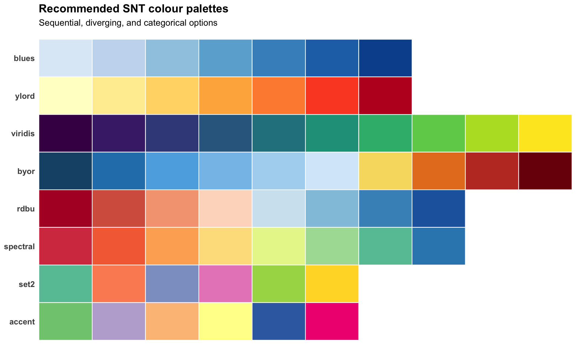
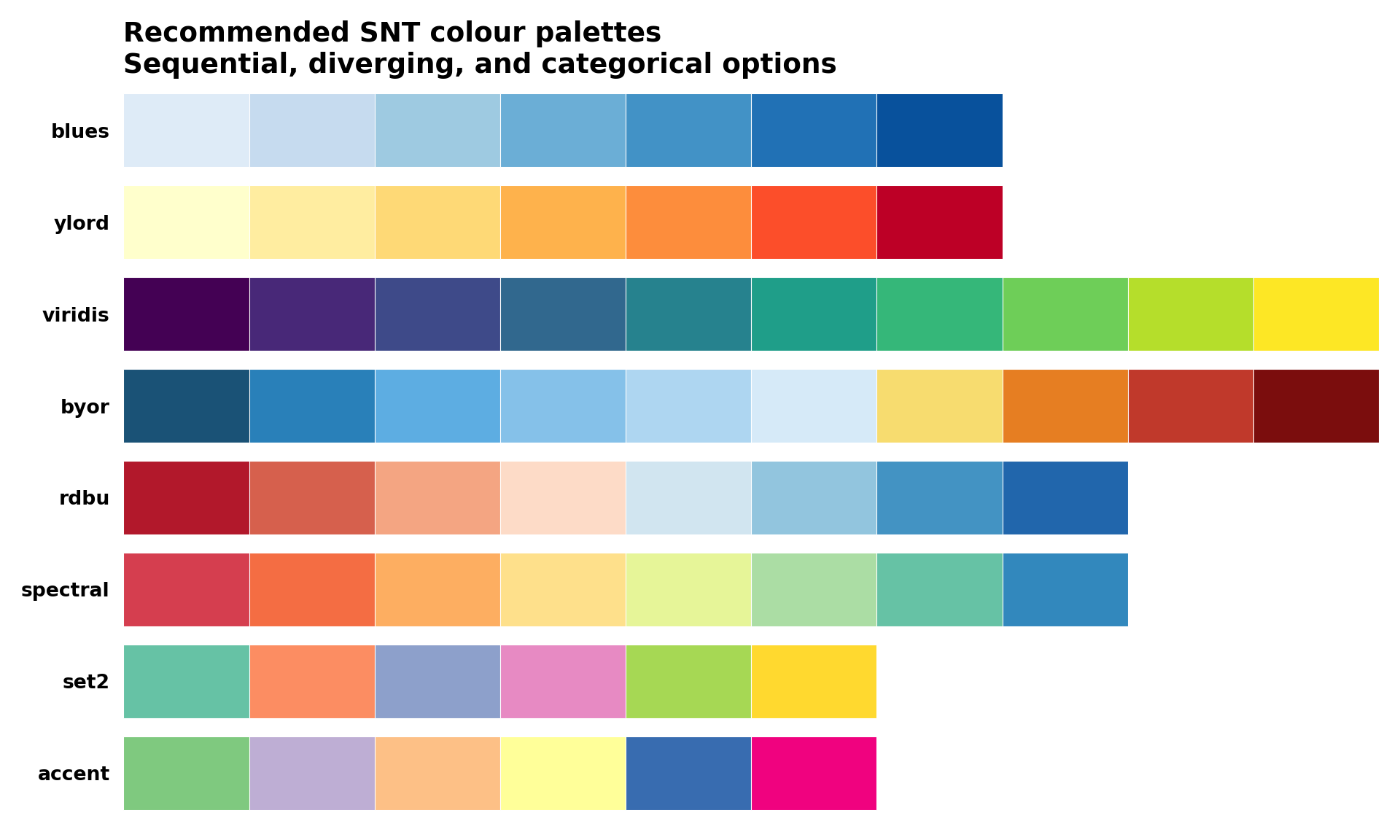
Step 5.1: Colour palettes and accessibility
Roughly 5% of men and 0.5% of women have some form of colour-vision deficiency, most commonly red-green. The diverging palette used in Step 4 (dark blue, light blue, yellow, orange, dark red) is robust under simulated deuteranopia and protanopia and is the SNT default for that reason. Pure red-green ramps (for example RdYlGn) and rainbow() should be avoided for choropleths.
Recommended palettes by data type
| Data type | Recommended palette | Notes |
|---|---|---|
| Sequential (low to high) | blues, ylord, viridis |
Use viridis when monochromatic printing is a concern |
| Diverging (low / mid / high) | rdbu, byor, spectral |
Place the neutral hue at the meaningful midpoint of the indicator |
| Categorical (up to 8 groups) | Accent, Set2 (ColorBrewer) |
Avoid red-green pairings; verify in a CVD simulator before publishing |
| Categorical (binary) | #1a5276 with grey80 |
Reserve a saturated hue for the "active" category, neutral for the other |
Show the code
# define a small catalogue of palettes covering sequential, diverging,
# and categorical use cases. each entry is an ordered character vector
# of hex codes that can be passed directly to scale_fill_manual().
snt_palettes <- list(
  # sequential
  blues = c(
    "#deebf7", "#c6dbef", "#9ecae1",
    "#6baed6", "#4292c6", "#2171b5", "#08519c"
  ),
  ylord = c(
    "#ffffcc", "#ffeda0", "#fed976",
    "#feb24c", "#fd8d3c", "#fc4e2a", "#bd0026"
  ),
  viridis = c(
    "#440154", "#482878", "#3e4a89",
    "#31688e", "#26828e", "#1f9e89", "#35b779",
    "#6ece58", "#b5de2b", "#fde725"
  ),
  # diverging (snt default for tpr-like indicators)
  byor = c(
    "#1a5276", "#2980b9", "#5dade2",
    "#85c1e9", "#aed6f1", "#d6eaf8",
    "#f7dc6f", "#e67e22", "#c0392b", "#7b0d0d"
  ),
  rdbu = c(
    "#b2182b", "#d6604d", "#f4a582",
    "#fddbc7", "#d1e5f0", "#92c5de",
    "#4393c3", "#2166ac"
  ),
  spectral = c(
    "#d53e4f", "#f46d43", "#fdae61",
    "#fee08b", "#e6f598", "#abdda4",
    "#66c2a5", "#3288bd"
  ),
  # categorical
  set2 = c(
    "#66c2a5", "#fc8d62", "#8da0cb",
    "#e78ac3", "#a6d854", "#ffd92f"
  ),
  accent = c(
    "#7fc97f", "#beaed4", "#fdc086",
    "#ffff99", "#386cb0", "#f0027f"
  )
)

# reshape into a long data frame so each colour is one tile
swatches_df <- purrr::imap_dfr(
  snt_palettes,
  function(cols, name) {
    data.frame(
      palette = name,
      position = seq_along(cols),
      colour = cols,
      stringsAsFactors = FALSE
    )
  }
) |>
  dplyr::mutate(
    palette = factor(
      palette,
      levels = rev(names(snt_palettes))
    )
  )

palette_swatches <- ggplot2::ggplot(
  swatches_df,
  ggplot2::aes(
    x = position,
    y = palette,
    fill = colour
  )
) +
  ggplot2::geom_tile(
    color = "white",
    linewidth = 0.4
  ) +
  ggplot2::scale_fill_identity() +
  ggplot2::scale_x_continuous(expand = c(0, 0)) +
  ggplot2::labs(
    title = "Recommended SNT colour palettes",
    subtitle = "Sequential, diverging, and categorical options",
    x = NULL,
    y = NULL
  ) +
  ggplot2::theme_minimal(base_size = 11) +
  ggplot2::theme(
    panel.grid = ggplot2::element_blank(),
    axis.text.x = ggplot2::element_blank(),
    axis.ticks = ggplot2::element_blank(),
    axis.text.y = ggplot2::element_text(
      face = "bold",
      size = 10
    ),
    plot.title = ggplot2::element_text(
      face = "bold",
      size = 14,
      margin = ggplot2::margin(b = 6)
    ),
    plot.subtitle = ggplot2::element_text(
      size = 11,
      margin = ggplot2::margin(b = 10)
    ),
    plot.margin = ggplot2::margin(
      t = 5, r = 10, b = 5, l = 5
    )
  )

# save plot
ggplot2::ggsave(
  plot = palette_swatches,
  filename = here::here(
    "03_output", "3a_figures", "palette_swatches.png"
  ),
  width = 10,
  height = 6,
  dpi = 300
)
NoteOutput
To adapt the code:
- Lines 4–48: Add, remove, or replace any palette entry in
snt_palettes. Each entry is a plain hex vector, so any custom palette can be plugged in - Lines 65–68: Reorder the
factorlevels to control the order of palettes on the y-axis (top to bottom) - Lines 82–83: Update the
titleandsubtitleto describe the palette set you are showing
Show the code
# reshape into a long data frame so each colour is one tile
swatches_df = pd.DataFrame(
    [
        {"palette": name, "position": i + 1, "colour": colour}
        for name, colours in snt_palettes.items()
        for i, colour in enumerate(colours)
    ]
)
palette_order = list(reversed(list(snt_palettes.keys())))

fig, ax = plt.subplots(figsize=(10, 6))
for y, palette_name in enumerate(palette_order):
    subset = swatches_df.loc[swatches_df["palette"] == palette_name]
    for _, row in subset.iterrows():
        ax.add_patch(
            mpatches.Rectangle(
                (row["position"] - 1, y - 0.4),
                1,
                0.8,
                facecolor=row["colour"],
                edgecolor="white",
                linewidth=0.4,
            )
        )

ax.set_xlim(0, max(len(cols) for cols in snt_palettes.values()))
ax.set_ylim(-0.5, len(palette_order) - 0.5)
ax.set_yticks(range(len(palette_order)))
ax.set_yticklabels(palette_order, fontweight="bold")
ax.set_xticks([])
ax.set_title(
    "Recommended SNT colour palettes\nSequential, diverging, and categorical options",
    loc="left",
    fontsize=14,
    fontweight="bold",
)
for spine in ax.spines.values():
    spine.set_visible(False)
ax.tick_params(left=False, bottom=False)

# save plot
save_figure(
    fig,
    here("03_output/3a_figures/palette_swatches.png"),
    width=10,
    height=6,
    dpi=300
)
plt.show()
NoteOutput
To adapt the code:
- Lines 3–11: Add, remove, or replace any palette entry in
snt_palettes. Each entry is a plain hex list, so any custom palette can be plugged in - Line 13: Reorder
palette_orderto control the order of palettes on the y-axis - Lines 34–39: Update the
titleto describe the palette set you are showing
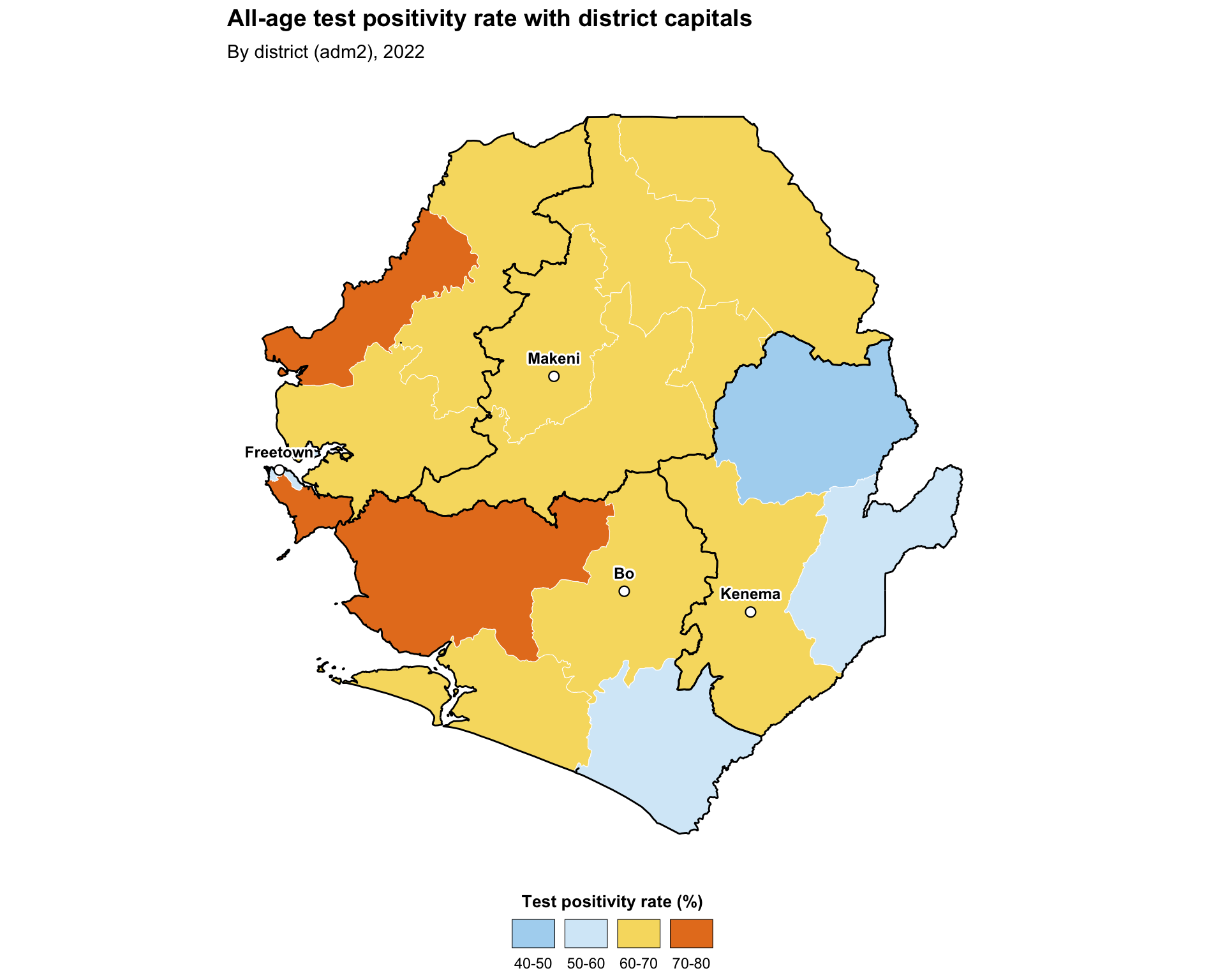
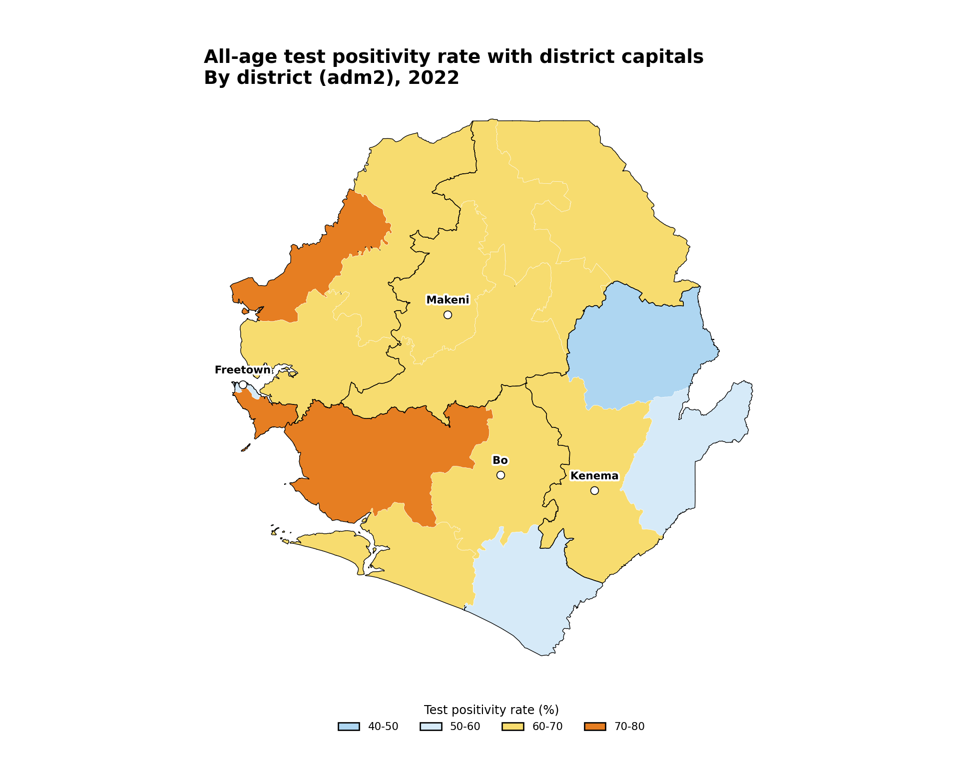
Step 5.2: Adding point overlays
Adding point overlays (health facilities, district capitals, urban centres) on top of a choropleth helps the SNT team interpret the spatial context of an indicator. The pattern is to layer a second geom_sf() for the points after the polygon layer, so the points sit on top.
Show the code
# small reference set of district capitals for orientation
# replace with your master facility list or capitals dataset
city_points <- data.frame(
  city = c("Freetown", "Bo", "Kenema", "Makeni"),
  lon = c(-13.234, -11.738, -11.190, -12.043),
  lat = c(8.484, 7.964, 7.875, 8.886)
) |>
  sf::st_as_sf(coords = c("lon", "lat"), crs = 4326)

map_with_points <- ggplot2::ggplot() +
  ggplot2::geom_sf(
    data = tabshp_with_rates,
    ggplot2::aes(fill = tpr_overall_bin),
    color = "white",
    size = 0.2
  ) +
  ggplot2::scale_fill_manual(
    name = "Test positivity rate (%)",
    values = tpr_bin_palette,
    drop = TRUE,
    na.value = "grey90",
    na.translate = FALSE,
    guide = ggplot2::guide_legend(
      title.position = "top",
      title.hjust = 0.5,
      label.position = "bottom",
      override.aes = list(
        colour = "black",
        size = 0.15,
        alpha = 1
      ),
      nrow = 1,
      byrow = TRUE
    )
  ) +
  # adm1 regions as the higher-level overlay
  ggplot2::geom_sf(
    data = adm1_gdf,
    fill = NA,
    color = "black",
    linewidth = 0.5
  ) +
  ggplot2::geom_sf(
    data = city_points,
    shape = 21,
    fill = "white",
    color = "black",
    size = 2.4,
    stroke = 0.6
  ) +
  shadowtext::geom_shadowtext(
    data = city_points,
    ggplot2::aes(
      x = sf::st_coordinates(geometry)[, 1],
      y = sf::st_coordinates(geometry)[, 2],
      label = city
    ),
    color = "black",
    bg.color = "white",
    bg.r = 0.18,
    size = 3.2,
    fontface = "bold",
    nudge_y = 0.08
  ) +
  ggplot2::labs(
    title = "All-age test positivity rate with district capitals",
    subtitle = "By district (adm2), 2022"
  ) +
  snt_map_theme()

# save plot
ggplot2::ggsave(
  plot = map_with_points,
  filename = here::here("03_output", "3a_figures", "map_with_points.png"),
  width = 10,
  height = 8,
  dpi = 300
)
NoteOutput
To adapt the code:
- Lines 3-7: Replace
city_pointswith your own point dataset (for example a health-facility master list). Any data frame with longitude and latitude columns, or an existingsfPOINT object, works - Lines 30-36: Adjust the marker
shape,fill,color,size, andstroketo match your figure style - Line 48: Tune
nudge_yto move labels above the points if they overlap
TipHealth-facility points
For real health-facility datasets, see Health facility master lists for the standard load-and-clean workflow that produces an sf object ready to drop into the chunk above.
Show the code
# small reference set of district capitals for orientation
# replace with your master facility list or capitals dataset
city_points = pd.DataFrame({
    "city": ["Freetown", "Bo", "Kenema", "Makeni"],
    "lon": [-13.234, -11.738, -11.190, -12.043],
    "lat": [8.484, 7.964, 7.875, 8.886],
})
city_points = gpd.GeoDataFrame(
    city_points,
    geometry=gpd.points_from_xy(city_points["lon"], city_points["lat"]),
    crs="EPSG:4326",
).to_crs(tabshp_with_rates.crs)
city_points["lon"] = city_points.geometry.x
city_points["lat"] = city_points.geometry.y

fig, ax = plt.subplots(figsize=(10, 8))
plot_binned_map(
    ax,
    tabshp_with_rates,
    fill_col="tpr_overall_bin",
    palette=tpr_bin_palette,
    title="All-age test positivity rate with district capitals",
    subtitle="By district (adm2), 2022",
    overlay=adm1_gdf,
)
city_points.plot(
    ax=ax,
    marker="o",
    facecolor="white",
    edgecolor="black",
    markersize=35,
    linewidth=0.6,
)
label_points(ax, city_points, label_col="city", dy=0.08, size=8)

# save plot
save_figure(
    fig,
    here("03_output/3a_figures/map_with_points.png"),
    width=10,
    height=8,
    dpi=300
)
plt.show()
NoteOutput
To adapt the code:
- Lines 3-16: Replace
city_pointswith your own point dataset, for example a health-facility master list - Lines 33-40: Adjust the marker
facecolor,edgecolor,markersize, andlinewidthto match your figure style - Line 42: Tune
dyto move labels above the points if they overlap
Step 5.3: Highlighting selected admin units
For decision support, the SNT team often needs to draw attention to a subset of admin units, for example the districts with the highest TPR or the districts targeted by a new intervention. Highlight by layering a second geom_sf() with a transparent fill and a thicker, contrasting outline on top of the choropleth.
Show the code
# select the three districts with the highest all-age TPR
top_tpr <- tabshp_with_rates |>
  dplyr::slice_max(tpr_overall_pct, n = 3)

highlighted_map <- ggplot2::ggplot() +
  ggplot2::geom_sf(
    data = tabshp_with_rates,
    ggplot2::aes(fill = tpr_overall_bin),
    color = "white",
    size = 0.2
  ) +
  ggplot2::scale_fill_manual(
    name = "Test positivity rate (%)",
    values = tpr_bin_palette,
    drop = TRUE,
    na.value = "grey90",
    na.translate = FALSE,
    guide = ggplot2::guide_legend(
      title.position = "top",
      title.hjust = 0.5,
      label.position = "bottom",
      override.aes = list(
        colour = "black",
        size = 0.15,
        alpha = 1
      ),
      nrow = 1,
      byrow = TRUE
    )
  ) +
  # adm1 regions as the higher-level overlay
  ggplot2::geom_sf(
    data = adm1_gdf,
    fill = NA,
    color = "grey40",
    linewidth = 0.5
  ) +
  # highlight layer sits on top of everything else
  ggplot2::geom_sf(
    data = top_tpr,
    fill = NA,
    color = "black",
    linewidth = 1.1
  ) +
  ggplot2::labs(
    title = "Top 3 districts by all-age test positivity rate",
    subtitle = "By district (adm2), 2022"
  ) +
  snt_map_theme()

# save plot
ggplot2::ggsave(
  plot = highlighted_map,
  filename = here::here("03_output", "3a_figures", "highlighted_map.png"),
  width = 10,
  height = 8,
  dpi = 300
)
NoteOutput

To adapt the code:
- Lines 2-3: Swap
slice_max()for any filter that selects the units you want to highlight, for exampledplyr::filter(adm2 %in% target_districts) - Lines 26-30: Adjust the highlight outline
colorandlinewidthto suit your figure - Lines 32-33: Modify the
titleandsubtitlebased on the units you are highlighting
Show the code
# select the three districts with the highest all-age TPR
top_tpr = tabshp_with_rates.nlargest(3, "tpr_overall_pct")

fig, ax = plt.subplots(figsize=(10, 8))
plot_binned_map(
    ax,
    tabshp_with_rates,
    fill_col="tpr_overall_bin",
    palette=tpr_bin_palette,
    title="Top 3 districts by all-age test positivity rate",
    subtitle="By district (adm2), 2022",
    overlay=adm1_gdf,
    overlay_color="#666666",
)

# highlight layer sits on top of everything else
top_tpr.boundary.plot(ax=ax, color="black", linewidth=1.1)

# save plot
save_figure(
    fig,
    here("03_output/3a_figures/highlighted_map.png"),
    width=10,
    height=8,
    dpi=300
)
plt.show()
NoteOutput

To adapt the code:
- Line 2: Swap
.nlargest()for any filter that selects the units you want to highlight, for exampletabshp_with_rates[tabshp_with_rates["adm2"].isin(target_districts)] - Line 20: Adjust the highlight outline
colorandlinewidthto suit your figure - Lines 10–11: Modify the
titleandsubtitlebased on the units you are highlighting
Step 5.4: Scale bar and north arrow
For maps destined for publication or operational dashboards, a scale bar and north arrow give readers immediate spatial context. The standard tool in the R ecosystem is ggspatial, which provides annotation_scale() and annotation_north_arrow() as plot-coordinate-aware layers.
Show the code
publication_map <- ggplot2::ggplot() +
  ggplot2::geom_sf(
    data = tabshp_with_rates,
    ggplot2::aes(fill = tpr_overall_bin),
    color = "white",
    size = 0.2
  ) +
  ggplot2::scale_fill_manual(
    name = "Test positivity rate (%)",
    values = tpr_bin_palette,
    drop = TRUE,
    na.value = "grey90",
    na.translate = FALSE,
    guide = ggplot2::guide_legend(
      title.position = "top",
      title.hjust = 0.5,
      label.position = "bottom",
      override.aes = list(
        colour = "black",
        size = 0.15,
        alpha = 1
      ),
      nrow = 1,
      byrow = TRUE
    )
  ) +
  # adm1 regions as the higher-level overlay
  ggplot2::geom_sf(
    data = adm1_gdf,
    fill = NA,
    color = "black",
    linewidth = 0.5
  ) +
  ggspatial::annotation_scale(
    location = "bl",
    width_hint = 0.25,
    style = "bar",
    line_width = 0.6
  ) +
  ggspatial::annotation_north_arrow(
    location = "tr",
    which_north = "true",
    style = ggspatial::north_arrow_fancy_orienteering(),
    height = grid::unit(1.4, "cm"),
    width = grid::unit(1.4, "cm")
  ) +
  ggplot2::labs(
    title = "Test positivity rate with scale bar and north arrow",
    subtitle = "By district (adm2), 2022"
  ) +
  snt_map_theme()

# save plot
ggplot2::ggsave(
  plot = publication_map,
  filename = here::here("03_output", "3a_figures", "publication_map.png"),
  width = 10,
  height = 8,
  dpi = 300
)
NoteOutput
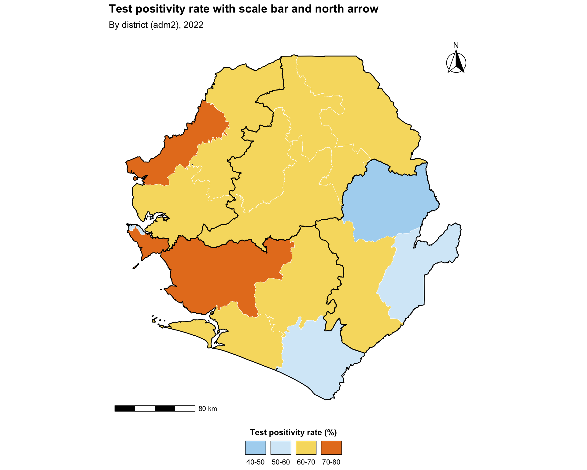
To adapt the code:
- Lines 21-25: Move the scale bar by changing
location(one of"bl","br","tl","tr") and resize it withwidth_hint - Lines 27-32: Switch
north_arrow_fancy_orienteering()fornorth_arrow_minimal()ornorth_arrow_orienteering()to use a simpler or different north symbol - Lines 34-35: Modify the
titleandsubtitlebased on the data you are plotting
Python uses matplotlib-scalebar for the scale bar and a simple annotated arrow for north.
Show the code
# transform to meters for the scale bar
tabshp_with_rates_m = tabshp_with_rates.to_crs(epsg=3857)
adm1_gdf_m = adm1_gdf.to_crs(epsg=3857)

fig, ax = plt.subplots(figsize=(10, 8))
plot_binned_map(
    ax,
    tabshp_with_rates_m,
    fill_col="tpr_overall_bin",
    palette=tpr_bin_palette,
    title="Test positivity rate with scale bar and north arrow",
    subtitle="By district (adm2), 2022",
    overlay=adm1_gdf_m,
)
ax.add_artist(
    ScaleBar(
        1,
        units="m",
        dimension="si-length",
        location="lower left",
        length_fraction=0.25,
        box_alpha=0,
    )
)
ax.annotate(
    "N",
    xy=(0.94, 0.93),
    xytext=(0.94, 0.80),
    xycoords="axes fraction",
    textcoords="axes fraction",
    ha="center",
    va="center",
    fontsize=12,
    fontweight="bold",
    arrowprops={"arrowstyle": "-|>", "facecolor": "black", "edgecolor": "black", "lw": 1.2},
)

# save plot
save_figure(
    fig,
    here("03_output/3a_figures/publication_map.png"),
    width=10,
    height=8,
    dpi=300
)
plt.show()
NoteOutput
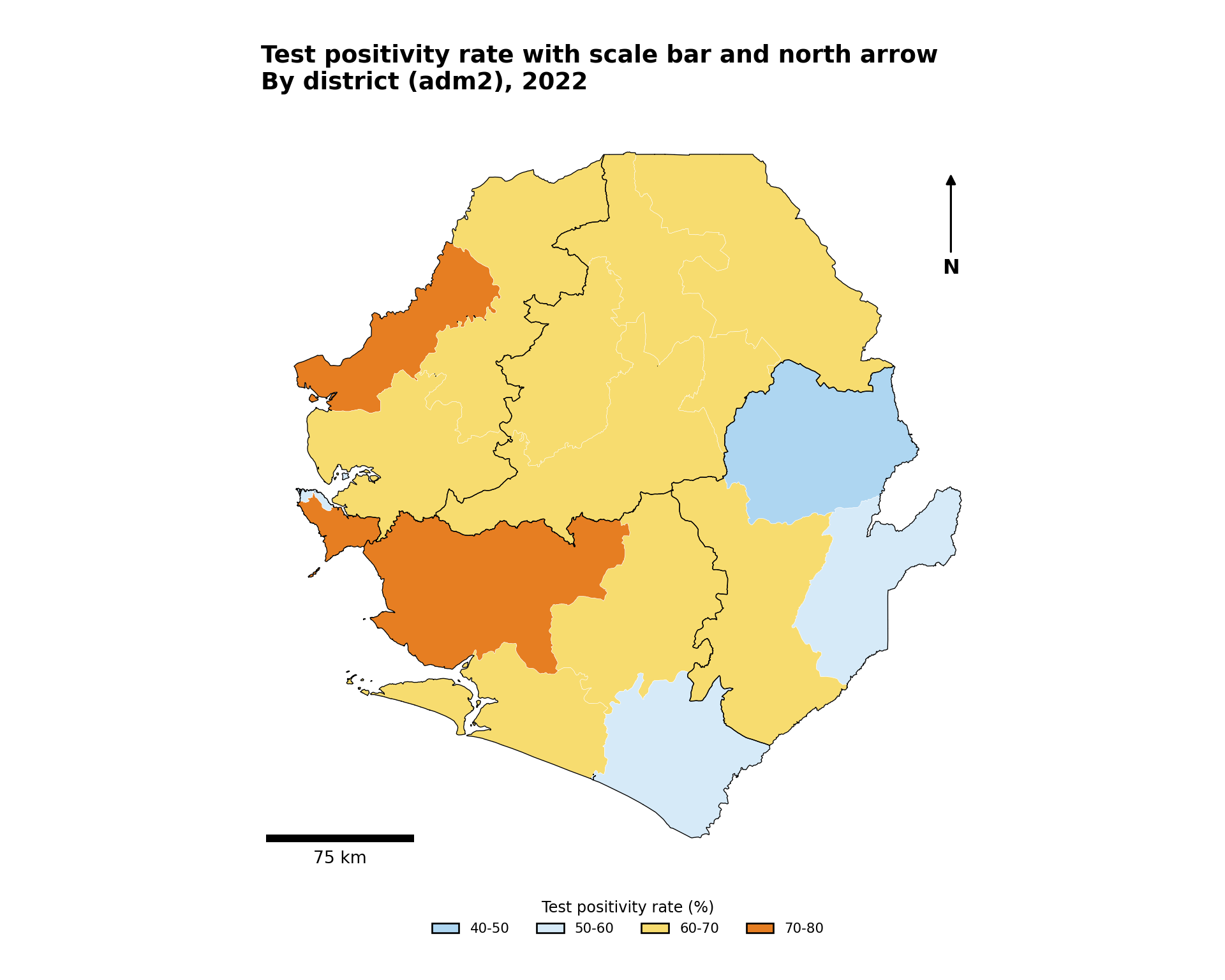
To adapt the code:
- Lines 18-27: Move the scale bar by changing
locationand resize it withlength_fraction - Lines 29-43: Move or restyle the north arrow by changing the axes-fraction coordinates and
arrowprops - Lines 12-13: Modify the
titleandsubtitlebased on the data you are plotting
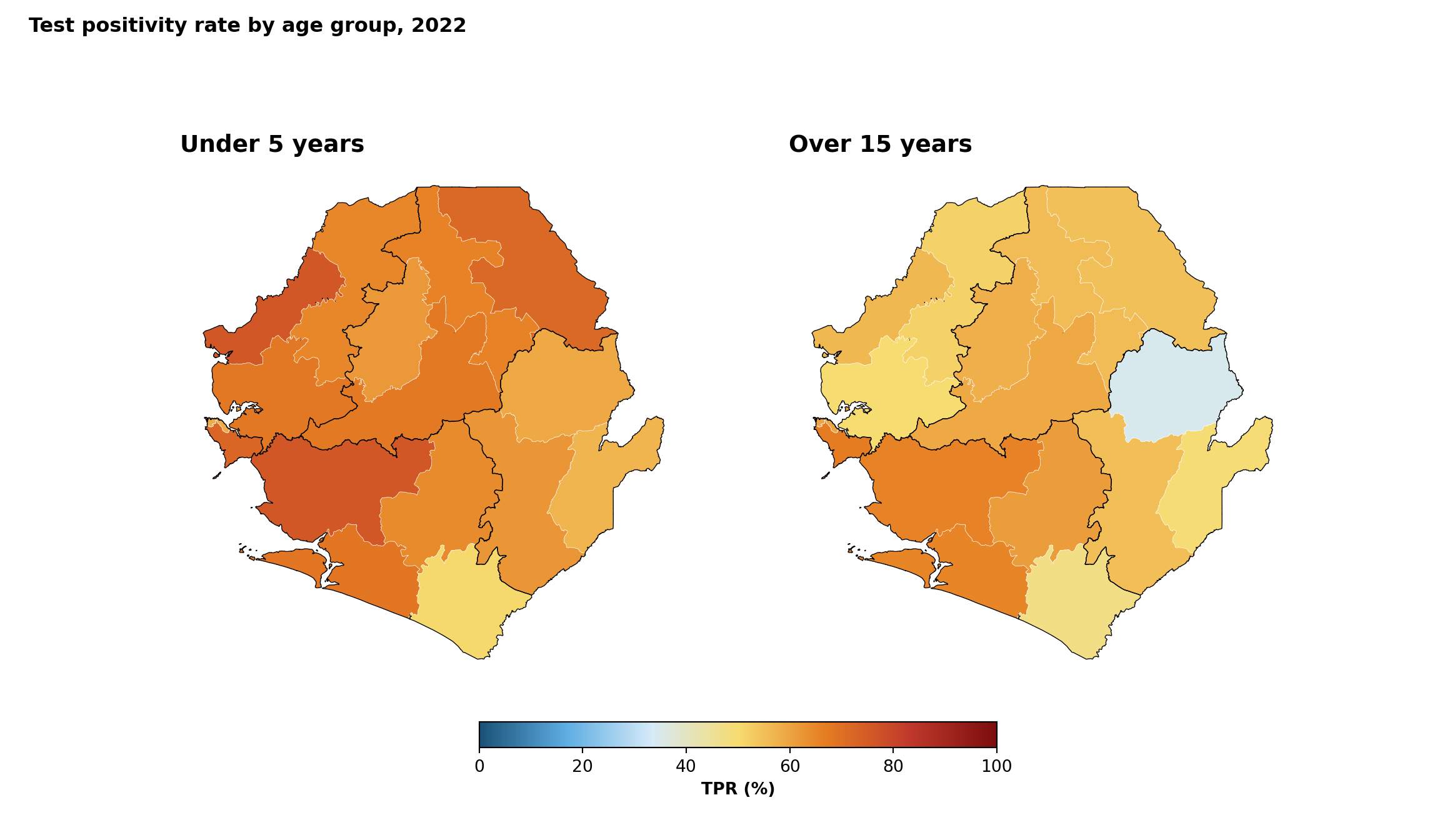
Step 5.5: Combining maps with patchwork
Side-by-side comparison of two indicators or two age groups is often clearer with patchwork than with facet_wrap, because each subplot can have its own scale, title, and legend. The + operator composes plots horizontally, / stacks them vertically, and plot_layout(guides = "collect") consolidates legends.
Show the code
# small helper so both panels share the same look and inherit the
# shared SNT map theme used in Steps 4.3 - 5.4 (fonts, sizes, legend
# layout, margins); only the per-panel subtitle is tweaked
make_panel <- function(data, fill_col, panel_title) {
  ggplot2::ggplot() +
    ggplot2::geom_sf(
      data = data,
      ggplot2::aes(fill = .data[[fill_col]]),
      color = "white",
      size = 0.2
    ) +
    ggplot2::scale_fill_gradientn(
      name = "TPR (%)",
      colors = rev(tpr_gradient_colors),
      limits = c(0, 100),
      na.value = "grey90",
      guide = ggplot2::guide_colorbar(
        title.position = "top",
        title.hjust = 0.5,
        barwidth = grid::unit(8, "lines"),
        barheight = grid::unit(0.4, "lines")
      )
    ) +
    # adm1 regions as the higher-level overlay
    ggplot2::geom_sf(
      data = adm1_gdf,
      fill = NA,
      color = "black",
      linewidth = 0.5
    ) +
    ggplot2::labs(subtitle = panel_title) +
    snt_map_theme() +
    ggplot2::theme(
      plot.subtitle = ggplot2::element_text(
        face = "bold",
        size = 11,
        hjust = 0,
        margin = ggplot2::margin(b = 6)
      )
    )
}

panel_u5 <- make_panel(
  tabshp_with_rates, "tpr_u5_pct", "Under 5 years"
)
panel_ov15 <- make_panel(
  tabshp_with_rates, "tpr_ov15_pct", "Over 15 years"
)

combined_map <- patchwork::wrap_plots(
  panel_u5, panel_ov15, ncol = 2
) +
  patchwork::plot_annotation(
    title = "Test positivity rate by age group, 2022",
    theme = ggplot2::theme(
      plot.title = ggplot2::element_text(
        face = "bold",
        size = 14,
        hjust = 0,
        margin = ggplot2::margin(b = 8)
      )
    )
  ) +
  patchwork::plot_layout(guides = "collect") &
  ggplot2::theme(legend.position = "bottom")

# save plot
ggplot2::ggsave(
  plot = combined_map,
  filename = here::here("03_output", "3a_figures", "combined_map.png"),
  width = 12,
  height = 7,
  dpi = 300
)
NoteOutput
To adapt the code:
- Lines 14-16: Replace
"tpr_u5_pct"/"tpr_ov15_pct"with the columns you want to compare side by side - Line 48: Switch
ncol = 2toncol = 1to stack the panels vertically - Line 51: Modify the overall
titlebased on the data you are plotting
TipSide-by-side vs
facet_wrap
Use facet_wrap (Step 4.6) when every panel shares the same scale, legend, and title. Use patchwork when panels need to differ in any of those, or when you want to combine maps with non-map plots such as a bar chart, a histogram of the indicator, or an inset locator.
Python uses matplotlib subplots for the same side-by-side composition.
Show the code
def make_panel_py(ax, data, fill_col, panel_title):
    cmap = mcolors.LinearSegmentedColormap.from_list("tpr_gradient", tpr_gradient_colors)
    data.plot(
        ax=ax,
        column=fill_col,
        cmap=cmap,
        vmin=0,
        vmax=100,
        edgecolor="white",
        linewidth=0.2,
        missing_kwds={"color": "#E5E5E5"},
    )
    adm1_gdf.boundary.plot(ax=ax, color="black", linewidth=0.5)
    finish_map(ax, title=panel_title)
    return cmap


fig, axes = plt.subplots(1, 2, figsize=(12, 7))
cmap = make_panel_py(axes[0], tabshp_with_rates, "tpr_u5_pct", "Under 5 years")
make_panel_py(axes[1], tabshp_with_rates, "tpr_ov15_pct", "Over 15 years")
fig.suptitle(
    "Test positivity rate by age group, 2022",
    fontweight="bold",
    x=0.02,
    ha="left",
)
sm = ScalarMappable(norm=mcolors.Normalize(vmin=0, vmax=100), cmap=cmap)
sm.set_array([])
cbar = fig.colorbar(sm, ax=axes, orientation="horizontal", fraction=0.04, pad=0.06)
cbar.set_label("TPR (%)", fontweight="bold")

# save plot
save_figure(
    fig,
    here("03_output/3a_figures/combined_map.png"),
    width=12,
    height=7,
    dpi=300
)
plt.show()
NoteOutput
To adapt the code:
- Lines 22-23: Replace
"tpr_u5_pct"/"tpr_ov15_pct"with the columns you want to compare side by side - Line 21: Switch
plt.subplots(1, 2)toplt.subplots(2, 1)to stack the panels vertically - Line 24: Modify the overall
titlebased on the data you are plotting
Step 5.6: Interactive maps for quality control
A static map is what ends up in the report, but for QC and stakeholder review an interactive map is often faster. In R, mapview::mapView() renders any sf object as an interactive Leaflet map. In Python, the equivalent is GeoDataFrame.explore() (built on folium). Both produce interactive Leaflet maps with attribute popups on click and a built-in basemap.
To adapt the code:
- Line 3: Replace
tabshp_with_rateswith thesfobject you wish to inspect - Line 4: Replace
"tpr_overall_pct"with the column you wish to colour by - Line 6: Swap
tpr_gradient_colorsfor any palette (for exampleget_palette("blues", n = 7))
WarningUse for QC, not for final delivery
Interactive maps are excellent for inspecting boundaries and outliers, but should not replace static maps in formal SNT outputs. Reviewers and decision-makers expect reproducible static figures, and interactive widgets do not survive PDF export or print delivery.
Python uses GeoPandas .explore(), which renders an interactive Folium/Leaflet map.
Show the code
# build a branca linear colormap from the hex palette. passing a
# matplotlib `LinearSegmentedColormap` to `.explore(cmap=...)` causes
# geopandas to emit rgba float tuples (e.g. [0.48, 0.05, 0.05, 1.0])
# into the geojson `fillColor`, which leaflet cannot parse - polygons
# then render as the default flat colour. branca colormaps emit hex
# strings that leaflet renders correctly.
import branca.colormap as bcm
# auto-scale the colormap to the actual data range so the full palette
# is used. hardcoding `vmin=0, vmax=100` would compress the data
# (typically 50-70%) into the middle of the gradient (yellows), which
# is what r's `mapview::mapView()` avoids by defaulting to the data
# range.
_tpr_vals = tabshp_with_rates["tpr_overall_pct"].dropna()
_tpr_vmin = float(_tpr_vals.min())
_tpr_vmax = float(_tpr_vals.max())
tpr_cmap = bcm.LinearColormap(
colors=tpr_gradient_colors,
vmin=_tpr_vmin,
vmax=_tpr_vmax,
caption="TPR (%)",
)
# per-feature style function: convert the value to a hex colour string
# via the branca colormap, so leaflet receives valid css colours.
def tpr_style_function(feature):
value = feature["properties"].get("tpr_overall_pct")
fill = tpr_cmap(value) if value is not None else "#cccccc"
return {
"fillColor": fill,
"color": "white",
"weight": 0.5,
"fillOpacity": 0.85,
}
# choropleth of all-age TPR with attribute popups
interactive_map = tabshp_with_rates.explore(
tooltip=["adm1", "adm2", "tpr_overall_pct"],
popup=True,
style_kwds={"style_function": tpr_style_function},
legend=False,
)
# attach the branca legend separately so it sits next to the map
tpr_cmap.add_to(interactive_map)
interactive_mapStep 5.7: Exporting maps for reports
The same map can look polished in a slide deck and pixelated in a print report if the export settings are wrong. The three parameters that matter most are:
- Aspect ratio (
width/height). For a map, this should match the country’s bounding box, otherwise the geography is squashed. For a non-map figure (a ranked bar chart, a per-district summary, a time-series), the aspect ratio is driven by the number of categories on the long axis, not by geography. - DPI. 300 for print, 150 for slides, 96-150 for web. DPI is ignored for vector output (
.pdf,.svg). - Output medium. A wide landscape map and a tall ranked-bar summary have very different width/height profiles even when they come from the same dataset. Save them with the dimensions that fit the medium, not with the dimensions that fit the screen you happen to be on.
Export presets by output medium
| Medium | Format | Width | DPI | Notes |
|---|---|---|---|---|
| Word / PDF report | PNG or PDF | 6.5 in (single column) | 300 | Set height so the aspect ratio matches the country bbox |
| Slide deck (16:9) | PNG | 10 in | 150 | Lower DPI keeps file size manageable in PPT |
| Print poster | PDF or SVG | physical size in inches | Vector | Use vector to avoid pixelation at large sizes |
| Web / dashboard | PNG or SVG | 8 in | 96-150 | Set width in inches and let DPI handle pixels |
Show the code
# Profile 1: wide landscape map (bbox-driven aspect ratio)
# compute aspect ratio from the shapefile bounding box so the exported
# figure matches the country's true shape and is never squashed sideways
bbox <- sf::st_bbox(adm2_gdf)
aspect_ratio <- (bbox$ymax - bbox$ymin) / (bbox$xmax - bbox$xmin)
map_width <- 10
map_height <- map_width * aspect_ratio
# PNG for a Word / PDF report at 300 dpi
ggplot2::ggsave(
plot = binned_map,
filename = here::here("03_output", "3a_figures", "tpr_binned_map.png"),
width = map_width,
height = map_height,
dpi = 300,
units = "in"
)
# PDF vector copy for print (DPI is ignored for vector output)
ggplot2::ggsave(
plot = binned_map,
filename = here::here("03_output", "3a_figures", "tpr_binned_map.pdf"),
width = map_width,
height = map_height,
units = "in",
device = grDevices::cairo_pdf
)
# Profile 2: tall ranked-bar summary (driven by number of districts, not bbox)
# a ranked horizontal bar chart of TPR by district. Its aspect ratio has
# nothing to do with the country's bounding box: height scales with the
# number of bars, width is fixed by the report column.
tpr_ranking <- tabshp_with_rates |>
sf::st_drop_geometry() |>
dplyr::arrange(dplyr::desc(tpr_overall_pct)) |>
dplyr::mutate(adm2 = forcats::fct_inorder(adm2))
ranked_bars <- ggplot2::ggplot(
tpr_ranking,
ggplot2::aes(x = tpr_overall_pct, y = forcats::fct_rev(adm2))
) +
ggplot2::geom_col(fill = "#1F3A57") +
ggplot2::labs(
title = "Test positivity rate by district, 2022",
x = "TPR (%)",
y = NULL
) +
ggplot2::theme_minimal(base_size = 11)
# height scales with the number of districts (~ 0.25 in per bar) so each
# label stays legible; width is fixed at the single-column report width
n_districts <- nrow(tpr_ranking)
bar_width <- 6.5
bar_height <- max(4, 0.25 * n_districts + 1.5)
ggplot2::ggsave(
plot = ranked_bars,
filename = here::here("03_output", "3a_figures", "tpr_ranking_bars.png"),
width = bar_width,
height = bar_height,
dpi = 300,
units = "in"
)
# Profile 3: SVG for web / dashboards (vector, screen-friendly width)
ggplot2::ggsave(
plot = binned_map,
filename = here::here("03_output", "3a_figures", "tpr_binned_map.svg"),
width = 8,
height = 8 * aspect_ratio,
units = "in"
)To adapt the code:
- Lines 13-14: Compute the bounding-box aspect ratio from your country’s
adm2_gdfso the map is not squashed - Lines 16-17: Change
map_widthto match the destination medium (6.5 in for single-column report, 10 in for a slide deck) - Lines 47-50: Replace
tpr_overall_pctandadm2with the indicator / unit you want to rank - Lines 66-68: Tune the height multiplier (
0.25 * n_districts) if your unit labels are longer or shorter than district names - Lines 80-81: Adjust the SVG dimensions to your dashboard column width; SVG ignores
dpi
Show the code
# Profile 1: wide landscape map (bbox-driven aspect ratio)
# compute aspect ratio from the shapefile bounding box so the exported
# figure matches the country's true shape and is never squashed sideways
xmin, ymin, xmax, ymax = adm2_gdf.total_bounds
aspect_ratio = (ymax - ymin) / (xmax - xmin)
map_width = 10
map_height = map_width * aspect_ratio
fig, ax = plt.subplots(figsize=(map_width, map_height))
plot_binned_map(
ax,
tabshp_with_rates,
fill_col="tpr_overall_bin",
palette=tpr_bin_palette,
title="All-age test positivity rate in Sierra Leone",
subtitle="By district (adm2), 2022",
overlay=adm1_gdf,
)
# PNG for a Word / PDF report at 300 dpi
save_figure(
fig,
here("03_output/3a_figures/tpr_binned_map.png"),
width=map_width,
height=map_height,
dpi=300
)
# PDF vector copy for print
ensure_output_dir(here("03_output/3a_figures/tpr_binned_map.pdf"))
fig.savefig(
here("03_output/3a_figures/tpr_binned_map.pdf"),
bbox_inches="tight"
)
# Profile 2: tall ranked-bar summary (driven by number of districts, not bbox)
# a ranked horizontal bar chart of TPR by district. Its aspect ratio has
# nothing to do with the country's bounding box: height scales with the
# number of bars, width is fixed by the report column.
tpr_ranking = (
pd.DataFrame(tabshp_with_rates.drop(columns="geometry"))
.sort_values("tpr_overall_pct", ascending=False)
)
n_districts = len(tpr_ranking)
bar_width = 6.5
bar_height = max(4, 0.25 * n_districts + 1.5)
fig_bar, ax_bar = plt.subplots(figsize=(bar_width, bar_height))
ax_bar.barh(
tpr_ranking["adm2"],
tpr_ranking["tpr_overall_pct"],
color="#1F3A57"
)
ax_bar.invert_yaxis()
ax_bar.set_title("Test positivity rate by district, 2022", loc="left", fontweight="bold")
ax_bar.set_xlabel("TPR (%)")
ax_bar.set_ylabel("")
ax_bar.spines[["top", "right"]].set_visible(False)
fig_bar.tight_layout()
save_figure(
fig_bar,
here("03_output/3a_figures/tpr_ranking_bars.png"),
width=bar_width,
height=bar_height,
dpi=300
)
# Profile 3: SVG for web / dashboards (vector, screen-friendly width)
ensure_output_dir(here("03_output/3a_figures/tpr_binned_map.svg"))
fig.savefig(
here("03_output/3a_figures/tpr_binned_map.svg"),
bbox_inches="tight"
)
TipWide map vs tall graph: pick the right profile
Two figures built from the same dataset rarely share the same width and height. Use this rule of thumb:
- Wide map. Width is set by the report column or slide. Height is driven by the bounding box (see code chunks below). Never set height manually; let the bounding box drive it.
- Tall ranked summary. Width is set by the report column. Height scales with the number of categories on the long axis (see code chunks below; roughly
0.25 inper bar for district-level data, more if labels wrap). Never set width to match the map; the two figures are different shapes by design. - Square comparison panel. When you combine a map and a non-map plot (R:
patchwork::wrap_plots(); Python:matplotlib.pyplot.subplots()withgridspec_kworFigure.subplot_mosaic()), render each one separately at its natural aspect ratio first, then let the layout function arrange them; do not force a single sharedfig-width/fig-height.
Wide-map height formula in code
Tall ranked-summary height formula in code
TipImporting into PowerPoint without distortion
Once a PNG is dropped into a slide, PowerPoint lets you drag any of the eight handles around the image. Most of those distort the figure:
- Use the corner handles only. Hold Shift while dragging a corner to lock the aspect ratio; width and height then scale together and the geography stays correct. The side and top / bottom handles stretch one dimension only and will squash the country.
- Right-click → Size and Position → Lock aspect ratio. Tick this once per image. From then on, typing a new width into the Size pane updates the height automatically, and vice versa.
- Re-export rather than resize past 100%. If a 10 in PNG ends up smaller than 4 in on the slide, the on-screen quality is fine but the file is still 10 in worth of pixels. If you need to make it noticeably larger than the exported size, re-export from R at the bigger dimensions instead of stretching the raster.
- Prefer SVG / EMF for slides you will resize a lot. Vector formats scale without resampling; raster PNGs blur once you go past 100% of the exported size.
Summary
This page has outlined the process for using and visualizing shapefile data. This begins with importing and validating spatial data, ensuring proper coordinate systems are established for accurate geographic alignment.
The visualization techniques demonstrated can be used for different purposes. Basic boundary mapping verifies proper data loading, while layered maps create the geographic framework needed for stratified analysis. These outputs become the foundation for key SNT applications: calculating intervention coverage across jurisdictions, identifying gaps in service delivery, and monitoring performance against geographic targets.
While implementation details vary across analytical environments, the core principles apply universally: validate before analysis, maintain consistent spatial references, and visualize at multiple scales to confirm operational relevance. The resulting spatial datasets enable evidence-based decision-making tailored to subnational contexts.
Full code
Find the full code script for viewing and visualizing shapefile data below.
Show full code
################################################################################
############# ~ Basic shapefile use and visualization full code ~ ##############
################################################################################
### Step 1: Install and load packages ------------------------------------------
# install `pacman` if not already installed
if (!requireNamespace("pacman", quietly = TRUE)) {
install.packages("pacman")
}
# load required packages using pacman
pacman::p_load(
readxl, # read Excel files
tidyr, # data organization
sf, # handling shapefile data
dplyr, # data manipulation
ggplot2, # plotting
viridis, # color palettes
shadowtext, # plot labels
cli, # styled console output
here, # file path management
stringr # cleaning up character strings
)
### Step 2: Import shapefiles --------------------------------------------------
# set up spatial path
spat_path <- here::here(
"1.1_foundational",
"1.1a_administrative_boundaries"
)
# load processed chiefdom (adm3) spatial object
gdf <- readRDS(
here::here(spat_path, "processed", "sle_spatial_adm3_2021.rds")
) |>
# ensure output remains a valid sf object for downstream usage
sf::st_as_sf()
# load processed district (adm2) spatial object
adm2_gdf <- readRDS(
here::here(spat_path, "processed", "sle_spatial_adm2_2021.rds")
) |>
sf::st_as_sf()
# load processed region (adm1) spatial object, used as the higher-level
# overlay in choropleth maps from Step 4 onward
adm1_gdf <- readRDS(
here::here(spat_path, "processed", "sle_spatial_adm1_2021.rds")
) |>
sf::st_as_sf()
### Step 3: Visualize shapefile contents ---------------------------------------
#### Step 3.1: Basic admin unit map --------------------------------------------
# shared map theme reused by every map on this page
# (theme_void() removes axes/grid by default; the theme block below
# controls fonts, sizes, legend layout, and margins so every plot
# from Step 3 through Step 5 has identical look-and-feel)
snt_map_theme <- function() {
ggplot2::theme_void() +
ggplot2::theme(
legend.position = "bottom",
legend.direction = "horizontal",
# title sits above the legend boxes, tick labels sit below them
legend.title.position = "top",
legend.text.position = "bottom",
legend.title = ggplot2::element_text(
face = "bold",
size = 10,
hjust = 0.5,
margin = ggplot2::margin(b = 6)
),
legend.box.margin = ggplot2::margin(t = 8),
# narrow key width keeps single-row legends compact even with many
# bins; Steps 4.3 / 4.6 / 5.2 / 5.3 / 5.4 all rely on this default
legend.key.width = grid::unit(0.9, "cm"),
strip.text = ggplot2::element_text(
face = "bold",
size = 10,
margin = ggplot2::margin(t = 2, b = 6, l = 4, r = 4)
),
strip.text.y = ggplot2::element_text(angle = -90),
panel.spacing = grid::unit(4, "pt"),
plot.title = ggplot2::element_text(
face = "bold",
size = 14,
margin = ggplot2::margin(b = 8)
),
plot.subtitle = ggplot2::element_text(
size = 11,
margin = ggplot2::margin(b = 10)
),
plot.margin = ggplot2::margin(t = 5, r = 5, b = 5, l = 5)
)
}
# plot the chiefdom shapefile
basic_map <- ggplot2::ggplot() +
ggplot2::geom_sf(
data = gdf,
fill = "lightblue",
color = "black"
) +
ggplot2::labs(
title = "Map of Sierra Leone chiefdoms (adm3)",
subtitle = "adm3 boundaries"
) +
snt_map_theme()
# save plot
ggplot2::ggsave(
plot = basic_map,
filename = here::here("03_output", "3a_figures", "basic_map.png"),
width = 10,
height = 8,
dpi = 300
)
#### Step 3.2: Overlay multiple administrative levels --------------------------
# compute label positions once so labels stay inside each district polygon
adm2_labels <- adm2_gdf |>
dplyr::mutate(
.lab_xy = sf::st_point_on_surface(geometry),
lon = sf::st_coordinates(.lab_xy)[, 1],
lat = sf::st_coordinates(.lab_xy)[, 2]
) |>
sf::st_drop_geometry()
overlay_map <- ggplot2::ggplot() +
# adm3 chiefdoms: soft fill with subtle but visible outlines
ggplot2::geom_sf(
data = gdf,
fill = "#EAF0F4",
color = "#A3B6C2",
linewidth = 0.2
) +
# adm2 districts: no fill, thin dark outline to anchor the overlay
ggplot2::geom_sf(
data = adm2_gdf,
fill = NA,
color = "#1F3A57",
linewidth = 0.45
) +
# adm2 labels with a strong white halo for legibility
shadowtext::geom_shadowtext(
data = adm2_labels,
ggplot2::aes(x = lon, y = lat, label = adm2),
color = "#1F3A57",
bg.color = "white",
bg.r = 0.18,
size = 3.6,
fontface = "bold"
) +
ggplot2::labs(
title = "Overlay of Sierra Leone administrative boundaries",
subtitle = "Districts (adm2) and chiefdoms (adm3)"
) +
snt_map_theme()
# save plot
ggplot2::ggsave(
plot = overlay_map,
filename = here::here("03_output", "3a_figures", "overlay_map.png"),
width = 10,
height = 8,
dpi = 300
)
### Step 4: Advanced shapefile use and visualization ---------------------------
#### Step 4.1: Load and prepare merged data for advanced visualizations --------
# load categorical intervention data
# the Excel ships with a verbose "Dea Chiefdom"-style `adm3` column and a
# raw `FIRST_CHIE` ("DEA") column. drop the verbose one and use the raw
# code so it matches the shapefile's `adm3` field.
categorical_intervention_data <- readxl::read_excel(
here::here(
"1.2_epidemiology",
"1.2a_routine_surveillance",
"processed",
"scenario_with_irs_no_smc_06_20_2025.xlsx"
)
) |>
dplyr::select(-dplyr::any_of("adm3")) |>
dplyr::rename(
adm2 = FIRST_DNAM,
adm3 = FIRST_CHIE
)
# diagnose name-only join coverage at adm2-adm3
shp_names_cat <- gdf |>
sf::st_drop_geometry() |>
dplyr::distinct(adm1, adm2, adm3)
shp_with_cat <- shp_names_cat |>
dplyr::inner_join(
categorical_intervention_data |>
dplyr::distinct(adm2, adm3),
by = c("adm2", "adm3")
)
cli::cli_h2("Categorical intervention join diagnostics")
cli::cli_alert_success(
"Exact matches across adm2-adm3: {nrow(shp_with_cat)}"
)
# perform the actual merge with adm2-adm3
gdf_cat_joined <- gdf |>
dplyr::inner_join(
categorical_intervention_data,
by = c("adm2", "adm3")
) |>
sf::st_as_sf()
cli::cli_alert_success(
"Final merged row count for intervention data: {nrow(gdf_cat_joined)}"
)
# ----------------------------------------------------------------------------
# load DHIS2 data and filter to the working year at read time so we
# never carry the full multi-year dataset in memory downstream
sle_dhis2_df_coord_spatial_adm3 <- readRDS(
here::here(
"1.2_epidemiology",
"1.2a_routine_surveillance",
"processed",
"sle_dhis2_df_coord_spatial_adm3.rds"
)
) |>
dplyr::filter(year == "2022")
# aggregate to annual chiefdom totals so each chiefdom appears once
# (rather than once per month) before joining
sle_dhis2_2022_annual <- sle_dhis2_df_coord_spatial_adm3 |>
dplyr::group_by(adm0, adm1, adm2, adm3) |>
dplyr::summarise(
dplyr::across(
c(conf, test, conf_u5, test_u5,
conf_5_14, test_5_14, conf_ov15, test_ov15),
~ sum(.x, na.rm = TRUE)
),
.groups = "drop"
)
# diagnose name-only join coverage at adm1-adm3
dhis2_admins <- sle_dhis2_2022_annual |>
dplyr::distinct(adm1, adm2, adm3)
shp_names <- gdf |>
sf::st_drop_geometry() |>
dplyr::distinct(adm1, adm2, adm3)
shp_with_dhis2 <- shp_names |>
dplyr::inner_join(
dhis2_admins,
by = c("adm1", "adm2", "adm3")
)
cli::cli_h2("DHIS2 join diagnostics")
cli::cli_alert_success(
"Exact matches across adm1-adm3: {nrow(shp_with_dhis2)}"
)
# perform the actual merge with adm1-adm3
tabshp <- gdf |>
dplyr::inner_join(
sle_dhis2_2022_annual,
by = c("adm0", "adm1", "adm2", "adm3")
) |>
sf::st_as_sf()
cli::cli_alert_success(
"Final merged row count: {nrow(tabshp)}"
)
#### Step 4.2: Categorical color mapping ---------------------------------------
categorical_map <- ggplot2::ggplot() +
ggplot2::geom_sf(
data = gdf_cat_joined,
ggplot2::aes(fill = irs),
color = "white",
size = 0.2
) +
ggplot2::scale_fill_brewer(
# drop the legend title and use self-explanatory category labels
name = NULL,
palette = "Accent",
labels = c(
"IRS" = "IRS planned",
"No IRS" = "No IRS planned"
),
na.value = "grey90",
na.translate = FALSE
) +
ggplot2::geom_sf(
data = gdf_cat_joined,
fill = NA,
color = "grey30",
linewidth = 0.3
) +
ggplot2::geom_sf(
data = adm2_gdf,
fill = NA,
color = "black",
linewidth = 0.5
) +
ggplot2::labs(
title = "Planned indoor residual spraying (IRS) coverage",
subtitle = "By chiefdom, 2026-2030"
) +
snt_map_theme() +
ggplot2::theme(
legend.key.size = ggplot2::unit(0.5, "cm")
)
# save plot
ggplot2::ggsave(
plot = categorical_map,
filename = here::here("03_output", "3a_figures", "categorical_map.png"),
width = 10,
height = 8,
dpi = 300
)
#### Step 4.3: Binned color mapping --------------------------------------------
# aggregate chiefdom-level counts up to district (adm2) so the choropleth
# fills the full district polygons, avoiding gaps caused by missing
# chiefdoms
tabshp_adm2 <- tabshp |>
sf::st_drop_geometry() |>
dplyr::group_by(adm0, adm1, adm2) |>
dplyr::summarise(
dplyr::across(
c(
conf, test,
conf_u5, test_u5,
conf_5_14, test_5_14,
conf_ov15, test_ov15
),
~ sum(.x, na.rm = TRUE)
),
.groups = "drop"
) |>
# restore polygon geometry from the adm2 shapefile
dplyr::left_join(adm2_gdf, by = c("adm0", "adm1", "adm2")) |>
sf::st_as_sf()
# calculate test positivity rates as percentages at adm2 level
tabshp_with_rates <- tabshp_adm2 |>
dplyr::mutate(
tpr_overall_pct = dplyr::if_else(
test > 0, (conf / test) * 100, NA_real_
),
tpr_u5_pct = dplyr::if_else(
test_u5 > 0, (conf_u5 / test_u5) * 100, NA_real_
),
tpr_5_14_pct = dplyr::if_else(
test_5_14 > 0, (conf_5_14 / test_5_14) * 100, NA_real_
),
tpr_ov15_pct = dplyr::if_else(
test_ov15 > 0, (conf_ov15 / test_ov15) * 100, NA_real_
)
)
# define ordered bin labels and a diverging palette where the
# blue end runs through 50-60 and warm tones take over above 60
tpr_bin_labels <- c(
"0-10", "10-20", "20-30", "30-40", "40-50",
"50-60", "60-70", "70-80", "80-90", "90-100"
)
tpr_bin_palette <- c(
"0-10" = "#1a5276",
"10-20" = "#2980b9",
"20-30" = "#5dade2",
"30-40" = "#85c1e9",
"40-50" = "#aed6f1",
"50-60" = "#d6eaf8",
"60-70" = "#f7dc6f",
"70-80" = "#e67e22",
"80-90" = "#c0392b",
"90-100" = "#7b0d0d"
)
tabshp_with_rates <- tabshp_with_rates |>
dplyr::mutate(
tpr_overall_bin = cut(
tpr_overall_pct,
breaks = c(0, 10, 20, 30, 40, 50, 60, 70, 80, 90, 100),
labels = tpr_bin_labels,
include.lowest = TRUE
)
)
binned_map <- ggplot2::ggplot() +
# adm2 districts coloured by tpr bin
ggplot2::geom_sf(
data = tabshp_with_rates,
ggplot2::aes(fill = tpr_overall_bin),
color = "white",
size = 0.2
) +
ggplot2::scale_fill_manual(
name = "Test positivity rate (%)",
values = tpr_bin_palette,
drop = TRUE,
na.value = "grey90",
na.translate = FALSE,
guide = ggplot2::guide_legend(
title.position = "top",
title.hjust = 0.5,
label.position = "bottom",
override.aes = list(
colour = "black",
size = 0.15,
alpha = 1
),
nrow = 1,
byrow = TRUE
)
) +
# adm1 regions: thicker overlay so regional borders read clearly
ggplot2::geom_sf(
data = adm1_gdf,
fill = NA,
color = "black",
linewidth = 0.5
) +
ggplot2::labs(
title = "All-age test positivity rate in Sierra Leone",
subtitle = "By district (adm2), 2022"
) +
snt_map_theme()
# save plot
ggplot2::ggsave(
plot = binned_map,
filename = here::here("03_output", "3a_figures", "binned_map.png"),
width = 10,
height = 8,
dpi = 300
)
#### Step 4.4: Continuous color mapping ----------------------------------------
# SNT gradient default palette (high values -> dark red,
# low values -> dark blue)
tpr_gradient_colors <- c(
"#7b0d0d", "#c0392b", "#e67e22", "#f7dc6f",
"#d6eaf8", "#5dade2", "#1a5276"
)
continuous_map <- ggplot2::ggplot() +
ggplot2::geom_sf(
data = tabshp_with_rates,
ggplot2::aes(fill = tpr_overall_pct),
color = "white",
size = 0.2
) +
ggplot2::scale_fill_gradientn(
name = "Test positivity rate (%)",
colors = rev(tpr_gradient_colors),
limits = c(0, 100),
na.value = "grey90",
guide = ggplot2::guide_colorbar(
title.position = "top",
title.hjust = 0.5,
barwidth = grid::unit(15, "lines"),
barheight = grid::unit(0.5, "lines")
)
) +
ggplot2::geom_sf(
data = adm1_gdf,
fill = NA,
color = "black",
linewidth = 0.5
) +
ggplot2::labs(
title = "All-age test positivity rate in Sierra Leone",
subtitle = "By district (adm2), 2022"
) +
snt_map_theme()
# save plot
ggplot2::ggsave(
plot = continuous_map,
filename = here::here("03_output", "3a_figures", "continuous_map.png"),
width = 10,
height = 8,
dpi = 300
)
#### Step 4.5: Plot subdivisions by larger regions -----------------------------
# adm1 labels with error handling
# (the processed .rds loaded in Step 2 is already valid, so no
# additional st_make_valid / st_buffer cleaning is needed here)
adm1_labels <- tryCatch(
{
gdf |>
dplyr::group_by(adm1) |>
dplyr::summarise(geometry = sf::st_union(geometry)) |>
sf::st_make_valid() |>
dplyr::mutate(
centroid = sf::st_point_on_surface(geometry),
coords = sf::st_coordinates(centroid),
x = coords[, 1],
y = coords[, 2]
)
},
error = function(e) {
adm2_gdf |>
dplyr::mutate(
centroid = sf::st_point_on_surface(geometry),
coords = sf::st_coordinates(centroid),
x = coords[, 1],
y = coords[, 2]
)
}
)
# automatic color palette
n_adm1 <- length(unique(gdf$adm1))
adm1_colors <- viridis::plasma(n_adm1)
names(adm1_colors) <- unique(gdf$adm1)
subdivided_plot <- ggplot2::ggplot() +
ggplot2::geom_sf(
data = gdf,
ggplot2::aes(fill = adm1),
color = "white",
linewidth = 0.35
) +
ggplot2::scale_fill_manual(values = adm1_colors) +
ggplot2::geom_sf(
data = adm2_gdf,
fill = NA,
color = "black",
linewidth = 0.8
) +
shadowtext::geom_shadowtext(
data = adm1_labels,
ggplot2::aes(x = x, y = y, label = adm1),
size = 3,
fontface = "bold",
color = "black",
bg.color = "white",
bg.r = 0.25
) +
ggplot2::labs(
title = "Sierra Leone subdivided adm1 and adm2 boundaries"
) +
snt_map_theme()
# save plot
ggplot2::ggsave(
plot = subdivided_plot,
filename = here::here("03_output", "3a_figures", "subdivided_map.png"),
width = 10,
height = 8,
dpi = 300
)
#### Step 4.6: Faceted maps ----------------------------------------------------
# select the TPR percentage columns
tpr_cols <- c(
"tpr_u5_pct",
"tpr_5_14_pct",
"tpr_ov15_pct",
"tpr_overall_pct"
)
# convert data to long format and create binned categories
tpr_long_data <- tabshp_with_rates |>
dplyr::select(geometry, dplyr::all_of(tpr_cols)) |>
tidyr::pivot_longer(
cols = -geometry,
names_to = "age_group",
values_to = "tpr_percentage"
) |>
dplyr::mutate(
age_group = dplyr::recode(
age_group,
"tpr_u5_pct" = "Under 5 years",
"tpr_5_14_pct" = "5-14 years",
"tpr_ov15_pct" = "Over 15 years",
"tpr_overall_pct" = "Overall"
),
age_group = factor(
age_group,
levels = c(
"Under 5 years",
"5-14 years",
"Over 15 years",
"Overall"
),
ordered = TRUE
),
tpr_binned = cut(
tpr_percentage,
breaks = c(0, 10, 20, 30, 40, 50, 60, 70, 80, 90, 100),
labels = c(
"0-10", "10-20", "20-30", "30-40", "40-50",
"50-60", "60-70", "70-80", "80-90", "90-100"
),
include.lowest = TRUE
)
)
faceted_tpr_plot <- ggplot2::ggplot(tpr_long_data) +
ggplot2::geom_sf(
ggplot2::aes(fill = tpr_binned),
color = "white",
linewidth = 0.15
) +
ggplot2::facet_wrap(~ age_group, ncol = 2) +
# use the same named palette and single-row legend recipe as
# Step 4.3 so the legend layout matches throughout the page
ggplot2::scale_fill_manual(
name = "Test positivity rate (%)",
values = tpr_bin_palette,
drop = TRUE,
na.value = "grey90",
na.translate = FALSE,
guide = ggplot2::guide_legend(
title.position = "top",
title.hjust = 0.5,
label.position = "bottom",
override.aes = list(
colour = "black",
size = 0.15,
alpha = 1
),
nrow = 1,
byrow = TRUE
)
) +
# adm1 regions as the higher-level overlay (single source of truth
# for boundaries on every facet)
ggplot2::geom_sf(
data = adm1_gdf,
fill = NA,
color = "black",
linewidth = 0.3
) +
ggplot2::labs(
title = "Test positivity rates by age group and district (2022)",
subtitle = "Proportion of positive tests"
) +
snt_map_theme() +
# facet-specific tweaks on top of the shared theme
ggplot2::theme(
panel.spacing = ggplot2::unit(0.5, "cm"),
strip.text = ggplot2::element_text(face = "bold", size = 11),
legend.key.width = ggplot2::unit(0.9, "cm")
)
# save plot
ggplot2::ggsave(
plot = faceted_tpr_plot,
filename = here::here("03_output", "3a_figures", "faceted_tpr_plot.png"),
width = 10,
height = 8,
dpi = 300
)
### Step 5: Customizing maps for publication -----------------------------------
#### Step 5.1: Colour palettes and accessibility -------------------------------
# define a small catalogue of palettes covering sequential, diverging,
# and categorical use cases. each entry is an ordered character vector
# of hex codes that can be passed directly to scale_fill_manual().
snt_palettes <- list(
# sequential
blues = c(
"#deebf7", "#c6dbef", "#9ecae1",
"#6baed6", "#4292c6", "#2171b5", "#08519c"
),
ylord = c(
"#ffffcc", "#ffeda0", "#fed976",
"#feb24c", "#fd8d3c", "#fc4e2a", "#bd0026"
),
viridis = c(
"#440154", "#482878", "#3e4a89",
"#31688e", "#26828e", "#1f9e89", "#35b779",
"#6ece58", "#b5de2b", "#fde725"
),
# diverging (snt default for tpr-like indicators)
byor = c(
"#1a5276", "#2980b9", "#5dade2",
"#85c1e9", "#aed6f1", "#d6eaf8",
"#f7dc6f", "#e67e22", "#c0392b", "#7b0d0d"
),
rdbu = c(
"#b2182b", "#d6604d", "#f4a582",
"#fddbc7", "#d1e5f0", "#92c5de",
"#4393c3", "#2166ac"
),
spectral = c(
"#d53e4f", "#f46d43", "#fdae61",
"#fee08b", "#e6f598", "#abdda4",
"#66c2a5", "#3288bd"
),
# categorical
set2 = c(
"#66c2a5", "#fc8d62", "#8da0cb",
"#e78ac3", "#a6d854", "#ffd92f"
),
accent = c(
"#7fc97f", "#beaed4", "#fdc086",
"#ffff99", "#386cb0", "#f0027f"
)
)
# reshape into a long data frame so each colour is one tile
swatches_df <- purrr::imap_dfr(
snt_palettes,
function(cols, name) {
data.frame(
palette = name,
position = seq_along(cols),
colour = cols,
stringsAsFactors = FALSE
)
}
) |>
dplyr::mutate(
palette = factor(
palette,
levels = rev(names(snt_palettes))
)
)
palette_swatches <- ggplot2::ggplot(
swatches_df,
ggplot2::aes(
x = position,
y = palette,
fill = colour
)
) +
ggplot2::geom_tile(
color = "white",
linewidth = 0.4
) +
ggplot2::scale_fill_identity() +
ggplot2::scale_x_continuous(expand = c(0, 0)) +
ggplot2::labs(
title = "Recommended SNT colour palettes",
subtitle = "Sequential, diverging, and categorical options",
x = NULL,
y = NULL
) +
ggplot2::theme_minimal(base_size = 11) +
ggplot2::theme(
panel.grid = ggplot2::element_blank(),
axis.text.x = ggplot2::element_blank(),
axis.ticks = ggplot2::element_blank(),
axis.text.y = ggplot2::element_text(
face = "bold",
size = 10
),
plot.title = ggplot2::element_text(
face = "bold",
size = 14,
margin = ggplot2::margin(b = 6)
),
plot.subtitle = ggplot2::element_text(
size = 11,
margin = ggplot2::margin(b = 10)
),
plot.margin = ggplot2::margin(
t = 5, r = 10, b = 5, l = 5
)
)
# save plot
ggplot2::ggsave(
plot = palette_swatches,
filename = here::here(
"03_output", "3a_figures", "palette_swatches.png"
),
width = 10,
height = 6,
dpi = 300
)
#### Step 5.2: Adding point overlays -------------------------------------------
# small reference set of district capitals for orientation
# replace with your master facility list or capitals dataset
city_points <- data.frame(
city = c("Freetown", "Bo", "Kenema", "Makeni"),
lon = c(-13.234, -11.738, -11.190, -12.043),
lat = c(8.484, 7.964, 7.875, 8.886)
) |>
sf::st_as_sf(coords = c("lon", "lat"), crs = 4326)
map_with_points <- ggplot2::ggplot() +
ggplot2::geom_sf(
data = tabshp_with_rates,
ggplot2::aes(fill = tpr_overall_bin),
color = "white",
size = 0.2
) +
ggplot2::scale_fill_manual(
name = "Test positivity rate (%)",
values = tpr_bin_palette,
drop = TRUE,
na.value = "grey90",
na.translate = FALSE,
guide = ggplot2::guide_legend(
title.position = "top",
title.hjust = 0.5,
label.position = "bottom",
override.aes = list(
colour = "black",
size = 0.15,
alpha = 1
),
nrow = 1,
byrow = TRUE
)
) +
# adm1 regions as the higher-level overlay
ggplot2::geom_sf(
data = adm1_gdf,
fill = NA,
color = "black",
linewidth = 0.5
) +
ggplot2::geom_sf(
data = city_points,
shape = 21,
fill = "white",
color = "black",
size = 2.4,
stroke = 0.6
) +
shadowtext::geom_shadowtext(
data = city_points,
ggplot2::aes(
x = sf::st_coordinates(geometry)[, 1],
y = sf::st_coordinates(geometry)[, 2],
label = city
),
color = "black",
bg.color = "white",
bg.r = 0.18,
size = 3.2,
fontface = "bold",
nudge_y = 0.08
) +
ggplot2::labs(
title = "All-age test positivity rate with district capitals",
subtitle = "By district (adm2), 2022"
) +
snt_map_theme()
# save plot
ggplot2::ggsave(
plot = map_with_points,
filename = here::here("03_output", "3a_figures", "map_with_points.png"),
width = 10,
height = 8,
dpi = 300
)
#### Step 5.3: Highlighting selected admin units -------------------------------
# select the three districts with the highest all-age TPR
top_tpr <- tabshp_with_rates |>
dplyr::slice_max(tpr_overall_pct, n = 3)
highlighted_map <- ggplot2::ggplot() +
ggplot2::geom_sf(
data = tabshp_with_rates,
ggplot2::aes(fill = tpr_overall_bin),
color = "white",
size = 0.2
) +
ggplot2::scale_fill_manual(
name = "Test positivity rate (%)",
values = tpr_bin_palette,
drop = TRUE,
na.value = "grey90",
na.translate = FALSE,
guide = ggplot2::guide_legend(
title.position = "top",
title.hjust = 0.5,
label.position = "bottom",
override.aes = list(
colour = "black",
size = 0.15,
alpha = 1
),
nrow = 1,
byrow = TRUE
)
) +
# adm1 regions as the higher-level overlay
ggplot2::geom_sf(
data = adm1_gdf,
fill = NA,
color = "grey40",
linewidth = 0.5
) +
# highlight layer sits on top of everything else
ggplot2::geom_sf(
data = top_tpr,
fill = NA,
color = "black",
linewidth = 1.1
) +
ggplot2::labs(
title = "Top 3 districts by all-age test positivity rate",
subtitle = "By district (adm2), 2022"
) +
snt_map_theme()
# save plot
ggplot2::ggsave(
plot = highlighted_map,
filename = here::here("03_output", "3a_figures", "highlighted_map.png"),
width = 10,
height = 8,
dpi = 300
)
#### Step 5.4: Scale bar and north arrow ---------------------------------------
publication_map <- ggplot2::ggplot() +
ggplot2::geom_sf(
data = tabshp_with_rates,
ggplot2::aes(fill = tpr_overall_bin),
color = "white",
size = 0.2
) +
ggplot2::scale_fill_manual(
name = "Test positivity rate (%)",
values = tpr_bin_palette,
drop = TRUE,
na.value = "grey90",
na.translate = FALSE,
guide = ggplot2::guide_legend(
title.position = "top",
title.hjust = 0.5,
label.position = "bottom",
override.aes = list(
colour = "black",
size = 0.15,
alpha = 1
),
nrow = 1,
byrow = TRUE
)
) +
# adm1 regions as the higher-level overlay
ggplot2::geom_sf(
data = adm1_gdf,
fill = NA,
color = "black",
linewidth = 0.5
) +
ggspatial::annotation_scale(
location = "bl",
width_hint = 0.25,
style = "bar",
line_width = 0.6
) +
ggspatial::annotation_north_arrow(
location = "tr",
which_north = "true",
style = ggspatial::north_arrow_fancy_orienteering(),
height = grid::unit(1.4, "cm"),
width = grid::unit(1.4, "cm")
) +
ggplot2::labs(
title = "Test positivity rate with scale bar and north arrow",
subtitle = "By district (adm2), 2022"
) +
snt_map_theme()
# save plot
ggplot2::ggsave(
plot = publication_map,
filename = here::here("03_output", "3a_figures", "publication_map.png"),
width = 10,
height = 8,
dpi = 300
)
#### Step 5.5: Combining maps with patchwork -----------------------------------
# small helper so both panels share the same look and inherit the
# shared SNT map theme used in Steps 4.3 - 5.4 (fonts, sizes, legend
# layout, margins); only the per-panel subtitle is tweaked
make_panel <- function(data, fill_col, panel_title) {
ggplot2::ggplot() +
ggplot2::geom_sf(
data = data,
ggplot2::aes(fill = .data[[fill_col]]),
color = "white",
size = 0.2
) +
ggplot2::scale_fill_gradientn(
name = "TPR (%)",
colors = rev(tpr_gradient_colors),
limits = c(0, 100),
na.value = "grey90",
guide = ggplot2::guide_colorbar(
title.position = "top",
title.hjust = 0.5,
barwidth = grid::unit(8, "lines"),
barheight = grid::unit(0.4, "lines")
)
) +
# adm1 regions as the higher-level overlay
ggplot2::geom_sf(
data = adm1_gdf,
fill = NA,
color = "black",
linewidth = 0.5
) +
ggplot2::labs(subtitle = panel_title) +
snt_map_theme() +
ggplot2::theme(
plot.subtitle = ggplot2::element_text(
face = "bold",
size = 11,
hjust = 0,
margin = ggplot2::margin(b = 6)
)
)
}
panel_u5 <- make_panel(
tabshp_with_rates, "tpr_u5_pct", "Under 5 years"
)
panel_ov15 <- make_panel(
tabshp_with_rates, "tpr_ov15_pct", "Over 15 years"
)
combined_map <- patchwork::wrap_plots(
panel_u5, panel_ov15, ncol = 2
) +
patchwork::plot_annotation(
title = "Test positivity rate by age group, 2022",
theme = ggplot2::theme(
plot.title = ggplot2::element_text(
face = "bold",
size = 14,
hjust = 0,
margin = ggplot2::margin(b = 8)
)
)
) +
patchwork::plot_layout(guides = "collect") &
ggplot2::theme(legend.position = "bottom")
# save plot
ggplot2::ggsave(
plot = combined_map,
filename = here::here("03_output", "3a_figures", "combined_map.png"),
width = 12,
height = 7,
dpi = 300
)
#### Step 5.6: Interactive maps for quality control ----------------------------
# choropleth of all-age TPR with attribute popups
mapview::mapView(
  tabshp_with_rates,
  zcol = "tpr_overall_pct",
  layer.name = "TPR (%)",
  col.regions = rev(tpr_gradient_colors),
  alpha.regions = 0.85,
  legend = TRUE
)
#### Step 5.7: Exporting maps for reports --------------------------------------
# Profile 1: wide landscape map (bbox-driven aspect ratio)
# compute aspect ratio from the shapefile bounding box so the exported
# figure matches the country's true shape and is never squashed sideways
bbox <- sf::st_bbox(adm2_gdf)
aspect_ratio <- (bbox$ymax - bbox$ymin) / (bbox$xmax - bbox$xmin)
map_width <- 10
map_height <- map_width * aspect_ratio
# PNG for a Word / PDF report at 300 dpi
ggplot2::ggsave(
plot = binned_map,
filename = here::here("03_output", "3a_figures", "tpr_binned_map.png"),
width = map_width,
height = map_height,
dpi = 300,
units = "in"
)
# PDF vector copy for print (DPI is ignored for vector output)
ggplot2::ggsave(
plot = binned_map,
filename = here::here("03_output", "3a_figures", "tpr_binned_map.pdf"),
width = map_width,
height = map_height,
units = "in",
device = grDevices::cairo_pdf
)
# Profile 2: tall ranked-bar summary (driven by number of districts, not bbox)
# a ranked horizontal bar chart of TPR by district. Its aspect ratio has
# nothing to do with the country's bounding box: height scales with the
# number of bars, width is fixed by the report column.
tpr_ranking <- tabshp_with_rates |>
sf::st_drop_geometry() |>
dplyr::arrange(dplyr::desc(tpr_overall_pct)) |>
dplyr::mutate(adm2 = forcats::fct_inorder(adm2))
ranked_bars <- ggplot2::ggplot(
tpr_ranking,
ggplot2::aes(x = tpr_overall_pct, y = forcats::fct_rev(adm2))
) +
ggplot2::geom_col(fill = "#1F3A57") +
ggplot2::labs(
title = "Test positivity rate by district, 2022",
x = "TPR (%)",
y = NULL
) +
ggplot2::theme_minimal(base_size = 11)
# height scales with the number of districts (~ 0.25 in per bar) so each
# label stays legible; width is fixed at the single-column report width
n_districts <- nrow(tpr_ranking)
bar_width <- 6.5
bar_height <- max(4, 0.25 * n_districts + 1.5)
ggplot2::ggsave(
plot = ranked_bars,
filename = here::here("03_output", "3a_figures", "tpr_ranking_bars.png"),
width = bar_width,
height = bar_height,
dpi = 300,
units = "in"
)
# Profile 3: SVG for web / dashboards (vector, screen-friendly width)
ggplot2::ggsave(
plot = binned_map,
filename = here::here("03_output", "3a_figures", "tpr_binned_map.svg"),
width = 8,
height = 8 * aspect_ratio,
units = "in"
)Show full code
################################################################################
############# ~ Basic shapefile use and visualization full code ~ ##############
################################################################################
### Step 1: Install and load packages ------------------------------------------
from pathlib import Path
import geopandas as gpd
import matplotlib.colors as mcolors
import matplotlib.patches as mpatches
import matplotlib.patheffects as path_effects
import matplotlib.pyplot as plt
import numpy as np
import pandas as pd
import pyreadr
from matplotlib.cm import ScalarMappable
from matplotlib_scalebar.scalebar import ScaleBar
from pyprojroot import here
def read_rds(path):
"""Read a single-object RDS file as a pandas object."""
result = pyreadr.read_r(str(path))
return next(iter(result.values()))
def ensure_output_dir(path):
"""Create the parent directory before saving figures or data."""
Path(path).parent.mkdir(parents=True, exist_ok=True)
def add_title(ax, title=None, subtitle=None):
"""Use one matplotlib title block to match ggplot title/subtitle output."""
if title and subtitle:
ax.set_title(f"{title}\n{subtitle}", loc="left", fontsize=14, fontweight="bold")
elif title:
ax.set_title(title, loc="left", fontsize=14, fontweight="bold")
def finish_map(ax, title=None, subtitle=None):
"""Apply the shared static map styling used on this page."""
add_title(ax, title, subtitle)
ax.set_axis_off()
def save_figure(fig, filename, width, height, dpi=300):
"""Save a matplotlib figure with dimensions matching the R examples."""
ensure_output_dir(filename)
fig.set_size_inches(width, height)
fig.savefig(filename, dpi=dpi, bbox_inches="tight")
def label_points(ax, data, label_col, x_col="lon", y_col="lat", dy=0.08, size=8):
"""Add point labels with a white halo for legibility."""
for _, row in data.iterrows():
text = ax.text(
row[x_col],
row[y_col] + dy,
row[label_col],
ha="center",
va="center",
fontsize=size,
fontweight="bold",
color="black",
)
text.set_path_effects([
path_effects.Stroke(linewidth=3, foreground="white"),
path_effects.Normal(),
])
def legend_patches(palette, labels=None):
"""Create categorical legend handles from a named color dictionary."""
labels = labels or {}
return [
mpatches.Patch(facecolor=color, edgecolor="black", label=labels.get(key, key))
for key, color in palette.items()
]
def add_bottom_legend(ax, handles, title=None, ncol=None):
"""Place a compact horizontal legend below a map."""
ncol = ncol or len(handles)
ax.legend(
handles=handles,
title=title,
loc="lower center",
bbox_to_anchor=(0.5, -0.10),
ncol=ncol,
frameon=False,
fontsize=8,
title_fontsize=9,
)
def plot_binned_map(ax, data, fill_col, palette, title=None, subtitle=None,
overlay=None, overlay_color="black", overlay_width=0.5):
"""Draw a binned choropleth with a bottom legend and optional overlay."""
plot_colors = data[fill_col].map(palette).fillna("#E5E5E5")
data.plot(
ax=ax,
color=plot_colors,
edgecolor="white",
linewidth=0.2,
)
if overlay is not None:
overlay.plot(ax=ax, facecolor="none", edgecolor=overlay_color, linewidth=overlay_width)
finish_map(ax, title, subtitle)
present_keys = [key for key in palette if key in set(data[fill_col].dropna().astype(str))]
handles = legend_patches({key: palette[key] for key in present_keys})
add_bottom_legend(ax, handles, title="Test positivity rate (%)", ncol=len(handles))
def plot_gradient_map(ax, data, fill_col, colors, title=None, subtitle=None,
overlay=None, legend_label="Test positivity rate (%)",
vmin=0, vmax=100):
"""Draw a continuous choropleth with a horizontal color bar."""
cmap = mcolors.LinearSegmentedColormap.from_list("snt_gradient", colors)
data.plot(
ax=ax,
column=fill_col,
cmap=cmap,
vmin=vmin,
vmax=vmax,
edgecolor="white",
linewidth=0.2,
missing_kwds={"color": "#E5E5E5"},
)
if overlay is not None:
overlay.plot(ax=ax, facecolor="none", edgecolor="black", linewidth=0.5)
finish_map(ax, title, subtitle)
sm = ScalarMappable(norm=mcolors.Normalize(vmin=vmin, vmax=vmax), cmap=cmap)
sm.set_array([])
cbar = ax.figure.colorbar(sm, ax=ax, orientation="horizontal", fraction=0.04, pad=0.04)
cbar.set_label(legend_label, fontweight="bold")
snt_palettes = {
"blues": ["#deebf7", "#c6dbef", "#9ecae1", "#6baed6", "#4292c6", "#2171b5", "#08519c"],
"ylord": ["#ffffcc", "#ffeda0", "#fed976", "#feb24c", "#fd8d3c", "#fc4e2a", "#bd0026"],
"viridis": [
"#440154", "#482878", "#3e4a89", "#31688e", "#26828e",
"#1f9e89", "#35b779", "#6ece58", "#b5de2b", "#fde725"
],
"byor": [
"#1a5276", "#2980b9", "#5dade2", "#85c1e9", "#aed6f1",
"#d6eaf8", "#f7dc6f", "#e67e22", "#c0392b", "#7b0d0d"
],
"rdbu": ["#b2182b", "#d6604d", "#f4a582", "#fddbc7", "#d1e5f0", "#92c5de", "#4393c3", "#2166ac"],
"spectral": ["#d53e4f", "#f46d43", "#fdae61", "#fee08b", "#e6f598", "#abdda4", "#66c2a5", "#3288bd"],
"set2": ["#66c2a5", "#fc8d62", "#8da0cb", "#e78ac3", "#a6d854", "#ffd92f"],
"accent": ["#7fc97f", "#beaed4", "#fdc086", "#ffff99", "#386cb0", "#f0027f"],
}
tpr_bin_labels = [
"0-10", "10-20", "20-30", "30-40", "40-50",
"50-60", "60-70", "70-80", "80-90", "90-100"
]
tpr_bin_palette = dict(zip(tpr_bin_labels, snt_palettes["byor"]))
tpr_gradient_colors = [
"#1a5276", "#5dade2", "#d6eaf8", "#f7dc6f",
"#e67e22", "#c0392b", "#7b0d0d"
]
### Step 2: Import shapefiles --------------------------------------------------
# set up spatial path
spat_path = here("1.1_foundational/1.1a_administrative_boundaries/processed")
# load processed chiefdom (adm3) spatial object
gdf = gpd.read_file(Path(spat_path) / "sle_spatial_adm3_2021.geojson")
# load processed district (adm2) spatial object
adm2_gdf = gpd.read_file(Path(spat_path) / "sle_spatial_adm2_2021.geojson")
# load processed region (adm1) spatial object, used as the higher-level
# overlay in choropleth maps from Step 4 onward
adm1_gdf = gpd.read_file(Path(spat_path) / "sle_spatial_adm1_2021.geojson")
### Step 3: Visualize shapefile contents ---------------------------------------
#### Step 3.1: Basic admin unit map --------------------------------------------
fig, ax = plt.subplots(figsize=(10, 8))
gdf.plot(ax=ax, facecolor="lightblue", edgecolor="black", linewidth=0.6)
finish_map(
ax,
title="Map of Sierra Leone chiefdoms (adm3)",
subtitle="adm3 boundaries"
)
# save plot
save_figure(
fig,
here("03_output/3a_figures/basic_map.png"),
width=10,
height=8,
dpi=300
)
plt.show()
#### Step 3.2: Overlay multiple administrative levels --------------------------
# compute label positions once so labels stay inside each district polygon
adm2_labels = adm2_gdf.copy()
adm2_points = adm2_labels.geometry.representative_point()
adm2_labels["lon"] = adm2_points.x
adm2_labels["lat"] = adm2_points.y
fig, ax = plt.subplots(figsize=(10, 8))
# adm3 chiefdoms: soft fill with subtle but visible outlines
gdf.plot(ax=ax, facecolor="#EAF0F4", edgecolor="#A3B6C2", linewidth=0.2)
# adm2 districts: no fill, thin dark outline to anchor the overlay
adm2_gdf.plot(ax=ax, facecolor="none", edgecolor="#1F3A57", linewidth=0.45)
# adm2 labels with a strong white halo for legibility
label_points(ax, adm2_labels, label_col="adm2", size=8)
finish_map(
ax,
title="Overlay of Sierra Leone administrative boundaries",
subtitle="Districts (adm2) and chiefdoms (adm3)"
)
# save plot
save_figure(
fig,
here("03_output/3a_figures/overlay_map.png"),
width=10,
height=8,
dpi=300
)
plt.show()
### Step 4: Advanced shapefile use and visualization ---------------------------
#### Step 4.1: Load and prepare merged data for advanced visualizations --------
# load categorical intervention data
# the Excel ships with a verbose "Dea Chiefdom"-style `adm3` column and a
# raw `FIRST_CHIE` ("DEA") column. drop the verbose one and use the raw
# code so it matches the shapefile's `adm3` field.
categorical_intervention_data = (
pd.read_excel(
here(
"1.2_epidemiology/1.2a_routine_surveillance/processed/"
"scenario_with_irs_no_smc_06_20_2025.xlsx"
)
)
.drop(columns=["adm3"], errors="ignore")
.rename(columns={"FIRST_DNAM": "adm2", "FIRST_CHIE": "adm3"})
)
# diagnose name-only join coverage at adm2-adm3
shp_names_cat = gdf[["adm1", "adm2", "adm3"]].drop_duplicates()
shp_with_cat = shp_names_cat.merge(
categorical_intervention_data[["adm2", "adm3"]].drop_duplicates(),
on=["adm2", "adm3"],
how="inner"
)
print("Categorical intervention join diagnostics")
print(f"SUCCESS: Exact matches across adm2-adm3: {len(shp_with_cat)}")
# perform the actual merge with adm2-adm3
gdf_cat_joined = gdf.merge(
categorical_intervention_data,
on=["adm2", "adm3"],
how="inner"
)
gdf_cat_joined = gpd.GeoDataFrame(gdf_cat_joined, geometry="geometry", crs=gdf.crs)
print(f"SUCCESS: Final merged row count for intervention data: {len(gdf_cat_joined)}")
# ----------------------------------------------------------------------------
# load DHIS2 data and filter to the working year at read time so we
# never carry the full multi-year dataset in memory downstream
sle_dhis2_df_coord_spatial_adm3 = (
read_rds(
here(
"1.2_epidemiology/1.2a_routine_surveillance/processed/"
"sle_dhis2_df_coord_spatial_adm3.rds"
)
)
.loc[lambda x: x["year"].astype(str) == "2022"]
)
# aggregate to annual chiefdom totals so each chiefdom appears once
# (rather than once per month) before joining
sum_cols = [
"conf", "test", "conf_u5", "test_u5",
"conf_5_14", "test_5_14", "conf_ov15", "test_ov15"
]
sle_dhis2_2022_annual = (
sle_dhis2_df_coord_spatial_adm3
.groupby(["adm0", "adm1", "adm2", "adm3"], as_index=False)[sum_cols]
.sum()
)
# diagnose name-only join coverage at adm1-adm3
dhis2_admins = sle_dhis2_2022_annual[["adm1", "adm2", "adm3"]].drop_duplicates()
shp_names = gdf[["adm1", "adm2", "adm3"]].drop_duplicates()
shp_with_dhis2 = shp_names.merge(dhis2_admins, on=["adm1", "adm2", "adm3"], how="inner")
print("DHIS2 join diagnostics")
print(f"SUCCESS: Exact matches across adm1-adm3: {len(shp_with_dhis2)}")
# perform the actual merge with adm1-adm3
tabshp = gdf.merge(
sle_dhis2_2022_annual,
on=["adm0", "adm1", "adm2", "adm3"],
how="inner"
)
tabshp = gpd.GeoDataFrame(tabshp, geometry="geometry", crs=gdf.crs)
print(f"SUCCESS: Final merged row count: {len(tabshp)}")
#### Step 4.2: Categorical color mapping ---------------------------------------
irs_palette = {"IRS": "#7fc97f", "No IRS": "#beaed4"}
irs_labels = {"IRS": "IRS planned", "No IRS": "No IRS planned"}
fig, ax = plt.subplots(figsize=(10, 8))
gdf_cat_joined.plot(
ax=ax,
color=gdf_cat_joined["irs"].map(irs_palette).fillna("#E5E5E5"),
edgecolor="white",
linewidth=0.2,
)
gdf_cat_joined.boundary.plot(ax=ax, color="#4D4D4D", linewidth=0.3)
adm2_gdf.boundary.plot(ax=ax, color="black", linewidth=0.5)
finish_map(
ax,
title="Planned indoor residual spraying (IRS) coverage",
subtitle="By chiefdom, 2026-2030"
)
add_bottom_legend(ax, legend_patches(irs_palette, irs_labels), ncol=2)
# save plot
save_figure(
fig,
here("03_output/3a_figures/categorical_map.png"),
width=10,
height=8,
dpi=300
)
plt.show()
#### Step 4.3: Binned color mapping --------------------------------------------
# aggregate chiefdom-level counts up to district (adm2) so the choropleth
# fills the full district polygons, avoiding gaps caused by missing chiefdoms
tabshp_adm2 = (
pd.DataFrame(tabshp.drop(columns="geometry"))
.groupby(["adm0", "adm1", "adm2"], as_index=False)[sum_cols]
.sum()
.merge(adm2_gdf, on=["adm0", "adm1", "adm2"], how="left")
)
tabshp_adm2 = gpd.GeoDataFrame(tabshp_adm2, geometry="geometry", crs=adm2_gdf.crs)
# calculate test positivity rates as percentages at adm2 level
tabshp_with_rates = tabshp_adm2.copy()
tabshp_with_rates["tpr_overall_pct"] = np.where(
tabshp_with_rates["test"] > 0,
(tabshp_with_rates["conf"] / tabshp_with_rates["test"]) * 100,
np.nan
)
tabshp_with_rates["tpr_u5_pct"] = np.where(
tabshp_with_rates["test_u5"] > 0,
(tabshp_with_rates["conf_u5"] / tabshp_with_rates["test_u5"]) * 100,
np.nan
)
tabshp_with_rates["tpr_5_14_pct"] = np.where(
tabshp_with_rates["test_5_14"] > 0,
(tabshp_with_rates["conf_5_14"] / tabshp_with_rates["test_5_14"]) * 100,
np.nan
)
tabshp_with_rates["tpr_ov15_pct"] = np.where(
tabshp_with_rates["test_ov15"] > 0,
(tabshp_with_rates["conf_ov15"] / tabshp_with_rates["test_ov15"]) * 100,
np.nan
)
tabshp_with_rates["tpr_overall_bin"] = pd.cut(
tabshp_with_rates["tpr_overall_pct"],
bins=np.arange(0, 110, 10),
labels=tpr_bin_labels,
include_lowest=True
).astype("string")
fig, ax = plt.subplots(figsize=(10, 8))
plot_binned_map(
ax,
tabshp_with_rates,
fill_col="tpr_overall_bin",
palette=tpr_bin_palette,
title="All-age test positivity rate in Sierra Leone",
subtitle="By district (adm2), 2022",
overlay=adm1_gdf,
)
# save plot
save_figure(
fig,
here("03_output/3a_figures/binned_map.png"),
width=10,
height=8,
dpi=300
)
plt.show()
#### Step 4.4: Continuous color mapping ----------------------------------------
fig, ax = plt.subplots(figsize=(10, 8))
plot_gradient_map(
ax,
tabshp_with_rates,
fill_col="tpr_overall_pct",
colors=tpr_gradient_colors,
title="All-age test positivity rate in Sierra Leone",
subtitle="By district (adm2), 2022",
overlay=adm1_gdf,
legend_label="Test positivity rate (%)",
vmin=0,
vmax=100,
)
# save plot
save_figure(
fig,
here("03_output/3a_figures/continuous_map.png"),
width=10,
height=8,
dpi=300
)
plt.show()
#### Step 4.5: Plot subdivisions by larger regions -----------------------------
# adm1 labels with error handling
# (the processed files loaded in Step 2 are already valid, so no
# additional geometry cleaning is needed here)
try:
adm1_labels = gdf.dissolve(by="adm1", as_index=False)
except Exception:
adm1_labels = adm2_gdf.copy()
adm1_points = adm1_labels.geometry.representative_point()
adm1_labels["lon"] = adm1_points.x
adm1_labels["lat"] = adm1_points.y
# automatic color palette
adm1_values = list(gdf["adm1"].dropna().unique())
plasma = plt.get_cmap("plasma")
adm1_colors = {
adm1: mcolors.to_hex(plasma(i / max(len(adm1_values) - 1, 1)))
for i, adm1 in enumerate(adm1_values)
}
fig, ax = plt.subplots(figsize=(10, 8))
gdf.plot(
ax=ax,
color=gdf["adm1"].map(adm1_colors),
edgecolor="white",
linewidth=0.35,
)
adm2_gdf.boundary.plot(ax=ax, color="black", linewidth=0.8)
label_points(ax, adm1_labels, label_col="adm1", size=8)
finish_map(ax, title="Sierra Leone subdivided adm1 and adm2 boundaries")
add_bottom_legend(ax, legend_patches(adm1_colors), ncol=len(adm1_colors))
# save plot
save_figure(
fig,
here("03_output/3a_figures/subdivided_map.png"),
width=10,
height=8,
dpi=300
)
plt.show()
#### Step 4.6: Faceted maps ----------------------------------------------------
# select the TPR percentage columns
tpr_cols = ["tpr_u5_pct", "tpr_5_14_pct", "tpr_ov15_pct", "tpr_overall_pct"]
# convert data to long format and create binned categories
age_labels = {
"tpr_u5_pct": "Under 5 years",
"tpr_5_14_pct": "5-14 years",
"tpr_ov15_pct": "Over 15 years",
"tpr_overall_pct": "Overall",
}
age_order = ["Under 5 years", "5-14 years", "Over 15 years", "Overall"]
tpr_long_data = tabshp_with_rates[["geometry"] + tpr_cols].melt(
id_vars="geometry",
value_vars=tpr_cols,
var_name="age_group",
value_name="tpr_percentage"
)
tpr_long_data["age_group"] = pd.Categorical(
tpr_long_data["age_group"].map(age_labels),
categories=age_order,
ordered=True
)
tpr_long_data["tpr_binned"] = pd.cut(
tpr_long_data["tpr_percentage"],
bins=np.arange(0, 110, 10),
labels=tpr_bin_labels,
include_lowest=True
).astype("string")
tpr_long_data = gpd.GeoDataFrame(tpr_long_data, geometry="geometry", crs=tabshp_with_rates.crs)
fig, axes = plt.subplots(2, 2, figsize=(10, 8))
for ax, age_group in zip(axes.flat, age_order):
subset = tpr_long_data.loc[tpr_long_data["age_group"] == age_group]
plot_colors = subset["tpr_binned"].map(tpr_bin_palette).fillna("#E5E5E5")
subset.plot(
ax=ax,
color=plot_colors,
edgecolor="white",
linewidth=0.15,
)
adm1_gdf.boundary.plot(ax=ax, color="black", linewidth=0.3)
finish_map(ax, title=age_group)
fig.suptitle(
"Test positivity rates by age group and district (2022)",
fontweight="bold",
x=0.02,
ha="left",
)
handles = legend_patches(tpr_bin_palette)
fig.legend(
handles=handles,
title="Test positivity rate (%)",
loc="lower center",
bbox_to_anchor=(0.5, -0.02),
ncol=len(handles),
frameon=False,
fontsize=8,
title_fontsize=9,
)
fig.tight_layout(rect=[0, 0.07, 1, 0.95])
# save plot
save_figure(
fig,
here("03_output/3a_figures/faceted_tpr_plot.png"),
width=10,
height=8,
dpi=300
)
plt.show()
### Step 5: Customizing maps for publication -----------------------------------
#### Step 5.1: Colour palettes and accessibility -------------------------------
# reshape into a long data frame so each colour is one tile
swatches_df = pd.DataFrame(
[
{"palette": name, "position": i + 1, "colour": colour}
for name, colours in snt_palettes.items()
for i, colour in enumerate(colours)
]
)
palette_order = list(reversed(list(snt_palettes.keys())))
fig, ax = plt.subplots(figsize=(10, 6))
for y, palette_name in enumerate(palette_order):
subset = swatches_df.loc[swatches_df["palette"] == palette_name]
for _, row in subset.iterrows():
ax.add_patch(
mpatches.Rectangle(
(row["position"] - 1, y - 0.4),
1,
0.8,
facecolor=row["colour"],
edgecolor="white",
linewidth=0.4,
)
)
ax.set_xlim(0, max(len(cols) for cols in snt_palettes.values()))
ax.set_ylim(-0.5, len(palette_order) - 0.5)
ax.set_yticks(range(len(palette_order)))
ax.set_yticklabels(palette_order, fontweight="bold")
ax.set_xticks([])
ax.set_title(
"Recommended SNT colour palettes\nSequential, diverging, and categorical options",
loc="left",
fontsize=14,
fontweight="bold",
)
for spine in ax.spines.values():
spine.set_visible(False)
ax.tick_params(left=False, bottom=False)
# save plot
save_figure(
fig,
here("03_output/3a_figures/palette_swatches.png"),
width=10,
height=6,
dpi=300
)
plt.show()
#### Step 5.2: Adding point overlays -------------------------------------------
# small reference set of district capitals for orientation
# replace with your master facility list or capitals dataset
city_points = pd.DataFrame({
"city": ["Freetown", "Bo", "Kenema", "Makeni"],
"lon": [-13.234, -11.738, -11.190, -12.043],
"lat": [8.484, 7.964, 7.875, 8.886],
})
city_points = gpd.GeoDataFrame(
city_points,
geometry=gpd.points_from_xy(city_points["lon"], city_points["lat"]),
crs="EPSG:4326",
).to_crs(tabshp_with_rates.crs)
city_points["lon"] = city_points.geometry.x
city_points["lat"] = city_points.geometry.y
fig, ax = plt.subplots(figsize=(10, 8))
plot_binned_map(
ax,
tabshp_with_rates,
fill_col="tpr_overall_bin",
palette=tpr_bin_palette,
title="All-age test positivity rate with district capitals",
subtitle="By district (adm2), 2022",
overlay=adm1_gdf,
)
city_points.plot(
ax=ax,
marker="o",
facecolor="white",
edgecolor="black",
markersize=35,
linewidth=0.6,
)
label_points(ax, city_points, label_col="city", dy=0.08, size=8)
# save plot
save_figure(
fig,
here("03_output/3a_figures/map_with_points.png"),
width=10,
height=8,
dpi=300
)
plt.show()
#### Step 5.3: Highlighting selected admin units -------------------------------
# select the three districts with the highest all-age TPR
top_tpr = tabshp_with_rates.nlargest(3, "tpr_overall_pct")
fig, ax = plt.subplots(figsize=(10, 8))
plot_binned_map(
ax,
tabshp_with_rates,
fill_col="tpr_overall_bin",
palette=tpr_bin_palette,
title="Top 3 districts by all-age test positivity rate",
subtitle="By district (adm2), 2022",
overlay=adm1_gdf,
overlay_color="#666666",
)
# highlight layer sits on top of everything else
top_tpr.boundary.plot(ax=ax, color="black", linewidth=1.1)
# save plot
save_figure(
fig,
here("03_output/3a_figures/highlighted_map.png"),
width=10,
height=8,
dpi=300
)
plt.show()
#### Step 5.4: Scale bar and north arrow ---------------------------------------
# transform to meters for the scale bar
tabshp_with_rates_m = tabshp_with_rates.to_crs(epsg=3857)
adm1_gdf_m = adm1_gdf.to_crs(epsg=3857)
fig, ax = plt.subplots(figsize=(10, 8))
plot_binned_map(
ax,
tabshp_with_rates_m,
fill_col="tpr_overall_bin",
palette=tpr_bin_palette,
title="Test positivity rate with scale bar and north arrow",
subtitle="By district (adm2), 2022",
overlay=adm1_gdf_m,
)
ax.add_artist(
ScaleBar(
1,
units="m",
dimension="si-length",
location="lower left",
length_fraction=0.25,
box_alpha=0,
)
)
ax.annotate(
"N",
xy=(0.94, 0.93),
xytext=(0.94, 0.80),
xycoords="axes fraction",
textcoords="axes fraction",
ha="center",
va="center",
fontsize=12,
fontweight="bold",
arrowprops={"arrowstyle": "-|>", "facecolor": "black", "edgecolor": "black", "lw": 1.2},
)
# save plot
save_figure(
fig,
here("03_output/3a_figures/publication_map.png"),
width=10,
height=8,
dpi=300
)
plt.show()
#### Step 5.5: Combining maps with patchwork -----------------------------------
def make_panel_py(ax, data, fill_col, panel_title):
cmap = mcolors.LinearSegmentedColormap.from_list("tpr_gradient", tpr_gradient_colors)
data.plot(
ax=ax,
column=fill_col,
cmap=cmap,
vmin=0,
vmax=100,
edgecolor="white",
linewidth=0.2,
missing_kwds={"color": "#E5E5E5"},
)
adm1_gdf.boundary.plot(ax=ax, color="black", linewidth=0.5)
finish_map(ax, title=panel_title)
return cmap
fig, axes = plt.subplots(1, 2, figsize=(12, 7))
cmap = make_panel_py(axes[0], tabshp_with_rates, "tpr_u5_pct", "Under 5 years")
make_panel_py(axes[1], tabshp_with_rates, "tpr_ov15_pct", "Over 15 years")
fig.suptitle(
"Test positivity rate by age group, 2022",
fontweight="bold",
x=0.02,
ha="left",
)
sm = ScalarMappable(norm=mcolors.Normalize(vmin=0, vmax=100), cmap=cmap)
sm.set_array([])
cbar = fig.colorbar(sm, ax=axes, orientation="horizontal", fraction=0.04, pad=0.06)
cbar.set_label("TPR (%)", fontweight="bold")
# save plot
save_figure(
fig,
here("03_output/3a_figures/combined_map.png"),
width=12,
height=7,
dpi=300
)
plt.show()
#### Step 5.6: Interactive maps for quality control ----------------------------
# build a branca linear colormap from the hex palette. passing a
# matplotlib `LinearSegmentedColormap` to `.explore(cmap=...)` causes
# geopandas to emit rgba float tuples (e.g. [0.48, 0.05, 0.05, 1.0])
# into the geojson `fillColor`, which leaflet cannot parse - polygons
# then render as the default flat colour. branca colormaps emit hex
# strings that leaflet renders correctly.
import branca.colormap as bcm

# auto-scale the colormap to the actual data range so the full palette
# is used. hardcoding `vmin=0, vmax=100` would compress the data
# (typically 50-70%) into the middle of the gradient (yellows), which
# is what r's `mapview::mapView()` avoids by defaulting to the data
# range.
_tpr_vals = tabshp_with_rates["tpr_overall_pct"].dropna()
_tpr_vmin = float(_tpr_vals.min())
_tpr_vmax = float(_tpr_vals.max())

tpr_cmap = bcm.LinearColormap(
    colors=tpr_gradient_colors,
    vmin=_tpr_vmin,
    vmax=_tpr_vmax,
    caption="TPR (%)",
)

# per-feature style function: convert the value to a hex colour string
# via the branca colormap, so leaflet receives valid css colours.
def tpr_style_function(feature):
    value = feature["properties"].get("tpr_overall_pct")
    fill = tpr_cmap(value) if value is not None else "#cccccc"
    return {
        "fillColor": fill,
        "color": "white",
        "weight": 0.5,
        "fillOpacity": 0.85,
    }

# choropleth of all-age TPR with attribute popups
interactive_map = tabshp_with_rates.explore(
    tooltip=["adm1", "adm2", "tpr_overall_pct"],
    popup=True,
    style_kwds={"style_function": tpr_style_function},
    legend=False,
)
# attach the branca legend separately so it sits next to the map
tpr_cmap.add_to(interactive_map)
interactive_map
#### Step 5.7: Exporting maps for reports --------------------------------------
# Profile 1: wide landscape map (bbox-driven aspect ratio)
# compute aspect ratio from the shapefile bounding box so the exported
# figure matches the country's true shape and is never squashed sideways
xmin, ymin, xmax, ymax = adm2_gdf.total_bounds
aspect_ratio = (ymax - ymin) / (xmax - xmin)

map_width = 10
map_height = map_width * aspect_ratio

fig, ax = plt.subplots(figsize=(map_width, map_height))
plot_binned_map(
    ax,
    tabshp_with_rates,
    fill_col="tpr_overall_bin",
    palette=tpr_bin_palette,
    title="All-age test positivity rate in Sierra Leone",
    subtitle="By district (adm2), 2022",
    overlay=adm1_gdf,
)

# PNG for a Word / PDF report at 300 dpi
save_figure(
    fig,
    here("03_output/3a_figures/tpr_binned_map.png"),
    width=map_width,
    height=map_height,
    dpi=300
)

# PDF vector copy for print
ensure_output_dir(here("03_output/3a_figures/tpr_binned_map.pdf"))
fig.savefig(
    here("03_output/3a_figures/tpr_binned_map.pdf"),
    bbox_inches="tight"
)

# Profile 2: tall ranked-bar summary (driven by number of districts, not bbox)
# a ranked horizontal bar chart of TPR by district. Its aspect ratio has
# nothing to do with the country's bounding box: height scales with the
# number of bars, width is fixed by the report column.
tpr_ranking = (
    pd.DataFrame(tabshp_with_rates.drop(columns="geometry"))
    .sort_values("tpr_overall_pct", ascending=False)
)

n_districts = len(tpr_ranking)
bar_width = 6.5
bar_height = max(4, 0.25 * n_districts + 1.5)

fig_bar, ax_bar = plt.subplots(figsize=(bar_width, bar_height))
ax_bar.barh(
    tpr_ranking["adm2"],
    tpr_ranking["tpr_overall_pct"],
    color="#1F3A57"
)
ax_bar.invert_yaxis()
ax_bar.set_title("Test positivity rate by district, 2022", loc="left", fontweight="bold")
ax_bar.set_xlabel("TPR (%)")
ax_bar.set_ylabel("")
ax_bar.spines[["top", "right"]].set_visible(False)
fig_bar.tight_layout()

save_figure(
    fig_bar,
    here("03_output/3a_figures/tpr_ranking_bars.png"),
    width=bar_width,
    height=bar_height,
    dpi=300
)

# Profile 3: SVG for web / dashboards (vector, screen-friendly width)
ensure_output_dir(here("03_output/3a_figures/tpr_binned_map.svg"))
fig.savefig(
    here("03_output/3a_figures/tpr_binned_map.svg"),
    bbox_inches="tight"
)